Creating Diagonal Pattern in WPF
A DrawingBrush would be much simpler than a VisualBrush.
In addition to the central diagonal line, this one draws two additional lines (which may of course be shorter) to cover the top right and bottom left corners of the Brush tile:
<DrawingBrush x:Key="HatchBrush" TileMode="Tile"
              Viewport="0,0,30,30" ViewportUnits="Absolute"
              Viewbox="0,0,30,30" ViewboxUnits="Absolute">
    <DrawingBrush.Drawing>
        <GeometryDrawing>
            <GeometryDrawing.Pen>
                <Pen Brush="Black" Thickness="5"/>
            </GeometryDrawing.Pen>
            <GeometryDrawing.Geometry>
                <Geometry>M0,0 L30,30 M15,-15 L45,15 M-15,15 L15,45</Geometry>
            </GeometryDrawing.Geometry>
        </GeometryDrawing>
    </DrawingBrush.Drawing>
</DrawingBrush>
As shown in the answer given by Balázs, you may also set the Brush's Transform property, and use e.g. a single vertical LineGeometry:
<DrawingBrush x:Key="HatchBrush" TileMode="Tile"
              Viewport="0,0,30,30" ViewportUnits="Absolute"
              Viewbox="0,0,30,30" ViewboxUnits="Absolute">
    <DrawingBrush.Transform>
        <RotateTransform Angle="45"/>
    </DrawingBrush.Transform>
    <DrawingBrush.Drawing>
        <GeometryDrawing>
            <GeometryDrawing.Pen>
                <Pen Brush="Black" Thickness="5"/>
            </GeometryDrawing.Pen>
            <GeometryDrawing.Geometry>
                <LineGeometry StartPoint="0,15" EndPoint="30,15"/>
            </GeometryDrawing.Geometry>
        </GeometryDrawing>
    </DrawingBrush.Drawing>
</DrawingBrush>
Wpf drawing diagonal lines between image and mvvm control
You could create a custom control in order to draw a line between any two controls that are located within a common parent element.
The custom control would take the common parent, and the two elements to be connected as parameters, then get their positon and size in order to compute the correct start and end points for a line between them.
In my example code, I draw the line from the middle of the elements, but given the element rects, you can implement any other logic to determine the desired line end points.
Note the example is just a small demo and might neither be efficient nor completely usable.
Custom Control code:
/// <summary>
/// Custom Line control to draw a line between two other controls
/// </summary>
public class LineConnectorControl : Control
{
    static LineConnectorControl()
    {
        DefaultStyleKeyProperty.OverrideMetadata(typeof(LineConnectorControl), new FrameworkPropertyMetadata(typeof(LineConnectorControl)));
    }

    #region Target Properties for Visual Line

    public double X1
    {
        get { return (double)GetValue(X1Property); }
        set { SetValue(X1Property, value); }
    }

    // Using a DependencyProperty as the backing store for X1.  This enables animation, styling, binding, etc...
    public static readonly DependencyProperty X1Property =
        DependencyProperty.Register("X1", typeof(double), typeof(LineConnectorControl), new PropertyMetadata(0d));

    public double X2
    {
        get { return (double)GetValue(X2Property); }
        set { SetValue(X2Property, value); }
    }

    // Using a DependencyProperty as the backing store for X2.  This enables animation, styling, binding, etc...
    public static readonly DependencyProperty X2Property =
        DependencyProperty.Register("X2", typeof(double), typeof(LineConnectorControl), new PropertyMetadata(0d));

    public double Y1
    {
        get { return (double)GetValue(Y1Property); }
        set { SetValue(Y1Property, value); }
    }

    // Using a DependencyProperty as the backing store for Y1.  This enables animation, styling, binding, etc...
    public static readonly DependencyProperty Y1Property =
        DependencyProperty.Register("Y1", typeof(double), typeof(LineConnectorControl), new PropertyMetadata(0d));

    public double Y2
    {
        get { return (double)GetValue(Y2Property); }
        set { SetValue(Y2Property, value); }
    }

    // Using a DependencyProperty as the backing store for Y2.  This enables animation, styling, binding, etc...
    public static readonly DependencyProperty Y2Property =
        DependencyProperty.Register("Y2", typeof(double), typeof(LineConnectorControl), new PropertyMetadata(0d));

    #endregion

    #region Source Elements needed to compute Visual Line

    // Positions are computed relative to this element
    public FrameworkElement PositionRoot
    {
        get { return (FrameworkElement)GetValue(PositionRootProperty); }
        set { SetValue(PositionRootProperty, value); }
    }

    // This is the starting point of the line
    public FrameworkElement ConnectedControl1
    {
        get { return (FrameworkElement)GetValue(ConnectedControl1Property); }
        set { SetValue(ConnectedControl1Property, value); }
    }

    // This is the ending point of the line
    public FrameworkElement ConnectedControl2
    {
        get { return (FrameworkElement)GetValue(ConnectedControl2Property); }
        set { SetValue(ConnectedControl2Property, value); }
    }

    // Using a DependencyProperty as the backing store for PositionRoot.  This enables animation, styling, binding, etc...
    public static readonly DependencyProperty PositionRootProperty =
        DependencyProperty.Register("PositionRoot", typeof(FrameworkElement), typeof(LineConnectorControl), new FrameworkPropertyMetadata(new PropertyChangedCallback(ElementChanged)));

    // Using a DependencyProperty as the backing store for ConnectedControl1.  This enables animation, styling, binding, etc...
    public static readonly DependencyProperty ConnectedControl1Property =
        DependencyProperty.Register("ConnectedControl1", typeof(FrameworkElement), typeof(LineConnectorControl), new FrameworkPropertyMetadata(new PropertyChangedCallback(ElementChanged)));

    // Using a DependencyProperty as the backing store for ConnectedControl2.  This enables animation, styling, binding, etc...
    public static readonly DependencyProperty ConnectedControl2Property =
        DependencyProperty.Register("ConnectedControl2", typeof(FrameworkElement), typeof(LineConnectorControl), new FrameworkPropertyMetadata(new PropertyChangedCallback(ElementChanged)));

    #endregion

    #region Update logic to compute line coordinates based on Source Elements

    private static void ElementChanged(DependencyObject d, DependencyPropertyChangedEventArgs e)
    {
        var self = (LineConnectorControl)d;
        self.UpdatePositions();
        var fr = (FrameworkElement)e.NewValue;
        fr.SizeChanged += self.ElementSizeChanged;
    }

    private void ElementSizeChanged(object sender, SizeChangedEventArgs e)
    {
        UpdatePositions();
    }

    private void UpdatePositions()
    {
        if (PositionRoot != null && ConnectedControl1 != null && ConnectedControl2 != null)
        {
            Rect rect1 = GetRootedRect(ConnectedControl1);
            Rect rect2 = GetRootedRect(ConnectedControl2);

            X1 = rect1.Location.X + (rect1.Width / 2);
            Y1 = rect1.Location.Y + (rect1.Height / 2);
            X2 = rect2.Location.X + (rect2.Width / 2);
            Y2 = rect2.Location.Y + (rect2.Height / 2);
        }
    }

    private Rect GetRootedRect(FrameworkElement childControl)
    {
        var rootRelativePosition = childControl.TransformToAncestor(PositionRoot).Transform(new Point(0, 0));
        return new Rect(rootRelativePosition, new Size(childControl.ActualWidth, childControl.ActualHeight));
    }

    #endregion
}
Custom Control visual style in Generic.xaml
<Style TargetType="{x:Type local:LineConnectorControl}">
    <Setter Property="Template">
        <Setter.Value>
            <ControlTemplate TargetType="{x:Type local:LineConnectorControl}">
                <Line X1="{TemplateBinding X1}" X2="{TemplateBinding X2}" Y1="{TemplateBinding Y1}" Y2="{TemplateBinding Y2}" Stroke="Red" StrokeThickness="2"></Line>
            </ControlTemplate>
        </Setter.Value>
    </Setter>
</Style>
Usage example
<Grid Name="parentGrid">

    <Grid Name="myGrid" ShowGridLines="True">
        <Grid.ColumnDefinitions>
            <ColumnDefinition Width="Auto" MinWidth="50"/>
            <ColumnDefinition Width="Auto" MinWidth="50"/>
            <ColumnDefinition Width="Auto" MinWidth="50"/>
            <ColumnDefinition Width="Auto" MinWidth="50"/>
            <ColumnDefinition Width="Auto" MinWidth="50"/>
            <ColumnDefinition Width="Auto" MinWidth="50"/>
        </Grid.ColumnDefinitions>

        <Grid.RowDefinitions>
            <RowDefinition Height="*"/>
            <RowDefinition Height="*"/>
            <RowDefinition Height="*"/>
            <RowDefinition Height="*"/>
            <RowDefinition Height="*"/>
        </Grid.RowDefinitions>

        <Border x:Name="Humidity1" Grid.Row="0" Grid.Column="4" MinWidth="30" Background="Yellow" HorizontalAlignment="Right"/>
        <Border x:Name="Humidity2" Grid.Row="3" Grid.Column="0" Grid.RowSpan="2" Background="Green"/>
    </Grid>
    <!--connecting line-->
    <local:LineConnectorControl PositionRoot="{Binding ElementName=parentGrid}" ConnectedControl1="{Binding ElementName=Humidity1}" ConnectedControl2="{Binding ElementName=Humidity2}"/>
</Grid>
Draw Diagonal Line in WPF Grid
You could use a Path with Stretch=Fill. For the top right cell in your example, you would use:
<Path Grid.Row="2" Grid.Column="0" Stroke="Red" StrokeThickness="2" Stretch="Fill">
    <Path.Data>
        <LineGeometry StartPoint="0,0" EndPoint="1,1" />
    </Path.Data>
</Path>
The "Fill" stretch makes the Path stretch to fill its parent, which gives the impression that the coordinates of the LineGeometry are relative (X=0,Y=0 is top left, X=1,Y=1 is bottom right).
How do I draw two-colored diagonal background?
This can be achieved by using a DrawingBrush. Here is an example for the background of a Canvas, but it can be used for the background of anything.
    <Canvas Margin="182,229,197,43">
        <Canvas.Background>
            <DrawingBrush>
                <DrawingBrush.Drawing>
                    <DrawingGroup>
                        <DrawingGroup.Children>
                            <GeometryDrawing Brush="Aquamarine" Geometry="M 1,1 L 0,1 0,0 1,1"/>
                            <GeometryDrawing Brush="Blue" Geometry="M 0,0 L 1,1 1,0 0,0"/>
                        </DrawingGroup.Children>
                    </DrawingGroup>
                </DrawingBrush.Drawing>
            </DrawingBrush>
        </Canvas.Background>
    </Canvas>
Resizing is not a problem as you can see in the attached pictures.
Creating Diagonal Pattern in WPF
A DrawingBrush would be much simpler than a VisualBrush.
In addition to the central diagonal line, this one draws two additional lines (which may of course be shorter) to cover the top right and bottom left corners of the Brush tile:
<DrawingBrush x:Key="HatchBrush" TileMode="Tile"
              Viewport="0,0,30,30" ViewportUnits="Absolute"
              Viewbox="0,0,30,30" ViewboxUnits="Absolute">
    <DrawingBrush.Drawing>
        <GeometryDrawing>
            <GeometryDrawing.Pen>
                <Pen Brush="Black" Thickness="5"/>
            </GeometryDrawing.Pen>
            <GeometryDrawing.Geometry>
                <Geometry>M0,0 L30,30 M15,-15 L45,15 M-15,15 L15,45</Geometry>
            </GeometryDrawing.Geometry>
        </GeometryDrawing>
    </DrawingBrush.Drawing>
</DrawingBrush>
As shown in the answer given by Balázs, you may also set the Brush's Transform property, and use e.g. a single vertical LineGeometry:
<DrawingBrush x:Key="HatchBrush" TileMode="Tile"
              Viewport="0,0,30,30" ViewportUnits="Absolute"
              Viewbox="0,0,30,30" ViewboxUnits="Absolute">
    <DrawingBrush.Transform>
        <RotateTransform Angle="45"/>
    </DrawingBrush.Transform>
    <DrawingBrush.Drawing>
        <GeometryDrawing>
            <GeometryDrawing.Pen>
                <Pen Brush="Black" Thickness="5"/>
            </GeometryDrawing.Pen>
            <GeometryDrawing.Geometry>
                <LineGeometry StartPoint="0,15" EndPoint="30,15"/>
            </GeometryDrawing.Geometry>
        </GeometryDrawing>
    </DrawingBrush.Drawing>
</DrawingBrush>
ProgressBar Theme with diagonal lines decorator
Edit:
This article from codeproject.com has a working version of the "barber pole" progress bar. Search the article for "CandyCaneProgressPainter".
Previous answer:
This does almost exactly what you want. All you have to do to make it what you want is restrict the visibility of the rectangle to the percentage you want and change the height/width ratio.
The keywords you want are "storyboard", "animate" and "trigger"
Here is the xaml from the link with some comments from the link on making the animation smooth:
 <Rectangle x:Name="pole" Width="100" Height="20" Stroke="Black" StrokeThickness="1">
  <Rectangle.Fill>
   <DrawingBrush TileMode="Tile" Stretch="None" Viewbox="0,0,1,1" Viewport="0,0,25,25" ViewportUnits="Absolute">
    <DrawingBrush.RelativeTransform>
     <TranslateTransform X="0" Y="0" />
    </DrawingBrush.RelativeTransform>
    <DrawingBrush.Drawing>
     <GeometryDrawing Brush="Red" Geometry="M10,0 25,0 15,25 0,25 Z" />    </DrawingBrush.Drawing>
   </DrawingBrush>
  </Rectangle.Fill>
  <Rectangle.Triggers>
   <EventTrigger RoutedEvent="FrameworkElement.Loaded">
    <BeginStoryboard>
     <Storyboard>
      <DoubleAnimation Storyboard.TargetProperty="(Rectangle.Fill).(DrawingBrush.RelativeTransform).(TranslateTransform.X)" From="0" To=".25" RepeatBehavior="Forever" Duration="0:0:1" />
     </Storyboard>
    </BeginStoryboard>
   </EventTrigger>
  </Rectangle.Triggers>
 </Rectangle>
I guess the jerking happens if you remove the "width" value, but if the value is put back it runs smooth. Weird.
Yup, indeed it basically needed a few adjustments with the multiples of the number rules the width in this case the animation can be a .1 or a .05 if for instance you have a 5000 width.... now it work great!
Rectangle Diagonal Gradient Brush between two points
Hope this helps.
I have edited lineseries template using BlurBitmapEffect and I have added one more polyline with same Points so that we can achieve BlurBitmapEffect.
for eg.
  <Grid>
    <Polyline Points="0 1 1 0" Stroke="#9FBD5F" StrokeThickness="200" Stretch="Fill">
        <Polyline.BitmapEffect>
            <BlurBitmapEffect Radius="100"  KernelType="Box" />
        </Polyline.BitmapEffect>
    </Polyline>
    <Polyline Points="0 1 1 0" Stroke="#2DB14D" StrokeThickness="5" Stretch="Fill"/>
</Grid>
xaml
<Window x:Class="WpfApplication8.Window1"
    xmlns="http://schemas.microsoft.com/winfx/2006/xaml/presentation"
    xmlns:x="http://schemas.microsoft.com/winfx/2006/xaml"
    xmlns:chartingToolkit="clr-namespace:System.Windows.Controls.DataVisualization.Charting;assembly=System.Windows.Controls.DataVisualization.Toolkit"
    xmlns:visualizationToolkit="clr-namespace:System.Windows.Controls.DataVisualization;assembly=System.Windows.Controls.DataVisualization.Toolkit"
    xmlns:Primitives="clr-namespace:System.Windows.Controls.DataVisualization.Charting.Primitives;assembly=System.Windows.Controls.DataVisualization.Toolkit"
    Title="Window1" Height="500" Width="500">
<Window.Resources>
    <Style x:Key="LineSeriesStyle1" TargetType="{x:Type chartingToolkit:LineSeries}">
        <Setter Property="IsTabStop" Value="False"/>
        <Setter Property="Template">
            <Setter.Value>
                <ControlTemplate TargetType="{x:Type chartingToolkit:LineSeries}">
                    <Canvas x:Name="PlotArea">

                        <!--You can use linergradient or visulbrush to give color to polyline -->

                        <!--or you can use additional polylines to achieve  this affect-->
                        <Polyline Fill="Transparent"  StrokeThickness="200" Points="{TemplateBinding Points}">
                            <Polyline.Stroke>
                                <SolidColorBrush Color="#9FBD5F"></SolidColorBrush>
                            </Polyline.Stroke>
                            <Polyline.BitmapEffect>
                                <BlurBitmapEffect Radius="100"  KernelType="Box" />
                            </Polyline.BitmapEffect>
                        </Polyline>
                        <Polyline x:Name="polynine" Points="{TemplateBinding Points}" StrokeThickness="5"   Stroke="#2DB14D"/>
                    </Canvas>
                </ControlTemplate>
            </Setter.Value>
        </Setter>
    </Style>
</Window.Resources>

<chartingToolkit:Chart x:Name="mcChart" >
    <chartingToolkit:LineSeries DependentValuePath="Value"  IsSelectionEnabled="True" IndependentValuePath="Key" ItemsSource="{Binding}" Style="{StaticResource LineSeriesStyle1}"/>
</chartingToolkit:Chart>
c#
public Window1()
    {
        InitializeComponent();
        LoadColumnChartData();
    }
    private void LoadColumnChartData()
    {
        ((LineSeries)mcChart.Series[0]).ItemsSource =
        new KeyValuePair<string, int>[]{
        new KeyValuePair<string,int>("Project Manager", 13),
        new KeyValuePair<string,int>("CEO", 23),};

    }
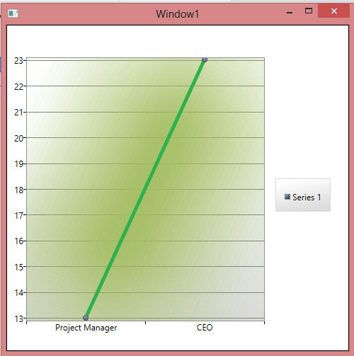
Result
Update add this in lineseries template.
                <Polyline Fill="Transparent"  StrokeThickness="200" Points="{TemplateBinding Points}">
                            <Polyline.Stroke>
                                <SolidColorBrush Color="#9FBD5F"></SolidColorBrush>
                            </Polyline.Stroke>
                            <Polyline.Effect>
                                <BlurEffect Radius="100"  KernelType="Box" />
                            </Polyline.Effect>
                        </Polyline>
Related Topics
What Does System.Double[*] Mean
How to Implement Gzip Compression in ASP.NET
How to Print Out a Tree Structure
How to Extend Identityuser with Custom Property
How to Support Listbox Selecteditems Binding with Mvvm in a Navigable Application
How Does Datetime.Touniversaltime() Work
A Dependent Property in a Referentialconstraint Is Mapped to a Store-Generated Column
Break Out of a While Loop That Contains a Switch Statement
3D Relative Angle Sum Calculation
Handling the Window Closing Event with Wpf/Mvvm Light Toolkit
In C#, How to Instantiate a Passed Generic Type Inside a Method
Is Configurationmanager.Appsettings Available in .Net Core 2.0
Multi-Tenant with Code First Ef6