Zoom Vs. Scale in CSS3
Transform is more predictable than zoom across browsers.
Zoom affects positioning differently in different browsers.
example:position:absolute; left:50px; zoom: 50%;
- IE will not change the
leftvalue at all. - Chrome will change the left value to
25px. Effectively it does doleft = left * zoom. But DevTools Computed Values in DevTools will still displayleft: 50px, even though that is effectively not true due to the zoom.
Transform is handled the same way in all browsers (as far as I can tell).
example:position:absolute; left:50px; transform: scale(0.5)
leftwould effectively be set to25pxin both Chrome and IE. (again, computed values will still not reflect this, it will displayleft:50px)- To avoid changing the
leftvalue, simply usetransform-origin: 0 0. That will ensure left is still 50px.
Demo: http://jsfiddle.net/4z728fmk/ shows 2 boxes where the small one is zoomed or scaled to 50%. Looks like this:
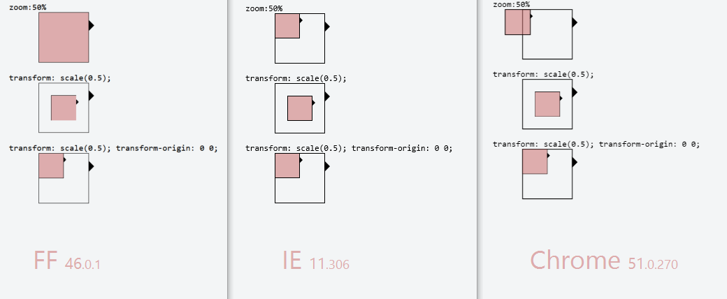
edit: img updated 2016-06-16 with Firefox (nothing had change in Chrome or IE since last time)
Using CSS transform scale() to zoom into an element without cropping, maintaining scrolling
Why not just to reposition the TransformOrigin to 0 0 and to use proper scrollTop/scrollLeft after the animation?
https://jsfiddle.net/b8vLg0ny/7/- Updated: https://jsfiddle.net/b8vLg0ny/13/
If you do not need the animation, the TransformOrigin can always stays 0 0 and only the scrolling is used to show the box.
To make the animation less jumpy use transition only for transform porperty, otherwise the transform-origin gets animated also. I have edited the example with 4x4 elements, but I think it makes sense to zoom a box completely into view, thats why I changed the zoom level. But if you stay by zoom level 2 and the grid size 15x15 for instance, then with this approach really precise origin should be calculated for transform, and then also the correct scrolling.
Anyway I don't know, if you find this approach useful.
Stack snippet
var zoomedIn = false;

var zoomContainer = $("#zoom-container");

$(".box").click(function(event) {

  var el = this;


  if (zoomedIn) {

    zoomContainer.css({

     transform: "scale(1)",

      transformOrigin: "0 0"

    });

    zoomContainer.parent().scrollTop(0).scrollLeft(0);

    zoomedIn = false;

    return;

  }

  zoomedIn = true;

  var $el = $(el);

  animate($el);

  zoomContainer.on('transitionend', function(){

   zoomContainer.off('transitionend');

   reposition($el);

  })

});

var COLS = 4, ROWS = 4,

   COLS_STEP = 100 / (COLS - 1), ROWS_STEP = 100 / (ROWS - 1),

    ZOOM = 4;


function animate($box) {

  var cell = getCell($box);

  var col =  cell.col * COLS_STEP + '%',

      row =  cell.row * ROWS_STEP + '%';

  zoomContainer.parent().css('overflow', 'hidden');

 zoomContainer.css({

    transition: 'transform 0.2s ease-in-out',

   transform: "scale(" + ZOOM + ")",

    transformOrigin: col + " " + row

  });

}

function reposition($box) {

  zoomContainer.css({

    transition: 'none',

   transform: "scale(" + ZOOM + ")",

    transformOrigin: '0 0'

  });

  zoomContainer.parent().css('overflow', 'auto');

  $box.get(0).scrollIntoView();

}

function getCell ($box) {

 var idx = $box.index();

  var col = idx % COLS,

      row =  (idx / ROWS) | 0;

  return { col: col, row: row };

}
* { margin: 0; }
body, html { height: 100%; }
#container {
height: 100%;
width: 50%;
margin: 0 auto;
overflow: hidden;
}
#zoom-container {
height: 100%;
width: 100%;
will-change: transform;
}
.box {
float: left;
width: 25%;
height: 25%;
color: white;
text-align: center;
}
.red { background: red; }
.blue { background: blue; }
.green { background: green; }
.black { background: black; }
.l { opacity: .3 }<script src="//cdnjs.cloudflare.com/ajax/libs/jquery/2.2.2/jquery.min.js"></script>
<div id="container">
<div id="zoom-container">
<div class="box red">A</div>
<div class="box blue">B</div>
<div class="box green">C</div>
<div class="box black">D</div>
<div class="box red l">E</div>
<div class="box blue l">F</div>
<div class="box green l">G</div>
<div class="box black l">H</div>
<div class="box red">I</div>
<div class="box blue">J</div>
<div class="box green">K</div>
<div class="box black">L</div>
<div class="box red l">M</div>
<div class="box blue l">N</div>
<div class="box green l">O</div>
<div class="box black l">P</div>
</div>
</div>Zooming on a point with CSS3 transform scale
One thing to watch out for when using transforms is the order that you apply them. You'll find your example works rather differently if you switch the scale and the translate around.
Here is an interesting article on the matter:
https://staff.washington.edu/fmf/2011/07/15/css3-transform-attribute-order/
I wasn't able to repair your version, mainly because it misbehaves unexpectedly when you switch the order of the transforms. Basically it seems you are running into odd behaviour because the scale itself causes an automatic translation in position, and then you also translate... and it seems these different translations are occurring at a slightly different pace.
I did however re-implement a version that works, and allows you to translate before scaling. Keeping the transforms in this order seems to avoid the issue.
http://jsfiddle.net/fxpc5rao/32/
I've modified the version below to use translate3D just because it performs better for many systems.
var current = {x: 0, y: 0, zoom: 1},

    con = document.getElementById('container');


window.onclick = function(e) {

    var coef = e.shiftKey || e.ctrlKey ? 0.5 : 2,

        oz = current.zoom,

        nz = current.zoom * coef,

        /// offset of container

        ox = 20,

        oy = 20,

        /// mouse cords

        mx = e.clientX - ox,

        my = e.clientY - oy,

        /// calculate click at current zoom

        ix = (mx - current.x) / oz,

        iy = (my - current.y) / oz,

        /// calculate click at new zoom

        nx = ix * nz,

        ny = iy * nz,

        /// move to the difference

        /// make sure we take mouse pointer offset into account!

        cx = mx - nx,

        cy = my - ny

    ;

    // update current

    current.zoom = nz;

    current.x = cx;

    current.y = cy;

    /// make sure we translate before scale!

    con.style.transform

        = 'translate3D('+cx+'px, '+cy+'px,0) '

        + 'scale('+nz+')'

    ;

};
#container {
position: absolute;
left: 20px;
top: 20px;
width: 100%;
height: 100%;
transform-origin: 0 0 0;
transition: transform 0.3s;
transition-timing-function: ease-in-out;
transform: translate3D(0,0,0) scale(1);
}
#item {
position: absolute;
}<div id="container">
<div id="item">
<img src="http://fadili.users.greyc.fr/demos/WaveRestore/EMInpaint/parrot_original.png" />
</div>
</div>Scale/zoom a DOM element and the space it occupies using CSS3 transform scale()
The HTML (Thanks Rory)
<!DOCTYPE html>
<html>
<head>
<meta name="description" content="Sandbox for Stack Overflow question http://stackoverflow.com/q/10627306/578288" />
<meta charset=utf-8 />
  <title>Sandbox for SO question about scaling an element both visually and dimensionally</title>
</head>
<body>

  <div id="wrapper">
    <div class="surrounding-content">
      before
    </div>

    <div id="content-to-scale">
      <div>something inside</div>
      <div><img src="http://placekitten.com/g/150/100"></div>
      <div>another something</div>
    </div>

    <div class="surrounding-content">
      after
    </div>
  </div>

</body>
</html>
The CSS (Still started from Rory's base)
body {
  font-size: 13px;
  background-color: #fff;
}
#wrapper {
  width: 50%;
  margin-left: auto;
  margin-right: auto;
  border: 0.07692307692307693em solid #888;
  padding: 1.1538461538461537em;
}
.surrounding-content {
  border: 0.07692307692307693em solid #eee;
}
#content-to-scale {
  border: 0.07692307692307693em solid #bbb;
  width: 10em;
}
#content-to-scale {
  font-size: 1.1em;
}
#content-to-scale img {
  width: auto;
  height: auto;
  min-width: 100%;
  max-width: 100%;
}
The Explanation:
I'm using font size and ems to "scale" the dimensions of the child elements.
Ems are dimension units that are relative to the current context's font-size.
So if I say I have a font-size of 13px and a border of 1 (the desired border-width in pixels) divded
by 13 (the current context's font-size also in pixels) = 0.07692307692307693em the browser ought to render a 1px border
To emulate a 15px padding I use the same formula, (desired pixels)/(current context's font-size in pixels) = desired ems.
15 / 13 = 1.1538461538461537em
To tame the scaling of the image I use an old favorite of mine: the natural ratio preserving scale, let me explain:
Images have a natural height and width and a ratio between them. Most browser's will preserve this ratio if both width and height are set to auto.
You can then control the desired width with min-width and max-width, in this case making it always scale to the full width of the parent element, even when it will scale beyond it's natural width.
(You can also use max-width and max-height 100% to prevent the image from busting out of the borders of the parent element, but never scaling beyond their natural dimensions)
You can now control the scaling by tweaking the font-size on #content-to-scale. 1.1em roughly equals scale(1.1)
This does have some drawbacks: nested font-sizing in ems are applied recusively. Meaning if you have:
<style type="text/css">
    div{
        font-size: 16px;
    }
    span{
        font-size: 0.5em;
    }
</style>
<div>
    <span>
        <span>
            Text
        </span>
    </span>
</div>
You will end up with "Text" rendering at 4px instead of the 8px you might expect.
What Does 'zoom' do in CSS?
Zoom is not included in the CSS specification, but it is supported in IE, Safari 4, Chrome (and you can get a somewhat similar effect in Firefox with -moz-transform: scale(x) since 3.5). See here.
So, all browsers
 zoom: 2;
 zoom: 200%;
will zoom your object in by 2, so it's like doubling the size. Which means if you have
a:hover {
   zoom: 2;
}
On hover, the <a> tag will zoom by 200%.
Like I say, in FireFox 3.5+ use -moz-transform: scale(x), it does much the same thing.
Edit: In response to the comment from thirtydot, I will say that scale() is not a complete replacement. It does not expand in line like zoom does, rather it will expand out of the box and over content, not forcing other content out of the way. See this in action here. Furthermore, it seems that zoom is not supported in Opera.
This post gives a useful insight into ways to work around incompatibilities with scale and workarounds for it using jQuery.
Related Topics
Handling CSS Id and Classes with Spaces
Remove "Whitespace" Between Div Element
How to Position a Div in the Middle of the Screen When the Page Is Bigger Than the Screen
Two Divs Next to Each Other, That Then Stack with Responsive Change
Finding "Equivalent" Color with Opacity
Why Is This Non-Float Margin Collapsing with a Float
Unordered List That Acts Like Grid-Auto-Flow Dense
My Z-Index Property Is Not Getting Set
Apply Background-Size to Individual Layer of a Multiple Background
How to Properly Use CSS-Values Viewport-Relative-Lengths
Drawing Rounded Triangle with CSS
How to Apply CSS to HTML5 Custom Elements