Word-wrap CSS property not affecting a table cell
In addition to your word-wrap rule on the cell, add the CSS rule table-layout:fixed to your table (and possibly a width).
jsFiddle example
CSS text-overflow in a table cell?
To clip text with an ellipsis when it overflows a table cell, you will need to set the max-width CSS property on each td class for the overflow to work. No extra layout div elements are required:
td
{
 max-width: 100px;
 overflow: hidden;
 text-overflow: ellipsis;
 white-space: nowrap;
}
For responsive layouts; use the max-width CSS property to specify the effective minimum width of the column, or just use max-width: 0; for unlimited flexibility. Also, the containing table will need a specific width, typically width: 100%;, and the columns will typically have their width set as percentage of the total width
table {width: 100%;}
td
{
 max-width: 0;
 overflow: hidden;
 text-overflow: ellipsis;
 white-space: nowrap;
}
td.column_a {width: 30%;}
td.column_b {width: 70%;}
Historical: For IE 9 (or less) you need to have this in your HTML, to fix an IE-specific rendering issue
<!--[if IE]>
<style>
table {table-layout: fixed; width: 100px;}
</style>
<![endif]-->
word-wrap break-word does not work in this example
Mozilla Firefox solution
Add:
display: inline-block;
to the style of your td.
Webkit based browsers (Google Chrome, Safari, ...) solution
Add:
display: inline-block;
word-break: break-word;
to the style of your td.
Note:
Mind that, as for now, break-word is not part of the standard specification for webkit; therefore, you might be interested in employing the break-all instead. This alternative value provides a undoubtedly drastic solution; however, it conforms to the standard.
Opera solution
Add:
display: inline-block;
word-break: break-word;
to the style of your td.
The previous paragraph applies to Opera in a similar way.
Preventing a pre from wrapping inside of a table
You can consisder width:0;min-width:100%; trick on the pre. The idea is that the width:0 will disable the contribution of pre on defining the width of the container then min-width:100% will force it to fill all the space:
.main-content {  max-width: 800px;  border: 1px solid red;}
th:first-of-type {  white-space:nowrap;} pre {  overflow: auto;  width:0;  min-width:100%;}
<div class="main-content"> <table border="0" class="config"> <thead> <tr> <th>Property</th> <th>Description</th> </tr> </thead> <tbody> <tr> <td class="config-name">name</td> <td class="config-description">
<p>Foo bar talking about some random things related to our code here in the paragraph:</p> <pre>// some really long code section here that should have its own scroll bar (and not wrap) some really long code section here that should have its own scroll bar (and not wrap)</pre> </td> </tr> </tbody> </table></div>Using CSS to create table cells of a specific width with no word wrapping
Unfortunately table elements do not respect overflow, so you will need to apply that to a child element.
edit: I may have spoken too soon, as I can create this effect in FF using max-width and I've discovered this thing which might work for IE. You learn something every day.
edit2: yeah it does work for IE7 at least but there's a serious caveat that you can't have whitespace in the text, they have to be converted to . I think you should probably stick with the <div> solution for sake of cleanliness and compatability.
Set the table column width constant regardless of the amount of text in its cells?
I played with it for a bit because I had trouble figuring it out.
You need to set the cell width (either th or td worked, I set both) AND set the table-layout to fixed. For some reason, the cell width seems to only stay fixed if the table width is set, too (I think that's silly but whatev).
Also, it is useful to set the overflow property to hidden to prevent any extra text from coming out of the table.
You should make sure to leave all of the bordering and sizing for CSS, too.
Ok so here's what I have:
table {  border: 1px solid black;  table-layout: fixed;  width: 200px;}
th,td {  border: 1px solid black;  width: 100px;  overflow: hidden;}
<table> <tr> <th>header 1</th> <th>header 234567895678657</th> </tr> <tr> <td>data asdfasdfasdfasdfasdf</td> <td>data 2</td> </tr></table>Stop word-wrap dividing words
use white-space: nowrap;. If you have set width on the element on which you are setting this it should work.
update -
rendered data in Firefox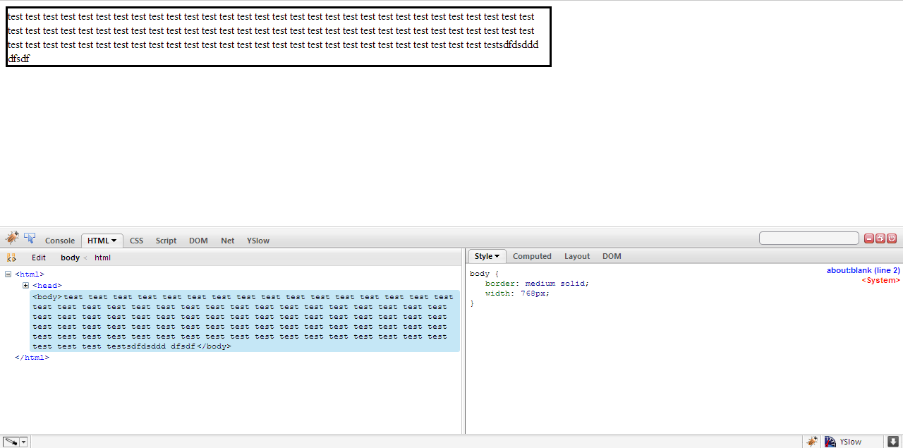
Related Topics
Create Angular Material Theme with CSS Variables
Adding CSS Stylesheet to Pages Based on Route in Opencart
CSS Multiple Class/Id Selectors
Cypress Testing Pseudo CSS Class :Before
CSS Auto Numbers for Table Rows - Not First
Why Is My Bootstrap Code Not Working
In CSS Grid Layout, Do We Count the Span Even Starting on Implicit Grid Lines
CSS Background Sizing Polyfill
Enable Support for CSS3 ::Outside Pseudoelement
CSS 3 Gradients for Styling Svg Elements
Safari Rounding Down on Subpixel Calculations
Best Way to Structure a CSS Stylesheet
React Native Font Outline/Textshadow
Imitate Photoshop Blend Effects Like Multiply, Overlay etc
CSS Sprites - Not Only for Background Images
Css3 Flexbox Compatibility Problems with Firefox and Safari