Why does overflow-x:hidden clip my descenders?
I found some answers in a previous question. According to the specs:
The computed values of
overflow-xandoverflow-yare the same as their specified values, except that some combinations withvisibleare not possible: if one is specified asvisibleand the other isscrollorauto, thenvisibleis set toauto. The computed value ofoverflowis equal to the computed value ofoverflow-xifoverflow-yis the same; otherwise it is the pair of computed values ofoverflow-xandoverflow-y.
Furthermore, on this page the author mentions that many browsers impose additional restrictions:
In Gecko, Safari, Opera, ‘visible’ becomes ‘auto’ also when combined with ‘hidden’ (in other words: ‘visible’ becomes ‘auto’ when combined with anything else different from ‘visible’).
That same page also provides demos for all possible combinations where this effect can be observed.
I am not aware of a viable workaround for my situation.
EDIT
I'm pretty sure I can do what I want by nesting my title tag in another tag: <div><h1>title</h1></div>. The inner h1 has line-height:normal to make everything vertically visible, as well as overflow:hidden to make it truncate. The outer element can have a strictly limited height and overflow:visible. It's not ideal, but it seems like the best option.
Why does overflow-y:hidden affect the visibility of items overflowing on the x axis?
overflow is intended to be used with elements that are not absolutely positioned. If you want to handle the clipping of an absolutely positioned element, use the clip css property. So to clip on the bottom and top of your containing div, but not the left or right, do this:
#test {
    position:relative;
    margin-left:50px;
    margin-top:50px;
    border:1px solid black;
    height:50px;
    width:50px;
    clip: rect(auto,auto,auto,-11px);
}
Sample: http://jsfiddle.net/treeface/UJNcf/6/
Text cropping when using overflow: hidden
To answer the question of why this happens, I think the key is this particular phrase from the Fonts section of the CSS 2.1 spec (emphasis mine):
The font size corresponds to the em square, a concept used in typography. Note that certain glyphs may bleed outside their em squares.
The line-height: 1 declaration sets the height of the paragraph to the same height as the font-size (since the paragraph only has one line). The fact that some characters are cut off implies that their glyphs bleed outside their em squares (I don't know how to definitively prove that this is true; I'm just speculating based on the evidence).
As for a solution, the most straightforward solution would be to use a larger line-height setting, such as 1.1 or 1.2.
Why does CSS2.1 define overflow values other than visible to establish a new block formatting context?
I asked about this on the mailing list on your behalf; the thread can be found here. In summary, this has to do with scrolling content for the most part:
Fundamentally, because if the spec didn't say this, then having floats intersect with something that's scrollable would require the browser to rewrap (around intruding floats) the contents of the scrollable element every time it scrolls. This is technically what
CSS 2.0 required, but it was never implemented, and it would have been a huge problem for speed of scrolling.-David
Most likely, it refers to scrollable content in a box that may occur outside of the float's parent but would intersect with the float. I don't think this is related to rewrapping content around a float within a scrollable container, as that already happens naturally, plus the float would clip into the container and scroll along with the rest of its content anyway.
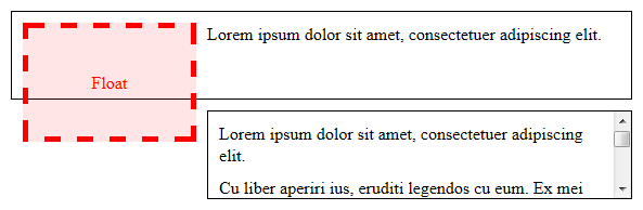
Finally this makes sense to me. In fact, I'm going to provide an example here so hopefully it makes sense to you and anyone else who may be wondering. Consider a scenario involving two boxes with the same fixed height and overflow: visible (the default), of which the first contains a float that stretches beyond its parent's height:
<div>
    <p>...</p>
</div>
<div>
    <p>...</p>
    <p>...</p>
</div>
/* Presentational properties omitted */
div {
    height: 80px;
}

div:first-child:before {
    float: left;
    height: 100px;
    margin: 10px;
    content: 'Float';
}
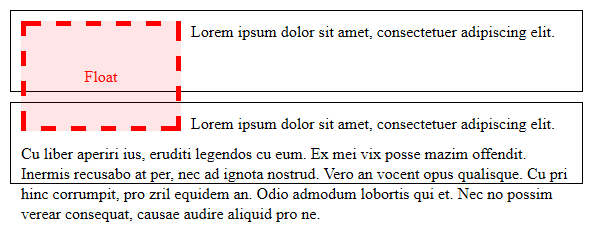
Notice the similarity to one of the examples given in section 9.5. The second box here is simply shown to have overflowing content for the purposes of this answer.
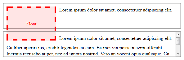
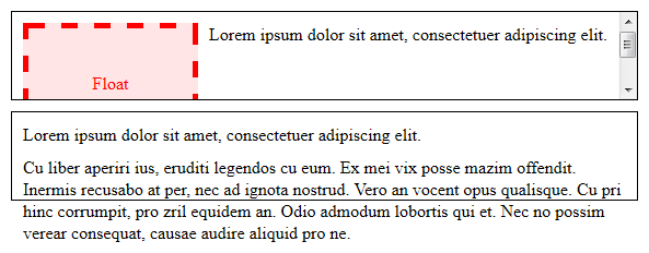
This is fine since the content will never be scrolled, but when overflow is set to something other than visible, that causes the content to not only be clipped by the bounds of the box, but also to become scrollable. If the second box has overflow: auto, this is what it would look like had a browser implemented the original CSS2 spec:
Because of the float, attempting to scroll the content would cause the browser to have to rewrap it so it doesn't become obscured by the float (and what should happen to the part that scrolls out of the top edge?). It would probably look something like this when scrolled to the bottom:
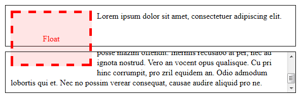
The catch here is that the browser has to rewrap the content every time it repaints it during scrolling. For browsers that are capable of pixel-based smooth scrolling — which is to say, all of them — I can see why it would be a performance disaster! (And a user experience one, too.)
But that's for when the user can scroll the content, right? This would make sense for overflow: auto and overflow: scroll, but what about overflow: hidden?
Well, a common misconception is that a container with overflow: hidden simply hides content by clipping and cannot be scrolled. This is not completely true:
While scrolling UI is not provided, the content is still scrollable programmatically, and a number of pages perform just such scrolling (e.g. by setting
scrollTopon the relevant element).-Boris
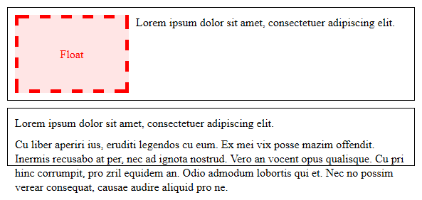
Indeed, this is what it'd look like if the second box was set to overflow: hidden and then scrolled to the bottom with the following JavaScript:
var div = document.getElementsByTagName('div')[1];
div.scrollTop = div.scrollHeight;
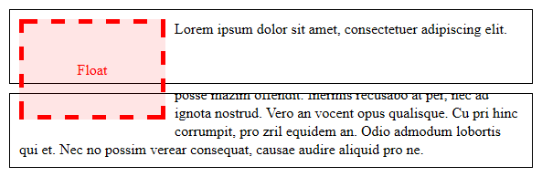
Again, notice that the content would have to be rewrapped to avoid being obscured by the float.
Even though this wouldn't be as painful for performance as had scrolling UI been available, my best guess is that they made boxes with any overflow value other than visible generate a new BFC mainly for the sake of consistency.
And so, this change was brought about in CSS2.1, documented here. Now if you apply an overflow value other than visible only to the second box, what a browser does is push the entire box aside to make way for the float, because the box now creates a new block formatting context that encloses its contents, instead of flowing around the float. This particular behavior is specified in the following paragraph:
The border box of a table, a block-level replaced element, or an element in the normal flow that establishes a new block formatting context (such as an element with 'overflow' other than 'visible') must not overlap the margin box of any floats in the same block formatting context as the element itself. If necessary, implementations should clear the said element by placing it below any preceding floats, but may place it adjacent to such floats if there is sufficient space. They may even make the border box of said element narrower than defined by section 10.3.3. CSS2 does not define when a UA may put said element next to the float or by how much said element may become narrower.
Here's what it looks like with overflow: auto for example:
Note that there is no clearance; if the second box had clear: left or clear: both it would be pushed down, not to the side, regardless of whether it established its own BFC.
If you apply overflow: auto to the first box instead, the float is clipped into its containing box with the rest of the content due to its fixed height, which is set to 80px in the example code given above:
If you revert the first box to height: auto (the default value), either by overriding or removing the height: 80px declaration from above, it then stretches to the height of the float:
This happens to be new in CSS2.1 as well, in that an element with height: auto that generates a new block formatting context (i.e. a block formatting context root) will stretch vertically to the height of its floats, and not just enough to contain its in-flow content unlike a regular box. The changes are documented here and here. The change leading to the side-effect of shrinking the box so that it does not intersect the float is documented here.
In both of these cases, no matter what you do to the second box, it will never be affected by the float because it has been restricted by the bounds of its container.
Why does CSS transform influence Site width?
I was always under the impression, that CSS transforms are purely visual and don't influence the actual site layouting in any way
This is correct since transformation will not affect the position of any other element and the layout will remain the same.
What you are facing is related to overflow:
The scrollable overflow of a box is the set of things extending outside of that box’s padding edge for which a scrolling mechanism needs to be provided.
The scrollable overflow area is the non-rectangular region occupied by the scrollable overflow, and the scrollable overflow rectangle is the minimal rectangle whose axes are aligned to the box’s axes and that contains the scrollable overflow area.
.. the border boxes of all boxes for which it is the containing block and whose border boxes are positioned not wholly outside its block-start or inline-start padding edges, accounting for transforms by projecting each box onto the plane of the element that establishes its 3D rendering context. ref
So transform is a part of the Scrollable Overflow
You will find that some properties are part of the Ink Overflow and this one doesn't generate a scroll:
The ink overflow of a box is the part of that box and its contents that creates a visual effect outside of the box’s border box. Ink overflow is the overflow of painting effects defined to not affect layout or otherwise extend the scrollable overflow area, such as box shadows, border images, text decoration, overhanging glyphs (with negative side bearings, or with ascenders/descenders extending outside the em box), outlines, etc.
For example box-shadow will never create a scroll
.box {
  width:100px;
  height:100px;
  background:red;
  box-shadow:0 0 0 1000vmax blue;
}
<div class="box"></div>Can specific text character change the line height?
My question is which behavior is the correct one.
All of them are correct because we don't have the same default font in all browsers and it's also different depending on the OS.
Is specific character allowed to change line height (I thought it was only supposed to be font dependent)?
Character doesn't change line-height. To be more accurate, line-height is a property that can only be changed by setting line-height but you are probably confusing with the line box that is defined by the line-height and a character alone cannot change it.
Shouldn't line-height: 1 imply it can fit exactly any text?
Not necessarely, line-height:1 means that the line box will be equal to the 1xfont-size 1 but is the font designed to include all the character inside this space? Probably most of them will do but we don't know.
Basically, you have two things to consider. The content area that is defined by the font properties and the line box that is defined by the line-height. We have no control over the first one and we can only control the second one.
Here is a basic example to illustrate:
span { background:red; color:#fff; font-size:20px; font-family:monospace;}
body { margin:10px 0; border-top:1px solid; border-bottom:1px solid; animation:change 2s linear infinite alternate;}
@keyframes change {  from {    line-height:0.2  }    to {    line-height:2  }}
<span >blah_blah</span>Related Topics
Em Vs Px and Cross Browser Compatibility
How to Use Font-Family with Same Name
How to Make Cross Browser Gradient Mixin in Compass, with Ie9, Ie8, Ie7 and Opera
Background Position, Margin-Top
How to Make Vim Alphabetically Sort CSS Rules Within a Single Line
Using @Import for Google Fonts Is Not Working on Internet Explorer
Difference Between Variable Fonts and Regular Fonts
Fixed Width Variable Height Grid CSS
Efficient and Inefficient CSS Selectors (According to Google, Pagespeed ...)
How to Make Bootstrap Icon Display Inline with Text in a Tag
Larger Div Centered Inside Smaller Div
CSS Make Textbox Fill All Available Width
Opposite of Adjacent Sibling Selector