Em vs Px and cross browser compatibility
Strictly speaking the use of em over px isn't really a cross-browser compatibility issue - all browsers support the use of them both for font-sizing.
It used to be advisable to avoid using px for font sizing as the browser with the biggest market share, IE6, wouldn't allow text resizing. It sees px as an absolute value, not a relative value like em, and so wouldn't scale text up or down sized in px.
Depending on your audience you may not need to worry about it. There's some great info on the benefits of the em, and how they can help towards building a fluid layout here: http://www.alistapart.com/articles/fluidgrids/
Why em instead of px?
The reason I asked this question was that I forgot how to use em's as it was a while I was hacking happily in CSS. People didn't notice that I kept the question general as I wasn't talking about sizing fonts per se. I was more interested in how to define styles on any given block element on the page.
As Henrik Paul and others pointed out em is proportional to the font-size used in the element. It's a common practice to define sizes on block elements in px, however, sizing up fonts in browsers usually breaks this design. Resizing fonts is commonly done with the shortcut keys Ctrl++ or Ctrl+-. So a good practice is to use em's instead.
Using px to define the width
Here is an illustrating example. Say we have a div-tag that we want to turn into a stylish date box, we may have HTML-code that looks like this:
<div class="date-box">
    <p class="month">July</p>
    <p class="day">4</p>
</div>
A simple implementation would defining the width of the date-box class in px:
* { margin: 0; padding: 0; }

p.month { font-size: 10pt; }

p.day { font-size: 24pt; font-weight: bold; }

div.date-box {
    background-color: #DD2222;
    font-family: Arial, sans-serif;
    color: white;
    width: 50px;
}
The problem
However, if we want to size the text up in our browser the design will break. The text will also bleed outside the box which is almost the same what happens with SO's design as flodin points out. This is because the box will remain the same size in width as it is locked to 50px.
Using em instead
A smarter way is to define the width in ems instead:
div.date-box {
    background-color: #DD2222;
    font-family: Arial, sans-serif;
    color: white;
    width: 2.5em;
}

* { margin: 0; padding: 0; font-size: 10pt; }

// Initial width of date-box = 10 pt x 2.5 em = 25 pt
// Will also work if you used px instead of pt
That way you have a fluid design on the date-box, i.e. the box will size up together with the text in proportion to the font-size defined for the date-box. In this example, the font-size is defined in * as 10pt and will size up 2.5 times to that font size. So when you're sizing the fonts in the browser, the box will have 2.5 times the size of that font-size.
Should I use px or rem value units in my CSS?
TL;DR: use px.
The Facts
First, it's extremely important to know that per spec, the CSS
pxunit does not equal one physical display pixel. This has always been true – even in the 1996 CSS 1 spec.CSS defines the reference pixel, which measures the size of a pixel on a 96 dpi display. On a display that has a dpi substantially different than 96dpi (like Retina displays), the user agent rescales the
pxunit so that its size matches that of a reference pixel. In other words, this rescaling is exactly why 1 CSS pixel equals 2 physical Retina display pixels.That said, up until 2010 (and the mobile zoom situation notwithstanding), the
pxalmost always did equal one physical pixel, because all widely available displays were around 96dpi.Sizes specified in
ems are relative to the parent element. This leads to theem's "compounding problem" where nested elements get progressively larger or smaller. For example:body { font-size:20px; }
div { font-size:0.5em; }Gives us:
  <body> - 20px
      <div> - 10px
          <div> - 5px
              <div> - 2.5px
                  <div> - 1.25px
The CSS3
rem, which is always relative only to the roothtmlelement, is now supported on 99.67% of all browsers in use.
The Opinion
I think everyone agrees that it's good to design your pages to be accommodating to everyone, and to make consideration for the visually impaired. One such consideration (but not the only one!) is allowing users to make the text of your site bigger, so that it's easier to read.
In the beginning, the only way to provide users a way to scale text size was by using relative size units (such as ems). This is because the browser's font size menu simply changed the root font size. Thus, if you specified font sizes in px, they wouldn't scale when changing the browser's font size option.
Modern browsers (and even the not-so-modern IE7) all changed the default scaling method to simply zooming in on everything, including images and box sizes. Essentially, they make the reference pixel larger or smaller.
Yes, someone could still change their browser default stylesheet to tweak the default font size (the equivalent of the old-style font size option), but that's a very esoteric way of going about it and I'd wager nobody1 does it. (In Chrome, it's buried under the advanced settings, Web content, Font Sizes. In IE9, it's even more hidden. You have to press Alt, and go to View, Text Size.) It's much easier to just select the Zoom option in the browser's main menu (or use Ctrl++/-/mouse wheel).
1 - within statistical error, naturally
If we assume most users scale pages using the zoom option, I find relative units mostly irrelevant. It's much easier to develop your page when everything is specified in the same unit (images are all dealt with in pixels), and you don't have to worry about compounding. ("I was told there would be no math" – there's dealing with having to calculate what 1.5em actually works out to.)
One other potential problem of using only relative units for font sizes is that user-resized fonts may break assumptions your layout makes. For example, this might lead to text getting clipped or running too long. If you use absolute units, you don't have to worry about unexpected font sizes from breaking your layout.
So my answer is use pixel units. I use px for everything. Of course, your situation may vary, and if you must support IE6 (may the gods of the RFCs have mercy on you), you'll have to use ems anyway.
Why use rem instead px when it's the same anyway?
So after all the research, I came to the conclusion that the only advantage of rem, is that users who use a bigger default font-size in their browser setting, will get the font-size scaled properly, while px will not scale. In other words, using rem for font-size, adds support for Accessibility to your website.
To sum up:
remis a way to add support for Accessibility to your website.- Keep in mind, most users use zoom instead of font-size change in their browser and phones, because zoom easier to access.
- Browser zoom has additonal affect on
em, in other words, it scalesremandpxequally. - Since 2012,
remis supported by all major browsers on desktop and mobile devices. - Use
pxas fall back option for IE8 and lower. - Although not specified by W3C, all browser across desktop and mobile devices have implemented a default
font-sizeof 16px (feel free to Google yourself), which equals to 1rem/em - To make the conversion easier between
pxandremyou can usehtml {font-size: 62.5%;}which converts10pxto1rem
In one sentence: Use rem with px on font-size to support accessibility.
html {
    font-size: 62.5%;
}

.your_class {
    font-size: 16px;
    font-size: 1.6rem;
}
em vs px... for mobile browsers
px won't be a real actual pixel when the screen is zoomed out on a modern mobile browser. These browsers are effectively emulating a desktop browser with desktop browser-size pixels.
So for this type of browser using px is no worse than it is for a normal desktop browser. You can do it if you want without major problems, but in both situations em is preferable for the main body content, if you can.
Is sizing fonts using em still relevant?
Do not specify the font-size in absolute length units for screen stylesheets. They render inconsistently across platforms and can't be resized by the User Agent (e.g browser). Keep the usage of such units for styling on media with fixed and known physical properties (e.g print)
If you will use this method, no need to calculate
You can set the font-size of the body to 62.5%(that is 62.5% of the default of 16px), which equates to 10px, or 0.625EMs. Now you can set your font-size in EMs with an easy to remember conversion, divide the px by 10.
* 12px = 1.2EMs
* 13px = 1.3EMs
* 16px = 1.6EMs
* 8px = 0.8EMs
* etc…
This makes everything SUPER easy to remember and eliminates the need for conversion tables. Of course, you will still need to use a conversion table for nested elements when using EMs, if you are not being specific in your CSS, which is a whole separate issue.
But 76% is much better and you can use this to calculate http://pxtoem.com/
Yes it's still relevant:
IE6 is still widely used and is unable to resize the fonts defined in px. => Usability issues. That alone is a no-no.
and
IE 7 and 8 don't resize text sized with pixels either, actually. They do have page zoom, but some people prefer to incease text size only.
Here's a summary of what's good and bad about font sizing in general.
Font size in css http://easycaptures.com/fs/uploaded/213/2470522253.png
I personally like ems. Others, like Chris Coyier over at CSS-Tricks.com likes pixels. (Chris has an excellent article on the different font units).
It really comes down to personal preference.
Almost similar or related questions on SO
Should we still use em and % for defining the font-size of the website elements?
Is there really any point to using relative font sizing in CSS?
Why em instead of px?
Font size in CSS - % or em?
CSS font size: relative vs. absolute values. Which to use?
Problem with EM
Using relative instead of fixed size in CSS
Helpful online tool for px to em
http://pxtoem.com/
http://riddle.pl/emcalc/
http://convert-to.com/pixels-px-to-em-conversion.html
Convert entire site from px to em (This tool is still in development)
http://converter.elementagency.com/
EM Calculator AIR application (will work on all os)
http://jameswhittaker.com/journal/em-based-layouts-vertical-rhythm-calculator/
http://jameswhittaker.com/projects/apps/em-calculator-air-application/
Windows apps
http://www.thebrightlines.com/2009/11/16/pixem-pixel-to-em-converter/
http://www.storkas.com/Projects.aspx(go at bottom)
Pixels to Ems Conversion Table for CSS
http://jontangerine.com/silo/css/pixels-to-ems/
http://reeddesign.co.uk/test/points-pixels.html
emchart
http://aloestudios.com/tools/emchart/
http://aloestudios.com/code/emchart/
Some more articles on this issue
http://www.d.umn.edu/itss/support/Training/Online/webdesign/type.html
Font sizes: EMs vs Pixels... in 2011, which one should be used?
While every modern browser is able to zoom with text sized using px, they can't all scale text sized using px, it still depends on the browser.
Try 'scaling' text in IE8 using zoom, absolutely fine. Scale using the official text size modifier (page -> text size -> largest), and it doesn't work.
- IE8 - Zoom, no scale
- Firefox 4, beta 12 - Zoom, no scale
- Google Chrome 10 beta - Zoom, no scale
Several official bodies that I work with use the official text size modifier as part of their user/group settings management. When accounts are set up for users, they're often pre-configured using this setting. I don't know if they have to set it there ... but for me, EMs are still preferable because PX doesn't scale everywhere.
Finally, a few words from the W3C.
Units: avoid absolute length units for
screen display
- Do not specify the font-size in pt, or other absolute length units for screen stylesheets. They render inconsistently across platforms and can't be resized by the User Agent (e.g browser). Keep the usage of such units for styling on media with fixed and known physical properties (e.g print).
- Use relative length units such as percent or (better) em
ref: http://www.w3.org/QA/Tips/font-size
Cross browser inconsistencies with margins?
It's most likely the em units you're using everywhere for widths, margins and padding. The em unit is based on font size and webkit renders fonts slightly differently than gecko (the same text in webkit and gecko will be different widths).
As a test, change your CSS widths, padding and margins to absolute px values and check if this fixes the inconsistencies.
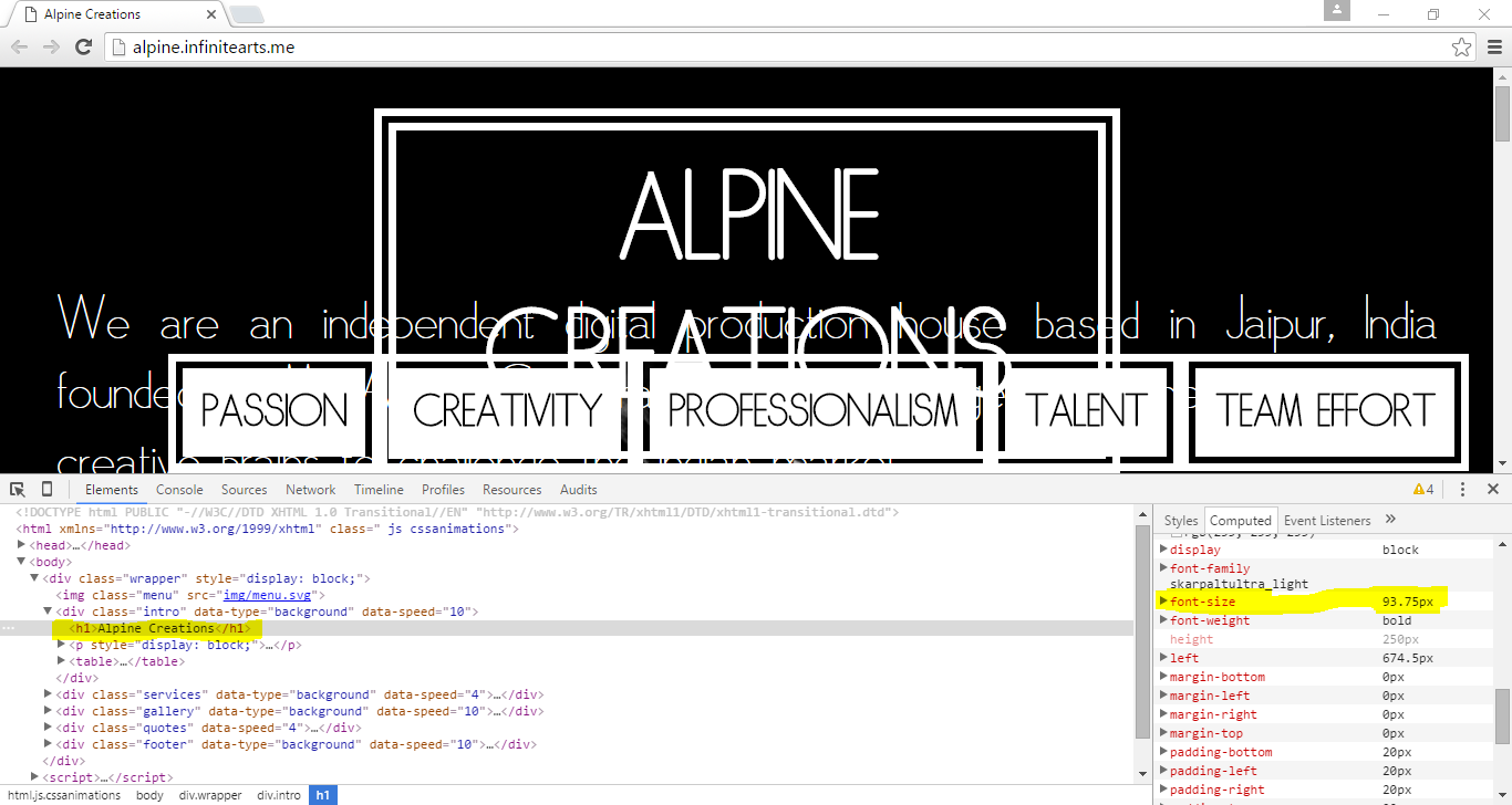
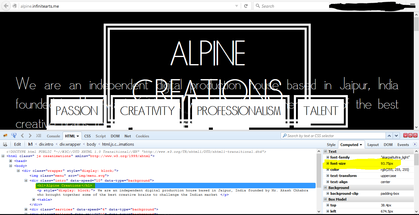
Cross browser font sizing
Font sizes are the same in both Firefox and Chrome.
Here is what it looks like in both browsers:
As you can see both browsers compute the font size as 93.75px.
After few adjustments:
h1 {
    background-clip: padding-box;
    border: 20px double #fff;
    color: #fff;
    display: inline-block;
    font-size: 10em;
    left: 50%;
    padding: 20px;
    position: absolute;
    text-align: center;
    text-transform: uppercase;
    top: 10%;
    transform: translateX(-50%);
}
.intro p {
    color: #fff;
    font-size: 5em;
    padding: 50px;
    position: absolute;
    text-align: justify;
    top: 40%;
}
table {
    bottom: 10%;
    color: #000;
    font-size: 3em;
    margin-left: 150px;
    position: absolute;
}

Related Topics
How to Make Tinymce's Modal Dialogs Responsive
Add Strikethrough to Checked Checkbox
Is There an Equivalent of Spriting for Svg Images in Web Pages
Svg Stroke-Dasharray Offset Not Consistent
CSS Color Names + Alpha Transparency
I Am Gettiing an Error Expected New Line While Compiling Sass
CSS Terminology: What Are These Called
How Make: Focus,: Active Be The Same as: Hover
Make a Material UI Component in React Sticky When Scrolling (Not Appbar)
CSSmin Not Correctly Handling @Import
Why Does Bootstrap Use a 0.02Px Difference Between Screen Size Thresholds in Its Media Queries
How to Capitalize First Letter Only Using CSS in Each Case
When Do We Use "Position:Relative" in CSS
Jquery UI Styled Text Input Box
Intellij Idea 11: How to Compile .CSS from .Less
Table Overflows Parent Div When Td Content Is Too Wide
Internet Explorer CSS Property "Filter" Ignores Overflow:Visible