Sub-Pixels calculated and rendered differently among browsers
As you already know, the problem arises from a different approach to subpixel calculus between browsers
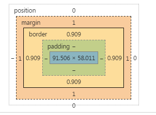
In Chrome, for instance, borders can have a fractional size, but margins are handled different (as integers).
I don't have documentation about it from the Chrome team, but it's what can be seen in dev tools:
AFAIK, there is not a way to change that.
Instead, you can transfer the use of the margin in the button to a border.
Since you need to get space for the 1px border of the input, do the same in the button, set a 1px border (instead of a margin), and set it transparent.
The remaining trick is to set the background-clip property to padding box, so that this transparency is not affected by the background
There is another bug in Chrome, the padding expressed in em is not reliable at this level of precision when the browser is zoomed. I changed this in the snippet.
Since we are using the border button to get the dimension ok, we can style the border using instead a inset shadow.
* {  margin: 0; padding: 0; box-sizing: border-box;}button, input, wrapper {  display: inline-block; border-radius: 3px;}
.wrapper {  position: relative;    width: 60%;  margin: 1em;  background-color: #ccc;}
input {  border: 1px solid red;  width: 100%;    background-color: limegreen;  line-height: 3em;/*  padding: 0.75em; */  padding: 10px;}
button {  position: absolute;  right: 0;  top: 0;  bottom: 0;  border: 1px solid transparent;  width: 7em;  margin: 0px;  background-clip: padding-box;  box-shadow:  inset 0px 0px 0px 2px  black;}
<div class="wrapper"> <input type="text"> <button>Test</button></div>safari rounding down on subpixel calculations
There isn't a whole lot you can do about how different browsers render subpixels, sadly. It'd be great if we could choose how the rounding should be handled through CSS, but nope.
Simply using pixels rather then percentages would solve the problem but that's obviously not what you want. I guess you could get around with static pixels if you change the values (possible to a percentage value) through media queries.
Whenever I find myself in a similar scenario I float the last child to the right. A few additional pixels between the last and second last elements don't usually hurt as much as a few additional pixels between the last element and its parent.
Fixing Sub-Pixel rounding issue in a CSS Fluid Grid
Stubbornella's OOCSS framework (links below) grids module deals with this by giving the last column the following overrides:
float:    none;
overflow: hidden;
width:    auto;
This allows it to occupy whatever width remains within the container.
A bit of browser-forking (IE, ptzsch…) is necessary to get the same behaviour:
https://github.com/stubbornella/oocss/blob/master/core/grid/grids.css
https://github.com/stubbornella/oocss/wiki/grids
Related Topics
Vertical Margins Disappear When Parent Is Set to Overflow:Visible
CSS Display:None and Visibility:Hidden
Cannot Change the Content of Visited :Before Pseudo-Elements
Pure CSS: Center Tooltip Above Text on Hover Pt. 2
Nightwatch Cannot Find/Click on Dropdown Option
A:Visited Links - Opacity Not Working
How to Layer Box-Shadows Using Z-Index
Safari Page-Break-Inside:Avoid Not Working
Style Type="Text/Css" ... What Else Is There
"Rowspan" Behavior with Flexbox
CSS Pointer-Events and Appearance Properties Not Recognized by CSS Validator
What's the Difference Between Padding and Margin
Sass: Set Variable at Compile Time
Special Characters in CSS Selectors
How to Get CSS Variables Working in Chrome 34
How to Imitate the Look of the Outline and Label from Material-Ui's Outlined Textfield