Skew the shadow, not the content
There are a couple of things. The pseudo element needs width and height - and the snippet below assumes those are to be the same as its 'owning' element.
Also, where is the element to be placed? This snippet assumes that what is wanted is the shadow skewed but as if it were otherwise the shadow on the main element so it positions it absolutely relative to the main element. Obviously change this if I've misunderstood.
.my-class {
  height: 5rem;
  width: 10rem;
  position: relative;
}

.my-class::before {
  content: "";
  position: absolute;
  top: 0;
  left: 0;
  width: 100%;
  height: 100%;
  box-shadow: 0.2em -0.4rem 0 -0em rgba(0, 0, 0, 0.6);
  transform: skew(0, 25deg);
}

}
<div class="my-class">
AAA
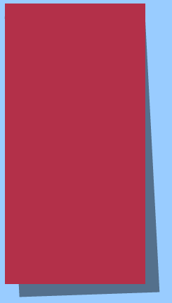
</div>Creating a skew box shadow on DIV
You could use pseudoelements instead of creating empty div for styling purpose only
e.g. http://codepen.io/anon/pen/yNQjgB
Markup
<div class="skewedshadow"></div>
CSS
div {
   width: 200px;
   height: 400px;
   background: #b33049;
}

.skewedshadow {
  position: relative;
}

.skewedshadow:before {
  position: absolute;
  z-index: -1;
  content: "";
  width: inherit;
  height: inherit;
  background: rgba(0,0,0, .45);
  transform: rotate(1.5deg) translateX(10px) translateY(15px) skewX(4deg) skewY(-4deg);
}
Result
Angled Border using skew with Box Shadow - FF issue
Add translateZ(1px) to fix the antialiasing issue with the transform.
transform: translateZ(1px) skewY(-1.5deg);
Render issues with transforms are common and modifying 3d transform properties are often the best way to fix them because it causes the browser to render using different methods. Other common fixes in this same vein but don't seem to apply here are: backface-visibility: hidden and perspective: 1px.
How to apply transform effect to box-shadow only
After fiddling with pseudo elements and classes more, I have a working solution!
First I added these two properties to my original .link class, making sure the text was stabilised:
display: inline;
position: relative;
Then I created an ::after pseudo element for my .link class:
.link::after {
    content: '';
    position: absolute;
    z-index: -1;
    top: 0;
    right: 0;
    bottom: 0;
    left: 0;
    box-shadow: 0 -0.5em 0 #7ed6df inset;
    transform: skew(-20deg);
    opacity: 0;
}
This element uses the z-index to sit underneath the original text, and hides itself with 0 opacity. The box shadow and the skew are applied to this ::after element, but because its content is empty, no text is affected. All I needed to do then was add the :hover function, which puts the pseudo class onto 1 opacity:
.link:hover::after {
    opacity: 1;
}
Thank you for the suggestions, I wanted to use box-shadow for this as I am trying to animate a swiping motion too.
Imperfect pixel when using CSS skew
The blue background color of that element was causing this. The grey border did get a little bit of blue from the bg with it. Changing the background with: background: linear-gradient(270deg, #0b19ba 0%, #0b19ba 99%, #cccccc 100%); solved the problem. Because it gives the edge close to that border a grey value.
PS: This was only possible because I have the light blue element on top of it so you don't see the gradient. Be aware of that if someone might need and find this later on in time. /p>
Creating a partial box shadow on a skewed div
Skew the parent then unskew the child at the same degree.
* {  box-sizing: border-box}body {  padding: 40px 0}section {  width: 60vw;  clear: both;  overflow: hidden;  min-height: 100px;  margin: 0 auto;  position: relative;  background: #035076}section article {  width: 60%;  padding: 20px;  color: white;  margin: 0 auto}section:nth-child(even) {  transform: skew(-45deg) translate(5vw);  box-shadow: inset 0 0 2px 0 black;}section:nth-child(odd) {  transform: skew(45deg);}section:nth-child(even) article {  transform: skew(45deg) translate(5vw);}section:nth-child(odd) article {  transform: skew(-45deg);}section:before,section:after {  content: '';  position: absolute;}section:nth-child(even):before {  width: 100%;  height: 0;  bottom: 100%;  left: 0;  z-index: 6;  opacity: 1;  transform: rotate(-10deg) translateY(-30px);  box-shadow: 0px 0px 64px 30px rgba(0, 0, 0, 0.8);}
section:nth-child(odd):not(:first-child):before {  width: 100%;  height: 0;  bottom: 100%;  right: 0;  z-index: 6;  opacity: 1;  transform: rotate(10deg) translateY(-30px);  box-shadow: 0px 0px 64px 30px rgba(0, 0, 0, 0.8);}
<section> <article>What our clients say About Us</article></section><section> <article>Read More!</article></section><section> <article>Read More!</article></section><section> <article>Read More!</article></section>Inner Shadow getting aliased when skewed
This is due to the transform that is getting applied on the parent element. There is no way to get rid of this completely but you can remove it to a significant extent by making the back-face hidden and also adding a translateZ(0) (like mentioned in Woodrow Barlow's comment). The extra transform will not cause any undesired effects because it is only translating by 0px.
backface-visibility: hidden;
transform: skew(10deg) translateZ(0); /* translateZ(0) was added */
Note: The backface-visibility property does need browser prefixes. I have used prefix-free library in the snippet to avoid writing the prefixed versions.
#BlockOutside { background-color: #cfcfcf; padding: 5px; padding-left: 3px; padding-right: 3px; height: 50px; width: 30px; transform: skew(10deg) translateZ(0); backface-visibility: hidden;}#BlockInside { background-color: gray; width: 100%; height: 100%; box-shadow: inset 0 0 5px black;}<script src="https://cdnjs.cloudflare.com/ajax/libs/prefixfree/1.0.7/prefixfree.min.js"></script>
<div id="BlockOutside"> <div id="BlockInside"></div></div>Related Topics
CSS How to Only Make Bold Fonts for First <Ul> Set
How to Use Nth-Child Correctly
CSS3 Flexbox Adjust Height of Vertically Aligned Elements
How to Use CSS Sibling Select to Select a Tag with a Link That Follows a Tag with an Image
P Tags Appearing Lower in Firefox Than in Internet Explorer, Using CSS
How to Show/Set Row Names to Matrixinput (Shinyincubator)
How to Show a <Div> by Clicking an Image in CSS
Strategies for Handling Multiple Screen Resolutions and Aspect Ratios in Web Development
Make a Div Display Under Another Using CSS in a Totally Fluid Layout
Gotham Book' Font-Family Not Working in Safari Browser and iPhone Devices
Attr as Property in CSS Selector
If I Use .Container-Fluid in Bootstrap 3, Does That Mean I Need to Use Grid Classes
Customizing Twitter Bootstrap Grid Does Not Work