Sigmoid Curve Shape with CSS
Use SVG for complex shapes and not CSS:
As I had mentioned in my comments, please do not use CSS for creating such complex shapes. SVG is the recommended tool for such complex stuff. SVGs are easy to create, maintain and they are also responsive (scaleable) by default and so it has a lot of advantages.
Creating the sigmoid shape:
Creating the sigmoid curve shape with SVG itself is pretty simple and just needs one path element:
M0,750moves the imaginary pen close to the bottom-left of the SVG element (co-ordinates are set slightly lower than the SVG's height so that there is a gap at the bottom where the shadow will be visible).L250,750produces a horizontal Line from the point (0,768) to (250,768)C650,730 500,154 1024,154creates the actual curve. Here the first two coordinates are control points of the curve ((650,730), (500,154)) and the third one is the end point (1024,154). Curvature of the curve can be adjusted by modifying the control points.L1024,0 0,0 0,750is for completing the shape. The shape needs to be complete for fill to work.
body { margin: 0;}svg { width: 100%; height: 100vh;}<svg viewBox='0 0 1024 768' preserveAspectRatio='none'>
<!-- For the shadow --> <defs> <filter id="dropShadow"> <feGaussianBlur in="SourceAlpha" stdDeviation="6" /> <feOffset dx="3" dy="3" result="offsetBlur" /> <feFlood flood-color="#AAA" flood-opacity="1" result="offsetColor" /> <feComposite in="offsetColor" in2="offsetBlur" operator="in" result="offsetBlur" /> <feMerge> <feMergeNode /> <feMergeNode in="SourceGraphic" /> </feMerge> </filter> </defs> <!-- End of shadow -->
<!-- For filling the top-left with pattern --> <pattern id='dots' patternUnits='userSpaceOnUse' width='25' height='25'> <polygon points='0,0 0,25 25,25 25,0' fill='yellowgreen' /> <circle cx='12.5' cy='12.5' r='4' fill='rebeccapurple' /> </pattern> <!-- End of pattern -->
<!-- Actual sigmoid curve --> <path d='M0,750 L250,750 C650,730 500,154 1024,154 L1024,0 0,0 0,750' fill='url(#dots)' filter='url(#dropShadow)' />
</svg>Wave (or shape?) with border on CSS3
You could use svg instead of .panel(div) and float it to the right.
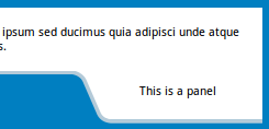
body { background: #007FC1;}.container { border-bottom: 4px solid #B4CAD8;}.container { background-color: #fff; z-index: -1;}.container > .text { padding: 0.5em;}.panel { position: relative; float: right; margin-top: -4px;}<div class="container"> <div class="text"> <p>Lorem ipsum dolor sit amet, consectetur adipisicing elit. Voluptates nam fuga eligendi ipsum sed ducimus quia adipisci unde atque enim quasi quidem perspiciatis totam soluta tempora hic voluptatem optio perferendis.</p> </div></div><svg class="panel" width="200" height="54"> <path d="M0,0 h7 q9,3 12.5,10 l13,30 q3.2,10 13,10 h157 v-50z" fill="white" /> <path transform="translate(0, -0.5)" d="M0,2 h7 q10,2 13,10 l13,30 q3,9 13,10 h157" fill="none" stroke="#B4CAD8" stroke-width="4" /> <text x="110.5" y="25" text-anchor="middle">This is a panel</text></svg>CSS 3 Shape: inverted rounded corner tunnel-like style
This can be created using a :before and :after pseudo element:

- The background colour is provided with the
box-shadowcolour, allowing the top and bottom of the shape to be transparent The curve is created with the
border-radiuslike so:(the red area is transparent)
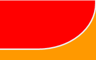
Complete Example
div { height: 300px; width: 200px; position: relative; overflow: hidden;}div:before { top: -60px; border-bottom: solid #EEE; border-right: solid #EEE; border-radius: 0 0 60% 0; box-shadow: 50px 10px 0 60px #F90;}div:after { bottom: -60px; box-shadow: 50px 10px 0 60px #F90; border-radius: 0 60% 0 0; border-top: solid #EEE; border-right: solid #EEE;}div:before,div:after { content: ''; position: absolute; width: 100%; height: 160px; right: 0; border-width: 3px;}<div></div>How to make an inset drop shadow in SVG
If you had a solid fill, you could just add
<feComposite operator="in" in2="SourceGraphic"/>
to the end of your filter and it would clip the blur to the shape of the SourceGraphic. Since your shape is transparent, you'll have to do a little more work. What I'd suggest is using a semi-transparent fill on the original graphic in order to get the right selection for compositing and using an feFuncA to zero out the fill for the final operation. This turns out to be surprisingly complicated. But here is a solution that will work for any solid-stroke shape
<filter id="inset-shadow" >
            <!-- dial up the opacity on the shape fill to "1" to select the full shape-->
            <feComponentTransfer in="SourceAlpha" result="inset-selection">
                <feFuncA type="discrete" tableValues="0 1 1 1 1 1"/>
            </feComponentTransfer>

            <!-- dial down the opacity on the shape fill to "0" to get rid of it -->
            <feComponentTransfer in="SourceGraphic" result="original-no-fill">
                <feFuncA type="discrete" tableValues="0 0 1"/>
            </feComponentTransfer>

            <!-- since you can't use the built in SourceAlpha generate your own -->
            <feColorMatrix type="matrix" in="original-no-fill" result="new-source-alpha" values="0 0 0 0 0
                      0 0 0 0 0
                      0 0 0 0 0
                      0 0 0 1 0"
/>

            <feGaussianBlur in="new-source-alpha" result="blur" stdDeviation="5" />
            <feGaussianBlur in="new-source-alpha" result="blur2" stdDeviation="10" />
            <feGaussianBlur in="new-source-alpha" result="blur3" stdDeviation="15" />
            <feMerge result="blur">
                <feMergeNode in="blur" mode="normal"/>
                <feMergeNode in="blur2" mode="normal"/>
                <feMergeNode in="blur3" mode="normal"/>
            </feMerge>
            <!-- select the portion of the blur that overlaps with your shape -->
            <feComposite operator="in" in="inset-selection" in2="blur" result="inset-blur"/>
             <!-- composite the blur on top of the original with the fill removed -->
            <feComposite operator="over" in="original-no-fill" in2="inset-blur"/>
        </filter>
here is my fork of your fiddle: http://jsfiddle.net/kkPM4/
How to draw S- Curve in SVG?
In order to exactly repeat the shape of the curve as in the figure, you need to load the image into a vector editor.
And draw nodal points along the contour
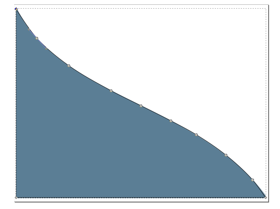
Save file as SVG.
And copy only path to another file
<svg xmlns="http://www.w3.org/2000/svg" xmlns:xlink="http://www.w3.org/1999/xlink" version="1.1" width="100vw" height="100vh" viewBox="0 0 688 535" preserveAspectRatio="xMinYMin meet"> <path d="m4.8 11.6c0 0 34.3 55.4 56.1 79.3 25.6 28.2 55.7 52.3 86.6 74.5 36.1 26 75.7 46.7 114.6 68.1 26.5 14.5 54 27.3 81 40.9 27 13.6 54.2 26.8 81 40.9 23.2 12.2 46.6 23.9 68.9 37.7 27.6 17 54.9 35 80.1 55.3 25.6 20.6 50.3 42.7 72.1 67.3 13.2 14.9 35.3 48.1 35.3 48.1H4.8Z" style="fill:#5B7E95;stroke:none"/></svg>html5 draw gaussian function using bezierCurveTo
Don't use Bezier curves if you want an exponent curve, they're different functions. Instead, just plot the function you actually need, with something like http://jsbin.com/nubutodosu/edit?js,output, where you define a Gaussian object:
// Gaussian distribution generator

var Gaussian = function(mean, std) {
  this.mean = mean;
  this.std = std;
  this.a = 1/Math.sqrt(2*Math.PI);
};

Gaussian.prototype = {
  addStd: function(v) {
    this.std += v;
  },

  get: function(x) {
    var f = this.a / this.std;
    var p = -1/2;
    var c = (x-this.mean)/this.std;
    c *= c;
    p *= c;
    return f * Math.pow(Math.E, p);
  },

  generateValues: function(start, end) {
    var LUT = [];
    var step = (Math.abs(start)+Math.abs(end)) / 100;
    for(var i=start; i<end; i+=step) {
      LUT.push(this.get(i));
    }
    return LUT;
  }
};
And then you can give that a draw routine so that it can plot itself over the interval that you need:
...
  draw: function(ctx) {
    var points = this.generateValues(-10,10);
    var len = points.length;
    ctx.strokeStyle = "black";
    ctx.beginPath();
    var p0 = points[0];
    ctx.moveTo(0, height - (height*p0));
    points.forEach(function(p,i) {
      if(i===0) {
        return;
      }
      ctx.lineTo(width * i/len, height - (height*p));
      p0 = p;
    });
    ctx.stroke();
  }
...
So you build your array of values over the interval, then draw them on the canvas by "connecting the dots".
Related Topics
Stop Link's :Before Content from Being Underlined by Rule Applied to the Link
White-Space: Nowrap Is Not Working in Ie in a Horizontally Scrolling Box
I Need to Remove the Horizontal Scrollbar on an Overflown <Div>
iOS Safari Transition Transform Not Working
Image Button Displaying 'Submit Query' Over the Top of Image in Firefox
Css: How to Combine Multiple Stylesheets into One
How to Get Floating Divs Inside Fixed-Width Div to Continue Horizontally
How to Create Responsive Text on Top of an Image
How to Make The Width of My <Figcaption> Match The Width of The <Img> Inside Its <Figure> Tag
CSS Menu Hover "Hangs" in Chrome & Safari
Sass/Scss @Extend Rule Selectors
Nth-Child to Alternate by 2 Rows
Remove Padding from Unordered List
How to Style Qpushbutton's Checked State to Remove Grey Dots
CSS Selector for Multiple Different Class Name Combinations
Set Div Height Equal to Screen Size
CSS Floating Divs with Different Height Are Aligned with Space Between Them