Sass 3.3.7 - dynamically create list of icons
$list : single-multi batch file imp-file man-fund-tran;

@mixin gen($selector, $postfix-list, $property-name, $delta) {
      $i : 0;
      @each $postfix in $postfix-list {
        #{$selector + $postfix}{
            #{$property-name} : $i;
        }
        $i : $i -  $delta;
      }
}

@include gen(".auth-px-", $list, 'background-position-left', 25px);

@include gen(".auth-percentage-",  $list, 'background-position-top', 50%);
Setting css properties with SASS and :nth-child
This is what my solution looks like using mixins. 600+ lines of code down to 90.
$unchecked: 0;
$checked: -96;
$hover: -192;

@mixin img-position($index, $state) {
  background-position: ($index * -96) + px $state + px;
  &:hover {
    background-position: ($index * -96) + px ($hover - $state) + px;
  }
}

input[type=checkbox],
input[type=radio] {
  &.img-checkbox {
    position:absolute;
    left:-3000px;

    &.checked + #bars-label                   { @include img-position(0, $checked); }
    &.checked + #event_spaces-label           { @include img-position(1, $checked); }
    &.checked + #night_clubs-label            { @include img-position(2, $checked); }

    + label {
      background-image:url('img.jpg');
      height: 96px;
      width: 96px;
      display: inline-block;
      padding: 0 0 0 0px;
      cursor:pointer;

      &#bars-label                   { @include img-position(0, $unchecked); }
      &#event_spaces-label           { @include img-position(1, $unchecked); }
      &#night_clubs-label            { @include img-position(2, $unchecked); }
    }
  }
}
If anyone has any improvements or feedback please let me know!
Mapping a list for background positions in SASS as a function
You could check if the current index is a list or value. If it's a value, do what you're already doing. If it's a tuple, iterate through each one, setting the position to the same value for each (only change the numerical value if it's a new index on the outermost list).
$teams: A AB, B, CB C, D;

$x: 0;
$y: 0;

@each $team in $teams {
  $y: $y + 20px;

  @if type-of($team) == list {
    @each $team-sub in $team {
      .team#{$team-sub}:before,
      .team#{$team-sub}:after {
        background-position: $x $y;
      }
    }
  }
  @else {
    .team#{$team}:before,
    .team#{$team}:after {
      background-position: $x $y;
    }
  }
}
I've tested this, and it works as expected.
Edit: Here's an updated version with compound selectors. This will be removed from SASS in the future, so use at your own risk.
$teams: A AB, B, CB C, D;

$x: 0;
$y: 0;

@each $team in $teams {
  $y: $y + 20px;

  @if type-of($team) == list {
    @each $team-sub in $team {
      $i: index($team, $team-sub);

      @if $i == 1 {
        .team#{$team-sub}::before,
        .team#{$team-sub}::after {
          background-position: $x $y;
        }
      }
      @else {
        .team#{$team-sub}::before {
          @extend .team#{nth($team, 1)}::before;
        }

        .team#{$team-sub}::after {
          @extend .team#{nth($team, 1)}::after;
        }
      }
    }
  }
  @else {
    .team#{$team}::before,
    .team#{$team}::after {
      background-position: $x $y;
    }
  }
}
Accessing SharePoint Search Statistics via the API
I don't know about the API. I do know that there is a stored proc in the shared services db which returns the top search queries. The proc is called "proc_MSS_QLog_TopQueries".
Some of the links which might help
https://sharepoint.missouri.edu/wiki/Wiki%20Pages/MOSS%20Usage%20Reports%20explained.aspx
http://jopx.blogspot.com/2008/04/extending-usage-analysis-reporting-in.html
Good luck
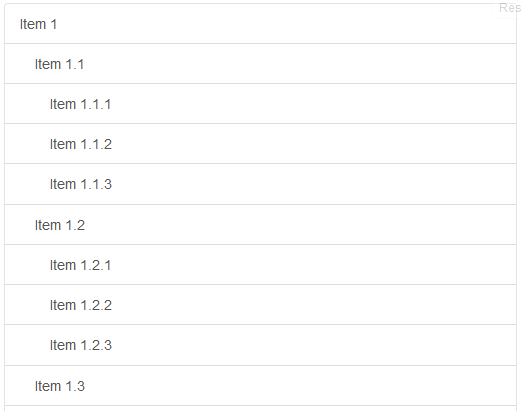
Consistent Styling for Nested Lists with Bootstrap
Nested Group Lists
.just-padding {  padding: 15px;}
.list-group.list-group-root {  padding: 0;  overflow: hidden;}
.list-group.list-group-root .list-group {  margin-bottom: 0;}
.list-group.list-group-root .list-group-item {  border-radius: 0;  border-width: 1px 0 0 0;}
.list-group.list-group-root > .list-group-item:first-child {  border-top-width: 0;}
.list-group.list-group-root > .list-group > .list-group-item {  padding-left: 30px;}
.list-group.list-group-root > .list-group > .list-group > .list-group-item {  padding-left: 45px;}
<link rel="stylesheet" href="https://maxcdn.bootstrapcdn.com/bootstrap/3.3.5/css/bootstrap.min.css">
<div class="just-padding">
<div class="list-group list-group-root well"> <a href="#" class="list-group-item">Item 1</a> <div class="list-group"> <a href="#" class="list-group-item">Item 1.1</a> <div class="list-group"> <a href="#" class="list-group-item">Item 1.1.1</a> <a href="#" class="list-group-item">Item 1.1.2</a> <a href="#" class="list-group-item">Item 1.1.3</a> </div> <a href="#" class="list-group-item">Item 1.2</a> <div class="list-group"> <a href="#" class="list-group-item">Item 1.2.1</a> <a href="#" class="list-group-item">Item 1.2.2</a> <a href="#" class="list-group-item">Item 1.2.3</a> </div> <a href="#" class="list-group-item">Item 1.3</a> <div class="list-group"> <a href="#" class="list-group-item">Item 1.3.1</a> <a href="#" class="list-group-item">Item 1.3.2</a> <a href="#" class="list-group-item">Item 1.3.3</a> </div> </div> <a href="#" class="list-group-item">Item 2</a> <div class="list-group"> <a href="#" class="list-group-item">Item 2.1</a> <div class="list-group"> <a href="#" class="list-group-item">Item 2.1.1</a> <a href="#" class="list-group-item">Item 2.1.2</a> <a href="#" class="list-group-item">Item 2.1.3</a> </div> <a href="#" class="list-group-item">Item 2.2</a> <div class="list-group"> <a href="#" class="list-group-item">Item 2.2.1</a> <a href="#" class="list-group-item">Item 2.2.2</a> <a href="#" class="list-group-item">Item 2.2.3</a> </div> <a href="#" class="list-group-item">Item 2.3</a> <div class="list-group"> <a href="#" class="list-group-item">Item 2.3.1</a> <a href="#" class="list-group-item">Item 2.3.2</a> <a href="#" class="list-group-item">Item 2.3.3</a> </div> </div> <a href="#" class="list-group-item">Item 3</a> <div class="list-group"> <a href="#" class="list-group-item">Item 3.1</a> <div class="list-group"> <a href="#" class="list-group-item">Item 3.1.1</a> <a href="#" class="list-group-item">Item 3.1.2</a> <a href="#" class="list-group-item">Item 3.1.3</a> </div> <a href="#" class="list-group-item">Item 3.2</a> <div class="list-group"> <a href="#" class="list-group-item">Item 3.2.1</a> <a href="#" class="list-group-item">Item 3.2.2</a> <a href="#" class="list-group-item">Item 3.2.3</a> </div> <a href="#" class="list-group-item">Item 3.3</a> <div class="list-group"> <a href="#" class="list-group-item">Item 3.3.1</a> <a href="#" class="list-group-item">Item 3.3.2</a> <a href="#" class="list-group-item">Item 3.3.3</a> </div> </div> </div> </div>Left sidebar same height as content area, footer at bottom of browser window
Without flexbox according to the given HTML
- Set a height for footer, e.g.
50px. Main content, sidebar and
.contenton the right side:height:
calc(100vh - 100px)(50px navbar height and 50px footer height).Set
.contenton the right sideoverflow-y: auto.
Example
main,main aside,main .content {  height: calc(100vh - 100px);}
main {  margin-top: 50px;}
main aside,main .content {  padding: 15px 0;}
main aside {  background: red;}
main .content {  overflow-y: auto;  background: blue;}
.footer {  height: 50px;  line-height: 50px;  background: #F8F8F8;}
<script src="https://ajax.googleapis.com/ajax/libs/jquery/2.0.3/jquery.min.js"></script><link href="https://maxcdn.bootstrapcdn.com/bootstrap/3.3.7/css/bootstrap.min.css" rel="stylesheet" /><script src="https://maxcdn.bootstrapcdn.com/bootstrap/3.3.7/js/bootstrap.min.js"></script>
<div class="navbar navbar-fixed-top navbar-default" role="navigation"> <div class="container-fluid"> <div class="navbar-header"> <button type="button" class="navbar-toggle" data-toggle="collapse" data-target=".navbar-collapse"> <span class="icon-bar"></span> <span class="icon-bar"></span> <span class="icon-bar"></span> </button> <a class="navbar-brand" href="#">Project name</a> </div> <div class="collapse navbar-collapse"> <ul class="nav navbar-nav"> <li class="active"><a href="#">Home</a></li> <li><a href="#about">About</a></li> <li><a href="#contact">Contact</a></li> </ul> </div> <!-- /.nav-collapse --> </div> <!-- /.container --></div><!-- /.navbar -->
<main> <div class="container-fluid"> <div class="row"> <aside class="hidden-xs col-sm-3"> <ul> <li>List 1</li> <li>List 2</li> <li>List 3</li> <li>List 4</li> <li>List 5</li> </ul> </aside> <div class="content col-sm-9"> <div class="jumbotron"> <a href="#" class="visible-xs" data-toggle="offcanvas"><i class="fa fa-lg fa-reorder"></i></a> <h1>test</h1> <p>This is an example to show the potential of an offcanvas layout pattern in Bootstrap. Try some responsive-range viewport sizes to see it in action.</p> </div> <div class="col-xs-12"> <h2>Heading</h2> <p>Bootstrap is a front-end framework that uses CSS and JavaScript to facilitate responsive Web design. Bootply is a playground for Bootstrap that enables developers and designers to test, prototype and create mockups using Bootstrap friendly HTML, CSS and Javascript.</p> <p><a class="btn btn-default" href="#">View details »</a></p> </div> <div class="col-xs-12"> <h2>Heading</h2> <p>Bootstrap is a front-end framework that uses CSS and JavaScript to facilitate responsive Web design. Bootply is a playground for Bootstrap that enables developers and designers to test, prototype and create mockups using Bootstrap friendly HTML, CSS and Javascript.</p> <p><a class="btn btn-default" href="#">View details »</a></p> </div> <div class="col-xs-12"> <h2>Heading</h2> <p>Bootstrap is a front-end framework that uses CSS and JavaScript to facilitate responsive Web design. Bootply is a playground for Bootstrap that enables developers and designers to test, prototype and create mockups using Bootstrap friendly HTML, CSS and Javascript.</p> <p><a class="btn btn-default" href="#">View details »</a></p> </div> <div class="col-xs-12"> <h2>Heading</h2> <p>Bootstrap is a front-end framework that uses CSS and JavaScript to facilitate responsive Web design. Bootply is a playground for Bootstrap that enables developers and designers to test, prototype and create mockups using Bootstrap friendly HTML, CSS and Javascript.</p> <p><a class="btn btn-default" href="#">View details »</a></p> </div> </div> </div> </div></main>
<footer class="footer"> <div class="container-fluid"> Footer </div></footer>Related Topics
How to Apply a CSS Stylesheet to All Page Views in My Firefox Browser
How to Disable Inline CSS in Gatsby
Targeting Nth Column (Made by Column-Count)
Scale Image with CSS But Limit to Orignial Size
Converting White Space into Line Break
CSS: How to Center Box Div Element Directly in Center
How to Make Border Radius in Popup Chrome Extension
Cant Edit CSS Style Properties (Grayed Out & Blocked) in Chrome
Why Is My CSS Class Being Overwritten/Ignored
Firefox Not Displaying Properly: Before and: After Pseudo-Elements
Conditional Ie8 Style in Original CSS File
How to Animate Element Again, After Animation-Fill-Mode: Forward
Anyone Familiar with Mobile Visibility and Zurbs Foundation
Primefaces Schedule Event Color Is Not Working After Replacing Primefaces Jar 3.3 by 4.0