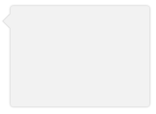
Pure CSS Speech Bubble with Border
You're pretty close. You just need to use both a :before and an :after to layer another triangular border.
Here's a jsfiddle: http://jsfiddle.net/rgthree/DWxf7/ and the CSS used:
.speech-bubble {
    position:relative;
    width: 320px;
    padding: 10px;
    margin: 3em;
    background-color:#FFF;
    color: #666;
    font: normal 12px "Segoe UI", Arial, Sans-serif;
    -moz-border-radius: 10px;
    -webkit-border-radius: 10px;
    border-radius: 10px;
    border: 10px solid rgba(0,0,0,0.095);
}
.speech-bubble p {
    font-size: 1.25em;
}

.speech-bubble:before,
.speech-bubble:after {
    content: "\0020";
    display:block;
    position:absolute;
    top:-20px;  /* Offset top the height of the pointer's border-width */
    left:20px;
    z-index:2;
    width: 0;
    height: 0;
    overflow:hidden;
    border: solid 20px transparent;
    border-top: 0;
    border-bottom-color:#FFF;
}
.speech-bubble:before {
    top:-30px; /* Offset of pointer border-width + bubble border-width */
    z-index:1;
    border-bottom-color:rgba(0,0,0,0.095);
}
CSS speech bubble border issue
This is how I usually do it: DEMO
Basically you need another slightly larger :before or :after element positioned behind the first.
.bubble:before {
    border-right: 25px solid hsla(0,0%,0%,.1);
    bottom: -28px;
    right: 22px;
    z-index: 1;
}
.bubble:before {
    border-right: 27px solid #DD4814;
    border-bottom: 27px solid transparent;
    bottom: -29px;
    right: 23px;
    z-index: 0;
}
apply 1px borders to CSS speech bubbles?
Have a look at this Jsfiddle.
These are the changes I made:
.sb {
  border: 1px solid #000;
}

.sb::before {
  height: 12px;
  top: 12px;
  border-left: 1px solid #000;
  border-bottom: 1px solid #000;
}

.sb-0 {
  background-color: #ffffff;
  float: left;
  margin: 5px 17% 5px 20px;
}

.sb-0::before {
  left: -9px;
}
EDIT
Updated Jsfiddle to contain the bubble on the right side also.
Pure CSS speech bubble with triangles: Firefox renders ugly 1px border for no reason?
You need to add
border-style: outset;
Update
To make it more visible on FF
border-style: solid outset;
To your
.bubble:before, .bubble:after {
(Updated JSFiddle)
http://jsfiddle.net/bFFrK/1
How to create speech-bubble border with CSS3
Like this: http://nicolasgallagher.com/pure-css-speech-bubbles/
.triangle-isosceles {
   position:relative;
   padding:15px;
   margin:1em 0 3em;
   color:#000;
   background:#f3961c;

   /* css3 */
   -moz-border-radius:10px;
   -webkit-border-radius:10px;
   border-radius:10px;
   background:-moz-linear-gradient(top, #f9d835, #f3961c);
   background:linear-gradient(top, #f9d835, #f3961c);
}

/* creates triangle */
.triangle-isosceles:after {
   content:"";
   display:block; /* reduce the damage in FF3.0 */
   position:absolute;
   bottom:-15px;
   left:50px;
   width:0;
   border-width:15px 15px 0;
   border-style:solid;
   border-color:#f3961c transparent;
}
CSS Speech Bubble with Box Shadow
Instead of using a triangle hack, you can just rotate a div using transform and get a real box-shadow. Since you only want the shadow on one side of the div (the visible triangle side), you have to make the blur smaller and lower the opacity.
Demo: http://jsfiddle.net/ThinkingStiff/mek5Z/
HTML:
<div class="bubble"></div>
CSS:
.bubble{
    background-color: #F2F2F2;
    border-radius: 5px;
    box-shadow: 0px 0px 6px #B2B2B2;
    height: 200px;
    margin: 20px;
    width:  275px;
}

.bubble::after {
    background-color: #F2F2F2;
    box-shadow: -2px 2px 2px 0 rgba( 178, 178, 178, .4 );
    content: "\00a0";
    display: block;
    height: 20px;
    left: -10px;
    position: relative;
    top: 20px;
    transform:             rotate( 45deg );
        -moz-transform:    rotate( 45deg );
        -ms-transform:     rotate( 45deg );
        -o-transform:      rotate( 45deg );
        -webkit-transform: rotate( 45deg );
    width:  20px;
}
Output:
how to add border to CSS only speech bubble
You can make a slightly larger brown arrow with the :after psudo-element, and position it behind the smaller green arrow (made with :before), and down 2px to create a border effect.
here's the fiddle: http://jsfiddle.net/rhGCb/
And the css:
.bubble {
  border:2px solid #493A34;
height: 30px;
width: 574px;
background-color: #9FC175;
background-image: -webkit-linear-gradient(top, hsla(0,0%,100%,.5), hsla(0,0%,100%,0));
background-image: -moz-linear-gradient(top, hsla(0,0%,100%,.5), hsla(0,0%,100%,0));
background-image: -ms-linear-gradient(top, hsla(0,0%,100%,.5), hsla(0,0%,100%,0));
background-image: -o-linear-gradient(top, hsla(0,0%,100%,.5), hsla(0,0%,100%,0));
background-image: linear-gradient(top, hsla(0,0%,100%,.5), hsla(0,0%,100%,0));
border-radius: 5px;
box-shadow: inset 0 1px 1px hsla(0,0%,100%,.5),3px 3px 0 hsla(0,0%,0%,.1);
text-shadow: 0 1px 1px hsla(0,0%,100%,.5);
position: absolute;
}

.bubble:before {
border-bottom: 25px solid transparent;
border-right: 25px solid #493A34;
bottom: -27px;
content: '';
position: absolute;
right: 23px;

}

  .bubble:after {
border-bottom: 25px solid transparent;
border-right: 25px solid #9FC175;
bottom: -23px;
content: '';
position: absolute;
right: 25px;
}
create specific chat bubble shape with CSS
Here's a example based on Pure CSS speech bubbles by Nicolas Gallagher.
It uses overlapping pseudo-elements with border-radius to create the bubble's pointy curved stem. This may not be a pixel-perfect match to your mockup, but you can modify the values to improve the shape as desired.
body {
  background: lightgray;
  margin: 0;
}

.speech-bubble {
  position: relative;
  padding: 50px;
  margin: 1em 20px;
  text-align: center;
  color: black;
  background: white;
  border-radius: 30px;
}

.speech-bubble:before {
  content: "";
  position: absolute;
  z-index:-1;
  left: -22px;
  top: 0;
  width: 40px;
  border-bottom: 35px solid white;
  border-top-right-radius: 25px;
}

.speech-bubble:after {
  content: "";
  position: absolute;
  z-index:-1;
  left: -28px;
  top: -3px;
  height: 38px;
  width: 28px;
  background: lightgray;
  border-top-right-radius: 20px;
}
<div class="speech-bubble">Hello, world.</div>Related Topics
Less Importing CSS and Relative Paths
How to Use Nth-Of-Type to Select Nested Children
Inject a CSS File into a Webpage via Firefox Extension
Want to Override Child Element CSS Property by Parent Element
How to Create Circle with Four Quarters
Javafx Text Styling for Dynamic Objects
Rails Images and Assets Not Being Loaded Properly
Sass: Change Color with @For Loop
Package for Showing All Possible CSS Values in Sublime Text 2
What Is the Meaning of the "@Include" in .CSS Files
Line Height Default Value If Font Size Is 100%
CSS Different Border Widths Overlapping Themselves
Change Background Color of Selectinput in R Shiny
How to Set Fill and Stroke Colors and Opacity on Vml Paths Using CSS