avoid page break inside row of table
You might try this with CSS:
<table class="print-friendly">
 <!-- The rest of your table here -->
</table>

<style>
    table.print-friendly tr td, table.print-friendly tr th {
        page-break-inside: avoid;
    }
</style>
Most CSS rules don't apply to <tr> tags directly, because of exactly what you pointed out above - they have a unique display style, which doesn't allow for these CSS rules. However, the <td> and <th> tags within them usually do allow this kind of specification - and you can easily apply such rules to ALL child-<tr>'s and <td>'s using CSS as shown above.
How to deal with page breaks when printing a large HTML table
<!DOCTYPE HTML>
<html>
<head>
<meta http-equiv="Content-Type" content="text/html; charset=UTF-8">
<title>Test</title>
<style type="text/css">
    table { page-break-inside:auto }
    tr    { page-break-inside:avoid; page-break-after:auto }
    thead { display:table-header-group }
    tfoot { display:table-footer-group }
</style>
</head>
<body>
    <table>
        <thead>
            <tr><th>heading</th></tr>
        </thead>
        <tfoot>
            <tr><td>notes</td></tr>
        </tfoot>
        <tbody>
        <tr>
            <td>x</td>
        </tr>
        <tr>
            <td>x</td>
        </tr>
        <!-- 500 more rows -->
        <tr>
            <td>x</td>
        </tr>
    </tbody>
    </table>
</body>
</html>
Html table breaking row when printing
Change your CSS to this
 @media print {

  table.report { page-break-after:auto }
  table.report tr    { page-break-inside:avoid; page-break-after:auto }
  table.report td    { page-break-inside:avoid; page-break-after:auto }
  table.report thead { display:table-header-group }
  table.report tfoot { display:table-footer-group }
 }
and also remove all extra
<tbody>...</tbody>
, you should have only one
<tbody></tbody>
and all tr between that.
that should work for you.
ref: https://www.w3.org/TR/css-print/
Table with print media css is breaking at an offset position
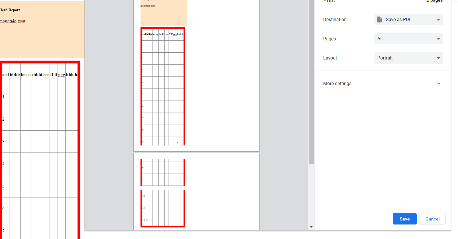
I think you have relatively positioned table and it has been shifted down by height equal to menu bar height.
For example, put below code in separate html file and try to print it. You'll see similar effect.
<!DOCTYPE html>

<head>

  <style>
    :root {
      --menu-height: 200px;
    }

    @media print {
     table { page-break-after:auto }
     tr    { page-break-inside:avoid; page-break-after:auto }
     td    { page-break-inside:avoid; page-break-after:auto }
     thead { display:table-header-group }
     tfoot { display:table-footer-group }

     table.listing tbody {
        border: 15px solid red;
     }

     table.listing tbody.display td {
        color: red;
     }
   }

    td,
    th {
      border: 1px solid gray;
      height: 2cm;
    }

    table {
      position: relative;      /* <-- position shifted table */
      top: var(--menu-height); /* <-- shifted down by menu height */

      border-collapse: collapse;
      border: 10px solid red
    }

    .menu-bar {
      position: absolute;      /* <-- floating menubar */
      top: 0px;
      width: 300px;
      height: var(--menu-height);
      background-color: bisque;

    }
  </style>
</head>

<body>
  <div class="menu-bar">
    <h5>Herd Report</h5>
    <p>mountain goat</p>
  </div>

  <table>
    <tr>
      <th>asd</th>
      <th>bbbb</th>
      <th>bcccc</th>
      <th>dddd</th>
      <th>eee</th>
      <th>ff ff</th>
      <th>ggg </th>
      <th>hhh h</th>
    </tr>
    <tr><td>1</td><td></td><td></td><td></td><td></td><td></td><td></td><td></td></tr>
    <tr><td>2</td><td></td><td></td><td></td><td></td><td></td><td></td><td></td></tr>
    <tr><td>3</td><td></td><td></td><td></td><td></td><td></td><td></td><td></td></tr>
    <tr><td>4</td><td></td><td></td><td></td><td></td><td></td><td></td><td></td></tr>
    <tr><td>5</td><td></td><td></td><td></td><td></td><td></td><td></td><td></td></tr>
    <tr><td>6</td><td></td><td></td><td></td><td></td><td></td><td></td><td></td></tr>
    <tr><td>7</td><td></td><td></td><td></td><td></td><td></td><td></td><td></td></tr>
    <tr><td>8</td><td></td><td></td><td></td><td></td><td></td><td></td><td></td></tr>
    <tr><td>9</td><td></td><td></td><td></td><td></td><td></td><td></td><td>c</td></tr>
    <tr><td>0</td><td></td><td></td><td></td><td></td><td></td><td></td><td></td></tr>
    <tr><td>11</td><td></td><td></td><td></td><td></td><td></td><td></td><td></td></tr>
    <tr><td>12</td><td></td><td></td><td></td><td></td><td></td><td></td><td></td></tr>
    <tr><td>13</td><td></td><td></td><td></td><td></td><td></td><td></td><td></td></tr>
    <tr><td>14</td><td>5</td><td></td><td></td><td></td><td></td><td></td><td></td>
    </tr>
  </table>
</body>

</html>
In above example the table is positioned relative. This is what the CSS standard say about position:relative:
relative
The element is positioned according to the normal flow of the document, and then offset relative to itself based on the values of top, right, bottom, and left. The offset does not affect the position of any other elements; thus, the space given for the element in the page layout is the same as if position were static.
For more info refer: https://developer.mozilla.org/en-US/docs/Web/CSS/position
If you play with the demo in the documentation, you'll notice that position relative reserves the spot and space on the page but the element is moved relative to that spot. So while printing the table browser considers element's static position, at top left in our case, and splits rows accordingly. But due to relative positioning table is shifted down and breaks at unwanted spots.
To fix the positioning you need to add following CSS rules at the end of style sheet.
    @media print {
     .menu-bar{
       position: static;
     }
     table{
       position: static;
     }
   }
What we are saying here is if media is print then position menubar and table statically.
You might have a lot and complex styling in your project but you may need to style the entire document separately for print media.
Bullet proof solution for page break on table row (tr) for printing
It is not nice but you could try to go with separat tables for each row. By using the following syntax you can make sure the columns are rendered in the same widths.
<style>
    table {
        page-break-inside: avoid;
    }
</style>

<table>
    <colgroup>
        <col width="25%" />
        <col width="50%" />
        <col width="25%" />
    </colgroup>
    <tr>
        <td>Narrow column</td>
        <td>Wide column</td>
        <td>Narrow column</td>
    </tr>
</table>
<!-- can break -->
<table>
    <colgroup>
        <col width="25%" />
        <col width="50%" />
        <col width="25%" />
    </colgroup>
    <tr>
        <td>Narrow column</td>
        <td>Wide column</td>
        <td>Narrow column</td>
    </tr>
</table>
Related Topics
How Debug Placeholder Pseudo Element in Firefox
Why Is There Excessive Whitespace with Facebook Mobile Comments Plugin
Styling Web Resources in Dynamics Crm 2016 Supported
What Is The Maximum Allowed Negative Value for CSS Left Property
What Does Multiple Class Definition Mean and How Is It Supposed to Work
Strange Styling Through Injected Stylesheets in Chrome
How to Say "Use The Current Font Weight" Without Making It Lighter/Bolder
My iPhone Thinks It's 980Px Wide
Safari Bug Using CSS Transition-Delay and CSS Filters
Change Div Background Color on Click Using Only CSS
@Media Query to Target Hi-Res Windows Phone 8+
How to Control 'Div' Overlapping in HTML
@Import Browser Compatibility 2013
Prevent Contenteditable Mode from Creating <Span> Tags
Select Second Active Slide in Slickslider Through CSS-Selector
How to Keep a Div Always on The Screen, But Not Always in a Fixed Position