overflow: hidden on div and body, different behavior
The overflow property has certain special behaviors specific to HTML's html and body elements, which are described in the CSS2.1 spec. These special cases are in place to accommodate changing overflow settings on the entire page in normal circumstances so authors simply need to set it on either html or body, but not both.
In this case, when you apply overflow: hidden to body, it actually affects the viewport instead of body (you can see this by resizing the preview pane to make it shorter — no scrollbars will appear on the preview pane itself). This causes #b to overflow the body normally even though you give it a fixed height that's less than the sum of #a and #b. In other words, it's as though you never set it on the body in the first place.
If you set overflow to something other than visible on html, though, this causes the viewport to use the value given to html instead of body, thereby leaving the declaration on body unaffected and allowing it to behave the same way as the wrapper:
html {
  overflow: auto;
}

body {
  height: 500px;
  width: 500px;
  overflow: hidden;
}
jsFiddle preview
Different between body { overflow hidden; } and #div { overflow hidden; }
Nabab wrote:
Body is not a block element.
Different overflow behavior for divs in same container
This is not possible. The css overflow property always affects all child elements. So:
- declaring overflow on
modal-bodywill hide both child divs A and B. - declaring overflow on div A will hide div B. A still can overflow.
- if overflow is declared like in 1. or 2. there is no option to make div B overflow the modal or A respectively.
Overflow property is not applied to body element
The following code should solve your issue.
You need to apply overflow: hidden; on both body and html
https://jsfiddle.net/b2ap5j86/2/
table {
  border: 1px solid green;
}

td {
  border: 1px solid red;
  width: 100px;
  padding: 5px;
}

body {
  border: 1px solid blue;
  width: 200px;
  overflow: hidden;
}

html {
  overflow: hidden;
}

div {
  width: 200px;
  overflow: hidden;
}
Alternatively you can use div wrapper for your elements and apply overflow: hidden on that, I would suggest this approach as you have better control, example here:
https://jsfiddle.net/b2ap5j86/3/
Body set to overflow-y:hidden but page is still scrollable in Chrome
I finally found a way to fix the issue so I'm answering here.
I set the overflow-y on the #content instead, and wrapped my steps in another div. It works.
Here is the final code:
<body>
  <div id="content">
    <div id="steps">
       <div class="step">this is the 1st step</div>
       <div class="step">this is the 2nd step</div>
       <div class="step">this is the 3rd step</div>
     </div>
   </div>
</body>

#content {
  position:absolute;
  width:100%;
  overflow-y:hidden;
  top:0;
  bottom:0;
}
.step {
  position:relative;
  height:500px;
  margin-bottom:500px;
}
Why doesn't overflow: hidden work with div
You can overflow: hidden !important; for avoid other ovverriden styles
.myDiv {
    position: relative;
    width: 100%;
    min-height: 100vh;
    display: flex;
    align-items: center;
    flex-direction: column;
    overflow: hidden !important;
}
overflow:hidden on body is broken in ios6
Nope. Safari 6 on Mac does not present with the bug. Scrollbars are not present.
I ran it on OSX Mountain Lion (10.8.2)
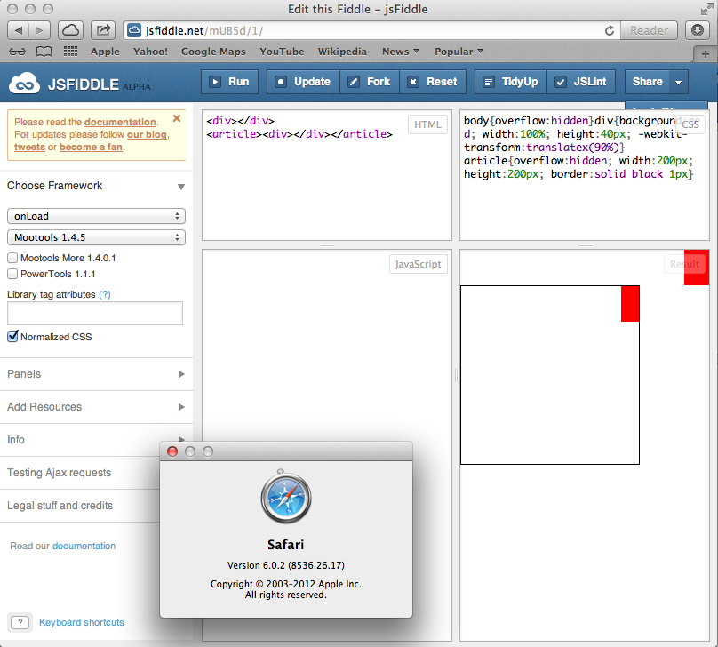
To further answer your question, the reason this is happening probably has more to do with Mobile Safari's zoom rendering than an overflow hidden bug. The element is in fact being hidden off screen (notice below where I have scrolled over to the right all the way, it still doesn't show me the full 100% width element - 90% of it is in fact being hidden.
It likely has something to do with iframes, and page zoom. Still looks like a bug though.
I'm assuming you're demonstrating in JSFiddle from a real life example. If you go back to your real life example (apart from iframe territory), try adding this meta tag to the head if you don't already have it, and see it this helps:
<meta name="viewport" content="width=device-width, initial-scale=1">

Related Topics
How to Use Both Rel="Preload" and Rel="Stylesheet" for the Same Tag
Sass Throws an Error for Bem Syntax
Svg Transform-Origin Problems in Firefox
Wobbly CSS Animation with Border-Radius in Internet Explorer
Is -Negative Margin or Padding Invalid CSS According to W3C
How to Add Multiple Linear-Gradients to a CSS Background
Internet Explorer 10+ Media Queries and Responsive Break Points
Remove/Reset CSS Behavior Property
CSS Word-Wrap: Break-Word Don't Work on IE9
Using CSS to Create Custom Borders with Just the Corners Showing
Twitter Bootstrap: White Space on Left and Right Side in Smaller Screen Widths
Nth-Child to Alternate by 2 Rows
CSS Webkit Transition - Fade Out Slowly Than Fade In
How to Change Img Src Attribute Using CSS
Global CSS Variables VS Local Variables in Terms of Efficiency