Linear gradient in Chrome and Safari browsers
Try this - http://jsfiddle.net/fwkgM/1/
  background-color: #9e9e9e;
  background-image: linear-gradient(to bottom, #9e9e9e, #454545);
CSS3 Please
safari and firefox vs chrome - css gradients
The short answer is that you don't.
The long answer is that there is no specific method mandated for how they are supposed to get from your starting gradient values to your end values. Hardware acceleration would pass this over to the rendering engine of any graphics card, but how the vendor deals with it would be different by rendering engine just as none hardware gradient fills will be left to the individual browser engines.
If you really need them to as close as possible then (notice I didn't say identical) then you're going to have to resort to using an over sized image as a background and adjusting its position to fit the area available. All of which means slightly different results at different screen sizes.
Of course some browsers wont render a gradient at all.
If you really want to you could try changing the starting and values and percentages and but that's a lot of work and the effectiveness depends on how good your users monitors are, so not really that useful.
So in reality does it really matter to the user (not you). It will appear fairly similar (even close) if they did happen to switch between browsers (why would they) and always be consistent when used on a particular browser. The fonts will render differently between browsers the rendering of the mark-up will have differences between the same browser on different OS / platforms.
The important thing in not about being pixel identical on every platform / OS / browser, because that's just not possible. but instead about giving your users clear, consistent access to the information that they need.
CSS Linear Gradient not showing up in Chrome, Safari
Don't put your links to style sheets inside a style tag.
<head>
<link rel="stylesheet" href="styles.css" type = "text/css">
</head>
Is how it should be.
Your code otherwise works just fine.
webkit-linear-gradient causes banding in Chrome/Safari
Looks like a webkit bug. I came up with the work-around below, tested on the latest Chrome and FF. In short, you'll position a div containing the background behind your main content. I also added a few styles to make IE happier.
Given this HTML:
<html lang="en">
<head>
<style>
...
</style>
</head>
<body>
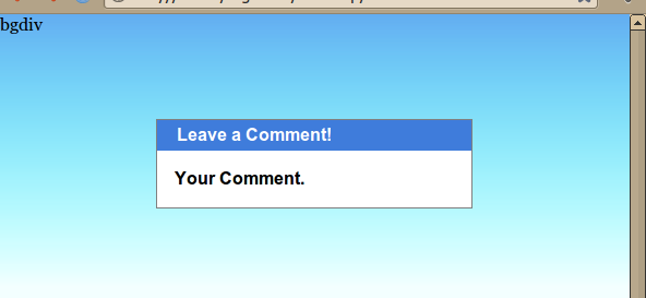
<div class="background">bgdiv</div>
<div class="content_pane">
<div class="titlebar">Leave a Comment!</div>
<div class="comment">Your Comment.</div>
</div>
</body>
</html>
Combined with this stylesheet:
    body{
        background-color: #f3ffff;
        min-height: 100%;
        margin:0px;
    }
    .background {
        height: 250px;
        left: 0;
        position: absolute;  /* could use fixed if you like. */
        right: 0;
        top: 0;
        z-index: -10;

        background-image:
            -webkit-linear-gradient(top,
                rgba(99, 173, 241, 1) 0px,
                rgba(0, 255, 255, 0) 250px
            );
        background-image:
            -moz-linear-gradient(top,
                rgba(99, 173, 241, 1) 0px,
                rgba(0, 255, 255, 0) 250px
            );
        background-image:
            -o-linear-gradient(top,
                rgba(99, 173, 241, 1) 0px,
                rgba(0, 255, 255, 0) 250px
            );
        background-image:
            -ms-linear-gradient(top,
                rgba(99,173,241,1) 0%,
                rgba(0,255,255,0) 250px
            ); /* IE10+ */
        filter: progid:DXImageTransform.Microsoft.gradient( startColorstr='#63adf1', endColorstr='#0000ffff',GradientType=0 ); /* IE6-9 */
        background-image:
            linear-gradient(top,
                rgba(99,173,241,1) 0%,
                rgba(0,255,255,0) 250px
            ); /* W3C */
        background-position: center top, center top;
        background-repeat: no-repeat, repeat-x;
    }
    .content_pane {
        background: white;
        border: 1px dotted white;
        border: 1px solid grey;
        font-family: arial, sans;
        font-weight: bold;
        margin: 6em auto 5em;
        width: 50%;
    }
    .titlebar {
        background: #3f7cdb;
        color: white;
        font-family: arial, sans;
        padding: .25em 2ex .25em;
    }
    .comment {
        padding: 1em;
    }
It should come out looking like this, regardless of window size:
Why this gradient is not properly rendering on Chrome?
It might be a Safari bug, actually. rgba(30, 113, 212, 0) is the same "color" as rgba(12, 34, 56, 0) (for example), because there is only one "color" with the alpha value 0: the transparent "color".
So Chrome (and Firefox) are trying to interpolate between #043a5f (the background color, effectively invisible), and transparent (effectively invisible). Because transparent has no hue, the only variable that changes throughout the gradient is the alpha channel value.
You can specify three steps in your gradient to achieve the desired result:
background-image: linear-gradient(180deg, transparent, rgb(30 113 212), transparent);
webkit-linear-gradient works well on Chrome and Safari but don't work on Firefox
If you need to support IE/Edge too you can't use this CSS Rule, it's very experimental and not supported by IE/Edge and Firefox < 49.
If you have a solid background color, like white you could try to get the effect by using a container with a transparent gradient on top of the text.
Try it out here: https://jsfiddle.net/z3japLqm/
.content {
    max-height: 120px;
    position: relative;
    overflow: hidden;
}
.content .overlay {
    position: absolute;
    bottom: 0;
    left: 0;
    width: 100%;
    text-align: center;
    margin: 0; padding: 30px 0;
    background-image: linear-gradient(to bottom, rgba(255, 255, 255, 0), rgba(255, 255, 255, 1));
}
Background Linear Gradient not showing on Safari
I have checked your website and was able to fix your safari problem.
It has nothing to do with the gradient you defined for body{} but with the background-size for .single-product{}
Try to change
.single-product {
    background-size: auto 1060px;
}
to
.single-product {
    background-size: 100% 1060px;
}
It works for me in Chrome and Safari (not tested in Edge or Firefox).
Related Topics
How to Disable Stacking of Bootstrap Justified Tabs on Small Screens
Smooth Scrolling with Just Pure CSS
:Empty Selector Not Working in CSS
Wrapping Text Around a Div with CSS
CSS (Perhaps with Compass): Cross-Browser Gradient
Ember.Js Router: How to Animate State Transitions
Center a <Ul> List with a Left Float <Li>'s with CSS
CSS Selector Clarification: |= VS ^=
CSS Background Image in :After Element
Bootstrap 4 - How to Make 100% Width Search Input in Navbar
Vertical Align Center Image in Fixed Size Div
CSS Relative + Right (Or Bottom) Almost Never Work
Css3 Scale Transform on Parent Div But Keeping Constant Size in Some of the Associated Divs
CSS Animations - Change a Property Without a Transition
(Css) Eliminating Browser's 'Selected' Lines Around a Hyperlinked Image