Left/right transparent cut out arrow
This solution is adapted from this answer : Transparent arrow/triangle
The point is to use two skewed pseudo elements to make the transparent cut out arrow. Both pseudo elements are absolutely positioned and skewed.
In the following demo, the arrow is on the left. To make the same on on the right, you could duplicate the .arrow element and use scaleX(-1) + positioning on the second one. This will allow you to change both sides at the same time and have less CSS. Or you can make a new element based on the first one and change the positioning and skew properties.
DEMO
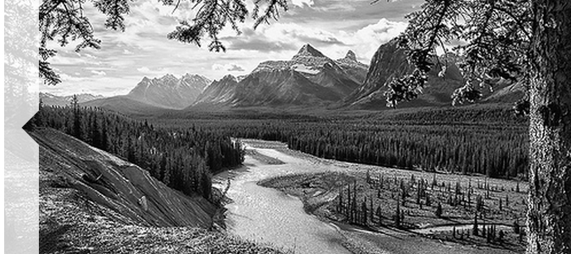
.wrap { position: relative; overflow: hidden; width: 70%; margin: 0 auto;}.wrap img { width: 100%; height: auto; display: block;}.arrow { position: absolute; left: 0; top:0; width: 3%; height:100%; background-color: rgba(255,255,255,.8);}.arrow:before, .arrow:after { content:''; position: absolute; left: 100%; width: 100%; height:50%; background-color: inherit;}.arrow:before { bottom: 50%; -ms-transform-origin: 0 100%; -webkit-transform-origin: 0 100%; transform-origin: 0 100%; -ms-transform: skewY(-45deg); -webkit-transform: skewY(-45deg); transform: skewY(-45deg);}.arrow:after { top: 50%; -ms-transform-origin: 0 0; -webkit-transform-origin: 0 0; transform-origin: 0 0; -ms-transform: skewY(45deg); -webkit-transform: skewY(45deg); transform: skewY(45deg);}<div class="wrap"> <img src="https://farm7.staticflickr.com/6217/6216951796_e50778255c.jpg" /> <div class="arrow"></div></div>Transparent arrow on right side of image
There are two polygons with white background over the image, it is not an arrow but the space between the two polygons. Changin the width and the position of :before and :after you can move the triangle.
.wrap {  position: relative;  overflow: hidden;  width: 70%;  height:150px;  margin: 0 auto;  background-color:#fff;}.wrap img {  width: 100%;  height: auto;  display: block;}.wrap:before, .wrap:after {  content:'';  position: absolute;  bottom: 0;  width: 100%;  background-color: inherit;  padding-bottom:3%;}.wrap:before {
  -ms-transform-origin: 100% 100%;  -webkit-transform-origin: 100% 100%;  transform-origin: 100% 100%;  -ms-transform: skewX(45deg);  -webkit-transform: skewX(45deg);  transform: skewX(45deg);}.wrap:after {  left: 97%;  -ms-transform-origin: 0 100%;  -webkit-transform-origin: 0 100%;  transform-origin: 0 100%;  -ms-transform: skewX(-45deg);  -webkit-transform: skewX(-45deg);  transform: skewX(-45deg);}
<div class="wrap"> <img src="https://farm8.staticflickr.com/7187/6895047173_d4b1a0d798.jpg" /></div>Inside transparent arrow on the top
As stated in the question, your case is a bit different from the example that was provided by web-tiki. In the example that you were referring to, the border with the transparent cut was included as the bottom border for the image whereas you need it as the top border of the plain text area.
The expected output can be achieved with the same skew technique described in that answer. However, it needs to be tweaked a bit to match your case.
- First thing is, the skewed pseudo-elements (that produce the border) should be added to the container of plain text area and not the top section which holds the image. This part you have already done correctly.
- Next, you need to position the border such that even with the border the height of your text container will be equal to the other two images placed by its side. For this, you need to position the elements that form the border within the plain text container (
top: 0%) instead of above it (bottom: 100%in your code). - Then, if the text container has a non-transparent background, you need to clip it such that it is not present behind the elements that is creating the border effect. This can be achieved by adding a
padding-topon the text container equal to theheightof the border pseudo-elements and then settingbackground-clip: content-boxto it. - Finally, you need to move the entire bottom part up by the same number of pixels as the height of the border in order for the top image to be seen through the transparent cut out area. This can be done by adding a negative
margin-topto the bottom container.
Putting it altogether your code should be similar to the below snippet to achieve the effect that you need. (Note: Your fiddle has way too much code and so I have created a simpler sample for the demo).
.section { height: 200px; width: 500px; background: url(http://lorempixel.com/500/200/nature/3);}.bottom-container { margin-top: -15px; height: 100px; width: 500px;}.text,.middle-image,.right-image { float: left; height: 100%; width: calc(100% / 3);}.middle-image { background: url(http://lorempixel.com/200/100/nature/2);}.right-image { background: url(http://lorempixel.com/250/100/nature/1);}.text { position: relative; box-sizing: border-box; height: 100%; padding-top: 15px; text-align: center; line-height: 85px; background: #F7F7F7; /* Just for demo */ background-clip: content-box; /* needed only if your background is not transparent */ overflow: hidden;}.text:after,.text:before { position: absolute; content: ''; top: 0px; height: 15px; background: rgb(215,182,115);}.text:before { left: 0px; width: 25%; transform-origin: left bottom; transform: skew(45deg);}.text:after { right: 0px; width: 75%; transform-origin: right bottom; transform: skew(-45deg);}<!-- prefix free library to avoid browser prefixes in CSS --><script src="https://cdnjs.cloudflare.com/ajax/libs/prefixfree/1.0.7/prefixfree.min.js"></script>
<section class="section"></section><div class="bottom-container"> <div class="text">Some text</div> <div class="middle-image"></div> <div class="right-image"></div></div>Border with a transparent centred arrow
There are two methods to achieve this using CSS3. One is using skewX on pseudo-elements while the other is using rotate on pseudo-elements. Both the methods are also responsive.
Using Skew:
This method is adapted from web-tiki's answer in this thread. It basically uses two pseudo-elements (with roughly 50% width of the container) that are skewed in opposite directions and positioned appropriately to arrive at the arrow shape. The shapes have borders where as the background is set to transparent meaning the pseudo-elements would produce a bottom border + downward arrow effect. The arrow fill would always be transparent (or body color) in this sample.
body {  background: rgb(245, 242, 242);}.bordered {  position: relative;  height: 200px;  width: 200px;  margin: 10px;  line-height: 200px;}.bordered:after,.bordered:before {  position: absolute;  content: ' ';  height: 8px;  width: 50%;  bottom: 0px;}.bordered:before {  left: 0px;  border-top: 1px solid gray;  border-right: 1px solid gray;  transform-origin: left bottom;  transform: skewX(45deg);}.bordered:after {  right: 0px;  border-top: 1px solid gray;  border-left: 1px solid gray;  transform-origin: right bottom;  transform: skewX(-45deg);}.bordered img {  width: 150px;  padding: 25px;  vertical-align: middle;}/* Just for demo */
.bordered {  transition: all 1s;  text-align: center;}.bordered:hover {  height: 250px;  width: 250px;  line-height: 250px;}
<!-- library included only to avoid browser prefixes --><script src="https://cdnjs.cloudflare.com/ajax/libs/prefixfree/1.0.7/prefixfree.min.js"></script>
<div class="bordered"> <img src="http://i.imgur.com/0Xqum3A.png" /></div>Transparent arrow/triangle indented over an image
There are several approaches to make a transparent arrow over an image with CSS. The two I will describe involve pseudo elements to minimize markup and have the same output. You can also see an SVG approach at the end of this answer :
The transparent effect on the black part arround the arrow is made with rgba() colors that allow transparency. But you can use opacity on the pseudo elements if you prefer.
1. SkewX()
You can use the CSS3 skewX() property on two pseudo elements to make the transparent arrow. The main asset of this approach is that the transparent arrow can be responsive but it also allows you to put a border on the black shape and around the traingle.
The responsiveness of the shape is made with the padding-bottom property to maintain it's aspect ratio (this technique is described here).
DEMO
.wrap { position: relative; overflow: hidden; width: 70%; margin: 0 auto;}.wrap img { width: 100%; height: auto; display: block;}.arrow { position: absolute; bottom: 0; width: 100%; padding-bottom: 3%; background-color: rgba(0, 0, 0, 0.8);}.arrow:before,.arrow:after { content: ''; position: absolute; bottom: 100%; width: 50%; padding-bottom: inherit; background-color: inherit;}.arrow:before { right: 50%; -ms-transform-origin: 100% 100%; -webkit-transform-origin: 100% 100%; transform-origin: 100% 100%; -ms-transform: skewX(45deg); -webkit-transform: skewX(45deg); transform: skewX(45deg);}.arrow:after { left: 50%; -ms-transform-origin: 0 100%; -webkit-transform-origin: 0 100%; transform-origin: 0 100%; -ms-transform: skewX(-45deg); -webkit-transform: skewX(-45deg); transform: skewX(-45deg);}<div class="wrap"> <img src="https://farm8.staticflickr.com/7187/6895047173_d4b1a0d798.jpg" /> <div class="arrow"></div></div>How to make transparent arrow?
This can be done but will require some extra pseudo elements. You need to reverse your logic a little and make the arrow "cut out" the background as CSS arrows are achieved using borders and can't have background images.
- Make
.bg__headerposition: relative;to ensure the pseudo elements are positioned relatively to it. - Add
.bg__header:beforeand.bg__header:after, these will provide the white borders left and right of the transparent arrow. - Amend
main:afterto make the arrow transparent and the sides white.
You've got quite a bit of code in your fiddle so for simplicity sake these are the changes:
.bg__header {
    position: relative;
}
.bg__header:before {
    content:"";
    background-color: white;
    height: 60px;
    position: absolute;
    bottom: 0;
    width: 50%;
    left: -60px;
}
.bg__header:after {
    content:"";
    background-color: white;
    height: 60px;
    position: absolute;
    bottom: 0;
    width: 50%;
    right: -60px;
}
main:after {
    border-color: white;
    border-top-color: transparent;
    top: -60px;
}
JS Fiddle: http://jsfiddle.net/2pjxfs4n/2/
How does CSS arrow work?
How do you draw a 50px border around a 0x0 square?
By making a 100x100 square.
#########
#########
#########
#########
#########
But, how do you control all four edges independently?
By cutting the square into 4 triangles. Each triangle is one complete segment of border, but because the border is 50px thick, it is actually composed of four different wedges of solid border:
  #########
#   #####   #
###   #   ###
####     ####
###   #   ###
#   #####   #
  #########
Now, make the top, left and right triangles transparent and you're left with just the bottom border, which forms and upwards-pointing triangle.
      #
    #####
  #########
You're left with a triangle pointing upwards, in the color of the bottom border.
Here's a demonstration using a progressively larger and larger border width:
div {  margin: 10px;}
#one {  width: 90px;  height: 90px;      border-top: 5px solid blue;  border-left: 5px solid red;  border-right: 5px solid green;  border-bottom: 5px solid black;}
#two {  width: 50px;  height: 50px;      border-top: 25px solid blue;  border-left: 25px solid red;  border-right: 25px solid green;  border-bottom: 25px solid black;}

#three {  width: 0;  height: 0;      border-top: 50px solid blue;  border-left: 50px solid red;  border-right: 50px solid green;  border-bottom: 50px solid black;}

#four {  width: 0;  height: 0;      border-top: 50px solid transparent;  border-left: 50px solid transparent;  border-right: 50px solid transparent;  border-bottom: 50px solid black;}
<p>First, lets make a box, 100x100px. We'll use a 5px border, and a 90x90px content area.</p> <div id="one"></div>
<p>Next, lets make the box smaller, but make the borders bigger. You should start to see how the four borders are controlled independly. We'll use a 50x50px box and a 25px border.</p> <div id="two"></div>
<p>Now we'll shrink the box down to 0x0, with a 50px border on all edges. Now, there is no box, only border. It's now quite obvious that, as the border grows and the content shrinks, the border is cut along the corners at a 45 degree angle.</p>
<div id="three"></div>
<p>Finally, if we make the top, left and right borders transparent, ony the lower triangle making up the bottom border is left.</p>
<div id="four"></div>Cutting a triangle out of div, BUT have it horizontally centered
Now you've provided an image, I'll change my answer to what you actually want.
The trick I'd use is to create :before and :after elements that are absolutely positioned, one left and one right. Each one has borders to create the shapes. The key to this is the box-sizing trick which means that the borders are inside the width, rather than added onto, allowing us to define a 50% width for the :before and :after pseudo elements.
Note that the image I'm using as the background in this demo is rectangular, it doesn't have the triangle in the image!
HMTL
<div class="box">
  I'm a box.
</div>
CSS
/* apply a natural box layout model to all elements */
*, *:before, *:after {
  -moz-box-sizing: border-box; -webkit-box-sizing: border-box; box-sizing: border-box;
}

.box {
  background: transparent url('http://i.imgur.com/ipGvBz0.png') no-repeat;
  padding: 20px;
  min-height: 200px; /* Just to show the image */
  margin: 10px;
  position: relative;
}

.box:before,
.box:after {
  content: '';
  display: block;
  position: absolute;
  bottom: 0;
  width: 50%;
  border-bottom: 20px solid white;
}

.box:before {
  left: 0;
  border-right: 20px solid transparent;
}

.box:after {
  right: 0;
  border-left: 20px solid transparent;
}
DEMO
CSS triangles getting cut off
Make the :after pseudo element inline-block (or block). Currently it's an inline element, and it's size is based on the line height of the (empty) text it contains.
You'll have to fix some positioning then, though, but that should be trivial.
div { height:0px; }div:after { content:""; display: block;}
.arrow-up:after {  margin-left: 50px; /* move right, to show it */ width: 0;  height: 0;  border-left: 15px solid transparent; border-right: 15px solid transparent;  border-bottom: 15px solid black;}
.arrow-down:after  { width: 0;  height: 0;  border-left: 20px solid transparent; border-right: 20px solid transparent;  border-top: 20px solid #f00;}
.arrow-right:after { width: 0;  height: 0;  border-top: 60px solid transparent; border-bottom: 60px solid transparent;  border-left: 60px solid green;}
.arrow-left:after { width: 0;  height: 0;  border-top: 10px solid transparent; border-bottom: 10px solid transparent;   border-right:10px solid blue; }
<div class="arrow-up"></div><div class="arrow-down"></div><div class="arrow-left"></div><div class="arrow-right"></div>Related Topics
How to See All Edited Styles in Firefox Developer Tools
CSS Div Center Multi-Line Text Vertically and Horizontally with a Background Image
Can The CSS: Part Pseudo-Selector Be Used to Style Nested Web Components
CSS Floats and Its Stack Order
Integrating Angularjs and Bootstrap in Legacy Web Application
CSS3 Ch Unit Inconsistent Between Ie9+ and Other Browsers
CSS - Use a Horizontal Scrollbar Only
Ie Conditional Comments with SASS and Bourbon
CSS: Remove Padding Within Select Element
Margin Collapse for Adjacent Siblings
What Tool How to Use to Test The: Contains() CSS3 Pseudo-Class in a Browser
How to Display Flexbox Items in Two Rows Instead of One
CSS Grid Nested in a Wrapper-Div or a Body Element
How to Set a Different Background Image for Each Page in Rails 3 Site
List of CSS Properties That Can Be Transitioned
Display: Table-Cell Problems in Chrome
No Possibility to Select Text Inside <Input> When Parent Is Draggable