How does CSS arrow work?
How do you draw a 50px border around a 0x0 square?
By making a 100x100 square.
#########
#########
#########
#########
#########
But, how do you control all four edges independently?
By cutting the square into 4 triangles. Each triangle is one complete segment of border, but because the border is 50px thick, it is actually composed of four different wedges of solid border:
  #########
#   #####   #
###   #   ###
####     ####
###   #   ###
#   #####   #
  #########
Now, make the top, left and right triangles transparent and you're left with just the bottom border, which forms and upwards-pointing triangle.
      #
    #####
  #########
You're left with a triangle pointing upwards, in the color of the bottom border.
Here's a demonstration using a progressively larger and larger border width:
div {  margin: 10px;}
#one {  width: 90px;  height: 90px;      border-top: 5px solid blue;  border-left: 5px solid red;  border-right: 5px solid green;  border-bottom: 5px solid black;}
#two {  width: 50px;  height: 50px;      border-top: 25px solid blue;  border-left: 25px solid red;  border-right: 25px solid green;  border-bottom: 25px solid black;}

#three {  width: 0;  height: 0;      border-top: 50px solid blue;  border-left: 50px solid red;  border-right: 50px solid green;  border-bottom: 50px solid black;}

#four {  width: 0;  height: 0;      border-top: 50px solid transparent;  border-left: 50px solid transparent;  border-right: 50px solid transparent;  border-bottom: 50px solid black;}
<p>First, lets make a box, 100x100px. We'll use a 5px border, and a 90x90px content area.</p> <div id="one"></div>
<p>Next, lets make the box smaller, but make the borders bigger. You should start to see how the four borders are controlled independly. We'll use a 50x50px box and a 25px border.</p> <div id="two"></div>
<p>Now we'll shrink the box down to 0x0, with a 50px border on all edges. Now, there is no box, only border. It's now quite obvious that, as the border grows and the content shrinks, the border is cut along the corners at a 45 degree angle.</p>
<div id="three"></div>
<p>Finally, if we make the top, left and right borders transparent, ony the lower triangle making up the bottom border is left.</p>
<div id="four"></div>How to code an arrow using css
For arrow and lines i have use border
.content {  margin-top: 30px;  position: relative;  border: 2px solid black;  border-bottom: 2px;  border-radius: 5px;  width: 200px;  height: 40px;}
.content:before,.content:after,.center:before {  content: '';  width: 0;  height: 0;  border-width: 8px 8px;  border-color: #000 transparent transparent transparent;  border-style: solid;  position: absolute;}
.content:before {  left: -8px;  top: 36px;}
.content:after {  right: -8px;  top: 36px;}
.center:before {  right: -8px;  top: 60px;}
.center {  position: absolute;  height: 60px;  top: -24px;  left: 50%;  margin-left:-2px;  border: 1px solid black;}
<div class="content"> <div class="center"> </div></div>How can I create an arrow using only CSS?
I didn't know this trick before, but I think I understand it. The bottom border isn't square, it's beveled on the sides. A left border would be beveled on the top and bottom. This is so borders of different colors meet cleanly. Because the arrow element has 0 height and width, the border segment is as wide on the bottom as you specify in the border rule, but narrows to a width of 0px (the size of the container).
You can play with the effect by setting different border thicknesses or changing the "side" of the border rule. The "arrow" always points opposite of the direction set in the rule. The bottom border "points" up; a right border "points" left.
Here's a quick diagram:
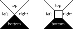
Left is the arrow trick. Right is a more typical border where the container has some dimensions.
How to make arrows on both sides of a box using css
Try this (using Pseudo-elements):
CSS
#arrowbox
{
    width: 200px;
    height: 50px;
    background-color:green;
    margin-left:100px;
    margin-top:100px;
    position: relative;
}

#arrowbox:after {
    left: 100%;
    top: 50%;
    border: solid transparent;
    content: " ";
    height: 0;
    width: 0;
    position: absolute;
    pointer-events: none;
    border-color: rgba(0, 128, 0, 0);
    border-left-color: #008000;
    border-width: 25px;
    margin-top: -25px;
}

#arrowbox:before {
    right: 100%;
    top: 50%;
    border: solid transparent;
    content: " ";
    height: 0;
    width: 0;
    position: absolute;
    pointer-events: none;
    border-color: rgba(0, 128, 0, 0);
    border-right-color: #008000;
    border-width: 25px;
    margin-top: -25px;
}
DEMO HERE
Creating different types of arrows with css
simply like below with two rotate pseudo element:
.arrow {
  width:600px; /* adjust this */
  height:20px; /* this */
  margin:80px 0;
  position:relative;
}
.arrow::before,
.arrow::after {
  content:"";
  position:absolute;
  bottom:0;
  width:50%;
  height:100%;
  background:red;
  border-radius:100px; /* a big value */
  transform-origin:calc(100% - 10px) 50%; /* 10px is half the height */
  transform:scaleX(var(--s,1)) rotate(10deg); /* and rotation here */
}
.arrow::before {
  --s:-1;
}
<div class="arrow"></div>CSS? How is this arrow made?
It's just a rotated square in the form of a ::before pseudo element.
As you can see, the element is a square (same height/width). The element is absolutely positioned with left: 50% and a negative margin-left of -31px (half the width) for horizontal centering. Finally, transform: rotate(-45deg) is used to rotate the square.
Here is the styling used:
.home-testimonial-wrapper:before
.home-cta-area::before, {
    display: block;
    width: 62px;
    height: 62px;
    background: #253031;
    position: absolute;
    top: -15px;
    left: 50%;
    margin: 0 0 0 -31px;
    z-index: 5;
    content: "";
    -webkit-transform: rotate(-45deg);
    -ms-transform: rotate(-45deg);
    -moz-transform: rotate(-45deg);
    transform: rotate(-45deg);
}
Aside from this, if you're interested in seeing how to make a triangle using CSS, see this answer.
CSS arrow. Only a portion of the arrow is being displayed
Is this what you're looking for?
http://jsfiddle.net/61tc5em9/2/
HTML
<div id="container">
    <div id="arrow">text text text</div>
    <div id="content">text text text text</div>
</div>
CSS
#container {
    height: 75px;
    background-color: black;
    position: relative;
    white-space: nowrap;
    }

#arrow {
    width: 30%;
    background-color: red;
    text-align: center;
    font-size: 1.5em;
    line-height: 75px;
}

#arrow::after {
    content: "";
    border-top: 37px solid transparent;
    border-bottom: 38px solid transparent;
    border-left: 50px solid red;
    position: absolute;
    left: 30%;
}

#content {
    color: yellow;
    font-size: 1.5em;
    position: absolute;
    left: 50%;
    top: 25px;
}
Hope this helps. Let me know if you need any changes.
css arrow top not working
Your positioning code was just a little bit off. The best way to position the arrow pseudoelement (thanks to @vals) is to use bottom: 100% along with margin: auto, left: 0, and right: 0. That way your arrow will always stay in the correct position even if you decide to change the arrow's size.
Here is a working live demo:
#bellnews { position: absolute; min-width: 140px; min-height: 100px; background: #fff; color: #000; border: 1px solid #000;}#bellnews:before { content: ""; vertical-align: middle; margin: auto; position: absolute; left: 0; right: 0; bottom: 100%; width: 0; height: 0; border-left: 5px solid transparent; border-right: 5px solid transparent; border-bottom: 5px solid black;}<div id=bellnews></div>Is it possible to make these arrows with html and css?
[Edit] After looking at your image again, I failed to account for the first element being flat. I have updated my answer.
Using before,after, and nth-child selectors, you can achieve what you showed in your image. The before and after pseudo elements are used to create the top and bottom half of the arrows while the nth-child selectors are used to make the arrows appear to be progressively closer together.
.steps-list {  display: flex;  list-style: none;}
.steps-list .step-item {  position: relative;  display: flex;  align-items:center;  text-align: center;  width: 25%;}
.steps-list .step-item .step-link {  font-weight: bold;  width: 100%;  display: inline-block;  padding:10px 5px;  box-sizing:border-box;}
.step-link::before {  content: "";  display: block;  position: absolute;  transform: skew(-40deg, 0);  background: #e2e3e4;  height: 50%;  bottom: 0;  z-index: -1;  left:5px;}.step-link::after {  content: "";  display: block;  position: absolute;  transform: skew(40deg, 0);  background: #e2e3e4;  height: 50%;  top: 0;  z-index: -1;  left:5px;}.step-item:nth-child(1){  overflow:hidden;}.step-item:nth-child(1) .step-link::after {  width:95%;  left:-15px;}
.step-item:nth-child(1) .step-link::before {  width: 95%;  left:-15px;}
.step-item:nth-child(2) .step-link::after {  width: 90%;}
.step-item:nth-child(2) .step-link::before {  width: 90%;}
.step-item:nth-child(3) .step-link::after {  width: 95%;}
.step-item:nth-child(3) .step-link::before {  width: 95%;}
.step-item:nth-child(4) .step-link::after {  width: 100%;}
.step-item:nth-child(4) .step-link::before {  width: 100%;}
<ul class="steps-list"> <li class="step-item"> <a href="#" class="step-link">Contact us</a> </li> <li class="step-item"> <a href="#" class="step-link">Consult with RCIC</a> </li> <li class="step-item"> <a href="#" class="step-link">Apply via your pathway</a> </li> <li class="step-item"> <a href="#" class="step-link">Settle in Canada</a> </li></ul>Related Topics
How to Set The Width and Height of a Textarea Using CSS
CSS: Not(), Selectors and Selecting Descendants
Cannot Stretch Svg Background Image, Aspect Ratio Will Be Preserved
Text-Shadow and Box-Shadow While Printing (Chrome)
CSS Change Border Color on Hover
:After,: Before Issues in Internet Explorer 11
How to Detect If Webp Images Are Supported via CSS
What Is The Limit of Character to Use in Alt="Text" According to Wcag 2.0
How to Change The Color of The Text Cursor in an Input Field in Ie
CSS Buttons Rounded on One Side
Chang Font Size Only for a Single Character with CSS
-Webkit-Text-Fill-Color: Transparent; Not Working in Safari 7.1.7
CSS Positioning Absolute Within Table Cells Not Working in Firefox
Remove CSS Filter on Child Elements
Twitter Bootstrap Tooltip Not Aligning Correctly When It Is Going to Go Outside of Window
How to Make The Native 'Browse' Button on a File Input Larger Cross Browser
Why Does Visual Studio 2013 Recognize CSS3 Display: Flexbox, But Not Flex