JavaFX - CSS styling listview
EDIT:
Slightly changing your css:
.list-cell:filled:selected:focused, .list-cell:filled:selected {
    -fx-background-color: linear-gradient(#328BDB 0%, #207BCF 25%, #1973C9 75%, #0A65BF 100%);
    -fx-text-fill: white;
}

.list-cell:even { /* <=== changed to even */
    -fx-background-color: white;
}

.list-cell:filled:hover {
    -fx-background-color: #0093ff;
    -fx-text-fill: white;
}
This css produces the following presentation:
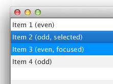
Does this give what you expect?
I changed odd to even. The first cell is even, because its index value is 0 (zero). Also -fx-cell-hover-color is not valid. I changed it to -fx-background-color where needed or removed it.
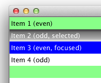
Original text: (note that this has different interpretation of odd/even)
My take would be this:
(I included your requirements in a numbered list for reference in the css. I also made the gradient more obvious and added a green background for even cells.)
/*
1. Odd rows with white background color;
2. ListView: when mouse over an item, highlight with a blue shade;
3. ListView: when an item is selected, paint it with a gradient;
4. ListView: when focus is lost from ListView, selected item should be painted with gradient;
5. ListView: all items will start with text-fill black. But on mouse over and/or selected it will change to white.
*/

.list-cell:filled:selected:focused, .list-cell:filled:selected {
    /* 3:, 4: */
    -fx-background-color: linear-gradient(#333 0%, #777 25%, #aaa 75%, #eee 100%);
    -fx-text-fill: white; /* 5 */
}
.list-cell { -fx-text-fill: black; /* 5 */ }
.list-cell:odd { -fx-background-color: white; /* 1 */ }
.list-cell:even { -fx-background-color: #8f8; /* for information */ }
.list-cell:filled:hover {
    -fx-background-color: #00f; /* 2 */
    -fx-text-fill: white; /* 5 */
}
This leads to this rendering:
ListView styling in JavaFX
You can use the following CSS styles:
.list-view .list-cell:even {
-fx-background-color: blue;
-fx-text-fill: black;
}
.list-view .list-cell:odd {
-fx-background-color: blue;
-fx-text-fill: black;
}
- Save the content of this style in a
lisStyles.css. Add the URL for the
lisStyles.cssstyle sheet to the scene:scene.getStylesheets().add(getClass().getResource("lisStyles.css").toExternalForm());
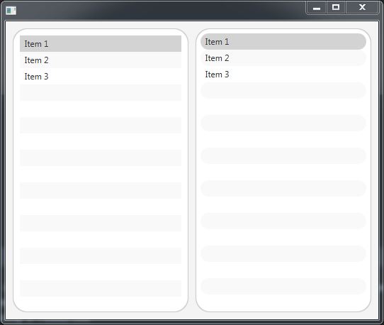
JavaFX ListView rounded corners using CSS
In your example the default styling of list cell is overlapping the round background of the list view. You can add some padding to the list view so there isn't any overlapping. You can have round borders for the items of the list view as well.
FXML:
<?xml version="1.0" encoding="UTF-8"?>

<?import java.lang.String?>
<?import javafx.collections.FXCollections?>
<?import javafx.geometry.Insets?>
<?import javafx.scene.control.ListView?>
<?import javafx.scene.layout.HBox?>

<HBox spacing="10.0" xmlns="http://javafx.com/javafx/11.0.1" xmlns:fx="http://javafx.com/fxml/1">
   <children>
      <ListView fx:id="listView1" style="-fx-background-radius: 20;">
         <items>
            <FXCollections fx:factory="observableArrayList">
               <String fx:value="Item 1" />
               <String fx:value="Item 2" />
               <String fx:value="Item 3" />
            </FXCollections>
         </items>
         <padding>
            <Insets bottom="10.0" left="10.0" right="10.0" top="10.0" />
         </padding>
      </ListView>
      <ListView fx:id="listView" stylesheets="@styling.css">
         <items>
            <FXCollections fx:factory="observableArrayList">
               <String fx:value="Item 1" />
               <String fx:value="Item 2" />
               <String fx:value="Item 3" />
            </FXCollections>
         </items>
         <padding>
            <Insets bottom="7.0" left="7.0" right="7.0" top="7.0" />
         </padding>
      </ListView>
   </children>
   <padding>
      <Insets bottom="10.0" left="10.0" right="10.0" top="10.0" />
   </padding>
</HBox>
styling.css (for second list view):
.list-view {
    -fx-background-radius: 20;
}

.list-cell, .list-cell::focused {
    -fx-border-radius: 20;
}
Preview:
JavaFX ListView - CellFactory styling
You can apply css to the label, when the list-cell is getting selected.
For a selected list-cell, the css is
.list-cell:filled:selected {
    ...
}
For a selected list-cell, which has a label, we can write
.list-cell:filled:selected .label {
    ...
}
To color the label, you can use -fx-text-fill
.list-cell:filled:selected .label {
    -fx-text-fill: red;
}
You can use the same way if it the content is any other node other than Label.
The output is as follows
EDIT
If you just want to override the default white color, you can override the .label on selected.
.list-cell:filled:selected .label {
    -fx-text-fill: black ;
}
how do you css style a scroll bar in JavaFX?
You can style the corner of your scroll pane like this:
.scroll-bar > .corner {
    -fx-background-color: #2c365d ;
}
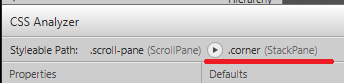
I highly recommend Scene Builder and its CSS Analyzer, is great for looking up things like this. Using the CSS Analyzer you can view the "Styleable path" and find the .corner style class, as can be seen in the image below.
Even if you create your GUI in code, you could still use Scene Builder to simply look up things like this and create quick mock-ups.
EDIT:
Though the above answer is fine for Scroll Panes, it's not the exact same for a ListView which is what op wanted - my bad. The ListView have the styleable path:
.list-view .virtual-flow .corner
So this should work to style a corner of a list-view.
.virtual-flow > .corner {
    -fx-background-color: #2c365d ;
}
I'm assuming that you will only have one of those ListView and then you could give it an id and only style the corners of your specific ListView.
JavaFX ListView and TableView CSS for non focused selection
These two selectors should do it for ListViews:
.list-cell:filled:selected {
    -fx-background: orange;
}

.list-view:focused > .virtual-flow > .clipped-container > .sheet > .list-cell:filled:selected {
    -fx-background: -fx-selection-bar;
}
To have the same coloring in TableViews (both cell and row selection), you can add more selectors:
.table-row-cell:filled:selected,
.tree-table-row-cell:filled:selected,
.table-row-cell:filled > .table-cell:selected,
.tree-table-row-cell:filled > .tree-table-cell:selected,
.list-cell:filled:selected {
    -fx-background: orange;
}

.table-view:focused > .virtual-flow > .clipped-container > .sheet > .table-row-cell:filled:selected,
.tree-table-view:focused > .virtual-flow > .clipped-container > .sheet > .tree-table-row-cell:filled:selected,
.table-view:focused > .virtual-flow > .clipped-container > .sheet > .table-row-cell .table-cell:selected,
.tree-table-view:focused > .virtual-flow > .clipped-container > .sheet > .tree-table-row-cell .tree-table-cell:selected ,
.list-view:focused > .virtual-flow > .clipped-container > .sheet > .list-cell:filled:selected {
    -fx-background: -fx-selection-bar;
}
Note: these selectors targeting even TreeTableViews.
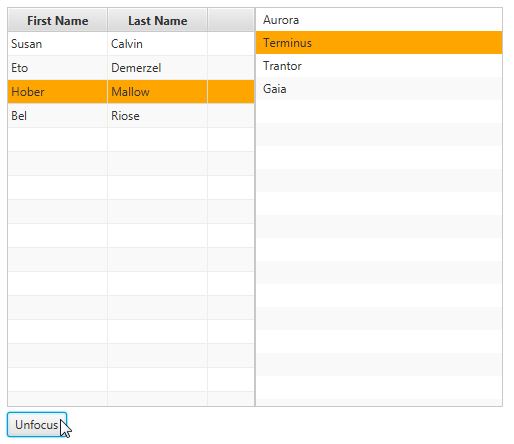
The result:
How to style custom control inside a ListView in JavaFX
Theoretically this set of selectors do the trick:
// Color of the list-cell selected + unselected: transparent
.list-view .list-cell,
.list-view .list-cell:filled,
.list-view .list-cell:selected,
.list-view .list-cell:focused,
 .list-view .list-cell:hover {
    -fx-background-color: transparent;
    -fx-effect: null;
}

// Color of the custom control hover
.list-view .list-cell:hover .email-view {
    -fx-background-color: greenyellow;
}

// Color of the custom control selected
.list-view .list-cell:filled:selected:focused .email-view,
.list-view .list-cell:filled:selected .email-view {
    -fx-background-color: green;
}

// Color of the custom control unselected
.email-view { -fx-background-color: gray; }
The goal is to kep the list-cell transparent all the time, and based on the pseudo-state of the list-cell set the background color of email-view. Maybe I forgot about some state, but it could be a good starting point.
JavaFX - styling an unfocused ListView row
The way a list-cell becomes both selected and not in focus is if the ListView it is part of loses focus. With that in mind two css classes should be created for each condition with one including ListView's css selector (list-view).
.list-cell:filled:selected {
    /* 4: (Styling when out of focus)*/
    -fx-background-color: linear-gradient(#333 0%, #777 25%, #aaa 75%, #eee 100%);
    -fx-text-fill: white;
}

.list-view:focused .list-cell:filled:selected {
    /* 3: (This is more specific and therefore overrides the above)*/
    -fx-background-color: linear-gradient(#300 0%, #700 25%, #a00 75%, #e00 100%);
}
Related Topics
React Animate Transition Between Components
CSS Difference Between Attribute Selectors with Tilde and Star
Svg "Fill: Url(#....)" Behaving Strangely in Firefox
iOS CSS Opacity + Visibility Transition
How to Stop a CSS Layout from Distorting When Zooming In/Out
Horizontal Centered Menu in CSS
Firefox Unexpected Line Break Using Floats & Overflow Hidden
What Happens If Multiple Classes of the Same Element Define a :Before Pseudo-Element
How to Animate Multiple CSS Transform Properties Separately Using Keyframe Animation
How to Add Compass Syntax Support to Jetbrains PHPstorm
Are CSS Custom Properties Global Across Linked CSS Documents
What Is the Different Between Clearfix Hack and Overflow:Hidden VS Overflow:Auto
Firefox Line-Height Issue with Input Fields
Blur Effect on the Entire Webpage
Conventional Order of CSS Properties