Image mysteriously ignoring max-width in Firefox & IE
You have max-width: 100%, but 100% of what? Of the parent width, right? But the parent is an inline-block (with class="sponsor") whose width is not set, so its width depends on the children, and in particular on the preferred width of the children.
The layout of this styling is undefined in the CSS specification. In particular, the intrinsic width of the kids in this case depends on the width of the parent which in turn depends on the intrinsic width of the kids. See http://www.w3.org/TR/CSS21/visudet.html#shrink-to-fit-float for the relevant spec text and note all the "does not define" bits.
I recommend giving your <div class="sponsor"> a width. That should deal with the problem, I would think.
max-width:100% not working on images in mozilla
You have float:left applied to all elements. Floated blocks occupy as much width, as needed by their content. In this case, image initial width "spreads" on the parent section.
And max-width on replaced block elements (such as images) doesn't make them occupy all the space - it just makes them not to widen more, than soe value. width:100% does
Try removing the float rule and give images width:100%
Rendering issues under Firefox
Replace max-width: 70% by width: 70% in this selector :
#miniMenu img { width: 70%; }
See this post on SO explaining issue on Firefox with max-width property :
Image mysteriously ignoring max-width in Firefox & IE
Especially theses lines from @Boris Zbarsky answer :
You have max-width: 100%, but 100% of what? Of the parent width,
right? But the parent is an inline-block (with class="sponsor") whose
width is not set, so its width depends on the children, and in
particular on the preferred width of the children.The layout of this styling is undefined in the CSS specification. In
particular, the intrinsic width of the kids in this case depends on
the width of the parent which in turn depends on the intrinsic width
of the kids. See
http://www.w3.org/TR/CSS21/visudet.html#shrink-to-fit-float for the
relevant spec text and note all the "does not define" bits.
JS-less responsive images with GIF shown on :hover
After a bit of trial and error I managed to resolve the issues by myself, so I added notes on solutions and the final (working) code to the question.
I'm not 100% happy with opening a new tab on Android (ideally should play when single-tapping), but all tested browsers close such popup-tabs when pressing Back so maybe it's not too bad. I added a "play" button, which also doubles as a first touch event absorber for mobile (initially covers the link completely, resized to 0% width after a short delay to allow clicking the link). This works both for modern browsers (which trigger :hover and animation playback on first tap and can open link on second tap) and for Opera Mini (which simply opens a popup tab with the GIF). You can see this in action here, for example.
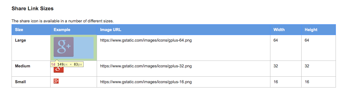
Table cell box model: extra width and height
It's a table cell, so the browser will automatically distribute space among the cells to fill the width of the table. The exact width will depend upon the contents of all the cells and the width of the table. In this case, the table is set as a percentage width of the browser window, so on my 1920x1080 monitor, it's actually quite a bit bigger than in your screenshot.
xHTML/CSS: How to make inner div get 100% width minus another div width
The mysterious overflow: hidden; is your friend here. It stops elements adjacent to floats from extending behind the float — I think that’s the layout you’re looking for.
Here’s some slightly edited HTML: I don’t think you can have # characters in your ids:
<div id="outer">
    <div id="inner1">
        inner div 1. Some text...
    </div>
    <div id="inner2">
        inner div 2...
    </div>
</div>
And here’s the CSS to achieve the layout you want.
(I put in additional CSS for IE 6 with HTML conditional comments. I just noticed you didn’t actually need it to work in IE 6 too, but if you fancy being nice to the IE 6 users out there...)
<style type="text/css">
#outer {
    overflow: hidden;/* Makes #outer contain its floated children */
    width: 100%;

    /* Colours and borders for illustration purposes */
    border: solid 3px #666;
    background: #ddd;
}

#inner1 {
    float: left;/* Make this div as wide as its contents */

    /* Colours and borders for illustration purposes */
    border: solid 3px #c00;
    background: #fdd;
}

#inner2 {
    overflow: hidden;/* Make this div take up the rest of the horizontal space, and no more */

    /* Colours and borders for illustration purposes */
    border: solid 3px #00c;
    background: #ddf;
}
</style>

<!--[if lte IE 6]>
<style type="text/css">
#inner2 {
    zoom: 1;/* Make this div take up the rest of the horizontal space, and no more, in IE 6 */
}

#inner1 {
    margin-right: -3px;/* Fix the 3-pixel gap that the previous rule introduces. (Shit like this is why web developers hate IE 6.) */
}
</style>
<![endif]-->
Tested and working in IE 6, 7, and 8; Firefox 3.5; and Chrome 4.
How to add cookie on a HttpTransportBindingElement
The method described in http://kennyw.com/indigo/153 works on a per-service-call basis. This means you have to make sure all invocations to your WCF service are made
after the OperationContextScope object is created and before it is disposed for this to work. Otherwise the cookie will never be added to the request.
If you are looking for a centralized solution to manually add a cookie to all outgoing HTTP requests made to the WCF service have a look at this thread:
http://social.msdn.microsoft.com/Forums/en-US/wcf/thread/624fb3f9-222d-4795-9140-fe9ef3934361/
Related Topics
How to Make a Box with Arrow in CSS
How to Disable Automatic Links Coloring Without Selecting a Color
CSS Animation with Delay and Opacity
Styling Not Applying to Child Component
How to Get IE8 to Accept a CSS :Before Tag
Can't Stop CSS Animation Disappearing After Last Key Frame
Horizontal Centered Menu in CSS
How to Modify the Strongloop's Loopback Explorer CSS
CSS Style - Percentage VS Em VS Px
How to Detect Element Visibility Using Only CSS
Sass Watching Multiple Directories
Bootstrap 4 Invalid Feedback with Input Group Not Displaying
Offset Scroll Anchor in HTML with Bootstrap 4 Fixed Navbar
What Is the Current State of Sub-Pixel Accuracy in the Major Browsers
CSS Perfect Full Screen Image Background
How to Stop a CSS Layout from Distorting When Zooming In/Out