IE11 making background image text blurry
It is a normal IE bug.
http://www.infoworld.com/t/microsoft-windows/blurry-fonts-bug-kb-2670838-persists-ie11-and-windows-7-231035
i Haven't found any solutions to this subject yet.
Blurry background images after update to IE11
Well i can see what is causing this problem. It's the border-radius of your ._ui.
Now i can't tell you why this happens.
However if you want to fix this you can or don't use border-radius or, which is a better solution i my opinion, use the <img> tag to generate the background.
Use image element
<img src="http://i.imgur.com/DauuVHW.png" />
Now to cut-off your image you can just use position: relative;, position: absolute; and a overflow: hidden;:
.block1 > div
{
    position: relative;
    overflow: hidden;
}
This will add the properties on ._ui _bre and ._ui _com.
Where the basic image properties are:
img
{
    position: absolute;
    left: 2px;
}
Now you can just use the top and bottom offset for the the image positioning. Where as you used background-position before:
._bre._ui img
{
    top: -68px;
}

._com._ui img
{
    top: -24px;
}
This way your image is not a part of the element which has border-radius anymore, which caused this problem. They have a more clear seperation now; 2 different elements.
jsFiddle
Blurry text in Internet Explorer
Did you try to add translateZ(0) for your popup? In your case it could be:
.popup {
    ...
    -webkit-transform: translate3d(-50%, -50%, 0);
    transform: translate3d(-50%, -50%, 0);
    ...
}
In IE11 on Windows 8.1 the font looks better: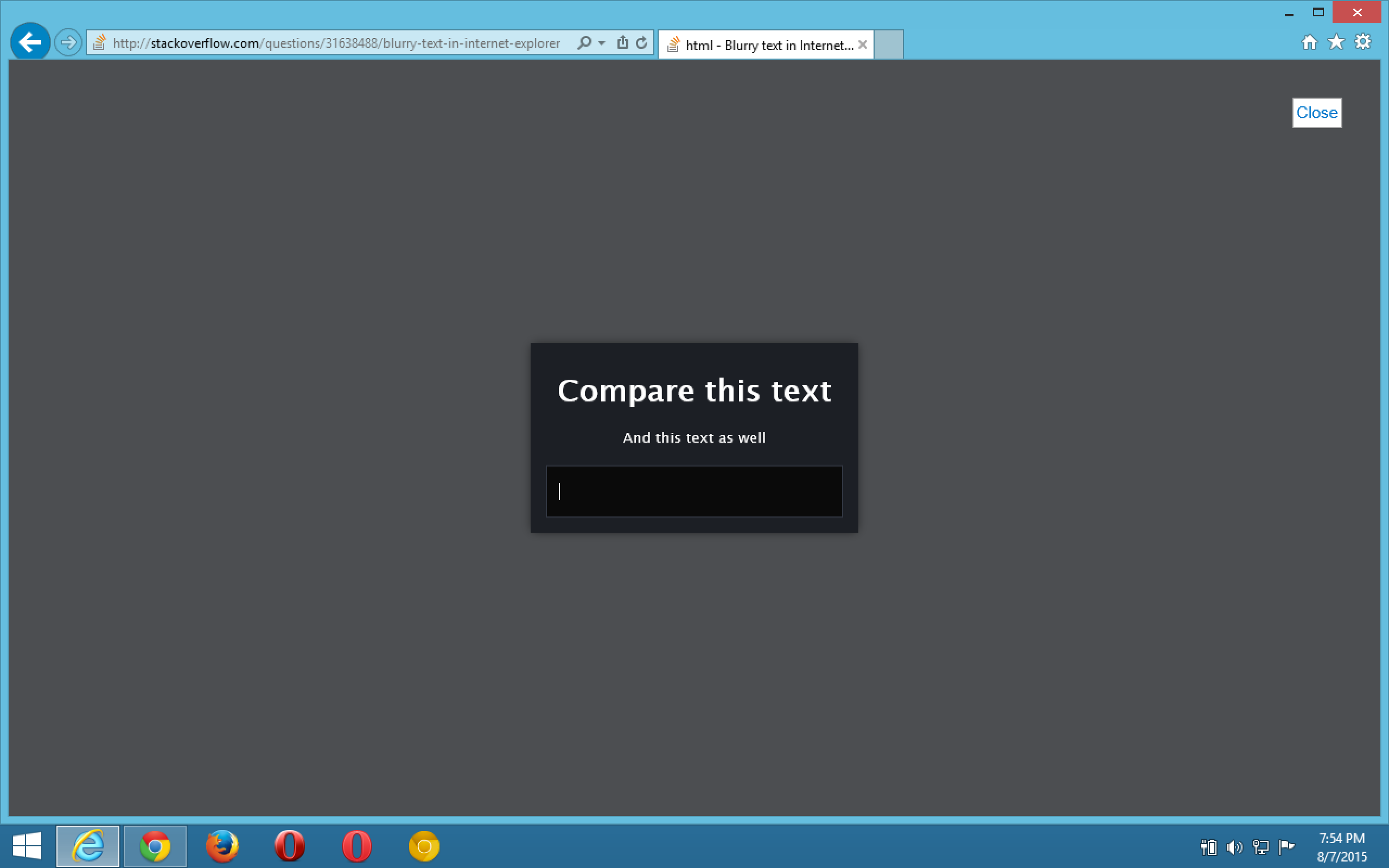
html, body {

    margin: 0;

    height: 100%;

    font: normal 14px/24px "Lucida Sans Unicode", "Lucida Grande", "Arial", sans-serif;

}

.popup {

    position: relative;

    top: 50%;

    left: 50%;

    text-align: center;

    vertical-align: middle;

    display: inline-block;

    white-space: nowrap;

    background-color: rgb(28, 31, 37);

    color: white;

    padding: 1em;

    z-index: 2;

    -webkit-filter: blur(0);

    -webkit-transform: translate3d(-50%, -50%, 0);

    transform: translate3d(-50%, -50%, 0);

    -webkit-box-shadow: 0px 0px 14px -2px rgba(0, 0, 0, 0.75);

    -moz-box-shadow: 0px 0px 14px -2px rgba(0, 0, 0, 0.75);

    box-shadow: 0px 0px 14px -2px rgba(0, 0, 0, 0.75);

}

p {

    font-size: small;

}

input {

    padding: 16px 12px;

    width: 250px;

    border: 0;

    background: #0A0A0A;

    color: #eee;

    font-size: 14px;

    font-family: "Open Sans", sans-serif;

    -webkit-box-shadow: inset 0 0 0 1px #323742;

    -moz-box-shadow: inset 0 0 0 1px #323742;

    box-shadow: inset 0 0 0 1px #323742;

}

#blackout {

    background: rgba(17, 19, 23, 0.5);

    position: fixed;

    top: 0;

    right: 0;

    bottom: 0;

    left: 0;

    z-index: 1;

    cursor: pointer;

}
<div id="blackout"></div>
<div class="popup">
<h1>Compare this text</h1>
<p>And this text as well</p>
<input type="text" placeholder="Even placeholders are blurry">
</div>How to apply a CSS 3 blur filter to a Text/image for Internet Explorer or IE 11
You could make blur filter using SVG gaussian blur! It is work with are modern browsers.
Control in intensity of blur from stdDeviation="4"
Demo
See also
<div class="container" style="height: 613px;">

    <svg id="mySVG" width="100%" height="100%" viewBox="0 0 1131 591">

        <filter id="blurMe">

            <feGaussianBlur in="SourceGraphic" stdDeviation="4" />

        </filter>

        <image filter="url(#blurMe)" xlink:href="http://static1.squarespace.com/static/56d70b042b8dde104d998bda/t/56d9b7e827d4bdab535a3af8/1457109282817/kiddos.jpg?format=1500w" x="0" y="0" height="100%" width="100%"/>

    </svg>

</div>
Related Topics
Why Doesn't Font Awesome Work in My Shadow Dom
Css3 Transitions: Is There an on Click Option Without Using Jquery
Differencebetween Perspective and Transform's Perspective Properties in CSS
Flex Item with Image Child Doesn't Adjust Its Size Properly
Draw a Static Line Between Two Divs
CSS Selector When :Target Empty
CSS Hover Menu Appearing Behind PDF Iframe
How to Add 1Px Border to a Div Whose Width Is a Percentage
Javafx CSS Border-Radius Issue
How a CSS Pixel Size Is Calculated
Why Does SASS Prepend an Incorrect @Charset Rule
Create a Radial Gradient for Internet Explorer 6/7/8
Preventing Relayout Due to Scrollbar
How to Force Firefox to Render Textarea Padding the Same as in a Div
How to Load CSS Rules Dynamically in Webkit (Safari/Chrome)
Leaving Certain Values Unchanged When Using CSS Shorthand Properties