Border-radius in JavaFX CSS not working on containers
Do not use borders. Css background instead.
Load the sample to SceneBuilder to get the idea.
<?xml version="1.0" encoding="UTF-8"?>

<?import javafx.scene.effect.DropShadow?>
<?import javafx.scene.layout.StackPane?>

<StackPane maxHeight="-Infinity" maxWidth="-Infinity" minHeight="-Infinity" minWidth="-Infinity" prefHeight="400.0" prefWidth="600.0" style="-fx-background-color: silver;" xmlns="http://javafx.com/javafx/8" xmlns:fx="http://javafx.com/fxml/1">
   <children>
      <StackPane maxHeight="-Infinity" maxWidth="-Infinity" minHeight="-Infinity" minWidth="-Infinity" prefHeight="200.0" prefWidth="300.0" style="-fx-background-color: purple, blue; -fx-background-radius: 8, 0; -fx-background-insets: 0, 4;">
         <effect>
            <DropShadow />
         </effect>
      </StackPane>
   </children>
</StackPane>
JavaFX - Border radius - Background color
You need to add the radius property as well to define the background fill. Otherwise it will asume a zero value, as shown in your picture.
You can check the CSS specs here.
You just need to add the -fx-background-radius property:
.payload {
    -fx-hgap: 20px;
    -fx-padding: 40px;

    -fx-background-color: #2969c0;
    -fx-background-radius: 50px;

    -fx-border-radius: 50px;
    -fx-border-width: 5px;
    -fx-border-color: black;
    -fx-effect: dropshadow(three-pass-box, rgba(0, 0, 0, 0.8), 10, 0, 0, 0);
}
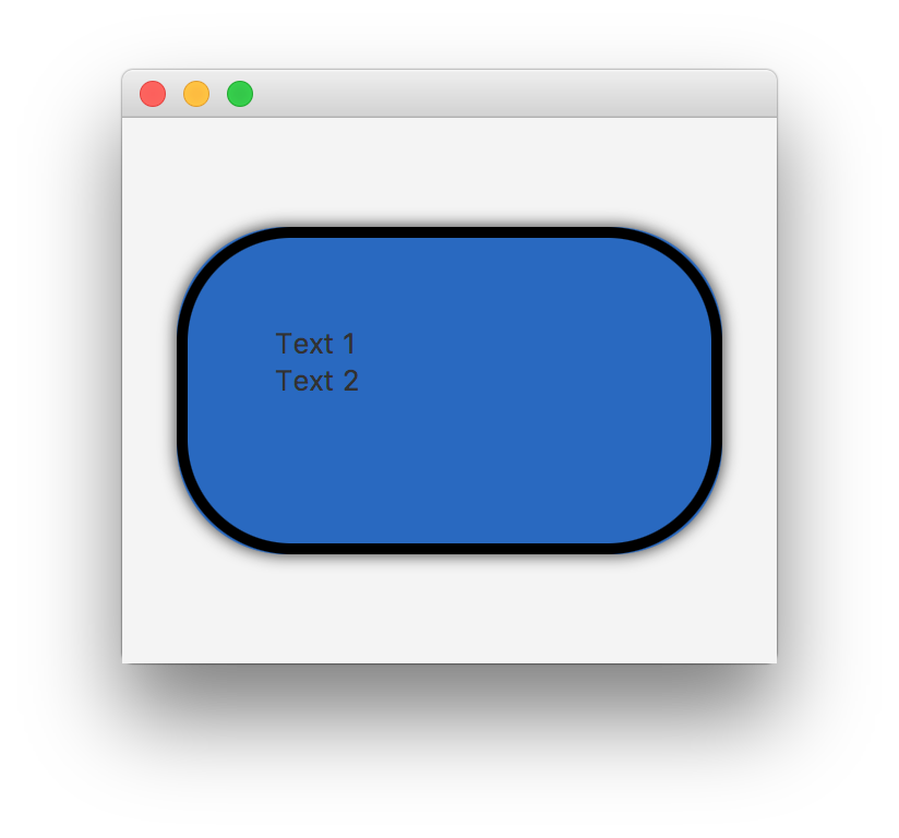
The -fx-background-radius doesn't seem to work with four values properly
From the documentation you posted, comma-separated values define the background radius for multiple backgrounds. So your CSS code sets the radius for the first background to 16px (on all four sides), the radius for the second background to 16px, and the radii for the third and fourth backgrounds to 0px. Since you only appear to have one background, you only see the results of the first value.
To set different radii for different corners, the values shouldbe whitespace-delimited, not comma-delimited:
.top-rounded-box {
    -fx-background-radius: 16 16 0 0;
}
You can have multiple backgrounds and different radii for different corners by comma-delimiting different sets of whitespace-delimited values, e.g. -fx-background-radius: 16 16 0 0, 16 16 8 8 ;, etc.
Why -fx-border-color reset border radius of TextField?
The default stylesheet applies borders to text fields (and almost all other controls) by using "nested backgrounds" instead of borders.
Some of the settings for the TextInputControl from the default stylesheet are:
-fx-background-color: linear-gradient(to bottom, derive(-fx-text-box-border, -10%), -fx-text-box-border),
    linear-gradient(from 0px 0px to 0px 5px, derive(-fx-control-inner-background, -9%), -fx-control-inner-background);
-fx-background-insets: 0, 1;
-fx-background-radius: 3, 2;
This basically sets two background colors (both defined by a linear gradient), one (the "outer" one) with a color based on -fx-text-box-border, and the other with a color based on -fx-control-inner-background. The "outer" background is outside the "inner" background because they have insets of 0 and 1, respectively; the curved edge to the resulting apparent border is created by having radii of 3 and 2 for each background, respectively.
This is, anecdotally at least, far more efficient than using actual borders in the CSS, so this choice of technique is for performance reasons.
So to preserve the radius for the border, you can use the same technique, and just override the two background colors:
.validation-error {
    -fx-background-color: #DBB1B1, #FFF0F0 ;
 }
Note that you can also just replace the "looked-up-colors", which would also preserve the subtle linear gradients being used:
.validation-error {
    -fx-text-box-border: #DBB1B1 ;
    -fx-control-inner-background: #FFF0F0 ;
  }
For highlighting when focused, the default uses colors named -fx-focus-color and -fx-faint-focus-color: so in the latter version you would probably want to redefine those too:
.validation-error {
    -fx-text-box-border: #DBB1B1 ;
    -fx-control-inner-background: #FFF0F0 ;
    -fx-focus-color: #FF2020 ;
    -fx-faint-focus-color: #FF202020 ;
  }
Child pane css style when parent pane has -fx-border-radius in JavaFX
I created the sample fxml considering your problem statement.
I haven't done anything special but it worked as expected
Please refer below fxml file for same.
<AnchorPane id="AnchorPane" prefHeight="400.0" prefWidth="600.0" xmlns:fx="http://javafx.com/fxml/1" xmlns="http://javafx.com/javafx/8">
   <children>
      <Pane layoutX="129.0" layoutY="72.0" prefHeight="300.0" prefWidth="300.0" style="-fx-border-width: 1; -fx-border-style: solid; -fx-border-radius: 4; -fx-background-color: derive(-fx-background, -35%); -fx-background-radius: 4;">
         <children>
            <Pane layoutX="1.0" layoutY="213.0" prefHeight="86.0" prefWidth="298.0" style="-fx-background-radius: 4; -fx-background-color: white;" />
         </children>
      </Pane>
   </children>
</AnchorPane>
Output :
Border-Radius and Shadow on ImageView
Use the following css to get a drop shadow:
-fx-effect: dropshadow(three-pass-box, rgba(0,0,0,0.8), 10, 0, 0, 0);
See the JavaFX CSS Reference guide for details.
To get the border in addition to the drop shadow, place your ImageView containing your Image in a StackPane. And apply the effect css above to the StackPane, in addition to a background and padding on the StackPane.
For example the css below applied to the StackPane containing your ImageView will provide a red border around your image:
-fx-padding: 10;
-fx-background-color: firebrick;
If you want the background defining your border curved at the edges, then use:
-fx-background-radius: 5;
That gets you an image like below where your image is enclosed in a shadowed border:
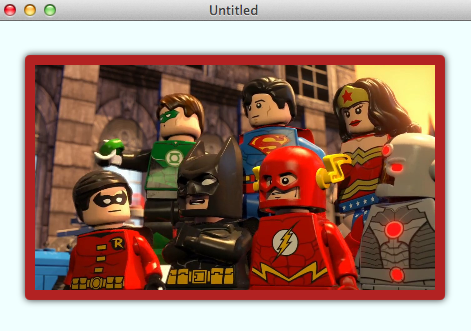
If you want to actually round the image itself, it's a bit trickier. You need to apply some code to:
- Clip the image to a rounded rectangle.
- Snapshot the clipped image.
- Store the snapshot image back in the ImageView.
- Remove the clip from the ImageView.
- Apply the drop shadow effect to the ImageView.
Then you can get something like below:
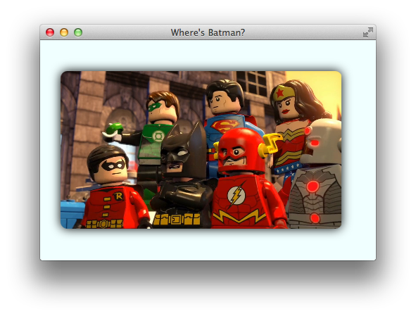
Some code for that "BatmanLost.java":
import javafx.application.Application;
import javafx.fxml.*;
import javafx.scene.*;
import javafx.scene.effect.DropShadow;
import javafx.scene.image.*;
import javafx.scene.layout.Pane;
import javafx.scene.paint.Color;
import javafx.scene.shape.Rectangle;
import javafx.stage.Stage;

import java.io.IOException;

public class BatmanLost extends Application {

    class WingClipper {
        @FXML
        private ImageView imageView;

        @FXML
        public void initialize() {
            // set a clip to apply rounded border to the original image.
            Rectangle clip = new Rectangle(
                imageView.getFitWidth(), imageView.getFitHeight()
            );
            clip.setArcWidth(20);
            clip.setArcHeight(20);
            imageView.setClip(clip);

            // snapshot the rounded image.
            SnapshotParameters parameters = new SnapshotParameters();
            parameters.setFill(Color.TRANSPARENT);
            WritableImage image = imageView.snapshot(parameters, null);

            // remove the rounding clip so that our effect can show through.
            imageView.setClip(null);

            // apply a shadow effect.
            imageView.setEffect(new DropShadow(20, Color.BLACK));

            // store the rounded image in the imageView.
            imageView.setImage(image);
        }
    }

    public static void main(String[] args) {
        launch(args);
    }

    @Override
    public void start(Stage stage) throws IOException {
        FXMLLoader loader = new FXMLLoader(
            getClass().getResource(
                "batmanlostinthemix.fxml"
            )
        );
        loader.setController(new WingClipper());

        Pane batman = loader.load();

        stage.setTitle("Where's Batman?");
        stage.setScene(new Scene(batman));
        stage.show();
    }
}
With some FXML "batmanlostinthemix.fxml":
<?xml version="1.0" encoding="UTF-8"?>

<?import javafx.scene.image.Image?>
<?import javafx.scene.image.ImageView?>
<?import javafx.scene.layout.AnchorPane?>

<AnchorPane id="AnchorPane" maxHeight="-Infinity" maxWidth="-Infinity" minHeight="-Infinity" minWidth="-Infinity" prefHeight="313.0" prefWidth="477.0" style="-fx-background-color: azure;" xmlns:fx="http://javafx.com/fxml/1" xmlns="http://javafx.com/javafx/2.2">
  <children>
    <ImageView fx:id="imageView" layoutX="29.0" layoutY="44.0" fitHeight="224.0" fitWidth="400.0" pickOnBounds="true" preserveRatio="true">
      <image>
        <Image url="http://collider.com/wp-content/uploads/lego-batman-movie-dc-super-heroes-unite-1.jpg" />
      </image>
    </ImageView>
  </children>
</AnchorPane>
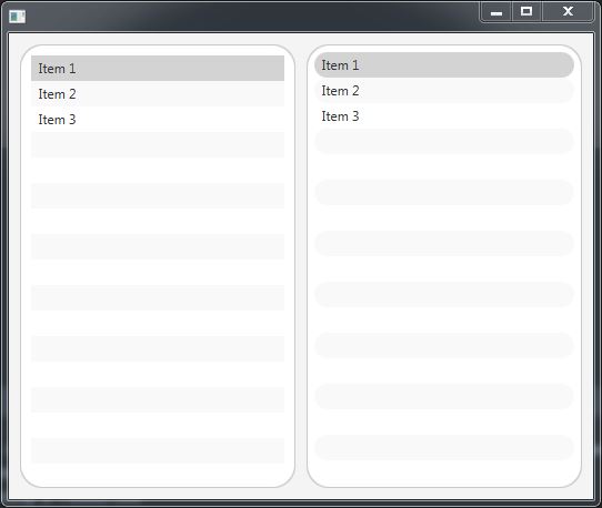
JavaFX ListView rounded corners using CSS
In your example the default styling of list cell is overlapping the round background of the list view. You can add some padding to the list view so there isn't any overlapping. You can have round borders for the items of the list view as well.
FXML:
<?xml version="1.0" encoding="UTF-8"?>

<?import java.lang.String?>
<?import javafx.collections.FXCollections?>
<?import javafx.geometry.Insets?>
<?import javafx.scene.control.ListView?>
<?import javafx.scene.layout.HBox?>

<HBox spacing="10.0" xmlns="http://javafx.com/javafx/11.0.1" xmlns:fx="http://javafx.com/fxml/1">
   <children>
      <ListView fx:id="listView1" style="-fx-background-radius: 20;">
         <items>
            <FXCollections fx:factory="observableArrayList">
               <String fx:value="Item 1" />
               <String fx:value="Item 2" />
               <String fx:value="Item 3" />
            </FXCollections>
         </items>
         <padding>
            <Insets bottom="10.0" left="10.0" right="10.0" top="10.0" />
         </padding>
      </ListView>
      <ListView fx:id="listView" stylesheets="@styling.css">
         <items>
            <FXCollections fx:factory="observableArrayList">
               <String fx:value="Item 1" />
               <String fx:value="Item 2" />
               <String fx:value="Item 3" />
            </FXCollections>
         </items>
         <padding>
            <Insets bottom="7.0" left="7.0" right="7.0" top="7.0" />
         </padding>
      </ListView>
   </children>
   <padding>
      <Insets bottom="10.0" left="10.0" right="10.0" top="10.0" />
   </padding>
</HBox>
styling.css (for second list view):
.list-view {
    -fx-background-radius: 20;
}

.list-cell, .list-cell::focused {
    -fx-border-radius: 20;
}
Preview:
Round Corners in java fx pane
Finally after so much research and some help from the spanish version of Stack O. the most easy way to remove the white corners is this:
In the main class you must add:
scene.setFill(Color.TRANSPARENT);
and:
stage.initStyle(StageStyle.TRANSPARENT);
The only problem is that StageStyle.TRANSPARENT will leave you without the close button so you must make it by yourself.
The final result is this:

Related Topics
Set the Width of Select2 Input (Through Angular-Ui Directive)
Differencebetween * and *|* in CSS
CSS Box Shadow - Top and Bottom Only
How to Create Pure CSS 3-Dimensional Spheres
Bootstrap 3 & Boostrap 4 & Bootstrap 5 - Input-Xs (Smaller Than Sm)
@Font-Face Svg Not Working Properly in Chrome
Calculate a Percent with SCSS/Sass
CSS Input Field Text Color of Inputted Text
Css: How to Position Element in Lower Right
Responsive Image Full Screen and Centered - Maintain Aspect Ratio, Not Exceed Window
Difference Between "Margin-Left", and "Left" (Or "Margin-Right", and "Right")