Is there a way to use SVG as content in a pseudo element ::before or ::after
Yes you can! Just tested this and it works great, this is awesome!
#test::before {
  content: url(path/to/your.svg);
  width: 200px;
  height: 200px;
}
Or if you prefer to put the SVG directly in the CSS:
#test::before {
  content: url("data:image/svg+xml,%3Csvg xmlns='http://www.w3.org/2000/svg'%3E%3Ccircle cx='100' cy='50' r='40' stroke='black' stroke-width='2' fill='red'/%3E%3Cpolyline points='20,20 40,25 60,40 80,120 120,140 200,180' style='fill:none;stroke:black;stroke-width:3'/%3E%3C/svg%3E ");
  width: 200px;
  height: 200px;
}
<div id="test"></div>How can I add a svg as content on :before pseudo element of an element?
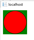
Seems like the SVG tag needed more attributes.
#square{   background-color: green;   width: 100px;   height: 100px;}
#square:before{   display: block;   content: url("data:image/svg+xml;charset=UTF-8, <svg xmlns='http://www.w3.org/2000/svg' version='1.1' height='100' width='100'><circle cx='50' cy='50' r='40' stroke='black' stroke-width='3' fill='red' /></svg>");   background-size: 28px 28px;   height: 28px;   width: 28px;}
<div id="square"></div>IE not displaying SVG as content in a pseudo element :before or :after
I have tested it with IE 11 and I am able to produce the issue. It seems that the pseudo-elements content attribute do not currently work on SVG elements. It can be possible that it is some kind of bug or it is IE browser default behavior. I will try to submit the feedback regarding this issue.
As a workaround, I suggest you display the svg content using background-image attribute, like this:
<style>
    .div1:after {
        content: '';
        display: block;
        height: 80px;
        width: 80px;
        background-image: url(data:image/svg+xml,%3Csvg%20xmlns%3D%22http%3A%2F%2Fwww.w3.org%2F2000%2Fsvg%22%20version%3D%221.1%22%20height%3D%2280%22%20width%3D%22160%22%3E%0D%0A%20%20%3Ccircle%20cx%3D%2240%22%20cy%3D%2240%22%20r%3D%2238%22%20stroke%3D%22black%22%20stroke-width%3D%221%22%20fill%3D%22red%22%20%2F%3E%0D%0A%20%20%3Ccircle%20cx%3D%22120%22%20cy%3D%2240%22%20r%3D%2238%22%20stroke%3D%22black%22%20stroke-width%3D%221%22%20fill%3D%22blue%22%20%2F%3E%0D%0A%3C%2Fsvg%3E);
    }
</style>
<div class="div1" style="background-color:green; width:80px;height:80px"></div>
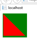
The result in IE 11 browser as below:
Edit:
I am not able to use my svg with background-image property whereas
your svg is loading with the property. Is there any problem with my
svg?
When we use SVG with background-image property, we should ensure that reserved URL characters are encoded (e.g. < === %3C and > === %3E) and also replace the space with '%20'.
So, please encode your svg element as below:
background-image: url(data:image/svg+xml,%3Csvg%20version%3D%221.1%22%20xmlns%3D%22http%3A%2F%2Fwww.w3.org%2F2000%2Fsvg%22%20xmlns%3Axlink%3D%22http%3A%2F%2Fwww.w3.org%2F1999%2Fxlink%22%20preserveAspectRatio%3D%22xMidYMid%20meet%22%20viewBox%3D%22266.53926701570674%20152.66492146596858%2044%2044%22%3E%3Cdefs%3E%3Cpath%20d%3D%22M267.54%20153.66L307.54%20193.66L267.54%20193.66L267.54%20153.66Z%22%20id%3D%22d6AN4MEUYO%22%3E%3C%2Fpath%3E%3C%2Fdefs%3E%3Cg%3E%3Cg%3E%3Cuse%20xlink%3Ahref%3D%22%23d6AN4MEUYO%22%20opacity%3D%221%22%20fill%3D%22red%22%20fill-opacity%3D%221%22%3E%3C%2Fuse%3E%3C%2Fg%3E%3C%2Fg%3E%3C%2Fsvg%3E);
Then, the result like this:
Use SVG image inline inside CSS :before pseudo-element
Try this:
div::before {
 content: '';
 background-image: url('data:image/svg+xml;charset=US-ASCII,%3Csvg%20width%3D%22auto%22%20height%3D%2210%22%20viewBox%3D%220%200%2080%2020%22%20xmlns%3D%22http%3A//www.w3.org/2000/svg%22%3E%3Cpath%20d%3D%22M0%200h20L10%2020z%22%20fill%3D%22%23ff0%22/%3E%3Cpath%20d%3D%22M30%2020h20L40%200z%22/%3E%3Cpath%20d%3D%22M60%200h20L70%2020z%22%20fill%3D%22%23ff0%22/%3E%3C/svg%3E');
}
I use http://www.grumpicon.com/ this website to convert SVGs for CSS background
CSS :before on inline SVG
No, inline SVG is treated as an image, and images are replaced elements which are not allowed to have generated content.
Strictly speaking, I think it's undefined. CSS 2.1 just talks about "images, embedded documents and applets" in general and The HTML standard defines it for images, but not SVG explicitly.
How do I get SVG added to ::after pseudo element as a content and scale it?
Replace the SVG's width/height with a viewBox and then adjust the size of your ::after element:
<svg xmlns="http://www.w3.org/2000/svg" viewBox="0 0 120 120">
    ...
a.content[href^="http"]::after {
  content: url("data:image/svg+xml,%3csvg xmlns='http://www.w3.org/2000/svg' viewBox='0 0 120 120'%3e%3cpath fill-opacity='0' stroke='%23a80000' stroke-width='10' stroke-linejoin='round' d='m53 45H15v60h60V67M55 15v10l10 10-30 30 20 20 30-30 10 10h10V15z'/%3e%3c/svg%3e");

  /* Adjustable size: */
  display: inline-block;
  width: 1em;
  height: auto;
}
<ol>
<li>
Here is a link:
<a href="https://google.com" class="content">Google.com</a>
</li>
</ol>CSS - SVG in a pseudo element with Color changing capabilities
This is easy if you flip the logic - instead of adding color on the hover - think of it as removing color when you are not hovering.
With CSS filters - you can convert your svg to greyscale - meaning that a color image / SVG is rendered as a black and white image. Then on hover - stop the filter / conversion and your svg will have its actual color.
Note that this only works with one color change - you cannot have different paths go different colors etc - but by reversing the color logic you get a black and white svg that turns colorful on hover.
The following div has a border - just to show the dimensions (and I would probably do the svg as the background image of the div rather than the ::before - but I left it as requested. The SVG is iniitally shown as black and on hover over the div - the svg turns red.... magic :)
div {
  height: 160px;
   width: 300px;
   border: solid 1px blue;
   position: relative
}

div::before {
  content: url('data:image/svg+xml;utf8,<svg version="1.1" id="" xmlns="http://www.w3.org/2000/svg" width="100%" height="100%" xmlns:xlink="http://www.w3.org/1999/xlink"  style="" xml:space="preserve"><path d="M150 0 L75 200 L225 200 Z" fill="red"></path></svg>');
  display: block;
    -webkit-filter: grayscale(100);
    filter: grayscale(100);
}


div:hover:before{
    -webkit-filter: grayscale(0);
    filter: grayscale(0);
} <div></div>Related Topics
Style ≪Select≫ Element Based on Selected ≪Option≫
What Are the Rules For CSS Media Query Overlap
How to Validate Vendor Prefixes in CSS Like -Webkit- and -Moz-
Css 3D Transform Doesn't Work If Perspective Is Set in the End of Property
Css to Prevent Child Element from Inheriting Parent Styles
@Font-Face Works in Ie8 But Not Ie9
Two-Tone Background Split by Diagonal Line Using CSS
Responsive CSS Styles on Mobile Devices Only
How to Make an Inline-Block Element Fill the Remainder of the Line
Is Background-Position-X (Background-Position-Y) a Standard W3C CSS Property
Css: Margin-Top When Parent'S Got No Border
Why Doesn't the Selector H3:Nth-Child(1):Contains('A') Work
Why the CSS Calc() Function Is Not Working
Css to Make an Empty Cell'S Border Appear
How to Center an Inline-Block Element and If So, How
React Native Text Going Off My Screen, Refusing to Wrap. What to Do