Is it possible to style a div to be trapezoidal?
It is possible, here is the rough idea:
div {

    width: 200px;

    height: 100px;

    background: #ddd;

    margin: 20px 150px;

    position: relative

}

div:before {

    content: '';

    line-height: 0;

    font-size: 0;

    width: 0;

    height: 0;

    border-top: 50px solid transparent;

    border-bottom: 50px solid #ddd;

    border-left: 50px solid transparent;

    border-right: 50px solid #ddd;

    position: absolute;

    top: 0;

    left: -99px;

}

div:after {

    content: '';

    line-height: 0;

    font-size: 0;

    width: 0;

    height: 0;

    border-top: 50px solid transparent;

    border-bottom: 50px solid #ddd;

    border-left: 50px solid #ddd;

    border-right: 50px solid transparent;

    position: absolute;

    top: 0;

    right: -99px;

}
<div>Hello</div>
<div>Lorem ipsum dolor sit amet, consectetur adipiscing elit. Etiam cursus ex quis enim posuere auctor.</div>How to draw a trapezium/trapezoid with css3?
You can use some CSS like this:
#trapezoid {

    border-bottom: 100px solid red;

    border-left: 50px solid transparent;

    border-right: 50px solid transparent;

    height: 0;

    width: 100px;

}
<div id="trapezoid"></div>Make a certain trapezoidal shape in pure css
For the second part of the question you can create SVG clip paths then reference the id in the css. You can see the SVGs at the bottom of the HTML.
-webkit-clip-path: url(#top-path);
clip-path: url(#top-path);
There are more details about both methods here: https://css-tricks.com/clipping-masking-css/
But be aware support for clip-path is quite limited at the moment.
http://caniuse.com/#search=clip-path
div {

  float: left;

  height: 100px;

  width: 130px;

}

.holder {

  position: relative;

}

.top {

  width: 490px;

}

.bottom {

  width: 490px;

  position: absolute;

  left: 0;

  top: 35px;

}

.top-left {

  background-color: aquamarine;

  height: 35px;

}

.top-mid {

  background-color: aquamarine;

  width: 97px;

  -webkit-clip-path: url(#top-path);

  clip-path: url(#top-path);

}

.top-right {

  background-color: aquamarine;

  margin-top: 37px;

  height: 53px;

}

.bottom-left {

  background-color: aqua;

  height: 34px;

}

.bottom-mid {

  background-color: aqua;

  width: 97px;

  -webkit-clip-path: url(#bottom-path);

  clip-path: url(#bottom-path);

}

.bottom-right {

  background-color: aqua;

  margin-top: 55px;

  height: 45px;

}
<!DOCTYPE html>
<html lang="en">
<head>
<meta charset="UTF-8">
<title>SVG Clip Path Shape</title>
</head>
<body>
<div class="holder">
<div class="top">
<div class="top-left"></div>
<div class="top-mid"></div>
<div class="top-right"></div>
</div>
<div class="bottom">
<div class="bottom-left"></div>
<div class="bottom-mid"></div>
<div class="bottom-right"></div>
</div>
<svg width="0" height="0">
<defs>
<clipPath id="bottom-path">
<path d="M14.966,0.68L0,0v33.113l14.966,0.68c29.252,2.041,55.102,70.509,76.068,70.503l6.245-0.32V54.864
l-6.245,0.32C70.068,55.189,44.218,2.721,14.966,0.68z" />
</clipPath>
</defs>
</svg>
<svg width="0" height="0">
<defs>
<clipPath id="top-path">
<path fill="#E30613" d="M88.763,36.612C59.511,33.053,45.639,0,13.327,0C9.346,0,0,0,0,0v33.113v1.622l14.966,0.68
c29.252,2.041,55.102,54.509,76.068,54.503l6.245-0.32V69.847V36.735L88.763,36.612z" />
</clipPath>
</defs>
</svg>
</div>
</body>
</html>Right trapezoid outline shape (with transparency)
Complete example following nice using @Feng Huo tip.
HTML Markup
<div class="trapezoidLine1">
    <div class="trapezoidLine2"/>
</div>
<div class="trapezoidLine3">
    <div class="trapezoidLine4"/>
</div>
CSS
.trapezoidLine1 {
  position: absolute;
  width: 200px;
  height: 2px;
  background: blue;
}
.trapezoidLine3 {
  position: relative;
  margin-top:45px;
  width: 207px;
  height: 2px;
    background:blue;
  }
.trapezoidLine2 {
  position: absolute;
  width: 47px;
  height: 2px;
  background: blue;
  left: 200px;
  -webkit-transform-origin: 0% 0%;
  -webkit-transform: rotateZ(80deg);
}

.trapezoidLine4 {
  position: absolute;
  width: 45px;
  height: 2px;
  background: blue;

  -webkit-transform-origin: 0% 0%;
  -webkit-transform: rotateZ(270deg);
}
Try the fiddle
http://jsfiddle.net/TNW63/
Trapezoid div in CSS
Here is a way to create a trapzoid like div.
This uses the ::before and ::after pseudo elements
.example {

  margin: 20px 0px;

  position: relative;

  display: inline-block;

  width: 200px;

  height: 200px;

  background-color: gray;

  color: white;

  font-size: 2rem;

}

.example::before {

  content: "";

  position: absolute;

  top: -20px;

  border-top: 20px solid transparent;

  border-left: 0px solid transparent;

  border-right: 200px solid gray;

  border-bottom: 0px solid gray;

}

.example::after {

  content: "";

  position: absolute;

  bottom: -20px;

  border-bottom: 20px solid transparent;

  border-left: 0px solid transparent;

  border-right: 200px solid gray;

  border-top: 0px solid gray;

}
<div class="example">
<p>Example</p>
</div>Rounded trapezoid with CSS
Although I think you're better off using <canvas>/SVG to draw this shape, this is close to what you want:
.trapezoid{
    vertical-align: middle;
    border-bottom: 120px solid red;
    border-left: 200px solid transparent;
    border-top-left-radius:30px;
    height: 0;
    width: 150px;}

/* ---------- */

.trapezoid {
    position:relative;
}
.trapezoid:after {
    content:' ';
    left:-14px;
    top:-10px;
    position:absolute;
    background:red;
    border-radius:40px 0 0 0;
    width:164px;
    height:40px;
    display:block;
}
Demo: http://jsfiddle.net/n3TLP/20/
It's not perfect, and you'll have to play with the numbers to get your desired dimensions, it's very finicky. You might be interested in something like Raphaël for drawing, CSS doesn't really have the capacity for complex shapes (at least not intentionally).
CSS custom the trapezoid with inverted border radius
You can use something like this:
div {

  border-top: solid 1px #06f;

  margin: 1rem;

  padding: 0;

  border-radius: .2em 0 0 .2em;

  overflow: hidden;

  font-size: 2rem;

}

h1 {

  display: inline-block;

  margin: 0 0 0 -1em;

  padding: 0 1em 0 2em;

  line-height: 1.4;

  border-radius: 0 0 .2em 0;

  background: #06f;

  transform: skewX(-25deg);

  font-size: inherit;

  font-weight: 500;

}

span:before,

span:after {

  content: '';

  position: absolute;

  width: .4em;

  height: .4em;

  background: #06f;

  right: -1.57em;

  border-radius: 0 0 .2em 0;

}

span:after {

  width: .5em;

  height: .5em;

  transform: skewX(-25deg);

  border-radius: .2em 0 0;

  background: #fff;

  right: -1.7em

}

span {

  position: relative;

  display: inline-block;

  color: #fff;

  transform: skewX(25deg);

}
<div>
<h1><span>Header</span></h1>
</div>
<div>
<h1><span>Header with a short text</span></h1>
</div>
<div>
<h1><span>Header with a long long long text</span></h1>
</div>CSS Trapezoid Button With Solid Border
Try the following code:
OPTION 1: PURE CSS
The logic of this approach is to add a thick border-bottom and a thick transparent border-right to achieve a tab effect;
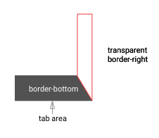
- PROS: very minimal styling and very easy to understand.
- CONS: very limited in terms of customisation (i.e. can't add border to the tab)
.tabs {

  display: flex;

  flex-direction: row;

}

.tab {

    height: 0;

    width: 120px;

    border-bottom: 50px solid #CCCCCC;

    border-right: 20px solid transparent;

    border-top-left-radius: 5px;

    box-sizing: border-box;

    display: block;

}

.tab:not(:first-child) {

    margin-left: -10px;

    z-index: 0;

}

.tab .label{

  padding: 15px;

  text-align: center;

  color: #444444;

}

.active {

  border-bottom: 50px solid #444444;

  z-index: 10;

}

.active .label{

  color: #ffffff;

}
<div class="tabs">
<div class="tab active"><div class="label">TAB 1</div></div>
<div class="tab"><div class="label">TAB 2</div></div>
<div class="tab"><div class="label">TAB 3</div></div>
</div>Responsive CSS Trapezoid Shape
There are many different ways to create the trapezoid shape and each have their own benefits and downfalls.
Below is a comprehensive list of the various ways and all should be responsive.
CSS Border
The most well supported of all the answers. It is supportwed way back to IE and across all other browsers both on the desktop and mobile.
- border - CSS | MDN
#trapezoid {

  border-left: 20vw solid red;

  border-top: 5vw solid transparent;

  border-bottom: 5vw solid transparent;

  width: 0;

  height: 10vw;

}
<div id="trapezoid"></div>Related Topics
What's the Purpose of Using CSS Browser Reset Code
How to Center Absolute Div Horizontally Using CSS
Ff3/Windows CSS Z-Index Problem with Youtube Player
Internet Explorer 8 Shows Gradient Instead of Background Image
Fill Element from Center on Hover
Fixed Header Position in Bootstrap 3 Modal
Bootstrap Modal Window Inside Another Div
How to Recreate Perspective-Origin Effect by Transforming Child Elements
How to Change CSS Class for the Inputfield and Label When Validation Fails
What CSS3 Features Still Need Vendor Prefixes
Div Height 100% and Expands to Fit Content
Vertically Center Rotated Text with CSS
Wordpress Loop Posts in Bootstrap 3 Grid Layout
How to Select Multiple Elements That Are Children of Given Element
Multiple CSS Keyframe Animations Using Transform Property Not Working