How does flex-wrap work with align-self, align-items and align-content?
Short Answer
Although the flex-wrap property seems pretty basic – it controls whether flex items can wrap – it actually has a wide-ranging impact on the entire flexbox layout.
The flex-wrap property determines the type of flex container you will use.
flex-wrap: nowrapcreates a single-line flex containerflex-wrap: wrapandwrap-reversecreate a multi-line flex container
The align-items and align-self properties work in both single- and multi-line containers. However, they can only have an effect when there's free space in the cross axis of the flex line.
The align-content property works only in multi-line containers. It is ignored in single-line containers.
Explanation
The flexbox specification provides four keyword properties for aligning flex items:
align-itemsalign-selfalign-contentjustify-content
To understand the functions of these properties it's important to first understand the structure of a flex container.
Part 1: Understanding the Main Axis and Cross Axis of a Flex Container
The X and Y Axes
A flex container works in two directions: x-axis (horizontal) and y-axis (vertical).

Source: Wikipedia
The child elements of a flex container – known as "flex items" – can be aligned in either direction. (Ignore the z axis in the image above. It doesn't apply here.)
This is flex alignment at its most fundamental level.
The Main and Cross Axes
Overlaying the x and y axes are, in flex layout, the main and cross axes.
By default, the main axis is horizontal (x-axis), and the cross axis is vertical (y-axis). That's the initial setting, as defined by the flexbox specification.

Source: W3C
However, unlike the x and y axes, which are fixed, the main and cross axes can switch directions.
The flex-direction Property
In the image above, the main axis is horizontal and the cross axis is vertical. As mentioned earlier, that's an initial setting of a flex container.
However, these directions can be easily switched with the flex-direction property. This property controls the direction of the main axis; it determines whether flex items align vertically or horizontally.
From the spec:
5.1. Flex Flow Direction: the
flex-direction
propertyThe
flex-directionproperty specifies how flex items are placed in
the flex container, by setting the direction of the flex container’s
main axis. This determines the direction in which flex items are laid
out.
There are four values for the flex-direction property:
/* main axis is horizontal, cross axis is vertical */
flex-direction: row; /* default */
flex-direction: row-reverse;

/* main axis is vertical, cross axis is horizontal */
flex-direction: column;
flex-direction: column-reverse;
The cross axis is always perpendicular to the main axis.
Part 2: Flex Lines
Within the container, flex items exist in a line, known as a "flex line".
A flex line is a row or column, depending on flex-direction.
A container can have one or more lines, depending on flex-wrap.
Single-Line Flex Container
flex-wrap: nowrap establishes a single-line flex container, in which flex items are forced to stay in a single line (even if they overflow the container).
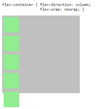
The image above has one flex line.
flex-container {
  display: flex;
  flex-direction: column;
  flex-wrap: nowrap; /* <-- allows single-line flex container */
  width: 250px;
  height: 250px;
  background-color: silver;
}
flex-item {
  flex: 0 0 50px;
  width: 50px;
  margin: 5px;
  background-color: lightgreen;
}
<flex-container>
<flex-item></flex-item>
<flex-item></flex-item>
<flex-item></flex-item>
<flex-item></flex-item>
<flex-item></flex-item>
</flex-container>flexbox and wrap property
You have quite a few things not quite right here. First, you're mixing old properties with new properties (display: -webkit-box is from the 2009 draft, but -webkit-flex-flow is from the standard draft).
Second, none of the 2009 Flexbox implementations support box-lines: multiple, which is required for enabling wrapping. Sadly, nearly all mobile devices support only the 2009 draft. Firefox versions that support the modern specification currently do not support wrapping either (flex-flow and flex-wrap are supported properties, but the values pertaining to wrapping are not supported).
Third, you've got justify-content: space-around, but its 2009 counterpart is set to box-pack: center. Center is center in all drafts.
http://cssdeck.com/labs/ccamtvl5
.flex-container {
  display: -ms-flexbox;
  display: -webkit-flex;
  -webkit-flex-wrap: wrap;
  -ms-flex-wrap: wrap;
  flex-wrap: wrap;
  -ms-flex-line-pack: end;
  -webkit-align-content: flex-end;
  align-content: flex-end;
  -ms-flex-pack: distribute;
  -webkit-justify-content: space-around;
  justify-content: space-around;
  height: 100%;
}
@supports (flex-wrap: wrap) { /* hide from incomplete Firefox versions */
  .flex-container {
    display: flex;
  }
}
Update: Wrapping now works in Firefox as of version 28, but only when using the modern properties (not the old prefixed ones like display: -moz-box).
How to specify when element should wrap with flexbox?
You could use min-width on the blocks. This means they will fully stretch, but when the screen size limits them to being 200px in this example, that breakpoint will lead them to wrap, and their width will never go below 200px.
Another option is to just apply flex-wrap: wrap; on that specific breakpoint you want with a media-query.
For further control, you could also look into flex-basis: https://developer.mozilla.org/en-US/docs/Web/CSS/flex-basis
EDIT: Responsive image
Genereally it's good to include this line of code on most images: max-width: 100%; height: auto; as this will make images auto-responsive. max-width: 100%; forces the image to never overflow from its container, and height: auto; adjusts the images height so its aspect ratio is correct. Try dragging the screen size and you will see its effect :)
.flex-row {
  display: flex;
  flex-wrap: wrap;
}

.block1,
.block2 {
  min-width: 200px;
}

.block2 img {
  max-width: 100%;
  height: auto;
}
<div class='flex-row'>
<div class="block1">
<h2>Some title</h2>
<p>Some text</p>
</div>
<div class="block2">
<img src="http://via.placeholder.com/350x350" />
</div>
</div>Flexbox: how to wrap a flex item once the width of another flex item is 0?
You can approximate this by using a big flex-shrink on the first container. This will give more priority to the first container for the shrink effect.
.wrapper {
  display: flex;
  justify-content: space-between;
  border: 1px solid red;
  max-width: 600px;
}

.flex-wrapper {
  display: flex;
  min-width: 0;
  flex-shrink:99999;
}

.header {
  overflow: hidden;
  display: inline-block;
  text-overflow: ellipsis;
  white-space: nowrap;
  line-height: 24px;
}

.actions {
  display: flex;
  flex-wrap: wrap;
  column-gap:10px; /* you can use gap with flexbox*/
}
<div class="wrapper">
<div class="flex-wrapper">
<div class="header">
Lorem ipsum dolar sit amet constructeur
</div>
</div>
<div class="actions">
<button>
button1
</button>
<button>
button2
</button>
<button>
button3
</button>
<button>
button4
</button>
</div>
</div>CSS: How can I ensure flex items wrap to the next line--after the first item--at a certain screen width?
Use the media query to apply flex-wrap:wrap on the flex container and flex:0 0 100% on the first child.
This way you don't need additional HTML markup, and no need to change anything on your code but the media query.
@media (max-width: 800px) {
  .cart-cb{
    flex-wrap:wrap;
  }
  .cart-cb div{
    flex: 0 0 100%;
    text-align:right;
  }
}
https://jsfiddle.net/378b4yLy/
Better way to set distance between flexbox items
- Flexbox doesn't have collapsing margins.
- Flexbox doesn't have anything akin to
border-spacingfor tables (edit: CSS propertygapfulfills this role in newer browsers, Can I use)
Therefore achieving what you are asking for is a bit more difficult.
In my experience, the "cleanest" way that doesn't use :first-child/:last-child and works without any modification on flex-wrap:wrap is to set padding:5px on the container and margin:5px on the children. That will produce a 10px gap between each child and between each child and their parent.
Demo
.upper {
  margin: 30px;
  display: flex;
  flex-direction: row;
  width: 300px;
  height: 80px;
  border: 1px red solid;

  padding: 5px; /* this */
}

.upper > div {
  flex: 1 1 auto;
  border: 1px red solid;
  text-align: center;

  margin: 5px;  /* and that, will result in a 10px gap */
}

.upper.mc /* multicol test */ {
  flex-direction: column;
  flex-wrap: wrap;
  width: 200px;
  height: 200px;
}
<div class="upper">
<div>aaa<br/>aaa</div>
<div>aaa</div>
<div>aaa<br/>aaa</div>
<div>aaa<br/>aaa<br/>aaa</div>
<div>aaa</div>
<div>aaa</div>
</div>
<div class="upper mc">
<div>aaa<br/>aaa</div>
<div>aaa</div>
<div>aaa<br/>aaa</div>
<div>aaa<br/>aaa<br/>aaa</div>
<div>aaa</div>
<div>aaa</div>
</div>First-child and second in Flexbox
Following way you can achieve above layout using flexbox
First you need to create one parent div which have 3 children
<div class="row">
  <div class="child child1">80%</div>
  <div class="child child2">20%</div>
  <div class="w-100">full Row</div>
</div>
Then we are going to provide css to layout our elements, so we will give flex and flex-wrap propertied to parent div.row, when we set flex-wrap property to wrap it will place child div to new row when there is no space available which child exactly required
Here is the css that will place our elements
 .row {
    display: flex;
    flex-wrap: wrap;
  }
  .child1 {
    flex: 0 0 80%;
  }
  .child2 {
    flex: 0 0 20%;
  }
  .w-100 {
    flex: 0 0 100%;
    background: yellow;
  }
Here we are using css flex property to define width of the child element, here is the overview of flex property
CodeSandbox
Related Topics
CSS Media Type: How to Load CSS for Mobile
CSS "D" Path - Attribute Doesn't Work in Safari, Firefox
Invalid Property Value on Background-Image
How to Create Custom Scrollbar for Mozilla Firefox with CSS
Jekyll Site Works Locally But Not on Github Pages
Disable Zoom on a Div, But Allow Zoom on the Page (An Alternate Div)
How to Reset or Override Ie CSS Filters
Css3 Columns - Force Non Breaking/Splitting Element
CSS Vertically Centering a Fixed Positioning Div
Any Way to Use CSS Variables in SASS Functions
How to Add a CSS Stylesheet in Fxml
How to Unskew Background Image in Skewed Layer (Css)
Is There a Way via CSS to Set the Image Height to the Line-Height
CSS Transform: Scale Does Not Change Dom Size
Which CSS Selector Can Be Used to Select a Flex Box Item in Wrapped State
How to Make Div Background Color Transparent in CSS
How to Use the Matrix Transform and Other Transform CSS Properties
Bootstrap 3:Vertically Center Navigation Links When Logo Increasing the Height of Navbar