How to prevent image flash when transitioning with blur?
An idea is to avoid the blur to go to 0, you may consider a value close like 0.5px
$(window).on('load', function(event) { setTimeout(function() { $('.sec').addClass('active') }, 1000)}).sec { margin: 0 auto; width: 700px; height: 500px; background-image: url(http://placekitten.com/700/500); background-size: cover; filter: blur(20px);}
.sec.active { filter: blur(0.5px); transition: all 3s ease, transform 1s ease-out;}<script src="https://ajax.googleapis.com/ajax/libs/jquery/2.1.1/jquery.min.js"></script><div class="sec">
</div>CSS transition effect makes image blurry / moves image 1px, in Chrome?
2020 update
- If you have issues with blurry images, be sure to check answers from below as well, especially the
image-renderingCSS property. - For best practice accessibility and SEO wise you could replace the background image with an
<img>tag using object-fit CSS property.
Original answer
Try this in your CSS:
.your-class-name {
    /* ... */
    -webkit-backface-visibility: hidden;
    -webkit-transform: translateZ(0) scale(1, 1);
}
What this does is it makes the division to behave "more 2D".
- Backface is drawn as a default to allow flipping things with rotate
and such. There's no need to that if you only move left, right, up, down, scale or rotate (counter-)clockwise. - Translate Z-axis to always have a zero value.
- Chrome now handles
backface-visibilityandtransformwithout the-webkit-prefix. I currently don't know how this affects other browsers rendering (FF, IE), so use the non-prefixed versions with caution.
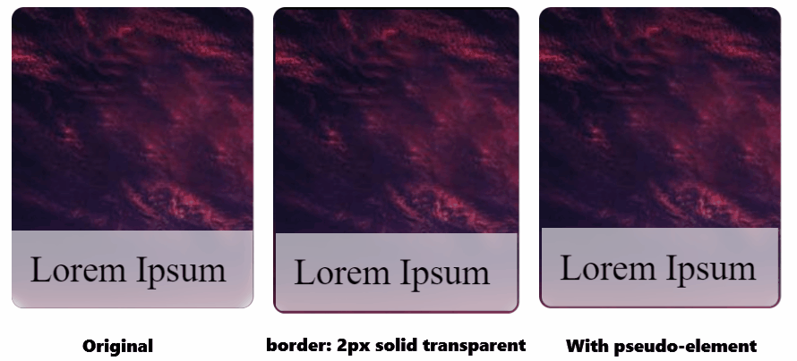
Flickering backdrop filter blur on scaling
You can try to using border: 2px solid transparent; for the entire card, this will prevent flickering, but you will get a border instead of a flickering effect. If you try to change the color of the border, you will get back a flikering effect.
Another way, more complicated, you will need to add a pseudo-element to the card-details class, then move backdrop-filter, background-color to the pseudo-element.
UPDATED
It also works with padding: 2px instead of border: 2px solid transparent;
body {
  display: flex;
  justify-content: center;
  gap: 1rem;
}

.card,
.card2,
.card3 {
  width: 200px;
  height: 250px;
  border-radius: 10px;
  display: flex;
  flex-direction: column;
  justify-content: flex-end;
  overflow: hidden;
  background-image: url('https://cdn.pixabay.com/photo/2015/04/23/22/00/tree-736885__480.jpg');
  /* margin: 25px; */
  transition: transform 0.5s;
  will-change: transform;
}

.card2 {
  border: 2px solid transparent; /* trick */
}

.card:hover,
.card2:hover,
.card3:hover {
  transform: scale(1.05);
}

.card-details {
  background-color: rgb(255 255 255/60%);
  backdrop-filter: blur(5px);
  padding: 15px;
  font-size: 30px;
}

.card-details3 {
  padding: 15px;
  border-radius: 0 0 8px 8px;
  border: 2px solid transparent; /* trick */
  font-size: 30px;
  position: relative;
}

.card-details3::after {
  content: '';
  position: absolute;
  inset: 0;
  background-color: rgb(255 255 255/60%);
  backdrop-filter: blur(5px);
  border-radius: inherit;
  z-index: -1;
}
<div class="card">
<div class="card-details">Lorem Ipsum</div>
</div>
<div class="card2">
<div class="card-details">Lorem Ipsum</div>
</div>
<div class="card3">
<div class="card-details3">Lorem Ipsum</div>
</div>Prevent flicker on webkit-transition of webkit-transform
The solution is mentioned here: iPhone WebKit CSS animations cause flicker.
For your element, you need to set
-webkit-backface-visibility: hidden;
Making text show up on hover and blur effect blinking fix
EDIT: This now looks great in Chrome
I don't think it's entirely possible to get a super clean transition when using webkit blur. I've had a lot of rendering issues and glitches when using it before. It's a resource hog too when used on a lot of elements. My advice to change your easing to linear and target only the blur. That should tighten it up a little bit.
img{
    -webkit-transition: -webkit-filter 0.5s linear;
    -moz-transition: -webkit-filter 0.5s linear;
    -o-transition: -webkit-filter 0.5s linear;
    -ms-transition: -webkit-filter 0.5s linear;
    transition: -webkit-filter 0.5s linear;
}
As for the text fade in. You'll need to add in an element that is initially opacity:0; but then changed to opacity:1; when the parent block is hovered. Initial HTML changed to this:
<div class='block'>
  <img src="https://www.nasa.gov/sites/default/files/styles/image_card_4x3_ratio/public/thumbnails/image/leisa_christmas_false_color.png?itok=Jxf0IlS4">
  <span>Hey there</span>
</div>
And the new CSS
/* CSS used here will be applied after bootstrap.css */
body {
  background-color: yellow;
}

img {
  -webkit-transition: -webkit-filter 0.5s linear;
  transition: -webkit-filter 0.5s linear;
}

.block {
  position: relative;
  width: 400px;
}
.block img {
  width: 100%;
}
.block span {
  opacity: 0;
  -webkit-transition: all .3s;
  transition: all .3s;
  color: white;
  position: absolute;
  top: 50%;
  -webkit-transform: translateY(-50%);
          transform: translateY(-50%);
  text-align: center;
  left: 0;
  right: 0;
}
.block:hover > span {
  opacity: 1;
}

img:hover {
  -webkit-filter: blur(4px);
}
Example here
http://codepen.io/jcoulterdesign/pen/58d613e80e4a768cc9e54aa1e7aaa0af
Weird CSS3 Transition (flickering)
I got rid of the flickering. Add «-webkit-backface-visibility: hidden;» to the elements you are transitioning. Voilà!
Related Topics
Get Child Element to Respect Parent Element Width & Height
How to Replace The Web Font with Svg Icon in CSS(Font Awesome)
Long Word Wrap in Nested Tables
Firefox Parsing 4 Digit Hex Color Values as Rgba
CSS Background Image Not Appearing in Safari
Can't Get My Div to Stay Fixed with Layout
Stopping Content from Getting Pushed Down Due to Overlap in Bootstrap
How to Prevent Image Flash When Transitioning with Blur
CSS Can't Seem to Set Height to 100% of Parent Container
Less CSS Compiler. Unable to Use Darken Property
Displaying Third Tier Submenus Properly with CSS Only Menu
Auto Grid Columns, Without Wrapping to Next Row