How can I place three buttons in the same row at the left, middle and right in a fluid-width container?
In my opinion you can do this with a stock bootstrap environment like this:
<div class="row-fluid">
  <div class="span4 text-left"><a href="#" class="btn">Btn1</a></div>
  <div class="span4 text-center"><a href="#" class="btn">Btn2</a></div>
  <div class="span4 text-right"><a href="#" class="btn">Btn3</a></div>
</div>
This makes three <div>'s that span4 columns that make up the twelve column grid for bootstrap.
You don't need to add any extra CSS as those .text-left, right and center classes ship with bootstrap.
Left, center, right three buttons in bootstrap row
Try this simplest solution
HTML
<!DOCTYPE html>
<html>
    <head>
        <!-- meta -->

        <!-- refs -->
        <link rel="stylesheet" type="text/css" href="style.css">

        <!-- Latest compiled and minified CSS -->
<link rel="stylesheet" href="https://maxcdn.bootstrapcdn.com/bootstrap/3.3.7/css/bootstrap.min.css" integrity="sha384-BVYiiSIFeK1dGmJRAkycuHAHRg32OmUcww7on3RYdg4Va+PmSTsz/K68vbdEjh4u" crossorigin="anonymous">

<!-- Optional theme -->
<link rel="stylesheet" href="https://maxcdn.bootstrapcdn.com/bootstrap/3.3.7/css/bootstrap-theme.min.css" integrity="sha384-rHyoN1iRsVXV4nD0JutlnGaslCJuC7uwjduW9SVrLvRYooPp2bWYgmgJQIXwl/Sp" crossorigin="anonymous">

<!-- Latest compiled and minified JavaScript -->
<script src="https://maxcdn.bootstrapcdn.com/bootstrap/3.3.7/js/bootstrap.min.js" integrity="sha384-Tc5IQib027qvyjSMfHjOMaLkfuWVxZxUPnCJA7l2mCWNIpG9mGCD8wGNIcPD7Txa" crossorigin="anonymous"></script>
        <!-- scripts -->

        <title>The title</title>
    </head>
    <body>

<!-- MASTER CONTAINER -->
<div class="container-fluid page-container">

    <!-- divide main content into three sections left, middle, right -->
    <!-- top section container -->
    <div class="row top-container">
        <!-- top section -->
        <div class="col-sm-12">

        </div>
    </div>

    <div class="row">
        <!-- LEFT CONTAINER (vertical)       -->
        <!-- left side -->
        <div class="col-sm-1">
            <button class="btn btn-default btn-block" type="button">Save Trick</button>
        </div

        <!-- right side -->
        <div class="col-sm-1">
            <button class="btn btn-default btn-block" type="button">Gold</button>
            <button class="btn btn-default btn-block" type="button">Black</button>
            <button class="btn btn-default btn-block" type="button">Blue</button>
            <button class="btn btn-default btn-block" type="button">Green</button>
            <button class="btn btn-default btn-block" type="button">White</button>
        </div>

        <div class="col-sm-8">
            <!-- MIDDLE CONTAINER (horizontal)  -->
            <div class="middle-container">
                <div class="middle-top"><center>
                    <button class="btn btn-default" type="button">Approach</button>
                    <button class="btn btn-default" type="button">Street/Half Pipe</button>
                    <button class="btn btn-default" type="button">Coach Assisted</button></center>
                </div>

                <div class="middle-video">
    4
                </div>

                <div class="middle-textinput">
    5
                </div>

                <div class="middle-bottom">
    6
                </div>
            </div>
        </div>

        <!-- RIGHT CONTAINER (vertical)     -->
        <div class="col-sm-1">
            <button class="btn btn-default btn-block" type="button">Gold</button>
            <button class="btn btn-default btn-block" type="button">Black</button>
            <button class="btn btn-default btn-block" type="button">Blue</button>
            <button class="btn btn-default btn-block" type="button">Green</button>
            <button class="btn btn-default btn-block" type="button">White</button>
        </div

        <!-- right side -->
        <div class="col-sm-1">
            <button class="btn btn-default btn-block" type="button">Gold</button>
            <button class="btn btn-default btn-block" type="button">Black</button>
            <button class="btn btn-default btn-block" type="button">Blue</button>
            <button class="btn btn-default btn-block" type="button">Green</button>
            <button class="btn btn-default btn-block" type="button">White</button>
        </div>

        </div>

    </div>
</div>

    </body>
</html>
How to display 3 buttons on the same line in css
Here is the Answer
CSS
#outer
{
    width:100%;
    text-align: center;
}
.inner
{
    display: inline-block;
}
HTML
<div id="outer">
  <div class="inner"><button type="submit" class="msgBtn" onClick="return false;" >Save</button></div>
  <div class="inner"><button type="submit" class="msgBtn2" onClick="return false;">Publish</button></div>
  <div class="inner"><button class="msgBtnBack">Back</button></div>
</div>
Fiddle
3 column fluid layout with expanding middle div based on panel positions
You need to play with "position: absolute" and add two more classList.toggle functions
$(document).ready(function () {
  var mwContent = document.querySelector('#mw-content');          // !!
  var lsToggleBtn = document.querySelector('.ls-toggle');
  var lsSidebar = document.querySelector('#left-sidebar');
  var rsToggleBtn = document.querySelector('.rs-toggle');
  var rsSidebar = document.querySelector('#right-sidebar');

  lsToggleBtn.addEventListener('click', function () {
    lsToggleBtn.classList.toggle('is-closed');
    lsSidebar.classList.toggle('is-closed');
    mwContent.classList.toggle('ls-pos');         // here
  });

  rsToggleBtn.addEventListener('click', function () {
    rsToggleBtn.classList.toggle('is-closed');
    rsSidebar.classList.toggle('is-closed');
    mwContent.classList.toggle('rs-pos');         // here
  });
});
body {
background-color: lightslategrey;
margin: 0;
overflow: hidden;
}
.red {
background-color: lightcoral;
}
.green {
background-color: lightgreen;
}
.grey {
background-color: lightslategray;
}
* {
box-sizing: border-box;
}
.d-flex {
display: flex;
position: relative;
}
.ls-toggle,
.rs-toggle {
cursor: pointer;
transition: 0.5s;
}
#left-sidebar {
position: absolute;
left: 0;
width: 250px;
height: 100vh;
transition: 0.5s;
}
#right-sidebar {
position: absolute;
right: 0;
width: 250px;
height: 100vh;
transition: 0.5s;
}
#left-sidebar.is-closed {
transform: translateX(-80%);
}
#right-sidebar.is-closed {
transform: translateX(80%);
}
.ls-top,
.rs-top {
display: flex;
width: 100%;
height: 35px;
align-items: center;
justify-content: flex-end;
background-color: lightslategrey;
}
.rs-top {
justify-content: flex-start;
}
#mw-content {
position: absolute;
right: 250px;
left: 250px;
height: 100vh;
transition: 0.5s;
}
.ls-pos {
left: 50px !important;
transition: 0.5s;
}
.rs-pos {
right: 50px !important;
transition: 0.5s;
}<script src="https://cdnjs.cloudflare.com/ajax/libs/jquery/3.3.1/jquery.min.js"></script>
<div class="d-flex">
<div id="left-sidebar" class="col red">
<div class='ls-top grey'>
<button class="ls-toggle"><i class="fas fa-angle-left fa-2x"></i></button>
</div>
</div>
<div id="mw-content" class="col green">
<h3> Main Window Content.</h3>
</div>
<div id="right-sidebar" class="col red">
<div class='rs-top grey'>
<button class="rs-toggle"><i class="fas fa-angle-right fa-2x"></i></button>
</div>
</div>
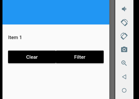
</div>How to fill the row with two buttons?
The main thing will be
        ListTile(
          title: Row(
            children: <Widget>[
              Expanded(child: RaisedButton(onPressed: () {},child: Text("Clear"),color: Colors.black,textColor: Colors.white,)),
              Expanded(child: RaisedButton(onPressed: () {},child: Text("Filter"),color: Colors.black,textColor: Colors.white,)),
            ],
          ),
        )
Complete Code
class SO extends StatelessWidget {
  @override
  Widget build(BuildContext context) {
    return Scaffold(
      appBar: AppBar(),
      drawer: Drawer(
        child: ListView(
          padding: EdgeInsets.zero,
          children: <Widget>[
            DrawerHeader(
              child: Text('Drawer Header'),
              decoration: BoxDecoration(
                color: Colors.blue,
              ),
            ),
            ListTile(
              title: Text('Item 1'),
              onTap: () {
                // Update the state of the app
                // ...
              },
            ),
            ListTile(
              //contentPadding: EdgeInsets.all(<some value here>),//change for side padding
              title: Row(
                children: <Widget>[
                  Expanded(child: RaisedButton(onPressed: () {},child: Text("Clear"),color: Colors.black,textColor: Colors.white,)),
                  Expanded(child: RaisedButton(onPressed: () {},child: Text("Filter"),color: Colors.black,textColor: Colors.white,)),
                ],
              ),
            )
          ],
        ),
      ),
    );
  }
}
How to align button right in a flex container?
Floats do not work in a flex container
Use align-self:flex-end instead
.faq {
  padding: 12px 20px;
  display: block;
  box-sizing: border-box;
  width: 50%;
  margin: auto;
  margin-top: 30px;
}

.outerDiv {
  display: flex;
  flex-direction: column;
  justify-content: center;
  align-items: center;
  text-align: center;
  margin-top: 20px;

  background-color: yellow;
}

.save {
   align-self:flex-end;
  background-color: red;
}
<div class="outerDiv">
<h2>New FAQ</h2>
<input type="text" class="faq">
<br>
<button class="save" mat-raised-button color="primary">Primary</button>
</div>Center one and right/left align other flexbox element
Below are five options for achieving this layout:
- CSS Positioning
- Flexbox with Invisible DOM Element
- Flexbox with Invisible Pseudo-Element
- Flexbox with
flex: 1 - CSS Grid Layout
Method #1: CSS Positioning Properties
Apply position: relative to the flex container.
Apply position: absolute to item D.
Now this item is absolutely positioned within the flex container.
More specifically, item D is removed from the document flow but stays within the bounds of the nearest positioned ancestor.
Use the CSS offset properties top and right to move this element into position.
li:last-child { position: absolute; top: 0; right: 0; background: #ddd;}ul { position: relative; padding: 0; margin: 0; display: flex; flex-direction: row; justify-content: center; align-items: center;}li { display: flex; margin: 1px; padding: 5px; background: #aaa;}p { text-align: center; margin-top: 0;}span { background-color: aqua;}<ul> <li>A</li> <li>B</li> <li>C</li> <li>D</li></ul><p><span>true center</span></p>Bootstrap 4, How do I center-align a button?
In Bootstrap 4 one should use the text-center class to align inline-blocks.
NOTE: text-align:center; defined in a custom class you apply to your parent element will work regardless of the Bootstrap version you are using. And that's exactly what .text-center applies.
<link rel="stylesheet" href="https://stackpath.bootstrapcdn.com/bootstrap/4.1.3/css/bootstrap.min.css">
<div class="container">  <div class="row">    <div class="col text-center">      <button class="btn btn-default">Centered button</button>    </div>  </div></div>
Related Topics
Sass Importing Without Compiling
Mvc: I Have Deployed My Application, But CSS Only Works When I Log In
How to Position a Background Image Relative to The Centre of an Element
Sass/Scss Object Key Value Loop
Rails: Precompiled Assets Missing Node Modules
Applying Borders to a Single Table Cell When Using Border-Collapse
CSS Issue Ngx-Table Angular2 Swimlane
Media Query to Differentiate Desktop from iPad in Landscape Mode
Why Backdrop Filter in Firefox Don't Work
Probleme CSS3 Scale Transform and Overflow:Hidden on Safari
How to Resolve The CSS Warnings for Browser Specific Selectors in Bootstrap 3
Page Styles Break When I Change Styles in Chrome Devtools with Webpack Hmr
Vertically Align Text to The Bottom of The Box
Firefox Add's 2Px Padding in a Submit Button
CSS: Link and: Visited Pseudo-Classes - Are Web Browsers Adhering to The Spec
Finding If The Current Working Browser Is Safari via CSS or JavaScript