Is it possible to make a hard-edged gradient on a large element?
I've found an alternative using gradients to achieve the same effect, however I think it should be possible to achieve this with 1 gradient, so I consider this a work-around.
The trick is to use multiple backgrounds with 2 gradients that don't change color. Then just define background-size to achieve the hard edge effect. See the working snippet:
div { height: 5000px; background-repeat: no-repeat; margin-bottom: 1em; background-image: linear-gradient(#000, #000), linear-gradient(#0f0, #0f0); background-size: 100% 20px, 100%;}div:first-child { height: 100px;}<div></div><div></div>Solid gradients not really solid? Don't have crisp edges at color stops
As @Mr Lister mentioned in comments, looks like a bug with Chrome. Finding a Mac machine to see if it's the same with safari too. That way I can raise a bug for both.
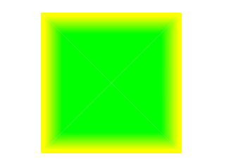
Safari linear gradient
This is a bug in safari that has to do with the way browsers interpolate between gradients.
A common answer is to do what you did, using rgba(255, 255, 255, 0), however, Safari still interprets this as white and leads to that unwanted additional of white to the gradient. A fix is to use the same color you are transitioning from (coral in this case) and set it to transparent, which for coral would be rgba(255, 127, 80, 0). The example below uses the code from your pen with the fix applied for safari.
See this stack for more
* {
  margin: 0;
}

.gradient-container {
  background-color: coral;
  width: 200px;
  height: 30px;
  position: relative;
  display: flex;
  align-items: center;
}

.elements {
  padding: 0 10px;
  display: flex;
  column-gap: 10px;
  overflow-x: hidden;
}

.elements p {
  color: #fff;
  white-space: nowrap;
}

.gradient {
  position: absolute;
  top: 0;
  left: 0;
  width: 100%;
  height: 100%;
  /*RGBA equivalent to coral html color with alpha set to 0 - fixes safari interpolation bug*/
  background: linear-gradient(to right, rgba(255, 127, 80, 0) calc(100% - 50px), coral);
}
<div class="gradient-container">
<div class="elements">
<p>Element 1</p>
<p>Element 2</p>
<p>Element 3</p>
</div>
<div class="gradient"></div>
</div>Blurry linear gradient stops in chrome
Not a fix to the problem, just a workaround… you can use multiple gradients as multiple backgrounds of a small enough size as to not trigger the problem (< ~300px seems to do it). Combine with background-size and background-position and you get something that is ugly, but works:
background-image:
    linear-gradient(to bottom, #383937 0, #001500 35px, #ffffff 35px, #b0b0b0 150px),
    linear-gradient(to bottom, #963 0, #abc 150px);
background-size:
    100px 150px,
    100px 150px;
background-position:
    0 0,
    0 150px;
background-repeat: no-repeat;
See JSFiddle for demo.
Linear two color smooth & sharp gradient using SVG
You can achieve this with two path elements in SVG and then give them the fill as required.
svg path#green { fill: green;}svg path#red { fill: red;}div.bg { position: relative; height: 100vh; width: 100%;}div.bg svg { position: absolute; height: 100%; width: 100%;}<div class='bg'> <svg viewBox='0 0 100 100' preserveAspectRatio='none'> <path d='M0,0 L100,100 100,0z' id='green' /> <path d='M0,0 L0,100 100,100z' id='red' /> </svg></div>How to create a gradient fill on the inner edge of an object with Raphael?
In theory it should be possible to do this by slicing the graph into four triangles.

Each triangle can then be filled with a gradient that is mostly your solid color but at one end it turns into your edge color. By setting the right angle on the gradient you can make it look like only the edges on the graph have a different color.
I've created the rectangle above using the following code.
var slice1 = paper.path("M200 200L100 100L300 100").attr({
    "fill": "90-#0f0:70-#ff0:95",
});

var slice2 = paper.path("M200 200L300 100L300 300").attr({
    "fill": "0-#0f0:70-#ff0:95",
});

var slice3 = paper.path("M200 200L300 300L100 300").attr({
    "fill": "270-#0f0:70-#ff0:95",
});

var slice4 = paper.path("M200 200L100 300L100 100").attr({
    "fill": "180-#0f0:70-#ff0:95",
});
Your case will be a bit more complex though. You will have to first find the middle of the graph to be able to slice it into triangles. Then you need to find the angle for each of the gradients.
Create a slanted edge to a div
You can use a skewed pseudo element to make the slanted solid background of your element. This way, the text won't be affected by the transform property.
The transform origin property allows the pseudo element to be skewed from the right bottom corner and the overflowwing parts are hidden with overflow:hidden;.
The pseudo element is stacked behind the content of the div with a negative z-index:
div {  position: relative;  display: inline-block;  padding: 1em 5em 1em 1em;  overflow: hidden;  color: #fff;}
div:after {  content: '';  position: absolute;  top: 0;  left: 0;  width: 100%;  height: 100%;  background: #000;  -webkit-transform-origin: 100% 0;  -ms-transform-origin: 100% 0;  transform-origin: 100% 0;  -webkit-transform: skew(-45deg);  -ms-transform: skew(-45deg);  transform: skew(-45deg);  z-index: -1;}
body {  background: url('https://farm3.staticflickr.com/2878/10944255073_973d2cd25c.jpg');  background-size: cover;}
<div>slanted div text</div><div> slanted div text<br/> on several lines<br/> an other line</div><div>wider slanted div text with more text inside</div>Related Topics
How to Change the CSS of Color of Select2 Tags
@Font-Face Being Ignored by IE7
Why Doesn't Max-Width Override Min-Width
How to Set Responsive Image's Max Width (Bootstrap 4)
Css: What This Asterisk (*) Does
Line Height Default Value If Font Size Is 100%
React Js: How to Animate Conditionally Rendered Components
How to Autoscale the Font Size to Fit the Contents of a Div
Macos Chrome Horizontal Scrollbar Not Disappearing
Can It Flexbox? Chat Window with Input at the Bottom, Chats Scrolling Up
Change Only One of Multiple Backgrounds on Hover
How to Make a Hard-Edged Gradient on a Large Element