How to left align bootstrap 3 dropdown menu?
Adding this style element to the dropdown <ul> will align the dropdown to the left side of the menu item:
left:0;
See this Bootply which targets the .dropdown-menu.pull-left and adds a left:0;.
This should solve your problem.
Update
I see that Bootstrap has deprecated pull-right and pull-left as of Bootstrap 3.1.0. Use dropdown-menu-left class to use built-in Bootstrap css to align the dropdown on the left edge so you don't need extra CSS. See this updated Bootply
bootstrap dropdown bubble align right (not push-right)
Bootstrap 5+ (Update June 2022)
dropdown-menu-right has been replaced with dropdown-menu-end
<div class="dropdown-menu dropdown-menu-end">
    STUFF
</div>
https://getbootstrap.com/docs/5.2/components/dropdowns/#menu-alignment
Bootstrap 3.1+
Adding the class .dropdown-menu-right to the same div containing the class dropdown-menu:
<div class="dropdown-menu dropdown-menu-right">
    STUFF
</div>
http://getbootstrap.com/components/#dropdowns-alignment
Bootstrap 2.3 & 3.0
Add the class .pull-right to the same div containing the class dropdown-menu
<div class="dropdown-menu pull-right">
    STUFF
</div>
This seems to work for me using bootstrap 3.0
Left aligning icons in a Bootstrap 3 dropdown menu
If you don't want to give margin-left:-15px then you can also decrease padding-left of a element like this:
.btn-group .dropdown-menu > li > a{
  padding-left:5px;
}
.btn-group .dropdown-menu > li > a{ padding-left:5px;}<link href="https://netdna.bootstrapcdn.com/bootstrap/3.0.2/css/bootstrap.min.css" rel="stylesheet"/><script src="https://ajax.googleapis.com/ajax/libs/jquery/2.1.1/jquery.min.js"></script><script src="https://netdna.bootstrapcdn.com/bootstrap/3.0.2/js/bootstrap.min.js"></script>
<div class="btn-group"> <button type="button" class="btn btn-default dropdown-toggle" data-toggle="dropdown">Action <span class="caret"></span> </button> <ul class="dropdown-menu" role="menu"> <li><a href="#"><i class="glyphicon glyphicon-tint"></i> Item 1</a></li> </ul></div>Bootstrap: Position of dropdown menu relative to navbar item
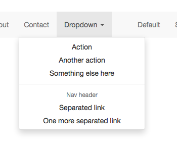
This is the effect that we're trying to achieve:

The classes that need to be applied changed with the release of Bootstrap 3.1.0 and again with the release of Bootstrap 4. If one of the below solutions doesn't seem to be working double check the version number of Bootstrap that you're importing and try a different one.
Before v3.1.0
You can use the pull-right class to line the right hand side of the menu up with the caret:
<li class="dropdown">
  <a class="dropdown-toggle" href="#">Link</a>
  <ul class="dropdown-menu pull-right">
     <li>...</li>
  </ul>
</li>
Fiddle: http://jsfiddle.net/joeczucha/ewzafdju/
After v3.1.0
As of v3.1.0, we've deprecated .pull-right on dropdown menus. To
right-align a menu, use .dropdown-menu-right. Right-aligned nav
components in the navbar use a mixin version of this class to
automatically align the menu. To override it, use .dropdown-menu-left.
You can use the dropdown-right class to line the right hand side of the menu up with the caret:
<li class="dropdown">
  <a class="dropdown-toggle" href="#">Link</a>
  <ul class="dropdown-menu dropdown-menu-right">
     <li>...</li>
  </ul>
</li>
Fiddle: http://jsfiddle.net/joeczucha/1nrLafxc/
Bootstrap 4
The class for Bootstrap 4 are the same as Bootstrap > 3.1.0, just watch out as the rest of the surrounding markup has changed a little:
<li class="nav-item dropdown">
  <a class="nav-link dropdown-toggle" href="#">
    Link
  </a>
  <div class="dropdown-menu dropdown-menu-right">
    <a class="dropdown-item" href="#">...</a>
  </div>
</li>
Fiddle: https://jsfiddle.net/joeczucha/f8h2tLoc/
Bootstrap 5
Again, very similar for Bootstrap 5 except now it's dropdown-menu-end
<li class="nav-item dropdown">
  <a class="nav-link dropdown-toggle" href="#">
    Link
  </a>
  <div class="dropdown-menu dropdown-menu-end">
    <a class="dropdown-item" href="#">...</a>
  </div>
</li>
Fiddle: https://jsfiddle.net/joeczucha/psnz2u36/
How to position dropdown menu of bootstrap 3
@media (min-width:768px) {

  .dropdown-menu {
    left:-75px;
    width:250px;
    text-align:center;
  }

}
DEMO: http://jsbin.com/nukogi/1/edit
You will need to play with this probably per dropdown depending on the width of the parent.
Align text in a drop-down form Bootstrap
You can target the arrow by using the ::after selector.
.dropdown-toggle::after {
    position: absolute;
    top: 26px;
    right: -155px;
}
body {  background: #000639;}
#email-form {  line-height: 250%;  margin-right: 115px;  width: 158%;}
#dropdown {  line-height: 250%;  width: 238%;  text-align: left;}
.row {  margin-top: 10%;}
.dropdown-toggle::after {    position: absolute;    top: 26px;    right: -155px;}
<html>
<head> <title>Demo</title> <link rel="stylesheet" href="https://maxcdn.bootstrapcdn.com/bootstrap/4.0.0-alpha.6/css/bootstrap.min.css"> <link rel="stylesheet" type="text/css" href="style.css"></head>
<body> <div class="container"> <div class="row justify-content-center"> <form class="form-inline"> <div class="form-group"> <div class="col-md-8"> <input type="email" class="form-control" placeholder="Email Address" id="email-form"> </div> </div> <div class="dropdown"> <div class="col-md-8"> <button class="btn btn-secondary dropdown-toggle" type="button" id="dropdown" data-toggle="dropdown"> Interested In... </button> </div> </div> </form> </div> </div></body>
</html>dropdown menu text align, css works but bootstrap fails?
Use should use .d-flex and then add this class .justify-content-start
Note: bootstrap V4
<a href="monthly_payment.html" class="dropdown-item text-white display-4 d-flex justify-content-start ">Monthly Payment</a>
Check this for more justify-content
Related Topics
Detecting Printed Page Size with CSS Media Queries
Why Do I Have to Add "Overflow:Hidden" to Make The Navigation Bar Visible on The Page
Pace.Js "Hide Everything But Pace Until The Page Has Fully Loaded" Local Copy
Symfony2 - Formbuilder - Add a Class to The Field and Input
How to Clear The Last <Li> Tag Within a <Ul>
Changes Made to (Static) CSS File Not Reflecting in Django Development Server
Twitter Bootstrap & Google Maps
Force Capitalised Input to Title Case in CSS Using Text-Transform
Margin: Auto Not Working in Ie
Make Bootstrap Carousel Responsive on Height
Site 5X Faster via Mod_Rewrite, But CSS Images Are Broken
Bootstrap: Multiple Nested Rows Within Row
Angular2 Get Window Width Onresize
Difference Between Ng-Class and Ng-Style
How to Style Form Drop Down Lists
Browser-Specific Prefixes with a CSS Transition on Transform