Nested rows with bootstrap grid system?
Bootstrap Version 3.x
As always, read Bootstrap's great documentation:
3.x Docs: https://getbootstrap.com/docs/3.3/css/#grid-nesting
Make sure the parent level row is inside of a .container element. Whenever you'd like to nest rows, just open up a new .row inside of your column.
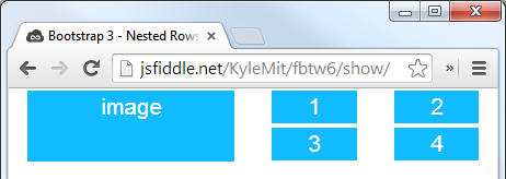
Here's a simple layout to work from:
<div class="container">
    <div class="row">
        <div class="col-xs-6">
            <div class="big-box">image</div>
        </div>
        <div class="col-xs-6">
            <div class="row">
                <div class="col-xs-6"><div class="mini-box">1</div></div>
                <div class="col-xs-6"><div class="mini-box">2</div></div>
                <div class="col-xs-6"><div class="mini-box">3</div></div>
                <div class="col-xs-6"><div class="mini-box">4</div></div>
            </div>
        </div>
    </div>
</div>
Bootstrap Version 4.0
4.0 Docs: http://getbootstrap.com/docs/4.0/layout/grid/#nesting
Here's an updated version for 4.0, but you should really read the entire docs section on the grid so you understand how to leverage this powerful feature
<div class="container">
  <div class="row">
    <div class="col big-box">
      image
    </div>

    <div class="col">
      <div class="row">
        <div class="col mini-box">1</div>
        <div class="col mini-box">2</div>
      </div>
      <div class="row">
        <div class="col mini-box">3</div>
        <div class="col mini-box">4</div>
      </div>
    </div>

  </div>
</div>
Demo in Fiddle jsFiddle 3.x | jsFiddle 4.0
Which will look like this (with a little bit of added styling):
Bootstrap: Multiple nested rows within row?
is it 'against the rules' to nest rows directly within rows?
Not against the rules as such, but not a best practice as per the guidelines.
Per bootstrap guidelines, third point under introduction -
..and only columns may be immediate children of rows".
*Edit: This is still true with Bootstrap 4.0 Beta. The link to the docs above will automatically redirect to the version 3.3 documentation. Thank you @Aakash for pointing this out.
This is because of the padding which Bootstrap uses for its layout, it is a good practice to nest via row-column-row pattern i.e. nest a row with one column across to nest.
See the difference in the snippet below. The first set of markup breaks the Bootstrap layout, although nothing bad happens.
<link href="https://maxcdn.bootstrapcdn.com/bootstrap/3.3.5/css/bootstrap.min.css" rel="stylesheet"/><div class="container"> <div class="row"> <div class="row"> <div class="col-xs-6">One</div> <div class="col-xs-6">Two</div> </div> </div></div><hr><div class="container"> <div class="row"> <div class="col-xs-12"> <div class="row"> <div class="col-xs-6">One</div> <div class="col-xs-6">Two</div> </div> </div> </div></div><hr><div class="container"> <div class="row"> <div class="col-xs-12">One</div> <div class="col-xs-12">Two</div> <div class="col-xs-12">Three</div> </div></div>Multiple rows inside a row with Bootstrap 4
Bootstrap has a smart (but delicate) gutters system providing "natural" (margins + paddings) for content on all devices 1.
This system is based on two simple assumptions:
- columns are immediate children of
.rows 2 - content is placed inside columns
That's why, if you want to place a .row inside another .row (to further divide one of your cols), you'd have to use this markup:
<div class="row">
  <div class="col-12">
     <div class="row">
        <div class="col-md-4 offset-md-2">
           Grid perhaps
        </div>
        <div class="col-md-4">
           More grid
        </div>
     </div>
  </div>
</div>
The above doesn't make much sense by itself (you could just use the markup of the child row and you'd get the same result). But it's useful when you want to offset (or limit) an entire area of a layout, like this:
<div class="row">
  <div class="col-md-8 offset-md-2 col-sm-10 offset-sm-1 col offset-0">
     <div class="row">
        <div class="col-md-6">Grid</div>
        <div class="col-md-6">More grid</div>
        <div class="col-md-6">Grid</div>
        <div class="col-md-6">More grid</div>
        <div class="col-md-6">Grid</div>
        <div class="col-md-6">More grid</div>
        <div class="col-md-6">Grid</div>
        <div class="col-md-6">More grid</div>
        <div class="col-md-6">Grid</div>
        <div class="col-md-6">More grid</div>
     </div>
  </div>
</div>
See this fiddle for a live example.
1 To get rid of Bootstrap's gutters (in v4), one would need to apply no-gutters class on .row.
2 This is a "general principle", not a "strict rule". Other elements are allowed (and even recommended) as direct children of .rows (such as column breaks). At the other end, other elements extend from .rows (such as .form-rows), thus inheriting the gutters system and being valid column parents.
Nest rows inside a bootstrap 4 column
Align the container instead of aligning the content. Apply your CSS to the body
body { min-height: 100%; min-height: 100vh; display: flex; align-items: center;}<link rel="stylesheet" href="https://stackpath.bootstrapcdn.com/bootstrap/4.1.3/css/bootstrap.min.css" integrity="sha384-MCw98/SFnGE8fJT3GXwEOngsV7Zt27NXFoaoApmYm81iuXoPkFOJwJ8ERdknLPMO" crossorigin="anonymous">
<div class="container"> <!-- this is mandatory when using row --> <div class="row justify-content-center"> <div class="col-auto"> <span id="field1">text</span> </div> <div class="col-auto"> <span id="field2">text</span> </div> <div class="col-auto"> <span id="field3">text</span> </div> <div class="col-auto"> <span id="field4">=</span> </div> <div class="col-auto"> <div class="row"> <div class="col"> <input type="text" id="field5" /> </div> </div> <div class="row"> <div class="col-auto"> <div id="xy">Bar</div> </div> </div> <div class="row"> <div class="col-auto"> <div id="h">Bar2</div> </div> </div> </div> </div></div>Bootstrap layout with nested rows and columns
I think the small-box class is applied to the wrong element.
In order to apply it to each left hand container, you should move it down a level like:
<div class="col-md-4">
  <div class = "row small-box">
    <h1>box1</h1>
  </div>
  <div class = "row small-box">
    <h1>box2</h1>
  </div>
</div>
To get the height of the left side to match the content box, you can set it in the css:
.small-box {
  background-color: gray;
  border: 1px solid black;
  height: 50%;
}
Here is a forked version of the codepen.
How to make two nested Bootstrap rows together fill their parent column?
You should nest the orange row in the blue row, like this:
.blue {background-color: blue;}.orange {background-color: orange;}.green {background-color: green;}.full-height {height: 100%;}#main {height: 200px; width: 100%; background-color: gray;}<link href="https://maxcdn.bootstrapcdn.com/bootstrap/3.3.7/css/bootstrap.min.css" rel="stylesheet"/><div id="main"> <div class="container-fluid full-height"> <div class="row full-height"> <div class="col-xs-3 green full-height"> Words! </div> <div class="col-xs-9 full-height"> <div class="row blue full-height"> <div class="col-xs-12"> <div class="row orange"> <div class="col-xs-12">Words!</div> </div> Other words! </div> </div> </div> </div> </div></div>full height nested rows and columns bootstrap 4
A few things
- the responsive class in BS4 is
img-fluid; it wasimg-responsivein BS3 - but you see that when the image is responsive, it will NOT conform to the 400 height which results in white space below the image
- A fix would be to select an appropriately sized image which can still deliver an effective message despite being hidden from the right (this is the second DIV in my code)
.h400 {  height: 400px;}
.removePadding {  padding: 0 !important}
.myCentreAlign {  display: flex;  justify-content: center;  align-items: center;}
.myImageStyle {  height: 400px;  overflow: hidden;}
@media screen and (max-width:575px) {  .myImageStyle {    height: auto;  }  .secondDiv .myImageStyle img {    height: auto;    width: 100%;  }  .secondDiv.h400 {    height: auto;  }  .theFourDiv .h-50 {    height: 200px !important;  }}
<link rel="stylesheet" href="https://maxcdn.bootstrapcdn.com/bootstrap/4.3.1/css/bootstrap.min.css"><script src="https://ajax.googleapis.com/ajax/libs/jquery/3.4.1/jquery.min.js"></script><script src="https://cdnjs.cloudflare.com/ajax/libs/popper.js/1.14.7/umd/popper.min.js"></script><script src="https://maxcdn.bootstrapcdn.com/bootstrap/4.3.1/js/bootstrap.min.js"></script>
<h1> Responsive image case (lots of empty space under the image) </h1><div class="container h400"> <div class="row h-100"> <div class="col-8 removePadding"> <img src="//placehold.it/800x400" class="img-fluid"> </div> <div class=" col-4 h-100 "> <div class="row h-50"> <div class="col-md text-center myCentreAlign">1</div> <div class="col-md bg-dark text-white myCentreAlign ">2</div> </div> <div class="row h-50"> <div class="col-md bg-secondary text-white myCentreAlign">3</div> <div class="col-md bg-primary text-white myCentreAlign">4</div> </div> </div> </div></div>
<hr/>
<h1> non-responsive but delivers a good message </h1><div class="container h400 secondDiv"> <div class="row h-100"> <div class="col-12 col-sm-8 removePadding myImageStyle"> <img src="//placehold.it/800x400" class=""> </div> <div class=" col-12 col-sm-4 h-100 theFourDiv"> <div class="row h-50"> <div class="col-md text-center myCentreAlign">1</div> <div class="col-md bg-dark text-white myCentreAlign ">2</div> </div> <div class="row h-50"> <div class="col-md bg-secondary text-white myCentreAlign">3</div> <div class="col-md bg-primary text-white myCentreAlign">4</div> </div> </div> </div></div>Nested bootstrap rows & columns
I don't think you're supposed to nest rows.
Also, you should put rows inside a container.
(see also: Bootstrap 3 Grid, do I need a container?)
The following code seems to do the trick:
.fix-result {padding-right:20px;border: 1px solid #0359cf; margin-bottom:20px;}.fix-result-info { color: #0359cf;text-transform: uppercase; text-align: center;}.fix-result .match-details {padding:10px;background-color: #0359cf;}<link href="https://maxcdn.bootstrapcdn.com/bootstrap/3.3.7/css/bootstrap.min.css" rel="stylesheet"/><div class="container"> <div class="row col-xs-12 fix-result"> <p class="fix-result-info">friendly Match | 23 July 2016 | The Muga | KO 14:30 </p> <div class="col-sm-6 text-center"> <p>WON</p> <h4>Team A 2-1 Team B</h4> </div> <div class="col-sm-6 match-details"> <p>goalscorers</p> </div> </div></div>Related Topics
Default Web Page Width - 1024Px or 980Px
Creating 3 Perfectly Equal Columns That Take Up 100% on The Browser Window Width
Using CSS Variables as SASS Function Arguments
Gooey CSS Effects with Contrast Parent
Century Gothic Font Usablility Question
How to Order My CSS Columns Horizontally Instead of Vertically
Why Doesn't CSS Hover Work on Table Rows When The Cells Inside The Rows Have Class Names
Force Capitalised Input to Title Case in CSS Using Text-Transform
How to Get a Custom Scroll in Firefox and Ie
What's The Point of Gutters in CSS Grid Frameworks
CSS: Define Media Query Within One Class
Using Cors Headers with CSS Background-Image
Browser Compatible Word Wrap and Whitespace: Pre
Object Oriented CSS: Should It Matter
Overriding Google Recaptcha CSS to Make It Responsive
Best Practice to Manage All Asset Caching (Images, CSS, Js, Everything)