How to invert stroke text color depending on background
One idea is to duplicate the text and use CSS variable to define the color so you can easily change them in one place. I used clip-path to hide half of one text and show the other half:
body {

  margin: 0;

  --c1:#510035;

  --c2:#E8E8E8;

}

body:hover {

  --c1:red;

  --c2:blue;

}

h1 {

  font-size: 4.7em;

  text-transform: uppercase;

  margin: 0;

}

.first {

  background:var(--c1);

  -webkit-text-stroke: 3px var(--c2);

}

.second {

  background:var(--c2);

  -webkit-text-stroke: 3px var(--c1);

  clip-path:polygon(0% 0%, 50% 0%, 50% 100%,0% 100%);

}

.lp-header {

  position:absolute;

  top:0;

  left:0;

  right:0;

  min-height:100vh;

  box-sizing:border-box;

  color: transparent;

  z-index: 1;

  padding: 50px;

  text-align: center;

  transition:0.5s;

}
<h1 class="lp-header first">left or right</h1>
<h1 class="lp-header second">left or right</h1>Invert CSS font-color depending on background-color
There is a CSS property called mix-blend-mode, but it's not supported by IE. I recommend using pseudo elements. If you like to support IE6 and IE7 you can also use two DIVs instead of pseudo elements.
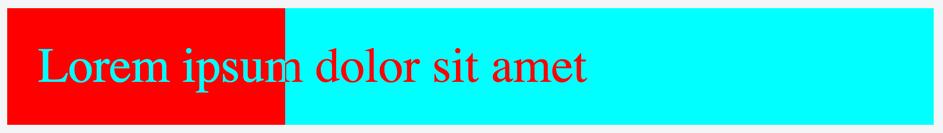
.inverted-bar {

    position: relative;

}

.inverted-bar:before,

.inverted-bar:after {

    padding: 10px 0;

    text-indent: 10px;

    position: absolute;

    white-space: nowrap;

    overflow: hidden;

    content: attr(data-content);

}

.inverted-bar:before {

    background-color: aqua;

    color: red;

    width: 100%;

}

.inverted-bar:after {

    background-color: red;

    color: aqua;

    width: 20%;

}
<div class="inverted-bar" data-content="Lorem ipsum dolor sit amet"></div>SVG Invert stroke colour based on background
In this example I use the dotted line as a mask on two <rect>. Beneath (defined first) are two <rect> that has the color that the dotted line is supposed to have.
The wave is also define as a mask and can be reused on the two <rect> that define the upper part of the SVG.
<svg xmlns="http://www.w3.org/2000/svg" class="header__wave" viewBox="0 0 200 80">
  <defs>
    <linearGradient x1="0%" y1="0%" x2="100%" y2="0%" id="g1">
      <stop offset="0%" stop-color="navy" stop-opacity="1" />
      <stop offset="100%" stop-color="navy" stop-opacity=".2" />
    </linearGradient>
    <mask id="line">
      <rect x="0" y="0" width="200" height="80" fill="white" />
      <line x1="100" y1="0" x2="100" y2="80" stroke="black" stroke-width="2" stroke-dasharray="5 2" />
    </mask>
    <mask id="wave">
      <rect width="200" height="31" fill="white" />
      <path transform="translate(0 30)" fill="white" d="M 0 0 L 200 0 L 200 7 Q 150 5 100 7 Q 50 9 0 7 Z" />
    </mask>
  </defs>
  <rect fill="gray" width="200" height="79" />
  <rect fill="white" width="200" height="80" mask="url(#wave)" />
  <g mask="url(#line)">
    <rect fill="white" width="200" height="80" />
    <rect fill="url(#g1)" width="200" height="80" mask="url(#wave)" />
  </g>
</svg>
Invert colors inside selection
I cannot see how to do this in a complex case, where the selection contains several HTML elements that might be setting color and background color individually (though of course some complex HTML/CSS parsing must be able to do that but I'm not capable).
However, we can fairly simply deal with the straightforward case where the color and background color are consistent across the parent div of the selection.
On a selection event this snippet reads the computed style of the parent element, calculates the inverse of the color and backgroundColor and sets CSS variables to these which are picked up and used in the selection pseudo element.
document.addEventListener('selectionchange', (e) => {
  function invert(color) {
    color = color.replace('rgb(', '');
    color = color.replace(')', '');
    color = color.replace('rgba(', '');
    let colors = color.split(',');
    let r = colors[0].replace(' ', '');
    let g = colors[1].replace(' ', '');
    let b = colors[2].replace(' ', '');
    let a = (colors.length > 3) ? colors[3].replace(' ', '') : 1;
    r = ~r & 255;
    g = ~g & 255;
    b = ~b & 255;
    return 'rgba(' + r + ', ' + g + ', ' + b + ', ' + a + ')';
  }
  selection = window.getSelection();
  if (selection.anchorNode) {
    const parent = selection.anchorNode.parentElement;
    const style = window.getComputedStyle(parent);
    parent.style.setProperty('--color', invert(style.color));
    parent.style.setProperty('--background-color', invert(style.backgroundColor));
  }
});
.invertSelectionColors::selection {
color: var(--color);
background-color: var(--background-color);
}<div class="invertSelectionColors" style="background-color: cyan;color:#000000;">
here is some text originally background color cyan and color #000000
</div>
<div class="invertSelectionColors" style="background-color: rgba(255, 0, 0, 0.5);color:#0000ffff;">
here is some text originally background color rgba(255, 0, 0, 0.5) and color #0000ffff
</div>How to set text overlapping background to be white while overflowing outside to be in different color?
It's not exactly elegant, and you have to be conscious of your margins and padding to make sure the :after element lines up with the base element - but you can then use clip-path and mess with the numbers based on your exact needs to get a polygon shape. For this example I just removed the margins from everything and did a 50% circle for the clip path.
There's probably a better solution, but this should at least get you started. Unfortunately, using blending modes will be tough to get true pure colors, so clip-path with a cloned or pseudo element is a decent bet:
body {

  margin: 0;

}

h1 {

  font-size: 72px;

  font-weight: 800;

  max-width: 200px;

  color: #2f78e1;

  position: relative;

  margin: 0;

}

h1:after {

    content: "Lorem ipsum dolor sit";

    position: absolute;

    top: 0;

    left: 0;

    clip-path: circle(50%);

    color: #fff;

    height: 200px;

    width: 200px;

}

#box {

  height: 200px;

  position: absolute;

  top: 0;

  left: 0;

  width: 200px;

  background: #2f78e1;

  z-index: -1;

  background-blend-mode: lighten;

  border-radius: 50%;

  color: blue;

}
<div class="container">
<svg id="box">
<circle></circle>
</svg>
<h1>Lorem ipsum dolor sit</h1>
</div>Substitute to css outline-color: invert
Perhaps this does the trick for you?
.background {

  display: inline-block;

  margin: 10px;

  padding: 20px;

}

.box {

  border: 3px solid white;

  height: 100px;

  width: 160px;

}

.invert {

  mix-blend-mode: difference;

}
<div class="background" style="background: #ff0000">
<div class="box invert"></div>
</div>
<div class="background" style="background: #000000">
<div class="box invert"></div>
</div>
<div class="background" style="background: #ffffff">
<div class="box invert"></div>
</div>SVG text color with correspond to background
The approach to use clip paths has already been described by squeamish ossifrage's answer. I have put together a working snippet doing it the d3 way:
var svg = d3.select("body")

    .append("svg")

    .attr({

        width: 400,

        height: 400

    });

var textOut = svg.append("text")

    .attr({

        x: 120,

        y: 66

    })

    .style({

        fill: "black",

        stroke: "none"

    })

    .text("Description");

var rect = svg.append("rect")

                    .attr({

                        id: "rect",

                        x: 50,

                        y: 50,

                        width: 100,

                        height: 20

                    })

                    .style({

                        fill: "limegreen",

                        stroke: "darkgreen"

                    });

svg.append("clipPath")

    .attr("id", "clip")

    .append("use")

    .attr("xlink:href", "#rect");

var textIn = svg.append("text")

    .attr({

        x: 120,

        y: 66

    })

    .style({

        fill: "white",

        stroke: "none",

        "clip-path": "url(#clip)"

    })

    .text("Description");
<script src="https://cdnjs.cloudflare.com/ajax/libs/d3/3.4.11/d3.min.js"></script>Related Topics
CSS Background-Image Refuses to Display in ASP.NET MVC
CSS Positioning Elements Next to Each Other
CSS Image Layouting Before Image Loaded
How to Display CSS3 Columns on Ie
Different Behaviours of Treating \ (Backslash) in the Url by Firefox and Chrome
Compile Less Files with Source Maps
CSS Counter-Reset on Nested List
Why Isn't :Nth-Child Working in IE9
Gradient Over Instagram Svg of Fontawesome 5
Input[Type=Number] Placeholder Color in Ff29+
What Are Most Useful Media="Print" Specific, Cross Browser Compatible CSS Properties
Which Is Better to Use in CSS, Percentage or Pixels
Clip-Path on Chrome Leaves a Strange Line on the Edge
How to Delete Border Spacing in Table
Less Mixin with Optional Parameters
Grid Layout on <Fieldset>... Bug on Chrome
CSS Min-Width in IE6, 7, and 8
How to Add Multiple Classes in Material UI Using the Classes Props