How to horizontally center an item in MUI Grid item?
Two seconds later... I solved this through some simple CSS:
<Grid item xs={4} style={{textAlign: "center"}}>
</Grid>
If there is another approach that is somehow more "correct", please feel free to post another answer.
How to center a component in Material UI and make it responsive?
Since you are going to use this on a login page.
Here is a code I used in a Login page using Material-UI
MUI v5
<Grid
  container
  spacing={0}
  direction="column"
  alignItems="center"
  justifyContent="center"
  style={{ minHeight: '100vh' }}
>

  <Grid item xs={3}>
   <LoginForm />
  </Grid>

</Grid>
MUI v4 and below
<Grid
  container
  spacing={0}
  direction="column"
  alignItems="center"
  justify="center"
  style={{ minHeight: '100vh' }}
>

  <Grid item xs={3}>
    <LoginForm />
  </Grid>

</Grid>
this will make this login form at the center of the screen.
But still, IE doesn't support the Material-UI Grid and you will see some misplaced content in IE.
As pointed by @max, another option is,
<Grid container justifyContent="center">
  <Your centered component/>
</Grid>
Please note that versions MUIv4 and below should use justify="center" instead.
However, using a Grid container without a Grid item is an undocumented behavior.
Update on 2022-06-06
In addition to that, another new and better approach will be using the Box component.
<Box
  display="flex"
  justifyContent="center"
  alignItems="center"
  minHeight="100vh"
>
  <YourComponent/>
</Box>
This was originally posted by Killian Huyghe as another answer.
Hope this will help you.
how to align a grid item center in material-ui in react?
It's simple enough using system properties.
    <Box
      display="flex"
      justifyContent="center"
      style={{
        backgroundColor:"rgb(234, 237, 242)"
      }}
    >
      ...
React Material UI Grid Horizontally Align Items for Containers With Different Number of Items
We want to add props to the <Grid> to make this possible.
alignItems="flex-start"will allow grid items to stick to the top then fall towards the bottom.direction="column"will change the flow of how items are "stacked" in a sense. This will change the sizing of the container and items that it is attached to so expect somexs={12}to turn intoxs={6}and vice versa.
Here's the example code below as well as its implementation via sandbox.
import "./styles.css";
import { Grid } from "@material-ui/core";

export default function App() {
  return (
    <div className="App">
      <Grid alignItems="flex-start" container spacing={1}>
        <Grid container direction="column" item xs={6} spacing={1}>
          <Grid item xs={12} style={{ border: "1px solid black" }}>
            x1
          </Grid>
          <Grid item xs={12} style={{ border: "1px solid black" }}>
            x2
          </Grid>
        </Grid>
        <Grid container direction="column" item xs={6} spacing={1}>
          <Grid item xs={12} style={{ border: "1px solid black" }}>
            y1
          </Grid>
          <Grid item xs={12} style={{ border: "1px solid black" }}>
            y2
          </Grid>
          <Grid item xs={12} style={{ border: "1px solid black" }}>
            y3
          </Grid>
        </Grid>
      </Grid>
    </div>
  );
}

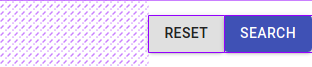
How to align material-ui Grid items vertically centered?
I figured out, this should work,
const useStyles = makeStyles({
  grid: {
    height: "100%"
  }
});

export default function Hook() {
  const classes = useStyles();

  return (
    <Box height="10vh" mr={4}>
      <Grid
        className={classes.grid}
        container
        justify="flex-end"
        alignItems="center"
        spacing={2}
      >
        <Button variant="contained" color="default" type="reset">
          Reset
        </Button>
        <Button
          type="submit"
          variant="contained"
          color="primary"
          onClick={console.log}
        >
          Search
        </Button>
      </Grid>
    </Box>
  );
}
Working sandbox, https://codesandbox.io/s/material-demo-forked-m7fyj?file=/demo.js
Center grid items within a MUI grid
You can use the Flexbox model on the parent .MuiGrid-item of the text and the card. First add a class to the parent to override and customize the styles:
  //TopSection.js
    <Grid item sm="12" lg="6" xs="12" className="wrapper">
      <Typography sx={{ textAlign: "center" }} variant="h3">
        FAITES LE PREMIER <br /> PAS A 2
      </Typography>
      <SignUpCard />
    </Grid>
and for your css:
.MuiGrid-item.wrapper {
  display: flex;
  flex-direction: column;
  align-items: center;
}
I have added a .wrapper class to override the default flex-direction: raw; that matrial-ui is applying to .MuiGrid-item
Here is a working example: https://codesandbox.io/embed/great-swirles-jk7on2?fontsize=14&hidenavigation=1&theme=dark
How to center a container/item in a complex grid with material ui
If I understand you correctly, you have some extra classes which are not necessary.
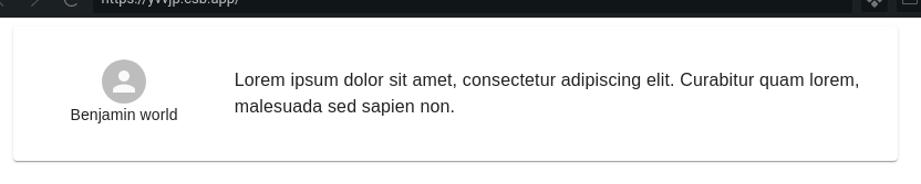
You can achieve the vertical alignment with the codes below:
const useStyles = makeStyles(theme => ({
  paper: {
    height: "15vh"
  },
}));

export default function App() {
  const classes = useStyles();

  return (
    <Container>
      <Paper>
        <Grid className={classes.paper} container alignItems="center" direction="row">
          <Grid
            item
            container
            direction="column"
            justify="center"
            alignItems="center"
            xs={3}
          >
            <Avatar />
            <Typography variant="subtitle2">Benjamin world</Typography>
          </Grid>
          <Grid item xs={9}>
            <Typography variant="body1">
              Lorem ipsum dolor sit amet, consectetur adipiscing elit. Curabitur
              quam lorem, malesuada sed sapien non.
            </Typography>
          </Grid>
        </Grid>
      </Paper>
    </Container>
  );
}
Center component inside the material-ui grid
I soved it by adding align="center" in the JSX code that means align-items: center in CSS as explained here.
The code was done like this:
  <Fragment>
    <Grid
      container
      spacing={24}
      justify="center"
      style={{ minHeight: '100vh', maxWidth: '100%' }}
      >
     <Grid item xs={3} align="center">
        <Card />
      </Grid>
      <Grid item xs={3} align="center">
        <Card />
      </Grid>
      <Grid item xs={3} align="center">
        <Card />
      </Grid>
      <Grid item xs={3} align="center">
        <Card />
      </Grid>
    </Grid>
  </Fragment>
Align image to the center in Grid item Material UI
Try giving the Grid which wrapps the image, the container attribute and then center the image by adding justify="center" and / or alignItems="center" to this container.
Related Topics
CSS Animate Text from Left to Right in Div Container with Overflow Hidden
The Min/Max-Width Media Query Doesn't Make Grammatical Sense
Internet Explorer Incorrectly Calculates Percentage Height for Generated Content in Td
How to Add Multiple Style Attributes to a React Element
Printing a Bootstrap Page from Google Chrome Cause (Sometimes) Truncation Height of The Printed Page
How to Align Text to The Middle of an Element with CSS in Twitter Bootstrap
Angular Material Table -Border Inside The Table
How to Create Facebook Style Fixed Status Bar
What Is a Good CSS Cleanup Tool
Calculating Square-Roots with CSS
Media Query to Target iPhone /Mobile/Ipad
Textarea - Disable Resize on X or Y
CSS Apply Border to a Cloud Shape
Angular Material Overriding Default Style of Snackbar Component
Should You Use Rgba(0, 0, 0, 0) or Rgba(255, 255, 255, 0) for Transparency in CSS