How do I get MS Outlook to accept the CSS style display:block?
The CSS display attribute is not supported in this version of MS Outlook.
Here's "The Book" on what you can and cannot use:
campaignmonitor.com/css/
Basically, if you can't change your mark-up to a natively-block item, you're stuck.
Outlook not allowing tables to display inline block
Outlook doesn't have very good support for the css box model, so things like display: inline-block; and margin don't always work as they do on the web.
Wrapping the two <tables> in a parent <table> will display each column side by side in every major email client:
<table cellspacing="0" cellpadding="0" border="0" role="presentation">
  <tr>
    <td width="150" style="padding: 20px 0 20px 20px;">

      <!-- your first table : BEGIN -->
      <table border="0" cellspacing="0" cellpadding="0">
        <tr>
          <td align="center" style="-webkit-border-radius: 3px; -moz-border-radius: 3px; border-radius: 3px;" bgcolor="#e9703e"><a href="https://litmus.com" target="_blank" style="font-size: 16px; font-family: Helvetica, Arial, sans-serif; color: #ffffff; text-decoration: none; text-decoration: none; -webkit-border-radius: 3px; -moz-border-radius: 3px; border-radius: 3px; padding: 12px 18px; border: 1px solid #e9703e; display: inline-block;">Read More</a></td>
        </tr>
      </table>
      <!-- your first table : END -->

    </td>
    <td width="150" style="padding-bottom:27px;">

      <!-- your second table : BEGIN -->
      <table border="0" cellspacing="0" cellpadding="0">
        <tr>
          <td>
            <a href="https://www.facebook.com" target="_blank"><img alt="Facebook" style="margin-right:10px; vertical-align: middle;" src="http://media.com/FB-02.png"></a>
            <a href="https://twitter.com" target="_blank"><img alt="Twitter" style="margin-right:10px; vertical-align: middle;" src="http://media.com/twitter-03.png"></a>
          </td>
        </tr>
      </table>
      <!-- your second table : END -->

    </td>
  </tr>
</table>
Can't use display: table in Outlook after using display: none on table
I doubt if this works in outlook display.
display: table !important;
if you just keep this line and remove does it work.
Anyway you are already using table html.
so try using
display: block !important;
instead of
display: table !important;
i think table was for divs to display as table. but outlook does not support it
display:none doesn't work on Outlook 2007
Outlook 2007 uses the Microsoft Word engine for rendering HTML which has very limited support for CSS. This page describes the kind of things you can expect to work (display is one of the "not supported" ones).
Unfortunately, there's not much you can do. You can enclose the element in HTML comments <!-- ... --> which would stop it from rendering, but that's about it.
HTML email Outlook images display inline block
Can you test with this structure :
<table style=" margin:0;"cellpadding="0" cellspacing="0" border="0" >
    <tr style=" margin:0;">
        <td style="margin:0;">
            <img style="margin:0; display:block;"  src="img2.jpg" />
        </td>
        <td style="margin:0;">
            <img style="margin:0; display:block;"  src="img1.jpg" />
        </td>
    </tr>
</table>
I never test responsive with email... so i work with fix size on all of my element...
Outlook is ignoring my email's CSS including font-family and background-color
I found the problem. Outlook was ignoring styles with an !important by them.
Cannot override display property in HTML email
Android had introduced a bug back in 2015 when stacking table data td were no longer stackable. As a walk around you can use table head th to do stacking but be sure to use font-style as normal on the th or the fonts get bolded (can have cascade effect if your inline CSS is messed up somewhere).
Working example:
@media only screen and (max-width: 480px){ .colms th{ display:block !important; width:100% !important; } }<table width="100%" border="0" cellspacing="0" cellpadding="0" class="colms"> <tbody> <tr> <th style="font-weight:normal;margin:0px;padding:0px;">Column 1</th> <th style="font-weight:normal;margin:0px;padding:0px;">Column 2</th> </tr> </tbody></table>Is it possible to use display:block on td in HTML email, to achieve responsive table design?
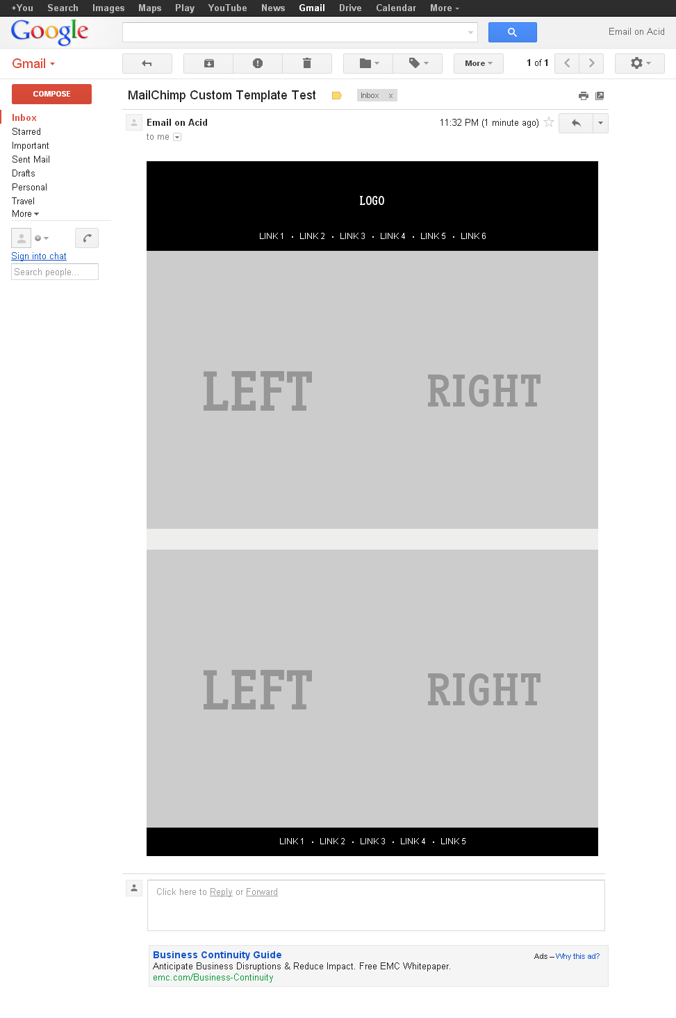
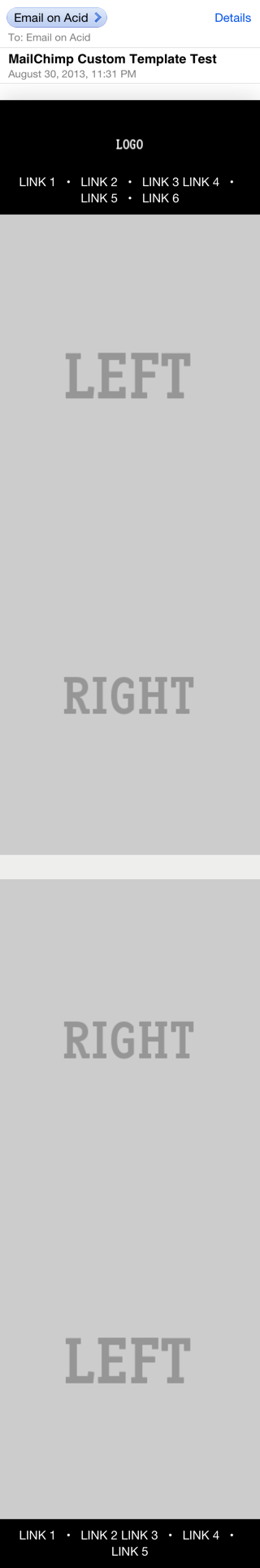
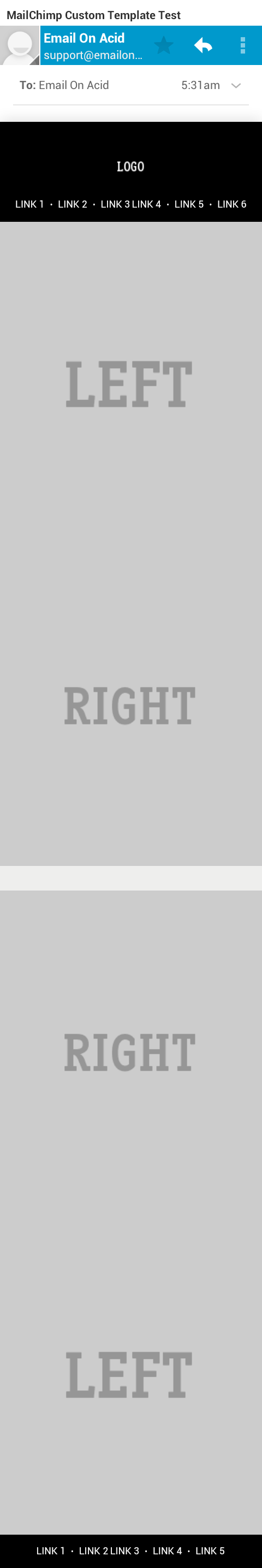
The accepted answer provides some great info but it doesn't address the question directly. I've been experimenting with responsive emails recently and have come up with some good solutions others might find useful. Here we go...
To answer the question, you can use display:block; to make table columns behave as rows on some mobile devices (Android, iOS and Kindle).
Here's an example showing how you would make a 2 column layout stack (left columns on top of right column) on mobile devices.
HTML
<table class="deviceWidth" width="100%" cellpadding="0" cellspacing="0" border="0" style="border-collapse: collapse; mso-table-lspace:0pt; mso-table-rspace:0pt; ">
  <tr>
    <td width="50%" align="right" class="full">
      <p style="mso-table-lspace:0;mso-table-rspace:0; padding:0; margin:0;">
        <a href="#"><img src="http://placehold.it/440x440&text=LEFT" alt="Sample Image" border="0" style="display: block; width:100%; height:auto;" /></a>
      </p>
    </td>
    <td width="50%" align="left" class="full">
        <a href="#"><img src="http://placehold.it/440x440&text=RIGHT" alt="Sample Image" border="0" style="display: block; width:100%; height:auto;" /></a>
    </td>
  </tr>
</table>
CSS
@media only screen and (max-width: 640px)  {
    body[yahoo] .deviceWidth {width:440px!important; }  T

    body[yahoo] .full {
        display:block;
        width:100%;
    }
}
Note: The body[yahoo] selector prevents Yahoo from rendering the media queries. The body element of my email has a yahoo="fix" attribute.
The above CSS says that if the screen is less than 640px in width then the tds with a class of full should display:block with width:100%.
Now, let's get a bit fancier. Sometimes you'll want the column on the left to stack BELOW the column on the right. To do this we can use dir="rtl" on the containing table to flip the order of the columns. The CSS stays the same, here's the new HTML:
HTML
<table class="deviceWidth" dir="rtl"  width="100%" cellpadding="0" cellspacing="0" border="0" style="border-collapse: collapse; mso-table-lspace:0pt; mso-table-rspace:0pt; ">
  <tr>
    <td width="50%" dir="ltr" align="right" class="full">
      <p style="mso-table-lspace:0;mso-table-rspace:0; padding:0; margin:0;">
        <a href="#"><img src="http://placehold.it/440x440&text=RIGHT" alt="Sample Image" border="0" style="display: block; width:100%; height:auto;" /></a>
      </p>
    </td>
    <td width="50%" dir="ltr" align="left" class="full">
        <a href="#"><img src="http://placehold.it/440x440&text=LEFT" alt="Sample Image" border="0" style="display: block; width:100%; height:auto;" /></a>
    </td>
  </tr>
</table>
By adding the dir="rtl" we're telling it to reverse the order of the columns. The first column (in the flow of the HTML) is being displayed on the right, the second column (in the HTML) on the left. For screens smaller than 640px it displays the first column (the column on the right) first, and the second column (the column on the left) second.
Here's the full HTML and CSS and a screenshots from Gmail and iOS 5 are attached.
Related Topics
Mvc: I Have Deployed My Application, But CSS Only Works When I Log In
CSS: Text-Align-Last Doesnt Work in Chrome
What Is Result of Calc() in CSS
Make an Element Overlap Contents Below It Using Bootstrap
How Specify Two CSS Classes: from Property and Conditional Class
Using CSS Clip with Percentage
How to Draw Triangle with Transparent Background with Border
Is -Webkit-Link a Valid Color for Any HTML Element or CSS Property for Which Color Is Relevant
How to Remove The Blue Border That Appears When Clicking on a UIb-Accordion-Heading
How to Style a Svg Using CSS in Javafx Fxml
CSS: :Before: :After Pseudo-Element of Class Not Working
Trigger Animation on Element Click in Pure CSS
CSS Transition - Two Directions
Media Query to Differentiate Desktop from iPad in Landscape Mode