How to change button active color in bootstrap 4
you have to overwrite .btn-primary:not(:disabled):not(.disabled):active{
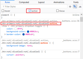
inspect the element and in the dev tool, click on toggle pseudo class then check active to see what rules are applied when the button is active, you'll see if your rules are overwritten or what you have to overwrite.
couldn't get it to work in the snippet , here's a fiddle : https://jsfiddle.net/takius/h9sj80kx/14/
EDIT : ( based on the comment )
to change the blue shadow, it's in : .btn-primary:not(:disabled):not(.disabled):focus{
updated fiddle : https://jsfiddle.net/takius/h9sj80kx/32/
How to change the button color when it is active using bootstrap?
CSS has different pseudo selector by which you can achieve such effect. In your case you can use
:active : if you want background color only when the button is clicked and don't want to persist.
:focus: if you want background color untill the focus is on the button.
button:active{
    background:olive;
}
and
button:focus{
    background:olive;
}
JsFiddle Example
P.S.: Please don't give the number in Id attribute of html elements.
How to change btn color in Bootstrap
The easiest way to see which properties you need to override is to take a look at Bootstrap's source code, specifically the .button-variant mixin defined in mixins/buttons.less. You still need to override quite a lot of properties to get rid of all of the .btn-primary styling (e.g. :focus, disabled, usage in dropdowns etc).
A better way might be to:
- Create your own customized version of Bootstrap using Bootstrap's online customization tool
- Manually create your own color class, e.g.
.btn-whatever - Use a LESS compiler and use the
.button-variantmixin to create your own color class, e.g..btn-whatever
How do I make the button change color when active
You can create your own kind of link that would be in sync with url
import {
  Link,
  withRouter
} from "react-router-dom";

function NavInput({ value, className, to, location }) {
  let isActive = to === location.pathname;
  return (
    <Link to={to}>
      <input
        type="button"
        className={className + (isActive ? " active" : "")}
        value={value}
      />
    </Link>
  );
}

const NavInputLink = withRouter(NavInput);
and then your leftBox.js would be
export default class LeftBox extends Component {
  constructor(props) {
    super(props);
  }
  render() {
    return (
      <>
        <div className="nav">
          <ul>
            <li className="list-item">
              <NavInputLink
                to="/about"
                value="Dashboard"
                className="sideButton sideBarText"
              />
            </li>
            <li className="list-item">
              <NavInputLink
                to="/"
                value="People"
                className="sideButton2 sideBarText2"
              />
            </li>
          </ul>
        </div>
      </>
    );
  }
}
Please check https://codesandbox.io/s/cool-firefly-cq0hr
How to change background color of active button when i am using bootstrap?
You need to target .btn-primary:focus too. It is .btn-primary:focus that is responsible for coloring the buttons #3276b1 after click :
.btn-primary:focus,
.btn-primary:active,
.btn-primary.active {
    background-color: #111111;
    border-color: #000000;
}
then it works -> http://jsfiddle.net/y5jo73wo/
How to change the color of active tab in bootstrap
You should not use inline css while it's not the last resort.
I refactor your code & edit the css as below.
It's just a problem with specificity value. You can refer to this https://css-tricks.com/specifics-on-css-specificity/
.nav-tabs .nav-item .nav-link {

  background-color: #0080FF;

  color: #FFF;

}

.nav-tabs .nav-item .nav-link.active {

  color: #0080FF;

}

.tab-content {

  border: 1px solid #dee2e6;

  border-top: transparent;

  padding: 15px;

}

.tab-content .tab-pane {

  background-color: #FFF;

  color: #0080FF;

  min-height: 200px;

  height: auto;

}
<script src="https://ajax.googleapis.com/ajax/libs/jquery/2.1.1/jquery.min.js"></script>
<script src="https://stackpath.bootstrapcdn.com/bootstrap/4.1.3/js/bootstrap.bundle.min.js"></script>
<link href="https://stackpath.bootstrapcdn.com/bootstrap/4.1.3/css/bootstrap.min.css" rel="stylesheet" />
<div class="col-md-11">
<ul class="nav nav-tabs" id="myTab" role="tablist">
<li class="nav-item">
<a class="nav-link active " id="home-tab" data-toggle="tab" href="#home" role="tab" aria-controls="home" aria-selected="true">Home</a>
</li>
<li class="nav-item">
<a class="nav-link" id="profile-tab" data-toggle="tab" href="#profile" role="tab" aria-controls="profile" aria-selected="false">Profile</a>
</li>
<li class="nav-item">
<a class="nav-link" id="contact-tab" data-toggle="tab" href="#contact" role="tab" aria-controls="contact" aria-selected="false">Contact</a>
</li>
</ul>
<div class="tab-content" id="myTabContent">
<div class="tab-pane fade show active" id="home" role="tabpanel" aria-labelledby="home-tab">The standard Lorem Ipsum passage, used since the 1500s "Lorem ipsum dolor sit amet, consectetur adipiscing elit, sed do eiusmod tempor incididunt ut labore et dolore magna aliqua. Ut enim ad minim veniam, quis nostrud exercitation ullamco laboris
nisi ut aliquip ex ea commodo consequat. Duis aute irure dolor in reprehenderit in voluptate velit esse cillum dolore eu fugiat nulla pariatur. Excepteur sint occaecat cupidatat non proident, sunt in culpa qui officia deserunt mollit anim id est
laborum." Section 1.10.32 of "de Finibus Bonorum et Malorum", written by Cicero in 45 BC "Sed ut perspiciatis unde omnis iste natus error sit voluptatem accusantium doloremque laudantium, totam rem aperiam, eaque ipsa quae ab illo inventore veritatis
et quasi architecto beatae vitae dicta sunt explicabo. Nemo enim ipsam voluptatem quia voluptas sit aspernatur aut odit aut fugit, sed quia consequuntur magni dolores eos qui ratione voluptatem sequi nesciunt. Neque porro quisquam est, qui dolorem
ipsum quia dolor sit amet, consectetur, adipisci velit, sed quia non numquam eius modi tempora incidunt ut labore et dolore magnam aliquam quaerat voluptatem. Ut enim ad minima veniam, quis nostrum exercitationem ullam corporis suscipit laboriosam,
nisi ut aliquid ex ea commodi consequatur? Quis autem vel eum iure reprehenderit qui in ea voluptate velit esse quam nihil molestiae consequatur, vel illum qui dolorem eum fugiat quo voluptas nulla pariatur?"</div>
<div class="tab-pane fade" id="profile" role="tabpanel" aria-labelledby="profile-tab">...</div>
<div class="tab-pane fade" id="contact" role="tabpanel" aria-labelledby="contact-tab">...</div>
</div>
</div>How to change bootstrap selection color
Remember that you have to position your custom style cheat below bootstrap to modify any style you want
<link rel="stylesheet" href="bootstrap.css">
<link rel="stylesheet" href="mystyle.css">
I recommend you to use a code snippet to confirm if that's the way you configured it
Related Topics
Anyway to Have a Label Respond to :Focus CSS
In Visual Studio 2010, How to Easily Comment Out Lines in CSS
Linking to CSS Files from React Index
Conventional Order of CSS Properties
Responsive Layout - Px, Em, or %
Which Browsers Support Page Break Manipulation Using CSS and the Page-Break-Inside Element
CSS Dotted Border Render Issue
Vertical Alignment of Image Inside a Div
Responsive Bootstrap Designing in Cakephp 3X
Can't Style Text on Input Submit Button as Bold
Why Do 'Foo Bar' and 'Foo > Bar' Have the Same Specificity in CSS
CSS Grid - Repeatable Grid-Template-Areas
CSS - Position: Absolute; - Auto Height
CSS Transitions with :Before and :After Pseudo Elements
Show/Hide Div Based on Browser Size Using Only CSS
How to Remove All Inherited CSS Formatting for a Table
How to Animate Multiple CSS Transform Properties Separately Using Keyframe Animation