How to change placeholder color on focus?
This works for me:
input:focus::placeholder {
  color: blue;
}
How to change placeholder colour on input focus?
you dont need the ~ for this to work
input:focus::placeholder{
    color: blue;
}
<input placeholder="ding">Changing color of placeholder text on focus with JavaScript
Believe you need vendor prefixes (From css-tricks.com):
::-webkit-input-placeholder {
   color: red;
}

:-moz-placeholder { /* Firefox 18- */
   color: red;
}

::-moz-placeholder {  /* Firefox 19+ */
   color: red;
}

:-ms-input-placeholder {
   color: red;
}
Using javascript you would only be applying similar styling (using vendor prefixes) programmatically on a focus event.
Edit: In fact these styles I don't think can be applied using javascript. You would need to create a class and apply that using js.
CSS:
input.placeholderred::-webkit-input-placeholder {
   color: red;
}
JQuery:
var $textInput = $('#TextField1');
$textInput.on('focusin',
    function () {
         $(this).addClass('placeholderred');
    }
);

$textInput.on('focusout',
    function () {
         $(this).removeClass('placeholderred');
    }
);
JS:
var textInput = document.getElementById('TextField1');
textInput.addEventListener('focus',
    function () {
         this.classList.add('placeholderred');
    }
);

textInput.addEventListener('blur',
    function () {
         this.classList.remove('placeholderred');
    }
);
And courtesy of the most helpful, Armfoot, a fiddle: http://jsfiddle.net/qbkkabra/2/
Change a HTML5 input's placeholder color with CSS
Implementation
There are three different implementations: pseudo-elements, pseudo-classes, and nothing.
- WebKit, Blink (Safari, Google Chrome, Opera 15+) and Microsoft Edge are using a pseudo-element:
::-webkit-input-placeholder. [Ref] - Mozilla Firefox 4 to 18 is using a pseudo-class:
:-moz-placeholder(one colon). [Ref] - Mozilla Firefox 19+ is using a pseudo-element:
::-moz-placeholder, but the old selector will still work for a while. [Ref] - Internet Explorer 10 and 11 are using a pseudo-class:
:-ms-input-placeholder. [Ref] - April 2017: Most modern browsers support the simple pseudo-element
::placeholder[Ref]
Internet Explorer 9 and lower does not support the placeholder attribute at all, while Opera 12 and lower do not support any CSS selector for placeholders.
The discussion about the best implementation is still going on. Note the pseudo-elements act like real elements in the Shadow DOM. A padding on an input will not get the same background color as the pseudo-element.
CSS selectors
User agents are required to ignore a rule with an unknown selector. See Selectors Level 3:
a group of selectors containing an invalid selector is invalid.
So we need separate rules for each browser. Otherwise the whole group would be ignored by all browsers.
::-webkit-input-placeholder { /* WebKit, Blink, Edge */
    color:    #909;
}
:-moz-placeholder { /* Mozilla Firefox 4 to 18 */
   color:    #909;
   opacity:  1;
}
::-moz-placeholder { /* Mozilla Firefox 19+ */
   color:    #909;
   opacity:  1;
}
:-ms-input-placeholder { /* Internet Explorer 10-11 */
   color:    #909;
}
::-ms-input-placeholder { /* Microsoft Edge */
   color:    #909;
}

::placeholder { /* Most modern browsers support this now. */
   color:    #909;
}
<input placeholder="Stack Snippets are awesome!">Styling input placeholder (default and focus state) in Chrome 42
If you have a list of comma seperated selectors like that and a browser doesn't recognise even one of those selectors it will ignore all selectors in that list.
In your example, the -moz prefix for Firefox will not be recognised by Chrome.
The fix is to create separate rules for each different prefix.
Color of active input placeholder text CSS3
You are using :active pseudo class, instead use :focus
My Fiddle
:active styles only applies when you keep an element clicked, so use :focus for input fields...
CSS
:focus::-webkit-input-placeholder {
   color: blue;
}
:-moz-placeholder:focus {
   color: blue;
}
:-ms-input-placeholder:focus {
   color: blue;
}
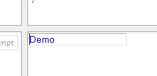
Preview
How to change text box placeholder color in Angular 6 Material
If i understand your question this css should work.
  .mat-focused .mat-form-field-label {
      /*change color of label*/
      color: red !important;
  }

 .mat-form-field-underline {
   /*change color of underline*/
    background-color: blue !important;
 }

.mat-form-field-ripple {
   /*change color of underline when focused*/
   background-color: yellow !important;;
 }
Hope it was useful.
Related Topics
How to Exclude the First Item in a Flexbox Wrap
How to Add a Custom Font to Rails App
Apply CSS Style to Child Elements
CSS to Make Bootstrap Navbar Transparent
How to Center a Bootstrap Div with a 'Spanx' Class
How to Add Automatic Class in Image for Wordpress Post
How to Have a Position: Fixed; Behaviour for a Flexbox Sized Element
How to Create Multi Columns from a Single Unordered List
Where Do CSS and JavaScript Files Go in a Maven Web App Project
What CSS Selector Can Be Used to Select the First Div Within Another Div
Translate X and Y Percentage Values Based on Elements Height and Width
Position Div to Bottom of Containing Div
Ml-Auto Is Not Pushing Navbar Links to the Right
What Is the Em Font-Size Unit? How Much Is It in Pixels
Overflow to Left Instead of Right