How to center one image over another
I generally use another image absolute positioned as background. like:
<div>
<img class="background-img" width="100%" height="100%" style="position:absolute; top:0; left:0">
<img class="second-img" width="100%" height="100%" />
<!-- Then do the positioning with classes -->
</div>
Give it a shot, hope it works as you want
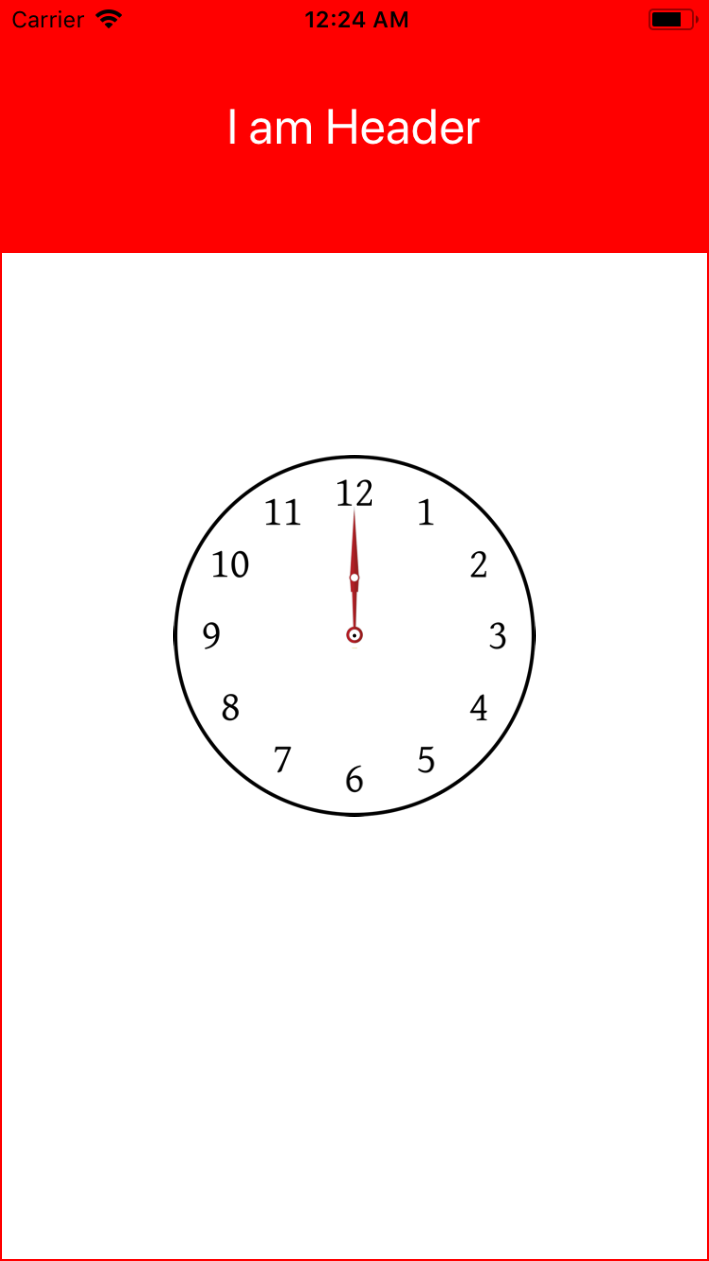
How do I center one image over another in React Native
If i understood correctly, you want to show one image over other image. With one as a Parent image and other as a child image without using absolute postion.
For this you can use ImageBackground Component provided by react-native and by setting its height and width with percentage value.
Below is the example :
Parent Image : Clock.png is an ImageBackground Component
Child Image : Needle.png is an Image Component
import React, { Component } from 'react'
import { StyleSheet, View, Text, ImageBackground, Image } from 'react-native'

export default class ImageView extends Component {
  render() {
    return (
      <View
        style={{
          flex: 1
        }}
      >
        <View
          style={{
            flex: 0.25,
            alignItems: 'center',
            justifyContent: 'center',
            backgroundColor: 'red'
          }}
        >
          <Text style={{ color: 'white', fontSize: 26 }}>I am Header</Text>
        </View>
        <View
          style={{
            flex: 1,
            alignItems: 'center',
            justifyContent: 'center',
            // backgroundColor: 'blue',
            borderWidth: 1,
            borderColor: 'red'
          }}
        >
          <ImageBackground
            source={require('@assets/Clock.png')}
            style={{
              height: '60%',
              width: '100%'
            }}
            resizeMode="contain"
          >
            <Image
              style={{
                marginTop: '4.5%',
                alignSelf: 'center',
                height: '30%',
                width: '100%'
              }}
              resizeMode="contain"
              source={require('@assets/Needle.png')}
            />
          </ImageBackground>
        </View>
      </View>
    )
  }
}
How to center an image over another image in CSS
Remember when you wanna center a nontext block, use margin:0 auto; which is intended for that. Also if you make image display:inline-block I think you could use text-align:center
Hope that helps.
Centering an image on top of another one with Bootstrap 4
Ok so now it's working.
I removed Bootstrap and just used flexbox.
the background in a flex container :
.container{
display: flex;
height: 300px;
background-image: url("../ordinateur.jpg");
}
the image:
.image{

width: 150px;
height: 150px;
margin: auto; /* center the image in the container */}
center image vertically/horizontally over another without dimensions
.videobox span {
  display: block;
  position: absolute;
  top: 0;
  left: 0;
  bottom: 0;
  right: 0;
  z-index: 1;
  background: url(../img/elements/playbutton.png) no-repeat center center;
}
CSS - Put an image centered on top of another
I don't understand this :
on img2, because it has an absolute position, and because it has a
size in px, i can't even put a left in %, because it would move
depending on the screen size.
You said img2 has a fixed size, it seems to me it's the perfect case for a centering with absolute position and negative margin.
Let's say your img2 is 200px wide :
.img2 {
  position: absolute;
  top: 0px;
  left: 50%;
  margin-left: -100px /* negative half the width */
}
It would not work if img2 had a % size.
How do I position one image on top of another in HTML?
Ok, after some time, here's what I landed on:
.parent {
  position: relative;
  top: 0;
  left: 0;
}
.image1 {
  position: relative;
  top: 0;
  left: 0;
  border: 1px red solid;
}
.image2 {
  position: absolute;
  top: 30px;
  left: 30px;
  border: 1px green solid;
}
<div class="parent">
<img class="image1" src="https://via.placeholder.com/50" />
<img class="image2" src="https://via.placeholder.com/100" />
</div>Put an image over another and keep the proportions (HTML - CSS)
You are aligning the second image using a percentage. Percentages are calculated based on the element's parent's properties.
For example, let's say your window has a width of 1000px. Your parent div, as a block, would expand to fit this width, so .parent also has a width of 1000px. .imageOver has a left position of 17%, which is 17% of 1000px = 170px. So for a window of width 1000px, .imageOver will be positioned 170px from its parent's left.
Now let's say you resize the window to have a width of 800px. The width of .parent is also 800px. Thus .imageOver will have a left property of 17% of 800px, which is 136px. So resizing the window from 1000px to 800px will shift .imageOver's position from 170px from the left to 136px from the left.
If you want to keep the image in the same position regardless of window size, use fixed units such as px to define its left and top properties.
For example:
.imageOver {
    position: absolute;
    top: 40px;
    left: 220px;
}
Or whatever values position the image to best fit your situation.
Related Topics
Color (Colour) Differences Between Browsers
CSS Border Shorthand When Each Border Has a Different Width
A:Visited Doesn't Work in Mozilla Firefox
Twitter Bootstrap: Add Media Queries for Xxs Breakpoint
How to Change Bootstrap Button Color
Change Background Color of Selectinput in R Shiny
Google Chrome Developer Tools - CSS File Showing as an Image Resource
How to Change Height of Ui-Grid Row
Css: How to Get Two Floating Divs Inside Another Div
CSS - "Position: Fixed" Acting Like "Absolute" in Firefox
Css3 Animation Keep Reverting to Original State
VS Code SCSS Auto Compiling to CSS
Selector for Even and Odd Level Children
CSS with If/Then Browser Logic