How to center content and make the background cover the full column when using CSS Grid?
Without place-items: center; your grid items will get stretched to cover all the area (the default behavior in most of the cases) that's why the background will the cover a big area:

With place-items: center; your grid item will fit their content and they will be placed in the center; thus the background will cover only the text.

To avoid this, you can center the content inside the p (your grid item) instead of centering the p. Don't forget to also remove the default margin to cover a bigger area:
main {
  display: grid;
  grid-template-columns: repeat(4, 1fr);
  grid-template-rows: 100px;
  place-items: stretch; /* this is the default value in most of the cases so it can be omitted */
  grid-gap: 20px;
}

p {
  background-color: #eee;
  /* center the content (you can also use flexbox or any common solution of centering) */
  display: grid; /* OR inline-grid */
  place-items: center;
  /**/
  margin: 0;
}
<main>
<p>box1</p>
<p>box2</p>
<p>box3</p>
<p>box4</p>
</main>Center a whole CSS grid with respect to the whole page
You could try this
Instead of display: inline-grid;
Keep it: display: grid;
And add
width: fit-content;
in both the containers
.grid-container {
display: grid;
grid-template-columns: auto auto auto auto auto auto auto auto auto;
background-color: #c8a2c8;
padding: 5px;
text-align: center;
margin: auto;
width: -moz-fit-content; /* For Mozilla firefox*/
width: -webkit-fit-content; /* For Google Chrome */
width: fit-content;
}

.grid-container2 {
display: grid;
grid-template-columns: 40px 40px 40px 40px 40px 40px 40px 40px 40px;
background-color: #c8a2c8;
padding: 5px;
text-align: center;
margin: auto;
width: -moz-fit-content; /* For Mozilla firefox*/
width: -webkit-fit-content; /* For Google Chrome */
width: fit-content;
}
CSS Grid Centering
You can use display:flex to achieve this
.grid-container {
  display: grid;
  width:100%;
  grid-template-columns: auto auto auto;
  grid-gap: 10px;
  padding: 10px;
  color: black;
}
.s2 {
grid-row: span 2;
}
.itemBox {
  border: 1px solid black;
  box-sizing: content-box;
  display:flex;
  justify-content: center;
  place-items: center stretch;
}
<div class="grid-container tab active" id="pageHome">
<div class="itemBox content">1</div>
<div class="itemBox"><span class="test">2</span></div>
<span class="itemBox">3</span>
<div class="itemBox s1">4</div>
<div class="itemBox s2">5</div>
<div class="itemBox">6</div>
<div class="itemBox">7</div>
<div class="itemBox">8</div>
<div class="itemBox s1x2">9</div>
<div class="itemBox">10</div>
<div class="itemBox">11</div>
<div class="itemBox">12</div>
</div>How to prevent CSS grid from taking up full width?
Because you're using block level grid which is always takes up the full width available. Use inline-grid instead.
.layout-grid {
    margin: 0 auto;

    background-color: lime;

    display: inline-grid;
    grid-template-columns: 200px 100px;
    grid-template-rows: auto;
    grid-gap: 1rem;
    grid-template-areas:
        "company company"
        "form billing";
}
<div class="layout-grid">
<div style="grid-area: company">company</div>
<div style="grid-area: form">form</div>
<div style="grid-area: billing">billing</div>
</div>My CSS Grid doesn't scale properly with content height-wise
You could have done this with flex, To the best of my knowledge grid is not made for that purpose!
Here's an example made with flex
body {
  display: flex;
  flex-direction: column;
  align-items: center;
  margin: 0;
  font-family: Arial, Helvetica, sans-serif;
  background: #171615;
}

.header {
  /* If you don't want the header to be sticky on scroll remove these lines */
  position: sticky;
  top: 0;
  /* If you don't want the header to be sticky on scroll remove these lines */
  display: flex;
  align-items: center;
  justify-content: space-between;
  flex-wrap: wrap;
  width: 100%;
  background: #171615;
}

.header-logo {
  height: 55px;
}

.logo {
  height: 100%;
  width: 135px;
  object-fit: cover;
}

.header-menu {
  display: flex;
  flex-flow: row wrap;
}

.header-menu a {
  color: #f1f1f1;
  padding: 12px;
  text-decoration: none;
  border-radius: 4px;
  margin-right: 8px;
  white-space: nowrap;
}

.header a.active {
  background: dodgerblue;
}

.login {
  background-color: dodgerblue;
}

.header-menu a:hover {
  background-color: #ddd;
  color: black;
}

.wrapper {
  width: 70%;
  color: white;
}


/* you can remove this part */

.white-space {
  display: flex;
  height: 800px;
  font-size: 3rem;
  background: darkgray;
}


/* you can remove this part */
<div class="header">
<div class="header-logo">
<a href="#"><img class="logo" src="https://via.placeholder.com/135x55" alt="Logo" /></a>
</div>
<div class="header-menu">
<a class="active" href="#">Home</a>
<a class="active" href="#">Games</a>
<a class="active" href="#">Web Projects</a>
<a class="login" href="#">Login</a>
<a href="#">Contact</a>
<a href="#">About</a>
</div>
</div>
<div class="wrapper">
<!-- put your content here -->
<p>Lorem ipsum dolor sit amet, consectetur adipiscing elit, sed do eiusmod tempor incididunt ut labore et dolore magna aliqua. Ac ut consequat semper viverra. Eget nunc scelerisque viverra mauris in aliquam sem fringilla ut.</p>
<div class="white-space">
<h2 style="margin: auto">White Space</h2>
</div>
<p>Lorem ipsum dolor sit amet, consectetur adipiscing elit, sed do eiusmod tempor incididunt ut labore et dolore magna aliqua. Ac ut consequat semper viverra. Eget nunc scelerisque viverra mauris in aliquam sem fringilla ut.</p>
<!-- put your content here -->
</div>How can I make a CSS grid fill the height of the parent element?
You can do it with height: 100%; on any of the items inside the grid
Working example:
button {
  display: grid;
  height: 50px;
  grid-auto-flow: column;
  align-items: center;
}

.one {
  color: white;
  background-color: purple;
  border-right: 1px solid red;
  height: 100%;
}
<button>
<span class="one">one</span>
<span class="two">two</span>
</button>Centering in CSS Grid
This answer has two main sections:
- Understanding how alignment works in CSS Grid.
- Six methods for centering in CSS Grid.
If you're only interested in the solutions, skip the first section.
The Structure and Scope of Grid layout
To fully understand how centering works in a grid container, it's important to first understand the structure and scope of grid layout.
The HTML structure of a grid container has three levels:
- the container
- the item
- the content
Each of these levels is independent from the others, in terms of applying grid properties.
The scope of a grid container is limited to a parent-child relationship.
This means that a grid container is always the parent and a grid item is always the child. Grid properties work only within this relationship.
Descendants of a grid container beyond the children are not part of grid layout and will not accept grid properties. (At least not until the subgrid feature has been implemented, which will allow descendants of grid items to respect the lines of the primary container.)
Here's an example of the structure and scope concepts described above.
Imagine a tic-tac-toe-like grid.
article {
  display: inline-grid;
  grid-template-rows: 100px 100px 100px;
  grid-template-columns: 100px 100px 100px;
  grid-gap: 3px;
}
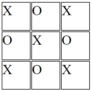
You want the X's and O's centered in each cell.
So you apply the centering at the container level:
article {
  display: inline-grid;
  grid-template-rows: 100px 100px 100px;
  grid-template-columns: 100px 100px 100px;
  grid-gap: 3px;
  justify-items: center;
}
But because of the structure and scope of grid layout, justify-items on the container centers the grid items, not the content (at least not directly).
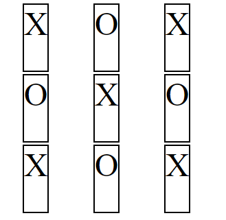
article {  display: inline-grid;  grid-template-rows: 100px 100px 100px;  grid-template-columns: 100px 100px 100px;  grid-gap: 3px;  justify-items: center;}
section {    border: 2px solid black;    font-size: 3em;}
<article> <section>X</section> <section>O</section> <section>X</section> <section>O</section> <section>X</section> <section>O</section> <section>X</section> <section>O</section> <section>X</section></article>Fill a grid column with a image?
Okay, I see what you're doing. You've explicitly defined the height of the container for the images and then applied attributes to the images inside of that container. So, the easiest fix is to just apply the same height to your images, give them a width of 100% so they fill the container horizontally, and use object-fit: cover; to crop them into the container and maintain their aspect ratio. https://jsfiddle.net/astombaugh/ad4kb2v5/46/ You may need to tweak the results in the context of your entire project but this should at least get your image container moving in the right direction.
let slideIndex = 1;
showSlides(slideIndex);

function plusSlides(n) {
  showSlides(slideIndex += n);
}

function currentSlide(n) {
  showSlides(slideIndex = n);
}

function showSlides(n) {
  let i;
  let slides = document.getElementsByClassName("mySlides");
  let dots = document.getElementsByClassName("dot");
  let headers = document.getElementsByClassName("headerText");
  let bodies = document.getElementsByClassName("bodyText");

  if (n > slides.length) {slideIndex = 1}
  if (n < 1) {slideIndex = slides.length}

  for (i = 0; i < slides.length; i++) {
    slides[i].style.display = "none";
  }

  slides[slideIndex-1].style.display = "block";
}
* {
box-sizing: border-box;
}
body {
background-color: grey;
}
.slideshowGrid {
display: grid;
grid-template-columns: 75% 25%;
justify-content: center;
align-content: center;
justify-items: stretch;
}
.textboxes {
display: grid;
justify-items: center;
}
.linkBox {
align-self: flex-end;
justify-self: center;
}
/* Slideshow container */
.slideshow-container {
height: 500px;
position: relative;
}
.slideshow-container img {
height: 500px;
width: 100%;
object-fit: cover;
}
/* Hide the images by default */
.mySlides {
display: none;
}
/* Next & previous buttons */
.prev,
.next {
cursor: pointer;
position: absolute;
top: 50%;
width: auto;
margin-top: -22px;
padding: 16px;
color: white;
font-weight: bold;
font-size: 18px;
transition: 0.6s ease;
border-radius: 0 3px 3px 0;
user-select: none;
}
/* Position the "next button" to the right */
.next {
right: 0;
border-radius: 3px 0 0 3px;
}
/* On hover, add a black background color with a little bit see-through */
.prev:hover,
.next:hover {
background-color: rgba(0, 0, 0, 0.8);
}
/* Caption text */
.text {
color: black;
font-size: 15px;
padding: 8px 12px;
width: 100%;
align-self: center;
justify-self: center;
}
/* Number text (1/3 etc) */
.numbertext {
color: #f2f2f2;
font-size: 12px;
padding: 8px 12px;
position: absolute;
top: 0;
}
/* The dots/bullets/indicators */
.dot {
cursor: pointer;
height: 15px;
width: 15px;
margin: 0 2px;
background-color: #bbb;
border-radius: 50%;
display: inline-block;
transition: background-color 0.6s ease;
}
.active,
.dot:hover {
background-color: #717171;
}
/* Fading animation */
.fade {
animation-name: fade;
animation-duration: 1.5s;
}
@keyframes fade {
from {
opacity: .4
}
to {
opacity: 1
}
}
/* On smaller screens, decrease text size */
@media only screen and (max-width: 300px) {
.prev,
.next,
.text {
font-size: 11px
}
}<div class="slideshowGrid">
<div class="slideshow-container">
<div class="mySlides fade">
<img src="https://2822935.fs1.hubspotusercontent-na1.net/hubfs/2822935/rw_phaseII.jpg">
</div>
<div class="mySlides fade">
<img src="https://2822935.fs1.hubspotusercontent-na1.net/hubfs/2822935/Riverwalk_Day-View_CYMK-web.jpg">
</div>
<a class="prev" onclick="plusSlides(-1)">❮</a>
<a class="next" onclick="plusSlides(1)">❯</a>
</div>
<div class="textboxes">
<div class="text">
<h3 class="headerText">TEST</h3>
<div class="bodyText">
adsfasdfasfadsfds
</div>
<h3 class="headerText">
Test 2
</h3>
<div class="bodyText">
werrererewrwereewrwer
</div>
</div>
<div class="linkBox">
<div class="linkingText">
<a href="https://www.google.com">TEST</a>
</div>
</div>
</div>
</div>Related Topics
Overlay a Background-Image with an Rgba Background-Color
Twitter Bootstrap 3 - Panels of Equal Height in a Fluid Row
Centering the Image in Bootstrap
How to Change Only the Alpha of a Rgba Background Colour on Hover
On Ie CSS Font-Face Works Only When Navigating Through Inner Links
Set Position Absolute and Margin
Why "Overflow: Hidden" Clears a Float
How to Apply CSS to Iframe Content
Css3 ::Selection Behaves Differently in Ff & Chrome
Is There Any Pros and Cons If I Use Always CSS Class Instead CSS Id for Everything
Scss Extend a Nested Selector and Override the Nested Rulesets
Why Doesn't Min() (Or Max()) Work with Unitless 0
Can Flex Items Wrap in a Container with Dynamic Height
Can You Set a Border Opacity in Css