How can I animate infinite marker movement down an SVG path without very high CPU usage?
It seems indeed that animating the stroke-dashoffset attribute causes a lot of calculations. The original example causes a CPU usage at around 50% when I open it in Firefox.
There's another approach that seems to give better results: manually increment the stroke-dashoffset and loop that using setInterval. Here's a proof of concept:
http://bl.ocks.org/kmandov/raw/a87de2dd49a21be9f95c/
Here's how I update the dashoffset:
var lines = d3.selectAll('.flowline');

var offset = 1;
setInterval(function() {
  lines.style('stroke-dashoffset', offset);
  offset += 1;
}, 50);
I know that it doesn't look very good but it (surprisingly) performs a lot better than relying on css animations or transitions. In Firefox I now get CPU usage at about 15%.
I can imagine that this approach won't perform very well if you have a lot of links, because the update will take too long. But maybe it's a viable hack for simpler use cases where you animate linearly a fixed amount of links.
Border created with a SVG path using excessive CPU resources when animating stroke dashoffset
A CSS only solution where I will animate only opacity and tranformation. Should use less ressources. Not as perfect as the SVG one but good enough as an alternative:
.outer {
  border-radius: 5px;
  position: relative;
  width: 300px;
  height: 300px;
  border: 1px solid gray;
  margin:15px;
  clip-path:inset(-5px);
}
.outer::before,
.outer::after,
.outer span::before,
.outer span::after {
  content:"";
  position: absolute;
  opacity:0;
  transition:1s;
  animation: 1s linear infinite;
}
.outer::before,
.outer::after {
  height: 2px;
  left: -5px;
  width: calc(100% + 20px);
  background: repeating-linear-gradient(to right, red 0 5px, transparent 0 10px);
  animation-name:drawX;
}

.outer span::before,
.outer span::after {
  width: 2px;
  top: -5px;
  height: calc(100% + 20px);
  background: repeating-linear-gradient(to bottom, red 0 5px, transparent 0 10px);
  animation-name:drawY;
}

.outer::before {top: -5px; animation-direction:reverse;}
.outer span::before {right: -5px; animation-direction:reverse;}

.outer::after { bottom: -5px;}
.outer span::after { left: -5px;}

.outer:hover::before,
.outer:hover::after,
.outer:hover span::before,
.outer:hover span::after {
  opacity:1;
}

@keyframes drawX {
  to {
    transform: translateX(-10px);
  }
}
@keyframes drawY {
  to {
    transform: translateY(-10px);
  }
}
<div class="outer">
<span></span>
</div>d3.js (svg) path directionality vs. marker-end, hive plots
Seems that it can be done by switching around the parameters. The d above, created by the hive plot algorithm turns out to be a moveto and a curveto (bezier) in the format M x y C x1 y1 x2 y2 x y.
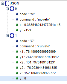
To reverse the curve, switching endpoint x,y in C with startpoint x,y in M and then switching the bezier control points x1,y1 with x2,y2 seems to do it.
Dashed SVG line with non-dashed marker in Safari
I've rewritten the path for the marker. Now it begins in the middle of the side instead of the vertex. Also I'm using stroke-dasharray="30,0"where 30 is the length of the path for the marker.
<svg width="100%" height="100%">
  <defs>
    <marker style="overflow:visible" id="myMarker" refX="0.0" refY="0.0" orient="auto">      <path transform="scale(-0.4) translate(-3,0)" style="fill-rule:evenodd;fill:#ffffff;stroke:#000000;stroke-width:1pt;stroke-opacity:1" d="M-2.88,0L-2.88,5L 5.77,0L -2.88,-5L-2.88,0z" stroke-dasharray="30,0"></path>    </marker>
  </defs>
  <line class="line" stroke-dasharray="5,5" x1="20" y1="20" x2="80" y2="80" marker-start="url(#myMarker)" stroke-width="10" stroke="black"></line>

</svg>
Text marker not visible on svg path element
The origin for text is (by default) the bottom left corner. Text at 0,0 is mostly displayed at negative y co-ordinates. Markers clip (by default) to the box (0, 0, markerWidth, markerHeight) so your text is basically not inside the marker visible area.
You could move the text (increase the y) or set overflow on the marker to visible.
Related Topics
Looping Through Two @Each Lists in SCSS
How to Change Img Src Attribute Using CSS
In Firebug, How to Tell What Is Overriding a Style
Angular 2 Special Selectors with SASS
Css: Scale Background Image Down If Larger Than Window, Keep at 100% Otherwise
Cannot View the Source Image File on a Website
How to Expand a Bootstrap 3 Column to Be the Full Page Width When the Page Is Printed
Easy Equal Height Divs Without JavaScript Possible
Jw Player: Cross-Browser "Display:None" Player Behavior
Set Width of Ng-Multiselect-Dropdown
Angular 6 Material - Hues and How to Change the Color of Mat Radio Button
Prevent Nginx from Serving CSS Files as Text/Plain
Can You Create Space Between Background Image Repeats
Cross-Browser CSS3 Keyframe Animation Firefox
Computed Width with Decimal Values in Firefox, But Without Decimals in Webkit