Full width background, without a wrapper
Your requirements are contradictory.
You specify that each of the three sections should span the entire width of the page (and contain different background) but the contents of each of these must be restricted to 960px. A single div can not simultaneously have 100% width and 960px width. Short of doing some JavaScript magic where you mess around with the spacing, you can not achieve this without folded divs.
Keeping div's width same as wrapper, but making the background full width
I have a solution nearly identitical to the one by patkay.
My HTML:
<div class="outer-wrapper">
    <div class="inner-wrapper">
        <div class="content">Content 1...</div>
    </div>
    <div class="inner-wrapper noted">
        <div class="content">Content 2...</div>
    </div>
    <div class="inner-wrapper">
        <div class="content">Content 3...</div>
    </div>
</div>
And my CSS:
.outer-wrapper {
    width: 100%;
    outline: 1px dotted blue;
}
.inner-wrapper {
    width: inherit;
}
.inner-wrapper.noted {
    background-color: gray;
}
.content {
    width: 600px;
    margin: 10px auto;
    outline: 1px dotted red;
}
Fiddle reference: http://jsfiddle.net/audetwebdesign/Nbu7G/
Essentially, I use the .outer-wrapper to set control the overall width, and then inherit the width to the .inner-wrapper which is used to set the background color through an extra class call .noted.
The inner-most container .content has the fixed width (for example, 600px).
The extra markup could be clean-up semantically using HTML5 tags, but this pattern gives you a lot of hooks to use background images and so on.
Having trouble getting a background image to cover full width of screen
You could do something like the following:
HTML:
<header class="navbar navbar-default" role="navigation">

  <div class="header-content">
    Code for header
  </div>

</header>

<div class="container">
  Rest of page contents here
</div>
CSS:
header {
  width: 100%;
  background: url(https://unsplash.it/2000/1000/?blur) no-repeat center center;
  -webkit-background-size: cover;
  -moz-background-size: cover;
  -o-background-size: cover;
  background-size: cover;
}

.header-content {
  padding: 5em 0;
  font-size: 2em;
  text-align: center;
}
So what's going on here? The wrapping header has a width of 100% in order to cover the entire width of the screen and has a background image as well. Also, it's set to no-repeat and centered vertically/horizontally, as well as background-size set to cover to allow as much of the image to show as possible.
On the .header-content, a padding is added to the div so that it is vertically centered.
The padding, text size, etc can be adjusted, but this should give you a general idea of how this effect is accomplished.
To see it in action, see this codepen.
CSS : Apply background to full width in a div with a fixed width
Were you going for something like this? It'd be easier to answer your question if you provided a fiddle or atleast some code so we can help you with your problem.
I came to this solution:
<div class="row1">
    ...
</div>

<div class="row2">
    ...
</div>
.row1 {
    background-color: red;
    width: 100%;
    height: 50%;
}
.row2 {
    background-color: pink;
    width: 100%;
    height: 50%;
}
You can run it here: JSFiddle
Full width background inside a div
I don't know your whole code but here's a Fiddle
.full-width {
  background: #333;
  height: 50px;
  position: absolute;
  left: 0;
  margin-top: 100px;
  width: 100%;
  z-index: 100;
}
Full-width div with background color
I've changed your html and css using firebug in real-time and it works look:
Your problem is the html, your .wide div are placed on the wrong place, i've placed it correctly, and changed a little the CSS, use these html and css:
HTML:
<div id="bdywrapper2">
<div class="wide">
<div class="odd">
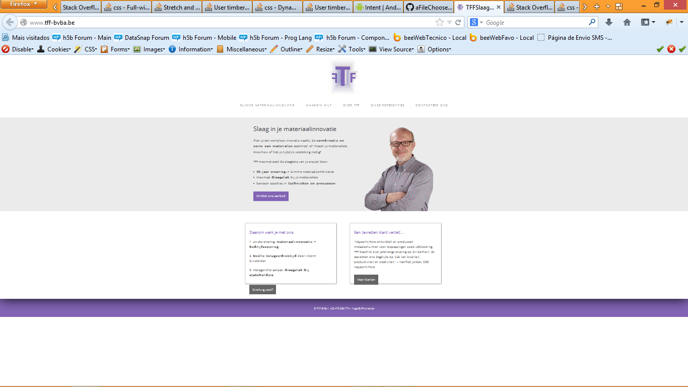
<div class="homeimage"><img src="http://www.tff-bvba.be/wp-content/uploads/2013/11/hugo-home.png" alt="hugo-home" class="alignright size-full wp-image-1283"></div>
<div class="hometext">
<h1>Slaag in je materiaalinnovatie</h1>
<p>Plan je een complexe innovatie waarbij de <b>combinatie en vorm van materialen</b> essentieel is? Missen je medewerkers <i>knowhow</i> of heb je tijdelijk versterking nodig?</p>
<p>TFF maximaliseert de slaagkans van je project door:</p>
<ul>
<li><b>35 jaar ervaring</b> in slimme materiaalcombinaties</li>
<li>maximaal <b>draagvlak </b>bij je medewerkers</li>
<li>bewezen expertise in<b> technieken en processen</b></li>
</ul>
<p><a class="bttn" title="Slimme materiaalinnovatie" href="http://www.tff-bvba.be/materiaalinnovatie/">Ontdek ons aanbod</a>
</p></div>
</div>
</div>
<!-- Start of main -->
<div class="main">
<div class="clear"></div>
<!-- Start of dynamic loop -->
<div class="dynoloop">
<!-- ******************************************************************** This is the start of blog loop ********************************************************************-->
<!-- Start of one half first -->
<div class="blog_one_half_first">
<!-- Start of slider wrapper -->
<section class="slider_wrapper">
<!-- Start of slider -->
<section style="overflow: hidden;" class="slider">
<ul style="width: 800%; margin-left: -412px;" class="slides"><li style="width: 412px; float: left; display: block;" class="clone">
<h3><a href="http://www.tff-bvba.be/testartikel-2/">Een tevreden klant vertelt…</a></h3>
<br>
<p>“Mayser/M.Pore ontwikkelt en produceert metaalschuimen voor toepassingen zoals LED-koeling. TFF beschikt over jarenlange ervaring op dit domein. Ze assisteren ons dagelijks op vlak van kwaliteit, productiviteit en creativiteit.” – Manfred Jordan, CEO Mayser/M.Pore</p>
<p>Meer klanten</p>
</li>
<li style="width: 412px; float: left; display: block;">
<h3><a href="http://www.tff-bvba.be/testartikel-1/">Daarom werk je met ons</a></h3>
<br>
<h2><a href="http://www.tff-bvba.be/waarom-wij/">Daarom werk je met ons</a></h2>
<p>1. Unieke ervaring: <b>materiaalinnovatie + bedrijfsvoering</b></p>
<p>
2. <b>Snelle terugverdientijd</b> door interim dividenden</p>
<p>3. Mensgerichte aanpak: <b>draagvlak bij stakeholders</b><br>
<a href="http://www.tff-bvba.be/waarom-wij/" title="Waarom wij?" class="bttn-left">Overtuig jezelf</a></p>
</li>
<li style="width: 412px; float: left; display: block;">
<h3><a href="http://www.tff-bvba.be/testartikel-2/">Een tevreden klant vertelt…</a></h3>
<br>
<p>“Mayser/M.Pore ontwikkelt en produceert metaalschuimen voor toepassingen zoals LED-koeling. TFF beschikt over jarenlange ervaring op dit domein. Ze assisteren ons dagelijks op vlak van kwaliteit, productiviteit en creativiteit.” – Manfred Jordan, CEO Mayser/M.Pore</p>
<p>Meer klanten</p>
</li>
<li style="width: 412px; float: left; display: block;" class="clone">
<h3><a href="http://www.tff-bvba.be/testartikel-1/">Daarom werk je met ons</a></h3>
<br>
<h2><a href="http://www.tff-bvba.be/waarom-wij/">Daarom werk je met ons</a></h2>
<p>1. Unieke ervaring: <b>materiaalinnovatie + bedrijfsvoering</b></p>
<p>
2. <b>Snelle terugverdientijd</b> door interim dividenden</p>
<p>3. Mensgerichte aanpak: <b>draagvlak bij stakeholders</b><br>
<a href="http://www.tff-bvba.be/waarom-wij/" title="Waarom wij?" class="bttn-left">Overtuig jezelf</a></p>
</li></ul>
<ol class="flex-control-nav"><li><a class="active">1</a></li><li><a>2</a></li></ol><ul class="flex-direction-nav"><li><a class="prev" href="#">Prev</a></li><li><a class="next" href="#">Next</a></li></ul></section><!-- End of slider -->
<!-- Start of clear fix --><div class="clear"></div>
</section><!-- End of slider wrapper -->
</div><!-- End of one half first -->
<!-- Start of one half -->
<div class="blog_one_half">
<!-- Start of slider wrapper -->
<section class="slider_wrapper">
<!-- Start of slider -->
<section class="slider">
<ul class="slides">
<li style="display: list-item;">
<h3><a href="http://www.tff-bvba.be/testartikel-3/">Een tevreden klant vertelt…</a></h3>
<br>
<h2><a href="http://www.tff-bvba.be/onze-referenties/">Een tevreden klant vertelt…</a></h2>
<p>
“Mayser/M.Pore ontwikkelt en produceert metaalschuimen voor toepassingen zoals LED-koeling. TFF beschikt over jarenlange ervaring op dit domein. Ze assisteren ons dagelijks op vlak van kwaliteit, productiviteit en creativiteit.” – Manfred Jordan, CEO Mayser/M.Pore<br>
<a href="http://www.tff-bvba.be/onze-referenties/" title="Onze referenties" class="bttn-right">Meer klanten</a></p>
</li>
</ul>
</section><!-- End of slider -->
<!-- Start of clear fix --><div class="clear"></div>
</section><!-- End of slider wrapper -->
</div><!-- End of one half -->
<!-- ******************************************************************** This is the emd of blog loop ********************************************************************-->
<div class="clear"></div>
</div><!-- End of dynamic loop -->
</div><!-- End of main -->
<!-- Start of accent bottom -->
<div class="accentbottom">
<!-- Start of accent top -->
<div class="accenttop">
</div><!-- End of accent top -->
</div><!-- End of accent bottom -->
</div>
CSS:
.wide {
    text-align:left;
    font-weight:bold;
    background:#ebebeb;
    margin-bottom: 60px;
    width: 100%;
    height: 465px;
}
Fixed width centered content without wrapper div
Turns out there is a solution to this problem, that I just figured out.
You can set a padding, with the use of calc(). Unfortunately it involves a division, which is not properly supported by android.
#container { background: rgba(0, 255, 0, 0.1); padding: 6em calc((100% - 400px)/2);}<div id="container"> One morning, when Gregor Samsa woke from troubled dreams, he found himself transformed in his bed into a horrible vermin.<br> He lay on his armour-like back, and if he lifted his head a little he could see his brown belly, slightly domed and divided by arches into stiff sections. The bedding was hardly able to cover it and seemed ready to slide off any moment.<br> His many legs, pitifully thin compared with the size of the rest of him, waved about helplessly as he looked. "What's happened to me? " he thought. It wasn't a dream. His room, a proper human room although a little too small, lay peacefully between its four familiar walls.<br> A collection of textile samples lay spread out on the table - Samsa was a travelling salesman - and above it there hung a picture that he had recently cut out of an illustrated magazine and housed in a nice, gilded frame. It showed a lady fitted out with a fur hat and fur boa who sat upright, raising a heavy fur muff that covered the whole of her lower arm towards the viewer. Gregor then turned to look out the window at the dull weather. Drops<br></div>Related Topics
Unexpected Empty Space Using Flexbox
Why Does Input's Size Increase in CSS Grid Layouts
Understanding The Z-Offset in Transform-Origin
Detect Screen Width with CSS Media Queries
Left/Right Transparent Cut Out Arrow
How to Write Multiple CSS Selectors in One Line
Perfect Infinite Rotation for ֍ Character
How to Keep Bootstrap 3 Navbar as Collapsed for All Screen Sizes
Matching First Element in Whole Document
CSS Backdrop-Filter Does Not Update When Content Behind It Moves
Internet Explorer 11 Wobbly CSS3 Animation
Two Vertical Divs Within a 100% Height Div
Flex Items Are Shrinking Below Flex-Basis
Resource Interpreted as Stylesheet But Transferred with Mime Type Text Plain Issue
Why Does Visual Studio 2013 Recognize CSS3 Display: Flexbox, But Not Flex