Filling water animation
This can be achieved with a single div and a ::before pseudo element:
The
#banneris givenborder-radius: 50%to create a circle andoverflow: hiddento clip its children inside itThe
::beforepseudo element is animated to 100% height and the animation is paused at 100% using theforwardsvalue. It begins at the bottom with the use ofbottom: 0The background images would be applied in place of the black and blue backgrounds on
#bannerand#banner::before
Compatibility: IE10+ and all modern browsers. The -webkit- prefixed property is most likely no longer necessary for your keyframe animations. Check the browser compatibility chart over here on caniuse.com
Working Example
I have added the cubic-bezier(.2,.6,.8,.4) which is explained in @ChrisSpittles answer. It provides a neat effect!
#banner {
  width: 300px;
  height: 300px;
  position: relative;
  background: #000;
  border-radius: 50%;
  overflow: hidden;
}
#banner::before {
  content: '';
  position: absolute;
  background: #04ACFF;
  width: 100%;
  bottom: 0;
  animation: wipe 5s cubic-bezier(.2,.6,.8,.4) forwards;
}
@keyframes wipe {
  0% {
    height: 0;
  }
  100% {
    height: 100%;
  }
}
<div id="banner">
</div>Filling Water effect with infinite repeat wrapping
You're missing a lot from the original demo. Why not just copy and paste and make whatever local changes to the size and position you wanted? Most of your issues are a result of not having all the SVG elements - the original demo has 3, not just 1. I've added them into your jsbin to get it to work:
<svg version="1.1" xmlns="http://www.w3.org/2000/svg" xmlns:xlink="http://www.w3.org/1999/xlink" x="0px" y="0px" style="display: none;">
  <symbol id="wave">
    <path d="M420,20c21.5-0.4,38.8-2.5,51.1-4.5c13.4-2.2,26.5-5.2,27.3-5.4C514,6.5,518,4.7,528.5,2.7c7.1-1.3,17.9-2.8,31.5-2.7c0,0,0,0,0,0v20H420z"></path>
    <path d="M420,20c-21.5-0.4-38.8-2.5-51.1-4.5c-13.4-2.2-26.5-5.2-27.3-5.4C326,6.5,322,4.7,311.5,2.7C304.3,1.4,293.6-0.1,280,0c0,0,0,0,0,0v20H420z"></path>
    <path d="M140,20c21.5-0.4,38.8-2.5,51.1-4.5c13.4-2.2,26.5-5.2,27.3-5.4C234,6.5,238,4.7,248.5,2.7c7.1-1.3,17.9-2.8,31.5-2.7c0,0,0,0,0,0v20H140z"></path>
    <path d="M140,20c-21.5-0.4-38.8-2.5-51.1-4.5c-13.4-2.2-26.5-5.2-27.3-5.4C46,6.5,42,4.7,31.5,2.7C24.3,1.4,13.6-0.1,0,0c0,0,0,0,0,0l0,20H140z"></path>
  </symbol>
</svg>
<div class="circle">
  <div class="liquid"></div>
  <div id="water" class="water">
    <svg viewBox="0 0 560 20" class="water_wave water_wave_back">
      <use xlink:href="#wave"></use>
    </svg>
    <svg viewBox="0 0 560 20" class="water_wave water_wave_front">
      <use xlink:href="#wave"></use>
    </svg>
  </div>
</div>
You also need JavaScript to get the water to fill.
http://jsbin.com/pinowufeqe/edit?html,css,js,output
Trigger water animation on button click in CSS
you need javascript to add interaction on button, like this
var fillPortion = 0 // the first state is 0%
document.getElementById('add-water-btn').addEventListener('click', () => {
  let height = document.getElementById('banner').clientHeight // get container height
  // prevent added more than 100%
  if (fillPortion < 100) {
    fillPortion += 25 // added 25% on every click
    // since the translate Y is backward (full is 0px, empty is 150px), then the fill portion must be backward to (the first click is 75%, second click is 50%, last click is 0%)
    document.querySelector('#banner .fill').style.transform = 'translate(0, ' + ((100 - fillPortion) / 100) * height + 'px)'
  } else {
    // add code if already full
  }
})
#banner {
border-radius: 50%;
width: 150px;
height: 150px;
background: #000;
overflow: hidden;
backface-visibility: hidden;
transform: translate3d(0, 0, 0);
}
/* add first state */
#banner .fill{
transform: translate(0, 150px);
transition: all cubic-bezier(.2, .6, .8, .4) 4s;
}
/* run animation when class .animate added */
/* EDIT: you dont need animation because it can be done only with transform translate */
/* #banner .fill.animate{
animation-name: fillAction;
animation-iteration-count: 1;
animation-timing-function: cubic-bezier(.2, .6, .8, .4);
animation-duration: 4s;
animation-fill-mode: forwards;
}
*/
#banner #waveShape {
animation-name: waveAction;
animation-iteration-count: infinite;
animation-timing-function: linear;
animation-duration: 0.5s;
width: 300px;
height: 150px;
fill: #04ACFF;
}
@keyframes fillAction {
0% {
transform: translate(0, 150px);
}
100% {
transform: translate(0, -5px);
}
}
@keyframes waveAction {
0% {
transform: translate(-150px, 0);
}
100% {
transform: translate(0, 0);
}
}<div id="banner">
<div class="fill">
<svg version="1.1" xmlns="http://www.w3.org/2000/svg" xmlns:xlink="http://www.w3.org/1999/xlink" x="0px" y="0px" width="300px" height="300px" viewBox="0 0 300 300" enable-background="new 0 0 300 300" xml:space="preserve">
<path fill="#04ACFF" id="waveShape" d="M300,300V2.5c0,0-0.6-0.1-1.1-0.1c0,0-25.5-2.3-40.5-2.4c-15,0-40.6,2.4-40.6,2.4
c-12.3,1.1-30.3,1.8-31.9,1.9c-2-0.1-19.7-0.8-32-1.9c0,0-25.8-2.3-40.8-2.4c-15,0-40.8,2.4-40.8,2.4c-12.3,1.1-30.4,1.8-32,1.9
c-2-0.1-20-0.8-32.2-1.9c0,0-3.1-0.3-8.1-0.7V300H300z"/>
</svg>
</div>
</div>
<!-- add id on button to make DOM interaction easier -->
<div><br/><button id="add-water-btn">Add water</button></div>Fill Ellipse with wave animation
Before giving you the code, have a look at this animated gif below to try to understand how this animation could be created.
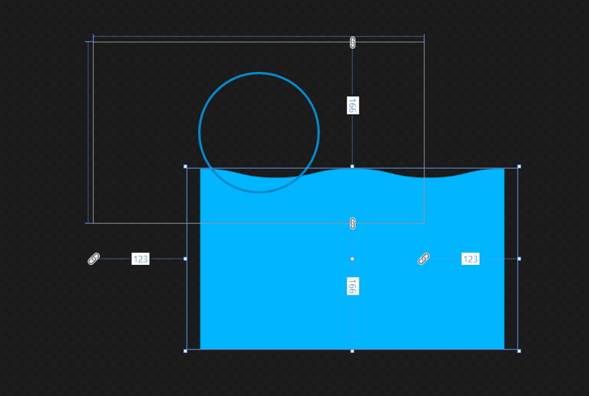
Make sense, right? All we need to do is to create a shape like this, animate its offset X(endlessly) and Y(water level), and finally just clip it with an ellipse.
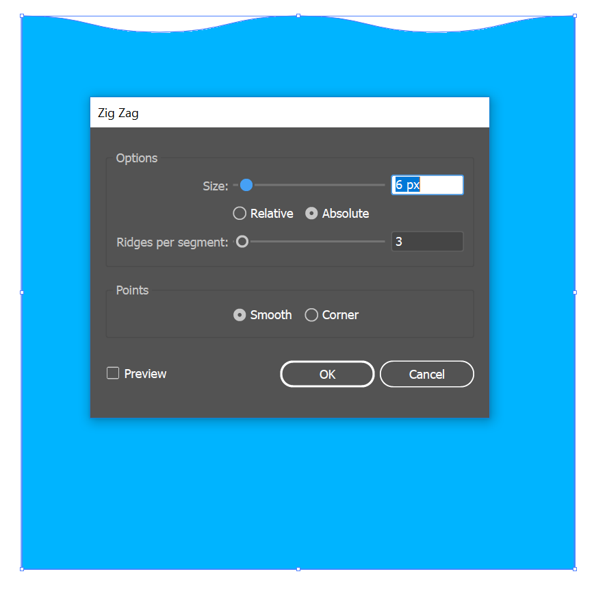
So first you will need to use Adobe Illustrator or similar tools to create this shape. In AI, there's a Zig Zag effect(see screenshot below) that's perfectly for this. You just need to make sure the starting point is at the same position as the ending one, so when you repeat the animation, it will feel like it's never ending.
What's currently missing in UWP is the ability to clip a UIElement with a non-rectangular shape, so here we have to export this as a png (otherwise we would export it as a svg and use Path to display it).
Also for the same reason, the clipping part requires a lot of work. Like in Jet Chopper's answer, that's tons of code to just get a surfaceBrush! Not to mention that you will also need to manually handle device lost and app lifecycle.
Thankfully, in Creators Update(i.e. 15063), there's a new API called LoadedImageSurface that creates a CompositionSurfaceBrush by an image uri with a couple of lines' code. In my code example below, you will see that I use this, which means, if you want to support older versions of Windows 10, you will need to replace it with what's in Jet's answer.
Code
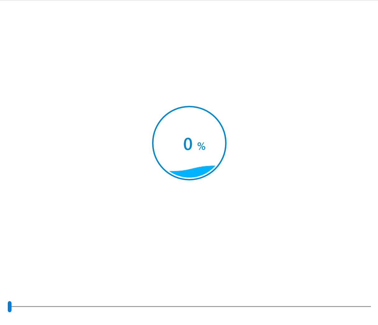
The idea is to create a UserControl called WaveProgressControl which encapsulates all the animation logic and exposes a dependency property called Percent that controls the water level.
The WaveProgressControl control - XAML
<UserControl x:Class="WaveProgressControlRepo.WaveProgressControl"
             Height="160"
             Width="160">

    <Grid x:Name="Root">
        <Ellipse x:Name="ClippedImageContainer"
                 Fill="White"
                 Margin="6" />
        <Ellipse x:Name="CircleBorder"
                 Stroke="#FF0289CD"
                 StrokeThickness="3" />
        <TextBlock Foreground="#FF0289CD"
                   FontSize="36"
                   FontWeight="SemiBold"
                   TextAlignment="Right"
                   VerticalAlignment="Center"
                   Width="83"
                   Margin="0,0,12,0">
            <Run Text="{x:Bind Percent, Mode=OneWay}" />
            <Run Text="%"
                 FontSize="22" />
        </TextBlock>
    </Grid>
</UserControl>
The WaveProgressControl control - Code-behind
private readonly Compositor _compositor;
private readonly CompositionPropertySet _percentPropertySet;

public WaveProgressControl()
{
    InitializeComponent();

    _compositor = Window.Current.Compositor;

    _percentPropertySet = _compositor.CreatePropertySet();
    _percentPropertySet.InsertScalar("Value", 0.0f);

    Loaded += OnLoaded;
}

public double Percent
{
    get => (double)GetValue(PercentProperty);
    set => SetValue(PercentProperty, value);
}
public static readonly DependencyProperty PercentProperty =
    DependencyProperty.Register("Percent", typeof(double), typeof(WaveProgressControl),
        new PropertyMetadata(0.0d, (s, e) =>
        {
            var self = (WaveProgressControl)s;
            var propertySet = self._percentPropertySet;
            propertySet.InsertScalar("Value", Convert.ToSingle(e.NewValue) / 100);
        }));

private void OnLoaded(object sender, RoutedEventArgs e)
{
    CompositionSurfaceBrush imageSurfaceBrush;

    SetupClippedWaveImage();
    SetupEndlessWaveAnimationOnXAxis();
    SetupExpressionAnimationOnYAxisBasedOnPercentValue();

    void SetupClippedWaveImage()
    {
        // Note LoadedImageSurface is only available in 15063 onward.
        var imageSurface = LoadedImageSurface.StartLoadFromUri(new Uri(BaseUri, "/Assets/wave.png"));
        imageSurfaceBrush = _compositor.CreateSurfaceBrush(imageSurface);
        imageSurfaceBrush.Stretch = CompositionStretch.None;
        imageSurfaceBrush.Offset = new Vector2(120, 248);

        var maskBrush = _compositor.CreateMaskBrush();
        var maskSurfaceBrush = ClippedImageContainer.GetAlphaMask(); // CompositionSurfaceBrush
        maskBrush.Mask = maskSurfaceBrush;
        maskBrush.Source = imageSurfaceBrush;

        var imageVisual = _compositor.CreateSpriteVisual();
        imageVisual.RelativeSizeAdjustment = Vector2.One;
        ElementCompositionPreview.SetElementChildVisual(ClippedImageContainer, imageVisual);

        imageVisual.Brush = maskBrush;
    }

    void SetupEndlessWaveAnimationOnXAxis()
    {
        var waveOffsetXAnimation = _compositor.CreateScalarKeyFrameAnimation();
        waveOffsetXAnimation.InsertKeyFrame(1.0f, -80.0f, _compositor.CreateLinearEasingFunction());
        waveOffsetXAnimation.Duration = TimeSpan.FromSeconds(1);
        waveOffsetXAnimation.IterationBehavior = AnimationIterationBehavior.Forever;
        imageSurfaceBrush.StartAnimation("Offset.X", waveOffsetXAnimation);
    }

    void SetupExpressionAnimationOnYAxisBasedOnPercentValue()
    {
        var waveOffsetYExpressionAnimation = _compositor.CreateExpressionAnimation("Lerp(248.0f, 120.0f, Percent.Value)");
        waveOffsetYExpressionAnimation.SetReferenceParameter("Percent", _percentPropertySet);
        imageSurfaceBrush.StartAnimation("Offset.Y", waveOffsetYExpressionAnimation);
    }
}
The MainPage
<Grid Background="{ThemeResource ApplicationPageBackgroundThemeBrush}">
    <Grid.RowDefinitions>
        <RowDefinition />
        <RowDefinition Height="Auto" />
    </Grid.RowDefinitions>

    <local:WaveProgressControl x:Name="WaveProgressControl" />

    <Slider Grid.Row="1"
            Margin="24"
            Value="{x:Bind WaveProgressControl.Percent, Mode=TwoWay}" />
</Grid>
I have put everything into this sample project and below is a live demo. Enjoy! :)
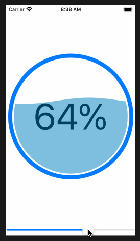
Fill circle with wave animation in SwiftUI
Here's a complete standalone example. It features a slider which allows you to change the percentage:
import SwiftUI

struct ContentView: View {

    @State private var percent = 50.0

    var body: some View {
        VStack {
            CircleWaveView(percent: Int(self.percent))
            Slider(value: self.$percent, in: 0...100)
        }
        .padding(.all)
    }
}

struct Wave: Shape {

    var offset: Angle
    var percent: Double

    var animatableData: Double {
        get { offset.degrees }
        set { offset = Angle(degrees: newValue) }
    }

    func path(in rect: CGRect) -> Path {
        var p = Path()

        // empirically determined values for wave to be seen
        // at 0 and 100 percent
        let lowfudge = 0.02
        let highfudge = 0.98

        let newpercent = lowfudge + (highfudge - lowfudge) * percent
        let waveHeight = 0.015 * rect.height
        let yoffset = CGFloat(1 - newpercent) * (rect.height - 4 * waveHeight) + 2 * waveHeight
        let startAngle = offset
        let endAngle = offset + Angle(degrees: 360)

        p.move(to: CGPoint(x: 0, y: yoffset + waveHeight * CGFloat(sin(offset.radians))))

        for angle in stride(from: startAngle.degrees, through: endAngle.degrees, by: 5) {
            let x = CGFloat((angle - startAngle.degrees) / 360) * rect.width
            p.addLine(to: CGPoint(x: x, y: yoffset + waveHeight * CGFloat(sin(Angle(degrees: angle).radians))))
        }

        p.addLine(to: CGPoint(x: rect.width, y: rect.height))
        p.addLine(to: CGPoint(x: 0, y: rect.height))
        p.closeSubpath()

        return p
    }
}

struct CircleWaveView: View {

    @State private var waveOffset = Angle(degrees: 0)
    let percent: Int

    var body: some View {

        GeometryReader { geo in
            ZStack {
                Text("\(self.percent)%")
                    .foregroundColor(.black)
                    .font(Font.system(size: 0.25 * min(geo.size.width, geo.size.height) ))
                Circle()
                    .stroke(Color.blue, lineWidth: 0.025 * min(geo.size.width, geo.size.height))
                    .overlay(
                        Wave(offset: Angle(degrees: self.waveOffset.degrees), percent: Double(percent)/100)
                            .fill(Color(red: 0, green: 0.5, blue: 0.75, opacity: 0.5))
                            .clipShape(Circle().scale(0.92))
                    )
            }
        }
        .aspectRatio(1, contentMode: .fit)
        .onAppear {
            withAnimation(Animation.linear(duration: 2).repeatForever(autoreverses: false)) {
            self.waveOffset = Angle(degrees: 360)
            }
        }
    }
}

struct ContentView_Previews: PreviewProvider {
    static var previews: some View {
        CircleWaveView(percent: 58)
    }
}
how can i implement a water bottle getting filled on android?
1-use GIF image from designer and use library to show it.
for example : android-gif-drawable
2-use images that show by animation timer.
Liquid filling text with animation
Here is text that fills like liquid.
Works great in Chrome but needs tweaking in Firefox.
#banner {  position: relative;  overflow: hidden;font-family: sans-serif;font-size: 40pt;font-weight: bold;background: #ccc}.inner {background: #000;color:#fff;mix-blend-mode: multiply; }#banner::before {  content: '';  position: absolute;  background: #0f0;  width: 100%;  bottom: 0;  animation: wipe 5s cubic-bezier(.2,.6,.8,.4) forwards;}
@keyframes wipe {  0% {    height: 0;  }  100% {    height: 73%;  }}
<span id="banner"> <span class="inner">73%</span></span>Related Topics
CSS Transitions with Calc() Do Not Work in Ie10+
How to Make Firefox Print a Background-Color Style
CSS Text Justify with Letter Spacing
How to Get the Nth Child of an Element Using CSS2 Selectors
How to Create the Masonry Effects with Just Bootstrap 3 Grid System and CSS
How to Add Animated Gradient to an Svg Path
Text-Overflow Ellipsis on Flex Child Not Working
Binding in Control with "Class" Attribute
The Use of /Deep/ and >>> in Angular 2
Combine CSS Attribute and Pseudo-Element Selectors
Blocky Gradient Effect in CSS3
Convert 8-Digit Hex Colors to Rgba Colors
How to Align Nav Items to the Right in Bootstrap 5