3 columns, center column fixed, sides fill parents
The easiest method is to use display: table-cell.
See: http://jsfiddle.net/47d4f/
That solves your problem, and also gives you equal height columns when the content is different in each column - something that isn't otherwise simple to obtain.
Browser support: http://caniuse.com/css-table
2 column div layout: right column fixed width, left fluid, height relative to eachother
So, I got an answer to my question from @thirtydot (see comment above):
Do you need to support IE7? If not, you can use display: table-cell
Flex container with 3 columns, 100% height, and fixed-width side columns
When you create a flex container (display: flex or display: inline-flex), it automatically applies flex-direction: row and align-items: stretch (among other initial settings).
These default settings line up flex items in a row and give them each the full height of the container. However, if you set a height on a flex item, it overrides align-items. So remove any heights you've set on the items.
This should work for you:
#container {  display: flex;  justify-content: space-between;  height: 100vh;}
.col-side {  flex: 0 0 240px;}
#col2 { flex: 1; }
#container > div + div {  border-left: 2px solid rgba(0, 0, 0, 0.12);}
#col1 { background-color: lightgreen; }#col2 { background-color: tomato; }#col3 { background-color: aqua; }body  { margin: 0; }
<div id="container"> <div class="col-side" id="col1">Left</div> <div class="col" id="col2">Center</div> <div class="col-side" id="col3">Right</div></div>Problems with a 3 column layout with fixed left side
You mean something more like this: http://jsfiddle.net/gbRzM/?
(uses left, right and width properties to position everything)
.left {
    width: 230px;
position:fixed;
    background:GREEN;
}

.right {
    right:0;
    width:30%;
    position:fixed;
    background: RED;
}

.center {
    left:230px;
    right:30%;
    position:fixed;
    border:1px solid;
    background:YELLOW;
}
Or more accurately this: http://jsfiddle.net/HKJvP/?
(puts center and right in a new div, so that pixels and % can be mixed, allows equal width that you specified)
.left {
    width: 230px;
    position:fixed;
    background:GREEN;
}

.notleft{
    left:230px;
    height:100%;
    right:0;
    position:fixed;
}

.right {
    right:0;
    width:50%;
    position:absolute;
    background: RED;
}

.center {
    left:0;
    width:50%;
    position:absolute;
    border:1px solid;
    background:YELLOW;
}
3-column layout (fixed-fluid-fixed) with full-screen height
Is this what you need? http://jsfiddle.net/3MfBa/
HTML:
<div class="side left">
    Sub Content
  </div>
  <div class="main">
    Main Content<br>
    <img src="" width="200" height="600">
  </div>
  <div class="side right">
    Sub Content
  </div>
CSS:
.main {
    position: absolute;
    top:0;
    bottom:0;
    left:20%;
    right:20%;
    background:#ddd;
    padding: 10px;
    overflow: auto;
  }

  .side {
    position:absolute;
    width:20%;

    top:0;
    bottom:0;

    background-color: green;
  }

  .left {
    left:0;
    background-color: red;
  }

  .right {
    right:0;
    background-color: blue;
  }
Alternative CSS (http://jsfiddle.net/DgPRZ/):
body { margin:0; padding:0;}

.main {
    margin-left:20%;
    margin-right:20%;
    background:#ddd;
    padding: 10px;
  }

  .side {
    position:fixed;
    width:20%;

    top:0;
    bottom:0;

    background-color: green;
  }

  .left {
    left:0;
    background-color: red;
  }

  .right {
    right:0;
    background-color: blue;
  }
ALT VERSION 2 (http://jsfiddle.net/B4X4p/2/):
HTML:
<div class="container">
  <div class="col side left">
    Sub Content
  </div>
  <div class="col main">
      <div class="main-content">
        Main Content<br>
      </div>
  </div>
  <div class="col side right">
    Sub Content
  </div>
</div>
CSS:
html, body { margin:0; padding:0; height:100%;}

.container, .container > div.col {
    display: flex;
    flex: 1 0 auto;
}

.container {
    width:100%;
    min-height:100%;
}

.main {
    width: 60%;
    background:#ddd;
    float:left;
}

.main-content {
    padding: 10px;
}

  .side {
    width:20%;
    background-color: green;
    min-height:100%;
    float:left;
  }

  .left {
    background-color: red;
  }

  .right {
    background-color: blue;
  }
3 columns, middle one with flexible width
You can do that by floating col1 and col3 to the left and to the right, with a fixed width.
Then add a left and right margin to col2 equal to the width of col1 and col3.
This gives you three columns; col1 and col3 having a fixed width and col2 filling the available width:
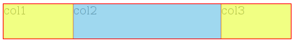
(col2's content box in blue, and its margins in yellow)
<div class='container'>
    <div class='right'>
        col3
    </div>
    <div class='left'>
        col1
    </div>
    <div class='middle'>
        col2
    </div>
</div>


.container {
    overflow: hidden;
}
.right {
    float: right;
    width: 100px;
}
.left {
    float: left;
    width: 100px;
}
.middle {
    margin: 0 100px;
}
Try it here: http://jsfiddle.net/22YBU/
BTW if you need display: table, display: table-row and display: table-cell, use a table ;-)
CSS three column resize issue
You can use CSS calc() on both the right and left bars:
#right-bar {
    width: calc(50% - 364px);
}
Fiddle: http://jsfiddle.net/K8qba/
Related Topics
CSS Media Queries Min-Width and Min-Device-Width Conflicting
Vue.Js Dynamic <Style> with Variables
MVC Bundling and CSS Relative Urls
I Cannot Change the Font Size of Package Explorer in Eclipse
Sass @Each with Multiple Variables
Why Would Font Names Need Quotes
Apple-Like Scrollbars Using CSS
Selenium Webdriver Get Text from CSS Property "Content" on a ::Before Pseudo Element
How to Get the Height of an Element Using CSS Only
Angular Dynamic Background Images
Float a Div Above Page Content
Can You Target an Element with CSS Only If 2 Classes Are Present
Can One CSS File Take Priority Over Another CSS File
Inner Border Over Images with CSS
How to Use Camelcase in CSS Class Names