Dynamically changing font, font-size, font-color, and so on in Vaadin Flow web apps
The short answer is yes. And this is one of the major changes between Vaadin Platform version 10 and later compared to Vaadin 8 and earlier. In Vaadin Platform theming is not based on SASS anymore.
The reason for this change is because we use web components to create the client "widgets", and web components are based on latest HTML5 standard. They introduce so called shadow DOM and local DOM concepts. I.e. the internals of the web components cannot be styled in global theme. So number of new concepts for theming is needed. Custom properties, themable mixins, etc. We have chapter in our documentation describing this in detail.
Your particular question can be addressed with CSS custom properties. They are basically CSS variables, and have notation --my-property. There is example in documentation how to add custom properties to custom widgets. Values of these custom properties can be defined in global styles and/or run time via Element API of Flow element.getStyle().set("--my-property", "red");.
Also those styles that are exposed naturally can be modified run time using Element API element.getStyle(), like element.getStyle().set("fontWeight", "bold");
So in general Vaadin Flow offers much more features for dynamic styling than Vaadin 8 ever did.
See also: Vaadin Flow/10/11 style component via css
Vaadin Flow TextField: how dynamically change font color?
With the Custom Theme feature, you can add your custom theme @Theme(value = "my-theme"), create a CSS stylesheet file ${project.basedir}/frontend/themes/my-theme/components/vaadin-text-field.css and place the following there:
:host(.my-class-red) [part="input-field"]{
    color:red
}

:host(.my-class-blue) [part="input-field"]{
    color:blue
}
On the Java side:
TextField name = new TextField("Your name");
name.setLabel("My label");

Button red = new Button("Red", click -> {
   name.removeClassName("my-class-blue");
   name.addClassName("my-class-red");
});

Button blue = new Button("Blue", click -> {
   name.removeClassName("my-class-red");
   name.addClassName("my-class-blue");
});

Button reset = new Button("Reset", click -> {
   name.removeClassNames("my-class-red", "my-class-blue");
});

add(red, blue, reset);
Is there any way to use font S as standard size in Vaadin Flow 14?
You can override the default Lumo values in a global style sheet. For example, the following will make the fonts consistently smaller:
html {
    --lumo-font-size: 1rem;
    --lumo-font-size-xxxl: 1.75rem;
    --lumo-font-size-xxl: 1.375rem;
    --lumo-font-size-xl: 1.125rem;
    --lumo-font-size-l: 1rem;
    --lumo-font-size-m: 0.875rem;
    --lumo-font-size-s: 0.8125rem;
    --lumo-font-size-xs: 0.75rem;
    --lumo-font-size-xxs: 0.6875rem;
}
For new projects, start.vaadin.com enable the adjustment of the theme downloaded with the starter.
Styling the titles in Vaadin Charts
Theme
The various Theme controlling the look of the charts vary widely in their sizing. The new Valo themes (ValoLightTheme and ValoDarkTheme, matching Vaadin’s new Valo theme) tend to be much larger than the previous default, VaadinTheme (matching Vaadin’s Reindeer theme).
So one easy way to change sizes of chart labels is to switch themes. The theme is not set on the individual chart. Instead, use a global setting affecting all charts within a UI (a web browser’s particular window/tab/portlet). The ChartOptions class has a setTheme method.
ChartOptions.get().setTheme( new VaadinTheme() ); // All charts within a UI share the same Theme object.
Unless you have a specific need, I suggest putting that code in the init method of your UI subclass (such as MyVaadinUI in Vaadin projects created by Maven or the Vaadin Plugin for NetBeans/Eclipse).
Title Object > Style Object
In Vaadin Charts 2, the title and subtitle of the chart are represented by appropriately named objects, Title and Subtitle. Each has an optional Style object. That object has several settings correlating to the usual CSS properties, including:
- font family
- font size
- color
Font Size
So setting the font size is a matter of fetching:
Chart object > Configuration object > Title object > Style object
…and then passing a string value for text size to the setFontSize method.
Seems simple, but there is one catch. The Style object is optional. By default, it does not exist. In other words, the Style object is meant for you and I to override the already-defined internal formatting.
So you must first check for the Style object’s existence, and if null, instantiate it.
Example code using Vaadin 7.3.7 with the fresh new (as of 2014-12) Vaadin Charts 2 in Java 8.
final Configuration configuration = chart.getConfiguration();  // As per usual, interact with the chart via its Configuration object.
Title t = configuration.getTitle();  // Obtain the object representing the title (or Subtitle for subtitle).
if ( t.getStyle() == null ) {  // If not yet existing…
    t.setStyle( new Style() );  // Instantiate a Style object and install on the Title object.
}
Style st = t.getStyle();  // Obtain the Style object (whether new or pre-existing).
st.setFontSize( "0.5em" );  // Half an em is teeny-tiny, but demonstrates this approach works to change the font size.
Left-Right Alignment
To set the title’s alignment towards the left or right of the chart, no need for the Style object. The Title object itself has a setHorizontalAlignment method. Pass values defined by the HorizontalAlign enum for LEFT, CENTER, RIGHT.
final Configuration configuration = chart.getConfiguration();  // As per usual, interact with the chart via its Configuration object.
Title t = configuration.getTitle();  // Obtain the object representing the title (or Subtitle for subtitle).
t.setHorizontalAlign( HorizontalAlign.LEFT );
Legend
The legend is similar to Title. The Configuration contains a Legend object. The Legend contains a Style object.
Chart object > Configuration object > Legend object > Style object
Legend Item
The items (marker & series name) in a Legend have their own styling. To change the font or font size of those series names, access the items’ Style object. The catch is that there is no layer of "LegendItem" object. Instead of accessing such an object, call the Legend method getItemStyle
Chart object > Configuration object > Legend object >
getItemStylemethod
Engage Lumo compact mode in Vaadin 13 and later, for smaller size layouts
Add two annotations: @JsModule & @Theme
I found a bit more documentation on this tutorial, Themes and styling in Vaadin, by Jouni Koivuviita on the Vaadin.com site. See Use global variants > Compact.
Add three imports:
import com.vaadin.flow.component.dependency.JsModule;
import com.vaadin.flow.theme.Theme;
import com.vaadin.flow.theme.lumo.Lumo;
Add two annotations:
@JsModule ("@vaadin/vaadin-lumo-styles/presets/compact.js")
@Theme ( Lumo.class)
To quote the tutorial:
Technically, it adds a
<style>element to the page which sets new values for the Lumo sizing and spacing CSS properties. You can view the values from the source code.
For more technical detail, including a list of affected CSS properties, see that first link in tutorial: Compact preset in the Lumo styles demo site. And see the actual code in that second link, the GitHub page: vaadin-lumo-styles/presets/compact.html.
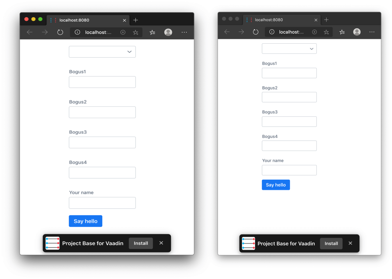
Put that together into a demo class. We are modifying the MainView class generated in a new project by the Vaadin.com project starters page, for Vaadin 14.1.17.
package work.basil.example;

import com.vaadin.flow.component.Key;
import com.vaadin.flow.component.button.Button;
import com.vaadin.flow.component.button.ButtonVariant;
import com.vaadin.flow.component.dependency.CssImport;
import com.vaadin.flow.component.dependency.JsModule;
import com.vaadin.flow.component.notification.Notification;
import com.vaadin.flow.component.orderedlayout.VerticalLayout;
import com.vaadin.flow.component.select.Select;
import com.vaadin.flow.component.textfield.TextField;
import com.vaadin.flow.router.Route;
import com.vaadin.flow.server.PWA;
import com.vaadin.flow.theme.Theme;
import com.vaadin.flow.theme.lumo.Lumo;

/**
 * The main view contains a button and a click listener.
 */
@JsModule ( "@vaadin/vaadin-lumo-styles/presets/compact.js" )
@Theme ( Lumo.class )
@Route ( "" )
@PWA ( name = "Project Base for Vaadin", shortName = "Project Base" )
@CssImport ( "./styles/shared-styles.css" )
@CssImport ( value = "./styles/vaadin-text-field-styles.css", themeFor = "vaadin-text-field" )
public class MainView extends VerticalLayout
{
    enum Animal { DOG, CAT, BIRD, HAMSTER } ;

    public MainView ( )
    {
        // Use TextField for standard text input
        TextField textField = new TextField( "Your name" );

        // Button click listeners can be defined as lambda expressions
        GreetService greetService = new GreetService();
        Button button = new Button( "Say hello" ,
                e -> Notification.show( greetService.greet( textField.getValue() ) ) );

        // Theme variants give you predefined extra styles for components.
        // Example: Primary button is more prominent look.
        button.addThemeVariants( ButtonVariant.LUMO_PRIMARY );

        // You can specify keyboard shortcuts for buttons.
        // Example: Pressing enter in this view clicks the Button.
        button.addClickShortcut( Key.ENTER );

        // Use custom CSS classes to apply styling. This is defined in shared-styles.css.
        this.addClassName( "centered-content" );

        Select < Animal > animalSelect = new Select <>();
        animalSelect.setItems( Animal.values() );
        this.add( animalSelect , new TextField( "Bogus1" ) , new TextField( "Bogus2" ) , new TextField( "Bogus3" ) , new TextField( "Bogus4" ) , textField , button );
    }
}
Here is the result when running with the embedded Jetty server to Microsoft Edge v 80.0.361.57 client on macOS Mojave 10.14.6.
I am not clear on whether you need to annotate every one of your UI classes or just the MainView.java. I would guess you must annotate every UI class.
Center widgets within a layout in Vaadin Flow
HorizontalLayout with CSS3 Flexbox
The trusty HorizontalLayout and VerticalLayout classes from olden days are still in Vaadin 14. This pair of classes have been retrofitted to use modern Flexbox technology found in CSS3. See excellent tutorials on Flexbox at CSS-Tricks.com and at Mozilla. CSS3 Flexbox is very close conceptually to the behavior of classic Vaadin HorizontalLayout and VerticalLayout.
In this example below we start with a Vaadin HorizontalLayout.
final public class AuthenticateView extends HorizontalLayout
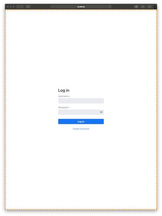
In the constructor, add your widget to the layout, a LoginForm being the widget in this example.
this.add ( new LoginForm() );
Make the HorizontalLayout to use all the available room with regards to both the width and the height.
this.setSizeFull ();
Set our content in the layout (our LoginForm) to move to the middle horizontally across. The verb “justify” here refers to typographer/designer lingo where justification means alignment to the margin of the page.
this.setJustifyContentMode ( FlexComponent.JustifyContentMode.CENTER );
Lastly, we can specify where our content should appear vertically within our now-very-tall layout. Do we want content at the top, at the bottom, or in the middle?
Notice the difference in syntax here from the Vaadin 8 generation: The term FlexComponent reflects the use of CSS Flexbox.
this.setDefaultVerticalComponentAlignment ( FlexComponent.Alignment.CENTER );
Bonus feature: Let's verify visually the behavior of our HorizontalLayout by coloring its otherwise invisible edges.
this.getStyle ().set ( "border" , "6px dotted DarkOrange" ); // DEBUG - Visually display the bounds of this layout.
Set this view to be default via the @Route annotation.
@Route ( "" )
final public class AuthenticateView extends HorizontalLayout
When run we find our login form appearing centered within our much bigger web browser window. Notice the orange border showing how our HorizontalLayout has grown to take the entire window.
For fun, try disabling the various lines of code shown here. Run the app to see the impact the code has on behavior by noticing the placement of the LoginForm and the orange border.
Here is complete class code.
package work.basil.example.ui;

import com.vaadin.flow.component.login.LoginForm;
import com.vaadin.flow.component.login.LoginI18n;
import com.vaadin.flow.component.orderedlayout.FlexComponent;
import com.vaadin.flow.component.orderedlayout.HorizontalLayout;
import com.vaadin.flow.router.Route;

@Route ( "" )
final public class AuthenticateView extends HorizontalLayout
{
    // Constructor
    public AuthenticateView ( )
    {
        super ();

        // Widgets
        this.add ( new LoginForm () );

        // Arrange
        this.getStyle ().set ( "border" , "6px dotted DarkOrange" );  // DEBUG - Visually display the  bounds of this layout.
        this.setSizeFull ();
        this.setJustifyContentMode ( FlexComponent.JustifyContentMode.CENTER ); // Put content in the middle horizontally.
        this.setDefaultVerticalComponentAlignment ( FlexComponent.Alignment.CENTER ); // Put content in the middle vertically.

    }
}
Caveat: This code shown above is nowhere near sufficient for real-world login work. The focus here was on widget layout, not user authentication.
Related Topics
Stack CSS Transitions Using Multiple Classes Without Overriding
CSS Columns: Target Last Child in Each Column
Background-Size Transition on Hover Causes Chrome to "Shake" Background Image
Fill a Parent Div While Maintaining a Ratio
How to Make a Div Disappear on Hover Without It Flickering When The Mouse Moves
Select All Block Level Elements with CSS
Angular 2 - Jquery | Adding Styles (Top/Left) with a Mouse Position
Are There a CSS Property That Would Change Nothing and Where We Can Store Information
How to Select My CSS Module Class Using Document.Queryselector
CSS Flexbox: a Centered Child Overflows a Parent with Position Fixed
Complex Selector Don't Work in Last Blink Version: Nth-Child(2):Nth-Last-Child(2){}