Why custom css class does not work on React-Semantic-UI elements?
Give your className a bit more specific name, like claim_Card. After that in your css you need to override sematic's default css by adding your className to existing semantic's css for that component. In your case it would be something like
.ui.card.claim_Card {
  background: #455332; //for example
}
This will give your css rule more specificity and will override default semantic css. Anyway, check in your browser inspector what css class is applied to your element that you want to style and use that className (in this case .ui.card) and add on it your className definition and rules.
React Semantic UI and a custom CSS class
I believe you practically answered your own question, in semantic.css that Semantic UI uses file class combination
.ui.label has a predefined color rgb(0,0,0,.6) - these are the classes React element Label uses.
Since .ui.label is more specific than .test (2 classes vs 1 class, here is an amazing infographic about this: http://www.standardista.com/css3/css-specificity/), the color parameter of the first class trumps the second color parameter.
I tried this with Semantic UI and without React and the same result occurred.
.test {
   color: red;
}

<div class="ui label test">not a color red</div>
How can I style react semantic components?
Actually you're setting the value of className incorrectly.
Here is the modified version of your code.
import React from "react";
import { Button, Form, Header } from "semantic-ui-react";
import from './loginForm.css';

const LoginForm = () => (
  <Form className='formStyle'>
    <Button className='buttonStyle'>Login</Button>
  </Form>
);

export default LoginForm;
and for loginForm.css
.ui.form.formStyle  {
  margin-left: 300px ;
  margin-top: 100px ;
  width: 550px ;
  height: 400px;
 }

.ui.button.buttonStyle {
  border-radius: 18px;
  width: 200px;
  background-color:#3865FE;
}
thanks @funJoker for suggesting me how to edit semantic-ui style.
CSS overriding Semantic React Ui Properties
You can simply give the className prop to the Header
See working demo here
Also you need to apply !important to the styles.
Note: If you inspect element, you will see that the below styles are applied to Header by semantic ui library. So if you want to provide custom className then with below mentioned css properties then you have to use !important.
.ui.header {
    border: none;
    margin: calc(2rem - .14285714em) 0 1rem;
    padding: 0 0;
    font-family: Lato,'Helvetica Neue',Arial,Helvetica,sans-serif;
    font-weight: 700;
    line-height: 1.28571429em;
    text-transform: none;
    color: rgba(0,0,0,.87);
}
How to use css modules (react semantic ui) in create react app?
The issue with line import css. While import the css no need to give the module name for it. Just change the import line as below, it will work
import './updatesPage.css';
Also change the code for className as below
<Table celled className='updateForm'>
Like sematic ui take priority while setting the css. So you need to change the priority in css add !important.
.updateForm {
    margin-top: 100px !important;
    margin-left: 50px !important;
}
Overriding styles in semantic ui react
Specificity is king. Only time would need to use !important would be when inline style is present and the library does not expose a way to toggle the property off in some way (poor architecture choice).
The following list of selector types increases by specificity:
Type selectors (e.g., h1) and pseudo-elements (e.g., ::before).
Class selectors (e.g., .example), attributes selectors (e.g.,
[type="radio"]) and pseudo-classes (e.g., :hover).ID selectors (e.g.,
#example).
https://developer.mozilla.org/en-US/docs/Web/CSS/Specificity
Take a look at the first UI Button for Semantic UI here, is comprised of the following HTML:
<button class="ui button">Click Here</button>
CSS is attached via semantic.min.css:
.ui.button {
    cursor: pointer;
    display: inline-block;
    min-height: 1em;
    outline: 0;
    border: none;
    vertical-align: baseline;
    background: #e0e1e2 none;
    color: rgba(0,0,0,.6);
    font-family: Lato,'Helvetica Neue',Arial,Helvetica,sans-serif;
    margin: 0 .25em 0 0;
    padding: .78571429em 1.5em .78571429em;
    text-transform: none;
    text-shadow: none;
    font-weight: 700;
    line-height: 1em;
    font-style: normal;
    text-align: center;
    text-decoration: none;
    border-radius: .28571429rem;
    -webkit-box-shadow: 0 0 0 1px transparent inset, 0 0 0 0 rgba(34,36,38,.15) inset;
    box-shadow: 0 0 0 1px transparent inset, 0 0 0 0 rgba(34,36,38,.15) inset;
    -webkit-user-select: none;
    -moz-user-select: none;
    -ms-user-select: none;
    user-select: none;
    -webkit-transition: opacity .1s ease,background-color .1s ease,color .1s ease,background .1s ease,-webkit-box-shadow .1s ease;
    transition: opacity .1s ease,background-color .1s ease,color .1s ease,background .1s ease,-webkit-box-shadow .1s ease;
    transition: opacity .1s ease,background-color .1s ease,color .1s ease,box-shadow .1s ease,background .1s ease;
    transition: opacity .1s ease,background-color .1s ease,color .1s ease,box-shadow .1s ease,background .1s ease,-webkit-box-shadow .1s ease;
    will-change: '';
    -webkit-tap-highlight-color: transparent;
}
To override say, the font color, all we have to do is write a selector that is more specific than this selector. We can achieve this by combining their two class selectors (equally specific) with a type selector (additional specificity).
This would look like:
button.ui.button {
  color: red;
}
Now since button.ui.button is more specific in describing the location of the element in the page (DOM), than say just .ui.button, this signals to the browser that this style should override the previous declaration. This is a common way to customize a theme.
Great docs here:
https://developer.mozilla.org/en-US/docs/Learn/CSS/Introduction_to_CSS
.ui.button {    cursor: pointer;    display: inline-block;    min-height: 1em;    outline: 0;    border: none;    vertical-align: baseline;    background: #e0e1e2 none;    color: rgba(0,0,0,.6);    font-family: Lato,'Helvetica Neue',Arial,Helvetica,sans-serif;    margin: 0 .25em 0 0;    padding: .78571429em 1.5em .78571429em;    text-transform: none;    text-shadow: none;    font-weight: 700;    line-height: 1em;    font-style: normal;    text-align: center;    text-decoration: none;    border-radius: .28571429rem;    -webkit-box-shadow: 0 0 0 1px transparent inset, 0 0 0 0 rgba(34,36,38,.15) inset;    box-shadow: 0 0 0 1px transparent inset, 0 0 0 0 rgba(34,36,38,.15) inset;    -webkit-user-select: none;    -moz-user-select: none;    -ms-user-select: none;    user-select: none;    -webkit-transition: opacity .1s ease,background-color .1s ease,color .1s ease,background .1s ease,-webkit-box-shadow .1s ease;    transition: opacity .1s ease,background-color .1s ease,color .1s ease,background .1s ease,-webkit-box-shadow .1s ease;    transition: opacity .1s ease,background-color .1s ease,color .1s ease,box-shadow .1s ease,background .1s ease;    transition: opacity .1s ease,background-color .1s ease,color .1s ease,box-shadow .1s ease,background .1s ease,-webkit-box-shadow .1s ease;    will-change: '';    -webkit-tap-highlight-color: transparent;}
button.ui.button {  color: red;}
<button class="ui button">Click Here</button>How to add custom color to menu in tab - Semantic UI React
The problem is:
Semantic UI adds a class to the menu with the "color-name" that is passed to color prop. See the image below when we pass a custom color instead of a "pre-defined color class"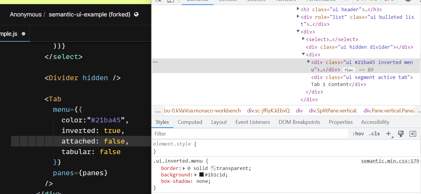
One of the Solution(s):
className attribute to menu props and define the custom css for that className.
Updated Sandbox
Hope this helps.
Related Topics
Add Ancestor Selector in Current SASS Nesting
Yii Chtml::Radiobuttonlist - CSS to Align Horizontally
Universal CSS Selector to Match Any and All HTML Data-* Attributes
Lesscss - Ie Gradient Filter with Variables and Lighten
How to Draw a Border Around The Text of a Javafx Label
Path-Relative Style Sheet Import Vulnerabilities
Use CSS to Make Background-Image Above Background-Color in a List
Style Dojox Grid Row Depending on Data
CSS - Underline Text But Ignore The Spaces
Vuetify V-Tooltip Unable to Change CSS
CSS Background Gradient Validation
Ionic 4 How to Change: Shadow Dom in CSS
Colored Characters in HTML Title
Does Display:None Still Use Performance of Rendering