CSS Triangles in React Native
It is still possible to draw triangles in React Native using the CSS trick.
I wrote a class to encapsulate this: https://github.com/Jpoliachik/react-native-triangle
If you'd like to write it yourself, I used this tool: http://apps.eky.hk/css-triangle-generator/ to generate the triangle I wanted and modify the styles to React Native syntax.
For example, an Isosceles triangle 90x90 pointing up in CSS reads:
width: 0;
height: 0;
border-style: solid;
border-width: 0 45px 90px 45px;
border-color: transparent transparent #007bff transparent;
But in React Native the styles would be:
triangle: {
     width: 0,
     height: 0,
     backgroundColor: 'transparent',
     borderStyle: 'solid',
     borderTopWidth: 0,
     borderRightWidth: 45,
     borderBottomWidth: 90,
     borderLeftWidth: 45,
     borderTopColor: 'transparent',
     borderRightColor: 'transparent',
     borderBottomColor: 'red',
     borderLeftColor: 'transparent',
   },
Why do these css styles create a triangle in react-native
Basically borders are not squares but are trapizoids at the corners, yours just have a width of zero.
this may help understand:
#tri {

    width: 0px;

    background: antiquewhite;

    border-top: 60px solid transparent;

    border-bottom: 60px solid blue;

    border-left: 60px solid green;

    border-right: 65px solid green;

}
<div id="tri""></div>Background border view with up-arrow triangle | React Native
Add 2 triangle one for background color and one for border color
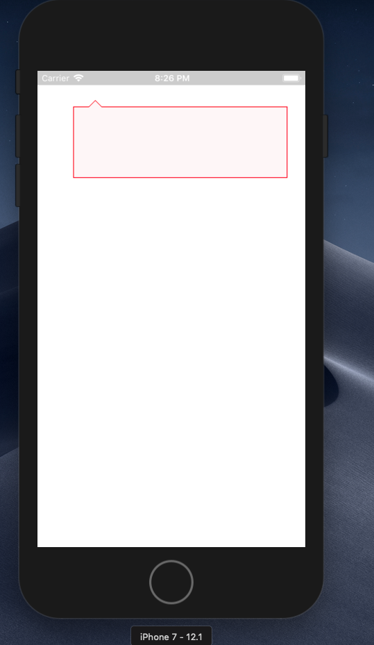
Complete code
import React, { Component } from "react";
import { View, StyleSheet } from "react-native";

export default class Dashboard extends Component {
  render() {
    return (
      <View style={styles.box}>
        <View style={styles.triangle} />
        <View style={styles.triangle2} />
      </View>
    );
  }
}

const styles = StyleSheet.create({
  box: {
    width: 300,
    height: 100,
    backgroundColor: "#fef6f7",
    position: "relative",
    margin: 50,
    borderColor: "red",
    borderWidth: 1
  },
  triangle: {
    width: 10,
    height: 10,
    position: "absolute",
    top: -10,
    left: 20,
    borderLeftWidth: 10,
    borderLeftColor: "transparent",
    borderRightWidth: 10,
    borderRightColor: "transparent",
    borderBottomWidth: 10,
    borderBottomColor: "red"
  },
  triangle2: {
    width: 10,
    height: 10,
    position: "absolute",
    top: -10,
    left: 21,
    borderLeftWidth: 9,
    borderLeftColor: "transparent",
    borderRightWidth: 9,
    borderRightColor: "transparent",
    borderBottomWidth: 9,
    borderBottomColor: "#fef6f7"
  }
});
How to implement inner corner radius in triangle in react-native
Hey you can achive this using 2 methods
- stacking the views
- using svg
working example: https://snack.expo.io/@ashwith00/honest-peach
code:
import * as React from 'react';
import { Text, View, StyleSheet } from 'react-native';
import Constants from 'expo-constants';
import { Svg, Path } from 'react-native-svg';

const RADVALUE = 40;
const SIZE = 200;
export default function App() {
  return (
    <View style={styles.container}>
      <View style={styles.traingleCorner}>
        <View style={styles.coloredPart} />
        <View style={styles.uncoloredPart} />
      </View>
      <View style={styles.traingleCorner}>
        <Svg
          width={`${SIZE}`}
          height={`${SIZE}`}
          fill="red"
          strokeWidth={1}
          viewBox={`0 0 ${SIZE} ${SIZE}`}>
          <Path
            d={`M0 0L0 ${SIZE}L${SIZE} ${SIZE}Q${RADVALUE} ${
              SIZE - RADVALUE
            } 0 0 `}
          />
        </Svg>
      </View>
    </View>
  );
}

const styles = StyleSheet.create({
  container: {
    flex: 1,
    justifyContent: 'center',
    alignItems: 'center',
    paddingTop: Constants.statusBarHeight,
    backgroundColor: '#ecf0f1',
    padding: 8,
  },
  traingleCorner: {
    width: SIZE,
    height: SIZE,
  },
  coloredPart: {
    flex: 1,
    backgroundColor: 'red',
  },
  uncoloredPart: {
    ...StyleSheet.absoluteFillObject,
    borderBottomLeftRadius: SIZE,
    backgroundColor: '#ecf0f1',
  },
});
In svg just change SIZE, RADVALUE as your requirements
Draw triangle on android
height: 10,
width: 10,
transform: [
  { rotate: '45deg' },
  { translateY: -7 },
],
It's not the best but it works.
how to set view on top of another view (having just borders) in react native
Hre is a sample example. First you need to have a container with a position: relative. Then you could position the inner divs with positions absolute and with a z-index.
.container {
        width: 200px;
        height: 200px;
        border: 1px solid red;
        position: relative;
    }
    .viewA {
        position: absolute;
        bottom: 0;
        left: 0;
        width: 50%;
        height: 50%;
        z-index: 2;
        background: yellow;
        opacity: 0.5;
    }
    .viewB{
        position: absolute;
        top: 0;
        left: 0;
        width: 100%;
        height: 100%;
        background: green;
        z-index: 1;
    }
<div class="container">
<div class="viewA">View B</div>
<div class="viewB">View A</div>
</div>Related Topics
Margin-Top Percentage Does Not Change When Window Height Decreases
CSS Positioning Elements Next to Each Other
What Does Hash (#) Sign Do Outside Loops in SASS
How to Identify and Eliminate Unused CSS Styles from My Bloated Stylesheet
Infinite Image Slider with Pure CSS3
Clip-Path:Circle() Radius Doesn't Seem to Be Calculated Correctly
:First-Letter Selector Doesn't Work for Link
Svg with Radialgradient Not Work in Browsers
Rmarkdown Font Size and Header
Why Doesn't This CSS Transition Work on Svg Inside an Anchor
Bootstrap Cards with 100% Height and Margin Bottom
Background Image Is Not Displayed in Firefox
Differencebetween Applying CSS Transition Property in Hover Rather Than in Its Normal State
Font-Face Embedded Fonts Look Fuzzy in Windows 7 Browsers