CSS Grid - unnecessary word break
It's not a bug but a complex calculation.
There is a kind of cycle to calculate the final width of the element which create the issue. The width is first calculated considering the content (a shrink-to-fit behavior based on the properties you used) then using percentage value with padding will consider the calculated width1. At the end, we will reduce the calculated padding from the width creating the word break.
This will happen with the smallest value since in all the cases the width will always be less than the needed width to contain the longest word:
.grid { display: grid; grid-template-columns: auto;}.item { margin:auto; border:1px solid;}.pad p { word-break: break-word; padding: 0 1%;}<div class="grid"> <div class="item"> <p>HOTEL</p> <p>I_WILL_FOR_SURE_BREAK</p> </div></div>
<div class="grid"> <div class="item pad"> <p>HOTEL</p> <p>I_WILL_FOR_SURE_BREAK</p> </div></div>Solution for word-wrapping and breaking my grid
You could set also a min-height making all of them reserve the space (gap) for 2 lines or...
jQuery equalheights plugin
How to stop line breaking with this CSS Grid autofill experiment
You are looking for auto-fit, not auto-fill:
I found a very good explanation on this here:
auto-fillfills the row with as many columns as it can fit. So it creates implicit columns whenever a new column can fit, because it’s trying to fill the row with as many columns as it can. The newly added columns can and may be empty, but they will still occupy a designated space in the row.
auto-fitfits the currently available columns into the space by expanding them so that they take up any available space. The browser does that after filling that extra space with extra columns (as withauto-fill) and then collapsing the empty ones.
.grid-container {
    display: grid;
    grid-template-columns: repeat(auto-fit, minmax(100px, 1fr));
    border: 0.5px solid Magenta;
}

.flex-display {
    display : flex;
    border: 0.5px solid Green;
}

.dbForm *{
    font-size: x-small;
}

.dbForm-nonTable {
    margin: 2px;
    padding: 2px;
    border: 0.5px solid #000000;
    overflow: auto;
    background-color: #ffec80; /* light gold */
    min-height: 10px;
    min-width: 30px;
}

.dbForm-label {
    margin: 2px;
    padding: 2px;
    overflow: auto;
    min-height: 10px;
}
<body>
<div class="dbForm" dbase-source="invoices" >
<div class="grid-container">
<div class="flex-display">
<div class="dbForm-label">Date:</div>
<div class="dbForm-nonTable">bumble doo</div>
</div>
<div class="flex-display">
<div class="dbForm-label">Client code:</div>
<div class="dbForm-nonTable">Dodo</div>
</div>
<div class="flex-display">
<div class="dbForm-label">Notes:</div>
<div class="dbForm-nonTable">Nabble</div>
</div>
</div>
</div>
</body>word-wrap not working in a CSS Grid item
Use style word-breaK:break-all as mentioned below:
.item p {
  min-width: 0;
  min-height: 0;
  color:gold ;
  word-wrap: break-word;
  word-break: break-all;
  max-width: 100%;
}
JSFiddle
The reason is that word-wrap: break-word will only break the words. So if for an example, if your paragraph has multiple words and you want to break them then this style will be used. And here your text inside p itself is one word.
While word-break: break-all; is used when you want to break the word.
Stop word-wrap dividing words
use white-space: nowrap;. If you have set width on the element on which you are setting this it should work.
update -
rendered data in Firefox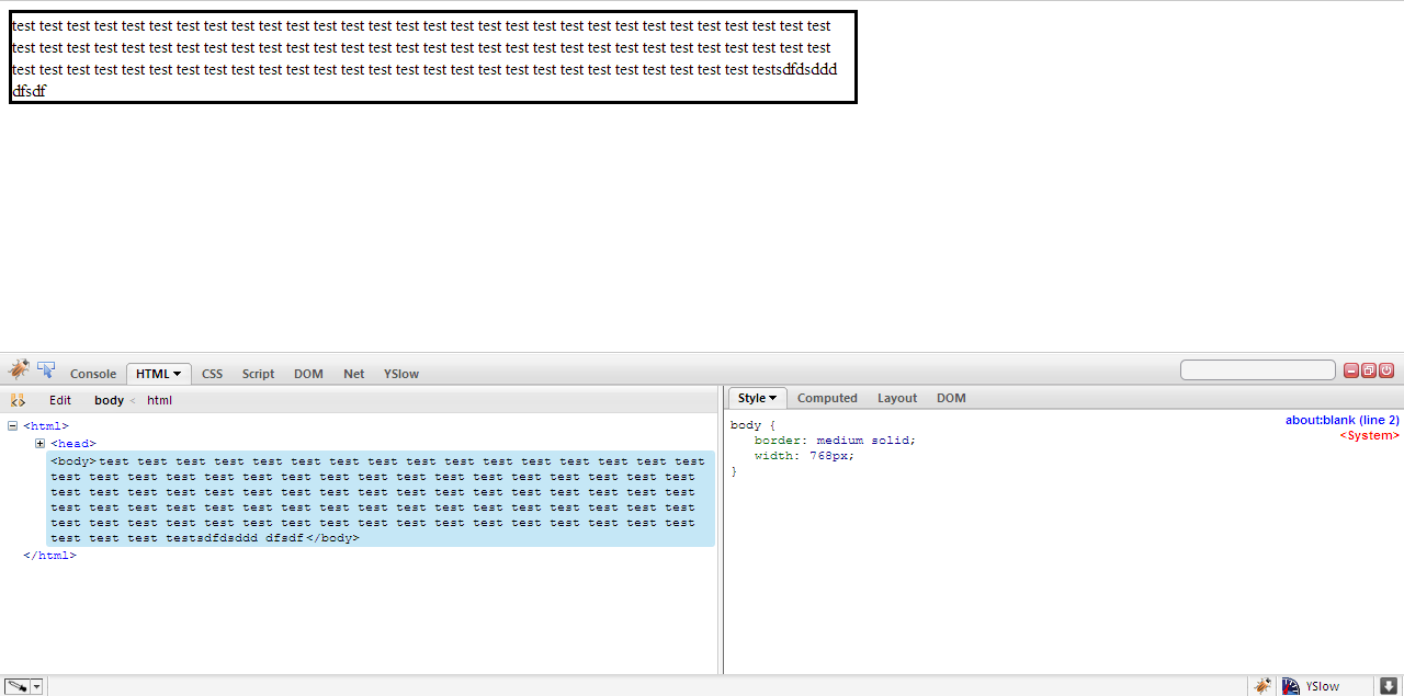
How can I force this CSS grid to wrap to a new line without specifying minmax sizes?
I don't see how this is possible with the current iteration of CSS Grid.
As you've already discovered, you would at least need to define a fixed minimum width on the columns, in order to force a wrap at some point.
Unfortunately, with automatic repetitions, the minimum length cannot be auto, min-content or max-content alone, because that is forbidden in the specification.
Here's as close as you can get with Grid, as far as I can tell:
.btn-tabs {  display: grid;  grid-template-columns: repeat(auto-fill, minmax(75px, max-content));  width: 20rem;}
/* original demo styles */.btn {  font-family: "Arial", sans-serif;  border-bottom: 4px solid #77aaee;  color: #77aaee;  padding: .6rem;  text-decoration: none;}
<div class="btn-tabs"> <a class="btn" href="#">Button 1</a> <a class="btn" href="#">Button 2</a> <a class="btn" href="#">Button 3</a> <a class="btn" href="#">Button 4</a> <a class="btn" href="#">Button 5</a> <a class="btn" href="#">Button 6</a></div>Related Topics
Is There a Reason Why CSS Doesn't Support Ids and Classes, Starting from Numbers
Xhtml/Css: How to Make Inner Div Get 100% Width Minus Another Div Width
Changing Three.Js Background to Transparent or Other Color
How to Remove Space (Margin) Above HTML Header
Does 'Position: Absolute' Conflict with Flexbox
How to Set the Height of a Div Based on a Percentage-Based Width
Align Button at the Bottom of Div Using CSS
How to Style the Ul List to a Single Line
Less and Bootstrap: How to Use a Span3 (Or Spanx [Any Number]) Class as a Mixin
How to Efficiently Load Google Fonts in Nuxt
Perspective and Translatez Moves Diagonally
CSS - First Child Without Certain Class
CSS Specificity or Inheritance
How to Fix Unexpected Column Order in Bootstrap 4
Webkit CSS to Control the Box Around the Color in an Input[Type=Color]