how to draw dashed and solid vertical lines with css gradient
You can do it like below:
.box {
  --c: #000; /* color */
  --t: 2px; /* thickness */
  --g: 40px; /* gap */
  --d: 10px; /* control the dashes */

  background:
    linear-gradient(90deg,var(--c) var(--t),#0000 0) 0/ calc(4*var(--g)) 100%,
    repeating-linear-gradient(90deg,#0000 0 var(--t),#fff 0 var(--g)),
    linear-gradient(var(--c) 50%,#0000 0) 0/100% var(--d);

  background-clip: padding-box;
  min-height: 100vh;
  border: solid #0000;
  border-width: 0 var(--g);
}

body {
  margin:0;
}
<div class="box"></div>How to create straight line with same css gradient at both ends?
You should just use a single gradient like in the below snippet with the start and end as transparent.
Explanation:
transparent 0%means the gradient starts with transparent color#8C8C8C 15%means that between 0% to 15% the gradient's color gradually changes from transparent to#8C8C8C.#8C8C8C 85%means that the gradient's color stays as#8C8C8Cfrom 15% to 85%.transparent 100%means that the gradient's color would again change gradually from#8C8C8Cto transparent between 85% - 100%.
The color stops create the illusion as though the gradient is proceeding inwards from either direction. Equal splits make the change look equal on either side.
div { background-image: -webkit-linear-gradient(left, transparent 0%, #8C8C8C 15%, #8C8C8C 85%, transparent 100%); background-image: linear-gradient(left, transparent 0%, #8C8C8C 15%, #8C8C8C 85%, transparent 100%); height: 2px;}<div></div>Is it possible to draw vertical lines via css gradients starting from arbitrary point?
As the linear-gradient creates an image and we can treat it as one, so a very simple way is to combine it with background-size/background-repeat.
div { width: 700px; height: 100px; background-color: linen; background-size: 50px 50px; background-repeat: repeat-x; background-image: linear-gradient(to right, black 1px, transparent 1px, transparent), linear-gradient(to right, black 1px, transparent 1px, transparent), linear-gradient(60deg, transparent 25px, black 25px, transparent 26px, transparent); background-position: left 30px top, left 5px bottom, left 5px center;}<div></div>how to make a vertical gradient lines with css
You might by overwriting .pluses class somewhere in your CSS file, but this should work
.pluses {
  padding: 30px;
  width: 250px;
  float: left;
  border: 1.5px solid;
  border-top: 0;
  border-bottom: 0;
  border-image: linear-gradient(to bottom, rgba(255, 255, 255, 0) 0%, rgba(226, 226, 226, 1) 48%, rgba(255, 255, 255, 0) 100%);
  border-image-slice: 1;
}
Fiddle: https://jsfiddle.net/2jvqn76L/1/
CSS3 Gradients: How to make a 1px wide line
.style {
    background-image: -o-linear-gradient(left , rgb(255,255,255) 50%, rgb(209,209,209) 50%, rgb(255,255,255) 50.5%);
    background-image: -moz-linear-gradient(left , rgb(255,255,255) 50%, rgb(209,209,209) 50%, rgb(255,255,255) 50.5%);
    background-image: -webkit-linear-gradient(left , rgb(255,255,255) 50%, rgb(209,209,209) 0%, rgb(255,255,255) 50.5%);
    background-image: linear-gradient(left , rgb(255,255,255) 50%, rgb(209,209,209) 50%, rgb(255,255,255) 50.5%);
}
You are not dealing with pixels, you are using percentages. So 1% of your width, which must be 200 is 2px. (I think that is why this works, maybe I'm wrong.) You can use percentages decimals, so .5% == 1px.
Hard edged gradient in css?
What about multiple gradient like this:
.line { height:5px; background-image: linear-gradient(red,red), linear-gradient(blue,blue), linear-gradient(yellow,yellow), linear-gradient(purple,purple); background-size: calc(1 * (100% / 4)) 100%, calc(2 * (100% / 4)) 100%, calc(3 * (100% / 4)) 100%, calc(4 * (100% / 4)) 100%; background-repeat:no-repeat;}<div class="line"></div>Color gradient for each line/character
Here is the solution of the effect you want:
HTML
<p class="text-gradient">
TaihouKai
</p>
CSS
.text-gradient {
    font-size: 20px;
    font-weight: 700;
    background-image: linear-gradient(to bottom, #9E9F9E, #ffffff);
    background-clip: text;
    -webkit-background-clip: text;
    color: transparent;
}
Explanation of background-clip CSS property (from MDN):
The background-clip CSS property sets whether an element's background extends underneath its border box, padding box, or content box.
This property allows the background gradient, image or colour to be "cast" onto the characters themselves.
JS Fiddle Demo
UPDATE If you want to deal with multiple lines which are separated with line break <br />, you can use JavaScript to achieve:
revised JSFiddle demo
Multiple circle lines with gradient color CSS
You can do it like below:
.box {
  height: 150px;
  background: linear-gradient(90deg, red, yellow);
  position: relative;
  overflow: hidden;
  border-radius:20px;
}

.box::before {
  content: "";
  position: absolute;
  width: 100%;
  height: 200%;
  top: 0;
  left: 50%;
  background: repeating-radial-gradient(circle, transparent 0 20px, blue 21px 23px);
  clip-path: circle(farthest-side); /* to cut extra circles*/
}
<div class="box">
</div>Can I create gradient line effect with css or html5?
Like this: http://codepen.io/richbradshaw/pen/uexaG
.blurred-line {
  height:30px;
  width:600px;
  margin:0 auto;

  -moz-background-image: linear-gradient(to right, transparent 0%, black 100%);
  background-image: linear-gradient(to right, transparent 0%, black 100%);

  border-radius:15px;
  -webkit-filter:blur(1px);
}
Which renders like:
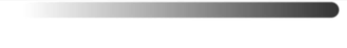
Despite what most people seem to think, that gradient syntax is the real syntax, and works in Firefox 10+, Chrome 26+, IE10+ and Safari 6 (or 7?)+.
Including all the ancient gradient stuff is a waste of time, unless you are planning to support browsers that don't exist (e.g. Chrome 10, Firefox 3.6).
Related Topics
Jqgrid Rowattr Not Applying Class
Why Is Fixed Background Image on Chrome Not Working
Flexbox Does Not Work in Safari, Striked Out in Web Inspector
How to Set The Width and Height of a Textarea Using CSS
CSS: Not(), Selectors and Selecting Descendants
Vertically Aligning an Image to The Bottom Inside a Bootstrap "Column"
CSS: Table and Table-Cell Replacement for Ie7
Centering in CSS, When The Object Is Larger Than The Viewport
Styles Based on Number of Children
Create Loading Messages That Will Change Based on Loading Time of Plot in a Shiny App
Slow Down CSS Transitions/Animations into "Slow Motion"
Vertically Aligning Block Element to Image
How to Expand a Cropped Image into a Box
Horizontal Navigation with Logo in Middle
Why Do H1 Tags Not Need a Class or Id in The CSS