Chrome will increase the font size when zooming out
See, you used px for the first div and em for the second.
Chrome has a minimum font size and fonts smaller than it will be displayed as that font size only. (see your Chrome Settings)
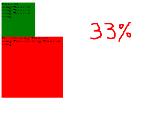
Now, using div with px, the box goes on and becomes even smaller on zooming at 33% (or 25% or 50%) but using em, the box remains the same size when the minimum font-size has been reached. see
em is useful on browsers which implement zooming by scaling the font size like Chrome. So if you size all your elements using em they scale accordingly.
em makes sure that the whole content is displayed as it is even if the size of div changes (on zooming). Hope you got your answer :)
EDIT
In IE10, there's no minimum font size in settings as in GC35. So the em px render like each other.
Chrome does not keep consistent rem units on zoom-in
The solution I found was to simply multiply the original font-size by 2, and then divide all rem sizes by 2 as well, because then the font-size at 50% will be 7px again. In other situations, that may not work, but repeating this trick again might fix
The problem seems to be that Chrome decides that its rendered font sizes cannot be less than 3px, which means that any font size below 12px will gradually creep towards being rendered at 3px, but will never shrink to smaller than that.
window.onresize = function() { console.log(getComputedStyle(document.body.parentElement, null).getPropertyValue("font-size"));}html { font-size: 14px;}body { font-size: 1em;}.box { width: 5rem; height: 5rem; background: red;}<html> <head> </head> <body> <div class="box"></div> <p>foo bar baz</p> </body></html>Why the font size won't change with browser zoom in?
The problem is that you have set -webkit-text-size-adjust: none; for the body in layout.css. Changing it to -webkit-text-size-adjust: auto; allows the zooming of the fonts along with the page.
Edit: Corrected the CSS. Should be auto not 0
Font size value scaling with browser zooming
First of all, the rem unit is related to the root element, i.e. html, therefore, changing font-size on body does not have any effect on the descendant elements.
Firebug and the other developer tools display the computed values according to the W3C specification. More precisely, they use the window.getComputedStyle() function to get the computed value and this function does not take the zoom level into account.
To get the actual font size, you need to calculate it yourself. How you do that is described by Tom Bigelajzen. He also created a script to detect the zoom level.
With it you should be able to calculate the actual font sizes by multiplying the computed font size with the zoom factor:
var cs = window.getComputedStyle(element);
var actualSize = Number.parseFloat(cs.fontSize) * detectZoom.zoom();
Font-size 12px doesn't have effect in Google Chrome
disable the auto adjustment by following style.
* {
    -webkit-text-size-adjust: none;
}
CSS (font-size?) - Chrome vs Firefox on zooming out
It has nothing to do with your code. What you see on maximum zoom-out in chrome is just minimum chrome font size. You can set it up in a way explained here . However you can't go below certain value which you can see in your case. And you can't do anything about it.
It's considered as a chrome bug: http://code.google.com/p/chromium/issues/detail?id=7417 and there seems to be some workaround, but it will not fix the default chrome behaviour (you'd have to tweak each chrome browser you're viewing the page on).
Why do you even care anyway?
Rem-Based Layouts, Zooming on chrome is inconsistent, PX vs REM
That's because Chrome's behavior of setting a minimum font-size, so if you zoom-out, chrome will set the minimum font-size to 6px (12px for chinese and japanese version). So your div will have a minimum width as it depends on your base font-size (which can't be smaller then chrome's minimum).
See also:
Chrome will increase the font size when zooming out
[Edit] Additional Information:
Chromium Tickets & Discussions On this topic:
https://bugs.chromium.org/p/chromium/issues/detail?id=16875
https://bugs.chromium.org/p/chromium/issues/detail?id=36429
-webkit-text-size-adjust Support Dropped, so the viable solution for this behavior is not reliable anymore:
https://trac.webkit.org/changeset/145168/webkit
Why does text not stay the same size when I zoom in my browser?
Previous answer: Try to use em instead of percentage.
If you want it to scale well you need to have a relative measurement for your css. em and percentage can help you there.
If you want the text to stay the same size despite the browser being zoomed in/out you can achieve this using viewport:
https://css-tricks.com/examples/ViewportTypography/
p {
  font-size: 2vmin;
}
However this isn't recommended and the format vh, vw, and vmin have compabitilies issues.
Related Topics
Setting Linear Gradient Height and Width
Multi Level Dynamic Flyout Menu
Bootstrap Grid with Different Image Heights
When Do Nested Child Elements Expand Their Parent Elment
How to Reuse React-Native Stylesheet (Styles) in React
CSS Animation Keyframes with Display None Works to Fade In, But Not Fade Out
Viewport-Unit Font-Size and Zooming Bug: Which Browsers Are Affected
Cannot Find Definitions of Editor-Label and Editor-Field in MVC 4, Did Ms Remove It? Why
Set Width of "Dialog" Widget to a Percentage of The Page in Vaadin 14
Creating Gradient Lines in CSS
:After,: Before Issues in Internet Explorer 11
Horizontal Sharp Background Gradient with Specific Length of First Color
Use Full Width Excluding Overflow Scrollbar with "Position: Absolute"