Change navbar color in twitter bootstrap 2.0.4
The color of the navbar come from the .navbar-inner lines 3582 to 3589 in bootstrap.css (for the version 2.0.4)
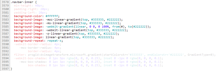
The css properties are applied in a specific order
- background-color (recognised by all web browser)
- vendor prefixes -moz, -ms, -webkit, -o (to serve specific web browser)
- the standard (but not implemented yet)
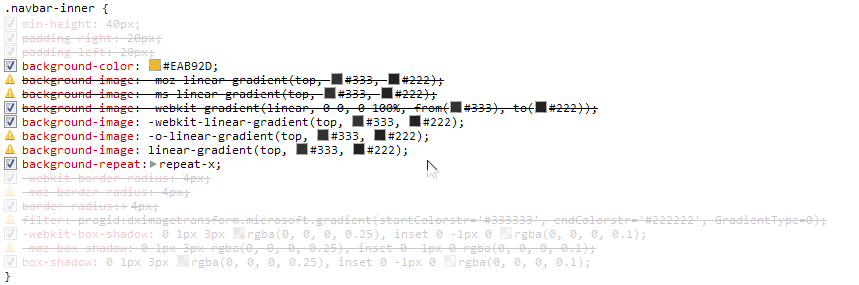
Example of background-color override in boostrap.css with Chrome:
background-color:#ffffff; has been replaced with background-color:#eab92d directly into boostrap.css (it's not recommended but it's just to illustrate the point).
background-color: #EAB92D is applied first
-moz-linear-gradient and -ms-linear-gradient are ignored
-webkit-gradient cover background: #EAB92D(back to the default gradient)
-webkit-linear-gradient overrides -webkit-gradient
-o-linear-gradient and linear-gradient are ignored

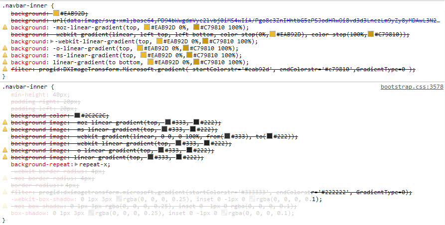
Change the color of .navbar-inner from colorzilla
You can easily create a cross browser gradient with colorzilla
Create a <style> tag in <head> after bootstrap.css is called.
Then copy the css generated by colorzilla in .navbar-inner {} inside the <style> tag.
.navbar-inner {
  background: #eab92d; /* Old browsers */
  /* IE9 SVG, needs conditional override of 'filter' to 'none' */
  background: url(data:image/svg+xml;base64,PD94bWwgdmVyc2lvbj0iMS4wIiA/Pgo8c3ZnIHhtbG5zPSJodHRwOi8vd3d3LnczLm9yZy8yMDAwL3N2ZyIgd2lkdGg9IjEwMCUiIGhlaWdodD0iMTAwJSIgdmlld0JveD0iMCAwIDEgMSIgcHJlc2VydmVBc3BlY3RSYXRpbz0ibm9uZSI+CiAgPGxpbmVhckdyYWRpZW50IGlkPSJncmFkLXVjZ2ctZ2VuZXJhdGVkIiBncmFkaWVudFVuaXRzPSJ1c2VyU3BhY2VPblVzZSIgeDE9IjAlIiB5MT0iMCUiIHgyPSIwJSIgeTI9IjEwMCUiPgogICAgPHN0b3Agb2Zmc2V0PSIwJSIgc3RvcC1jb2xvcj0iI2VhYjkyZCIgc3RvcC1vcGFjaXR5PSIxIi8+CiAgICA8c3RvcCBvZmZzZXQ9IjEwMCUiIHN0b3AtY29sb3I9IiNjNzk4MTAiIHN0b3Atb3BhY2l0eT0iMSIvPgogIDwvbGluZWFyR3JhZGllbnQ+CiAgPHJlY3QgeD0iMCIgeT0iMCIgd2lkdGg9IjEiIGhlaWdodD0iMSIgZmlsbD0idXJsKCNncmFkLXVjZ2ctZ2VuZXJhdGVkKSIgLz4KPC9zdmc+);
  background: -moz-linear-gradient(top,  #eab92d 0%, #c79810 100%); /* FF3.6+ */
  background: -webkit-gradient(linear, left top, left bottom, color-stop(0%,#eab92d), color-stop(100%,#c79810)); /* Chrome,Safari4+ */
  background: -webkit-linear-gradient(top,  #eab92d 0%,#c79810 100%); /* Chrome10+,Safari5.1+ */
  background: -o-linear-gradient(top,  #eab92d 0%,#c79810 100%); /* Opera 11.10+ */
  background: -ms-linear-gradient(top,  #eab92d 0%,#c79810 100%); /* IE10+ */
  background: linear-gradient(to bottom,  #eab92d 0%,#c79810 100%); /* W3C */
  filter: progid:DXImageTransform.Microsoft.gradient( startColorstr='#eab92d', endColorstr='#c79810',GradientType=0 ); /* IE6-8 */
}
The css generated by colorzilla overrides all the css properties from boostrap.css as you can see below


Changing '.navbar-inner' is not enough few other bits needs to be changed.
.navbar .btn-navbar (the button to open the menu when width<768px) share the same properties as .navbar-inner
.navbar-inner, .navbar .btn-navbar {
    background: #eab92d; /* Old browsers */
    /* IE9 SVG, needs conditional override of 'filter' to 'none' */
    background: url(data:image/svg+xml;base64,PD94bWwgdmVyc2lvbj0iMS4wIiA/Pgo8c3ZnIHhtbG5zPSJodHRwOi8vd3d3LnczLm9yZy8yMDAwL3N2ZyIgd2lkdGg9IjEwMCUiIGhlaWdodD0iMTAwJSIgdmlld0JveD0iMCAwIDEgMSIgcHJlc2VydmVBc3BlY3RSYXRpbz0ibm9uZSI+CiAgPGxpbmVhckdyYWRpZW50IGlkPSJncmFkLXVjZ2ctZ2VuZXJhdGVkIiBncmFkaWVudFVuaXRzPSJ1c2VyU3BhY2VPblVzZSIgeDE9IjAlIiB5MT0iMCUiIHgyPSIwJSIgeTI9IjEwMCUiPgogICAgPHN0b3Agb2Zmc2V0PSIwJSIgc3RvcC1jb2xvcj0iI2VhYjkyZCIgc3RvcC1vcGFjaXR5PSIxIi8+CiAgICA8c3RvcCBvZmZzZXQ9IjEwMCUiIHN0b3AtY29sb3I9IiNjNzk4MTAiIHN0b3Atb3BhY2l0eT0iMSIvPgogIDwvbGluZWFyR3JhZGllbnQ+CiAgPHJlY3QgeD0iMCIgeT0iMCIgd2lkdGg9IjEiIGhlaWdodD0iMSIgZmlsbD0idXJsKCNncmFkLXVjZ2ctZ2VuZXJhdGVkKSIgLz4KPC9zdmc+);
    background: -moz-linear-gradient(top,  #eab92d 0%, #c79810 100%); /* FF3.6+ */
    background: -webkit-gradient(linear, left top, left bottom, color-stop(0%,#eab92d), color-stop(100%,#c79810)); /* Chrome,Safari4+ */
    background: -webkit-linear-gradient(top,  #eab92d 0%,#c79810 100%); /* Chrome10+,Safari5.1+ */
    background: -o-linear-gradient(top,  #eab92d 0%,#c79810 100%); /* Opera 11.10+ */
    background: -ms-linear-gradient(top,  #eab92d 0%,#c79810 100%); /* IE10+ */
    background: linear-gradient(to bottom,  #eab92d 0%,#c79810 100%); /* W3C */
    filter: progid:DXImageTransform.Microsoft.gradient( startColorstr='#eab92d', endColorstr='#c79810',GradientType=0 ); /* IE6-8 */
    }
.divider-vertical (the vertical separator) uses the same colors used in the gradient
.navbar .divider-vertical {
    background-color: #c79810;
    border-right: 1px solid #eab92d;
    }
.active (the highlight on the active page) is corresponding to the dark color of the gradient
.navbar .nav .active > a, .navbar .nav .active > a:hover {
    background-color: #c79810;
    }
the color of the link on the menu needs to be changed as well, in this case 75% from the fair color of the gradient to white.
.navbar .nav > li > a {
    color: #f9ed9d;
    }
And finally the color of the .brand , in this case 50% from the fair color of the gradient to white.
.navbar-fixed-top .brand {
    color: #634c08;color: #f4dc87;
    }
The :hover color of links has not been changed bu can be with:
.navbar .nav > li > a:hover {color:white;}
Same for the color of the active link
.navbar .nav .active > a, .navbar .nav .active > a:hover {color:white;}


Twitter Bootstrap Change Navbar
Since you are using the .navbar-inverse class, you need to use more specific css. .navbar-inverse .navbar-inner is overriding the coloring for .navbar-inner
Use this css selector:
.navbar-inverse .navbar-inner {
  background-color: red; /* background color will be black for all browsers */
  background-image: none;
  background-repeat: no-repeat;
  filter: none;
}
navbar color in Twitter Bootstrap
You can overwrite the bootstrap colors, including the .navbar-inner class, by targetting it in your own stylesheet as opposed to modifying the bootstrap.css stylesheet, like so:
.navbar-inner {
  background-color: #2c2c2c; /* fallback color, place your own */

  /* Gradients for modern browsers, replace as you see fit */
  background-image: -moz-linear-gradient(top, #333333, #222222);
  background-image: -ms-linear-gradient(top, #333333, #222222);
  background-image: -webkit-gradient(linear, 0 0, 0 100%, from(#333333), to(#222222));
  background-image: -webkit-linear-gradient(top, #333333, #222222);
  background-image: -o-linear-gradient(top, #333333, #222222);
  background-image: linear-gradient(top, #333333, #222222);
  background-repeat: repeat-x;

  /* IE8-9 gradient filter */
  filter: progid:DXImageTransform.Microsoft.gradient(startColorstr='#333333', endColorstr='#222222', GradientType=0);
}
You just have to modify all of those styles with your own and they will get picked up, like something like this for example, where i eliminate all gradient effects and just set a solid black background-color:
.navbar-inner {
  background-color: #000; /* background color will be black for all browsers */
  background-image: none;
  background-repeat: no-repeat;
  filter: none;
}
You can take advantage of such tools as the Colorzilla Gradient Editor and create your own gradient colors for all browsers and replace the original colors with your own.
And as i mentioned on the comments, i would not recommend you modifying the bootstrap.css stylesheet directly as all of your changes will be lost once the stylesheet gets updated (current version is v2.0.2) so it is preferred that you include all of your changes inside your own stylesheet, in tandem with the bootstrap.css stylesheet. But remember to overwrite all of the appropriate properties to have consistency across browsers.
Change Bootstrap 2.0.4 responsive navbar width
Okay, I got it. I used the fixed navbar, which didn't work as expected. You have to use a static navbar. Then you could just use the row / scaffolding system from bootstrap.
Example code for a logo left from the navbar:
   <div class="row-fluid">
    <div class="span3">
      <p><img src="/sites/img/your_logo.png" alt="Logo" class="responsive-logo"></p>
    </div>
    <div class="span9">
      <div class="navbar">
        <div class="navbar-inner">
          <div class="container">
            <a class="btn btn-navbar" data-toggle="collapse" data-target=".nav-collapse">
              <span class="icon-bar"></span>
              <span class="icon-bar"></span>
              <span class="icon-bar"></span>
            </a>
            <div class="btn-group pull-right">
              <a class="btn dropdown-toggle" data-toggle="dropdown" href="#">
                <i class="icon-user"></i> Username
                <span class="caret"></span>
              </a>
              <ul class="dropdown-menu">
                <li><a href="#">Profile</a></li>
                <li class="divider"></li>
                <li><a href="#">Sign Out</a></li>
              </ul>
            </div>
            <div class="nav-collapse">
              <ul class="nav">
                <li class="active"><a href="#">Home</a></li>
                <li><a href="#about">About</a></li>
                <li><a href="#contact">Contact</a></li>
              </ul>
            </div>
          </div>
        </div>
      </div><!-- end navbar -->
    </div><!-- end span8 -->
  </div><!-- end row -->
To make my Logo responsive, I added the following css rules:
  .responsive-logo {
max-width: 100%;
height: auto;
border: 0;
padding-top: 10px;
}
How to change navbar collapse threshold using Twitter bootstrap-responsive?
You are looking for line 239 of bootstrap-responsive.css
@media (max-width: 979px) {...}
Where the max-width value triggers the responsive nav. Change it to 550px or so and it should resize fine.
Twitter Bootstrap 2, collapse-nav
I was a bit curious to see if this problem still occurs with bootstrap 2.0.4
In fact, it makes no sense to include both bootstrap.js and bootstrap-collapse.js since bootstrap.js includes bootstrap-collapse.js
only boostrap-collapse.js
http://jsfiddle.net/baptme/YWUmb/6/
It works pefectly fine as expected.
both boostrap.js & boostrap-collapse.js:
http://jsfiddle.net/baptme/YWUmb/5/
If you click on the collapse button for the first time, the div opens and closes immediately. (I think it's because the plugin is declared twice).
And then it works ok.
This issue is specific to the early version of twitter boostrap (2.0.0) but it has been dealt with or no longer occuring due to a change in the plugin structure.
Fixed sidebar navigation in fluid twitter bootstrap 2.0
Note: There is a bootstrap jQuery plugin that does this and so much more that was introduced a few versions after this answer was written (almost two years ago) called Affix. This answer only applies if you are using Bootstrap 2.0.4 or lower.
Yes, simply create a new fixed class for your sidebar and add an offset class to your content div to make up for the left margin, like so:
CSS
.sidebar-nav-fixed {
    padding: 9px 0;
    position:fixed;
    left:20px;
    top:60px;
    width:250px;
}

.row-fluid > .span-fixed-sidebar {
    margin-left: 290px;
}
Demo: http://jsfiddle.net/U8HGz/1/show/
Edit here: http://jsfiddle.net/U8HGz/1/
Update
Fixed my demo to support the responsive bootstrap sheet, now it flows with the responsive feature of the bootstrap.
Note: This demo flows with the top fixed navbar, so both elements become position:static upon screen resize, i placed another demo below that maintains the fixed sidebar until the screen drops for mobile view.
CSS
.sidebar-nav-fixed {
     position:fixed;
     top:60px;
     width:21.97%;
 }

 @media (max-width: 767px) {
     .sidebar-nav-fixed {
         width:auto;
     }
 }

 @media (max-width: 979px) {
     .sidebar-nav-fixed {
         position:static;
        width: auto;
     }
 }
HTML
<div class="container-fluid">
<div class="row-fluid">
 <div class="span3">
   <div class="well sidebar-nav sidebar-nav-fixed">
    ...
   </div><!--/.well -->
 </div><!--/span-->
 <div class="span9">
    ...
 </div><!--/span-->
</div><!--/row-->

</div><!--/.fluid-container-->
Demo, edit here.
minor note: there is about a 10px/1% difference on the width of the fixed sidebar, its due to the fact that since it doesn't inherit the width from the span3 container div because it is fixed i had to come up with a width. It's close enough.
And here is another method if you want to keep the sidebar fixed until the grid drops for small screen/mobile view.
CSS
.sidebar-nav-fixed {
    position:fixed;
    top:60px;
    width:21.97%;
}

@media (max-width: 767px) {
    .sidebar-nav-fixed {
        position:static;
        width:auto;
    }
}

@media (max-width: 979px) {
    .sidebar-nav-fixed {
        top:70px;
    }
}
Demo, edit here.
Bootstrap navbar dropdown not working
You are referring to a wrong JS file.
Instead of your <script> tag you use, use the following:
<link rel="stylesheet" href="//netdna.bootstrapcdn.com/bootstrap/3.0.0/css/bootstrap.min.css">
<script src="//netdna.bootstrapcdn.com/bootstrap/3.0.0/js/bootstrap.min.js"></script>
You can read about it here
At the <ul> class definition, add the relevant nav you wish to use:
<ul class="nav nav-tabs">
-----------------------------^^
or <ul class="nav nav-pills">
You can also directly link to bootstrap-dropdown.js through as per your comment, but nevertheless you'd need bootstrap css and js included (I also updated the fiddle):https://netdna.bootstrapcdn.com/twitter-bootstrap/2.0.4/js/bootstrap-dropdown.js
See fiddle
Also - I see that you use RoR, so make sure it's not a RoR issue on top of the missing JS file.
Related Topics
Freeze Keyframe Animation for Debugging
Text-Align: Center Placeholder Text in Select
Custom Fields for Shopify User Registration Form
CSS Media Queries and Size of Images
How to Have "Margin:Auto" and "Margin-Left:Offset" Working Together
Simple Two Column HTML Layout Without Using Tables
Which Way to Load a Huge Image (Canvas Vs Img Vs Background-Image)
Where Should I Use CSS Vendor Prefixes
Strange Styling Through Injected Stylesheets in Chrome
Bootstrap Scrollspy Link Active Not Applied
How to Use Non Standard CSS Selectors in a CSSresource
Rails 4: How to Identify and Format Links, Hashtags and Mentions in Model Attributes
Overflow:Hidden in Float. Does It Hide Anything
How Reliable Is Double-Slash Comment in CSS
Angular2 Sub Component Break CSS Relationship
5Px Extra Margin Getting Added to The Bottom of Each Div
Hide-Nav-Bar Hides Nav-Buttons Too. I Want to Retain The View Title and The Ion-Nav-Buttons