Change icon from jQuery UI to FontAwesome in PrimeFaces
Try my FontAwesomeResourceHandler.
This resource handler will strip the jQuery UI icons from the community PrimeFaces themes and adds FontAwesome rules to
the theme. You can use it on existing applications without needing to convert all XHTML (for example ui-icon-gear tofa fa-cog). The injected CSS will map all the UI icons.
Add this dependency to your pom.xml:
<dependency>
  <groupId>com.github.jepsar</groupId>
  <artifactId>primefaces-theme-jepsar</artifactId>
  <version>0.9.1</version>
</dependency>
Then, in the faces-config.xml, add the handler:
<application>
  <resource-handler>org.jepsar.primefaces.theme.jepsar.FontAwesomeResourceHandler</resource-handler>
</application>
How can I use Font Awesome (or other font icons) instead of the jQuery sprites in Primefaces DataTable?
I ended up with this bit of CSS for the DataTable:
.ui-datatable .ui-sortable-column-icon.ui-icon {
    background-image: none; text-indent: 0; margin: 0 0 0 .5em;
}
.ui-paginator > span:before, .ui-sortable-column-icon:before {
    font-family: FontAwesome; color: #fff;
}
.ui-paginator > span > span, .ui-paginator a span { display: none; }
.ui-paginator-first:before { content: '\f049'; }
.ui-paginator-prev:before { content: '\f048'; }
.ui-paginator-next:before { content: '\f051'; }
.ui-paginator-last:before { content: '\f050'; }
.ui-icon-carat-2-n-s:before { content: '\f0dc'; }
.ui-icon-carat-2-n-s.ui-icon-triangle-1-n:before { content: '\f0de'; }
.ui-icon-carat-2-n-s.ui-icon-triangle-1-s:before { content: '\f0dd'; }
.ui-paginator .ui-state-disabled { opacity: .25; }
All the unicodes can be found here: http://fontawesome.io/cheatsheet/
Font Awesome offers some alternative icons:
- fa-sort-alpha-asc
\f15d - fa-sort-alpha-desc
\f15e - fa-sort-amount-asc
\f160 - fa-sort-amount-desc
\f161 - fa-sort-numeric-asc
\f162 - fa-sort-numeric-desc
\f163
Update
After doing some CSS overriding for my theme and taking Kukeltje's comment into consideration I decided I would be a good idea to add a JSF ResourceHandler to the theme I'm working on.
Simply add the dependency to your project and add the resource handler
<application>
    <resource-handler>org.jepsar.primefaces.theme.jepsar.FontAwesomeResourceHandler</resource-handler>
</application>
The handler will detect PrimeFaces themes and will patch the CSS. It removes the jQuery UI icons and adds Font Awesome rules (which includes a separate icon mapping SCSS).
How can to change ui-icon's color in PrimeFaces?
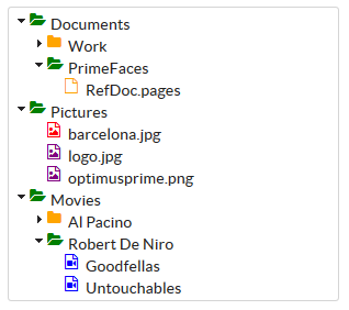
For me the most flexible and easiest solution is to use font-awesome 'icons' for the nodes. They are not effectively icons but as the name states, fonts. So these can be changed by css. Hence their popularity and why they are also included in PrimeFaces
The PrimeFaces showcase for tree with icons shows that you can add custom icons for nodes, both the open and closed ones and also for the leaves. Luckily everything you add in the corresponding attributes client-side ends up in 'class' attributes on the html AND you can add multiple white space values in the attributes. This is what font-awesome needs, so by adding expandedIcon="fa fa-folder-open" or collapsedIcon="fa fa-folder" you can get the right icons and with a default style of .fa { color: orange} you get exactly what you want.
In a full example with changed leaves would be something like this:
<style>

    .fa {
        color: orange;
    }

</style>
<h:form>
   <p:tree value="#{treeIconView.root}" var="doc">
        <p:treeNode expandedIcon="fa fa-folder-open" collapsedIcon="fa fa-folder">
            <h:outputText value="#{doc.name}"/>
        </p:treeNode>

        <p:treeNode type="document" icon="fa fa-file-o">
            <h:outputText value="#{doc.name}" />
        </p:treeNode>

        <p:treeNode type="picture" icon="fa fa-file-picture-o">
            <h:outputText value="#{doc.name}" />
        </p:treeNode>

        <p:treeNode type="mp3" icon="fa fa-file-video-o">
            <h:outputText value="#{doc.name}" />
        </p:treeNode>
    </p:tree>
</h:form>
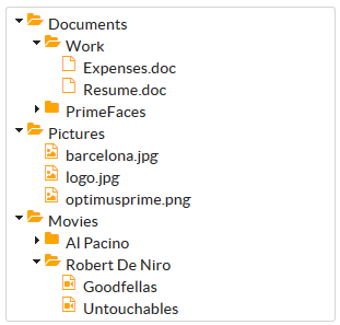
But you can go a lot further. Look at the following image:
It is produced with the following example:
<style>

    .fa {
        color: orange;
    }

    .videoColor {
        color: blue;
    }

    .colorOpen {
        color: green;
    }

    .fa-file-picture-o {
        color: purple;
    }

    .color30KB {
        color: red;
    }

</style>
<h:form>
    <p:tree value="#{treeIconView.root}" var="doc">
        <p:treeNode expandedIcon="fa fa-folder-open colorOpen" collapsedIcon="fa fa-folder">
            <h:outputText value="#{doc.name}"/>
        </p:treeNode>

        <p:treeNode type="document" icon="fa fa-file-o">
            <h:outputText value="#{doc.name}" />
        </p:treeNode>

        <p:treeNode type="picture" icon="fa fa-file-picture-o #{doc.size == '30 KB' ? 'color30KB' : '' }">
            <h:outputText value="#{doc.name}" />
        </p:treeNode>

        <p:treeNode type="mp3" icon="fa fa-file-video-o videoColor">
            <h:outputText value="#{doc.name}" />
        </p:treeNode>
    </p:tree>
</h:form>
You can add additional 'classes' in the icon attributes, but you can also use the fa classes that are already added and use that in css selectors, or you can add specific conditional 'classes' in the icons based on values etc... And since it can all be changed by css, you can not only change the color, but also the size, rotation, css animations or whatever.
FontAwesome with PrimeFaces
The ^ can be removed with
.ui-icon.fa {
     text-indent:0px;
     background-image:none;
}
PrimeFaces icons
Primefaces use jQuery themeroller for styling UI. All of the used icons in Primefaces are from there. Just mouseover icon you like (in themeroller) and something like : .ui-icon-arrow-1-e will pop. Then use it like this:
<p:commandButton action="target" icon="ui-icon ui-icon-arrow-1-e" value="Arrow icon"/>
How to change icon of TreeTable in Primefaces?
If you want to use custom icons (images), override the following CSS classes for their respective uses, on the treetable:
ui-icon: to customise the expanded-row state icon (the triangle).ui-icon {
width: 16px;
height: 16px;
background-image: url("/your-image-here");
}ui-icon-triangle-1-e ui-c: to customize the collapsed-row state icon
If you want to use more modern fontAwesome 'icons', see Change icon from jQuery UI to FontAwesome in PrimeFaces
How can I change icon of primefaces roweditor
overwrite your the styles in your CSS and point to your icon image:
  .ui-row-editor > .ui-icon-pencil {
  background-image: url(../images/myPencil.png) !important;
  height: 20px;
  width:20px;
 }
Related Topics
How to Animate an Ellipsis with CSS Animations
Using CSS How to Change Only The 2Nd Column of a Table
Is There an Alternative to CSS
CSS: Creating Textured Backgrounds
How to Add a Top and Bottom Shadow While Scrolling But Only When Needed
Difference Between CSS Fit-Content and Max-Content
Overlap Notification Badge on Glyph in Bootstrap 3
A Mnemonic for The Order of CSS Margin and Padding Shorthand Properties
Li:Before{ Content: "■"; } How to Encode This Special Character as a Bullit in an Email Stationery
CSS: Lighten an Element on Hover
What Are Your Tips for Best Practice for Web Application Structure
Override and Reset CSS Style: Auto or None Don't Work
Statically Rotate Font-Awesome Icons
How to Create Inline Style with: Before and: After
Optimize Font Awesome for Only Used Classes
Can CSS3 Box-Shadow:Inset Do Only One or Two Sides? Like Border-Top