Browser support for CSS Grid
Browser Support for CSS Grid
- Chrome - full support as of March 8, 2017 (version 57)
- Firefox - full support as of March 6, 2017 (version 52)
- Safari - full support as of March 26, 2017 (version 10.1)
- Edge - full support as of October 16, 2017 (version 16)
- IE11 - no support for current spec; supports obsolete version
- IE10 - no support for current spec; supports obsolete version
Here's the complete picture: http://caniuse.com/#search=grid (click on "Show all" for more details)
Is it safe to use Flexbox and Grid freely by now (2020)?
Whether it's "safe" depends on the percentage of browsers your target audience is using. So the problem can be considered subjective.
There is no fatal instability because at the moment it is rich in polyfills and most modern browsers support flexbox and grid layout.
Support tables of flexbox and grid layout:
- https://caniuse.com/#feat=flexbox
- https://caniuse.com/#feat=css-grid
Polyfills:
- https://github.com/FremyCompany/css-grid-polyfill
- https://github.com/jonathantneal/flexibility
Still software companies are using Css3 Gird Layout?
CSS grid is supported by most modern browsers. See caniuse.com for specific details.
Although IE doesn't support it, Microsoft will stop support of the browser in August 2021, which means that from now on, all major browsers will support grid.
In case you really worry about users still using legacy browsers, you can still implement fallbacks, as presented in this video.
CSS grid not displaying correctly on actual mobile browsers (all displays correctly when testing mobile screens on desktop though )
I have changed some html from your code also I'm use flexbox instead of grid.
Here is example:
HTML
<div class="calculator" id="calculator">
    <div class="container">
        <div class="key-area">
            <div id="display" class="display">0</div>
            <div class="key-group">
                <div class="key-item"><button id="seven" class="key-pad seven">7</button></div>
                <div class="key-item"><button id="eight" class="key-pad eight">8</button></div>
                <div class="key-item"><button id="nine" class="key-pad nine">9</button></div>
                <div class="key-item"><button id="divide" class="key-pad divide">÷</button></div>
                <div class="key-item"><button id="four" class="key-pad four">4</button></div>
                <div class="key-item"><button id="five" class="key-pad five">5</button></div>
                <div class="key-item"><button id="six" class="key-pad six">6</button></div>
                <div class="key-item"><button id="multiply" class="key-pad multiply">×</button></div>
                <div class="key-item"><button id="one" class="key-pad one">1</button></div>
                <div class="key-item"><button id="two" class="key-pad two">2</button></div>
                <div class="key-item"><button id="three" class="key-pad three">3</button></div>
                <div class="key-item"><button id="subtract" class="key-pad subtract">-</button></div>
                <div class="key-item"><button id="zero" class="key-pad zero">0</button></div>
                <div class="key-item"><button id="decimal" class="key-pad decimal">.</button></div>
                <div class="key-item"><button id="clear" class="key-pad clear">AC</button></div>
                <div class="key-item"><button id="add" class="key-pad add">+</button></div>
                <div class="key-item"><button id="equals" class="key-pad equals">=</button></div>
            </div>
        </div>
    </div>
</div>
CSS
*:after, *:before {
  -webkit-box-sizing: border-box;
     -moz-box-sizing: border-box;
          box-sizing: border-box;
}
body {
        font-family: 'Helvetica Neue', sans-serif;
        font-weight: 400;
    height: 100%;
    width: 100%;
    margin: 0;
    padding: 0;
        background: #53687e;
    background: linear-gradient(120deg, #53687e, hsl(0, 0%, 18%)) fixed;
}
.calculator .container {
  max-width: 320px;
  margin-left: auto;
  margin-right: auto;
  padding-left: 8px;
  padding-right: 8px;
}
.calculator .container .key-area {
  background-color: black;
  -webkit-border-radius: 8px;
     -moz-border-radius: 8px;
          border-radius: 8px;
  -webkit-box-shadow: 0px 0px 15px rgba(0, 0, 0, 0.7);
     -moz-box-shadow: 0px 0px 15px rgba(0, 0, 0, 0.7);
          box-shadow: 0px 0px 15px rgba(0, 0, 0, 0.7);
}
.calculator .container .key-area .display {
  cursor: pointer;
  background: transparent;
  font-size: 2.5rem;
  border: none;
  color: #51aaff;
  text-align: right;
  padding: 8px 8px 0;
}
.calculator .container .key-area .key-pad {
  cursor: pointer;
  background: #33373f;
  border-radius: 5px;
  color: #ffff;
  font-size: 2rem;
  border: none;
  padding: 8px;
  width: 100%;
}
.calculator .container .key-area .key-pad.divide, .calculator .container .key-area .key-pad.multiply, .calculator .container .key-area .key-pad.subtract, .calculator .container .key-area .key-pad.clear, .calculator .container .key-area .key-pad.add, .calculator .container .key-area .key-pad.equals {
  color: #51aaff;
  background-color: #1e242c;
}
.calculator .container .key-area .key-group {
  display: -webkit-box;
  display: -webkit-flex;
  display: -moz-box;
  display: -ms-flexbox;
  display: flex;
  flex-direction: row;
  -webkit-flex-wrap: wrap;
      -ms-flex-wrap: wrap;
          flex-wrap: wrap;
}
.calculator .container .key-area .key-group .key-item {
  -webkit-flex-basis: 25%;
      -ms-flex-preferred-size: 25%;
          flex-basis: 25%;
  -webkit-box-flex: 0;
  -webkit-flex-grow: 0;
     -moz-box-flex: 0;
      -ms-flex-positive: 0;
          flex-grow: 0;
  -webkit-flex-shrink: 0;
      -ms-flex-negative: 0;
          flex-shrink: 0;
  max-width: 25%;
  display: -webkit-box;
  display: -webkit-flex;
  display: -moz-box;
  display: -ms-flexbox;
  display: flex;
  -webkit-box-orient: horizontal;
  -webkit-box-direction: normal;
  -webkit-flex-direction: row;
     -moz-box-orient: horizontal;
     -moz-box-direction: normal;
      -ms-flex-direction: row;
          flex-direction: row;
  padding: 8px;
}
.calculator .container .key-area .key-group .key-item:last-child{
  flex-basis: 100%;
  max-width: 100%
}
I use max-width for container. You can change max-width in @media (max-width:*) or @media (min-width:*).
Edit this answer after @Pat comments
Using
gridCSSit can be fix
Example Calculator
Explanation
I seen you haven't use Normalize.css. Normalize.css is a small CSS file that provides better cross-browser consistency in the default styling of HTML elements. It’s a modern, HTML5-ready, alternative to the traditional CSS reset.
Most important you missing in Viewport meta tags. You used <meta name="viewport" content="width=device-width, initial-scale=1.0">. But you have to use <meta name="viewport" content="width=device-width, initial-scale=1.0, shrink-to-fit=no">. Benefit using shrink-to-fit=no adding this to the viewport meta tag restores pre-Safari 9.0 behaviour. Good explanation is here.
You haven't use box model *{box-sizing: ?;}. The box-sizing CSS property sets how the total width and height of an element is calculated. I used *{box-sizing: border-box;}*:after,*:before{box-sizing: border-box}. Details in MDN.
You use grid-gap. grid-gap has been deprecated in favor of gap. The gap CSS property sets the gaps (gutters) between rows and columns. It is a shorthand for row-gap and column-gap. CSS Grid Layout initially defined the grid-gap property. This prefixed property is being replaced by gap. However, in order to support browsers that implemented grid-gap and not gap for grid, you will need to use the prefixed property. Details in MDN.
You use grid-column property every child element where parent set grid-template-columns: repeat(4, 1fr);. You no need to specific every child element. You just need to first and last child element need to specific grid-column: 1 / span 4;.
Note: I changed font family and given height for
displayclassaccording your example.
Here is HTML
<!doctype html>
<html lang="en">
    <head>
        <!-- Required meta tags -->
        <meta charset="utf-8">
        <meta name="viewport" content="width=device-width, initial-scale=1, shrink-to-fit=no">

        <!-- Fonts -->
        <link rel="stylesheet" href="https://fonts.googleapis.com/css?family=Source+Sans+Pro&display=swap" />
        <!-- CSS -->
        <link rel="stylesheet" href="css/style.css" />

        <title>Calculator</title>
    </head>
    <body>
        <div class="calculator" id="calculator">
            <div class="container">
                <div class="key-group">
                    <div id="display" class="key-pad display">0</div>
                    <button id="seven" class="key-pad seven">7</button>
                    <button id="eight" class="key-pad eight">8</button>
                    <button id="nine" class="key-pad nine">9</button>
                    <button id="divide" class="key-pad divide">÷</button>
                    <button id="four" class="key-pad four">4</button>
                    <button id="five" class="key-pad five">5</button>
                    <button id="six" class="key-pad six">6</button>
                    <button id="multiply" class="key-pad multiply">×</button>
                    <button id="one" class="key-pad one">1</button>
                    <button id="two" class="key-pad two">2</button>
                    <button id="three" class="key-pad three">3</button>
                    <button id="subtract" class="key-pad subtract">-</button>
                    <button id="zero" class="key-pad zero">0</button>
                    <button id="decimal" class="key-pad decimal">.</button>
                    <button id="clear" class="key-pad clear">AC</button>
                    <button id="add" class="key-pad add">+</button>
                    <button id="equals" class="key-pad equals">=</button>
                </div>
            </div>
        </div>
    </body>
</html>
Here is CSS
* {
  -webkit-box-sizing: border-box;
     -moz-box-sizing: border-box;
          box-sizing: border-box; }

*:after, *:before {
  -webkit-box-sizing: border-box;
     -moz-box-sizing: border-box;
          box-sizing: border-box; }

[role="button"] {
  cursor: pointer; }

body {
  background: #53687e;
  background: -webkit-linear-gradient(330deg, #53687e, #2e2e2e) fixed;
  background: -moz-linear-gradient(330deg, #53687e, #2e2e2e) fixed;
  background: -o-linear-gradient(330deg, #53687e, #2e2e2e) fixed;
  background: linear-gradient(120deg, #53687e, #2e2e2e) fixed;
  font-family: 'Source Sans Pro', sans-serif;
  font-weight: 400;
  height: 100%;
  width: 100%;
  margin: 0;
  padding: 0;
  -webkit-font-smoothing: antialiased;
  text-rendering: optimizeLegibility;
  -moz-osx-font-smoothing: grayscale; }

.calculator {
  margin: 0 auto;
  text-align: center;
  padding-top: 100px; }

.calculator .container {
  -webkit-box-align: center;
  -webkit-align-items: center;
     -moz-box-align: center;
      -ms-flex-align: center;
          align-items: center;
  display: -webkit-box;
  display: -webkit-flex;
  display: -moz-box;
  display: -ms-flexbox;
  display: flex;
  -webkit-box-pack: center;
  -webkit-justify-content: center;
     -moz-box-pack: center;
      -ms-flex-pack: center;
          justify-content: center;
  line-height: 1.5;
  padding-bottom: 50px;
  position: relative; }

.calculator .container .key-group {
  background-color: black;
  -webkit-border-radius: 8px;
     -moz-border-radius: 8px;
          border-radius: 8px;
  -webkit-box-shadow: 0px 0px 15px rgba(0, 0, 0, 0.7);
     -moz-box-shadow: 0px 0px 15px rgba(0, 0, 0, 0.7);
          box-shadow: 0px 0px 15px rgba(0, 0, 0, 0.7);
  display: grid;
  gap: 10px;
  grid-template-columns: repeat(4, 1fr);
  overflow: hidden;
  padding: 8px; }

.calculator .container .key-group .key-pad {
  background-color: #33373f;
  -webkit-border-radius: 5px;
     -moz-border-radius: 5px;
          border-radius: 5px;
  color: #ffff;
  cursor: pointer;
  font-size: 2rem;
  border: none;
  margin: 0;
  padding: 8px; }

.calculator .container .key-group .key-pad.display {
  -webkit-box-align: end;
  -webkit-align-items: flex-end;
     -moz-box-align: end;
      -ms-flex-align: end;
          align-items: flex-end;
  cursor: default;
  background-color: transparent;
  display: -webkit-box;
  display: -webkit-flex;
  display: -moz-box;
  display: -ms-flexbox;
  display: flex;
  font-size: 2.5rem;
  grid-column: 1 / span 4;
  height: 5rem;
  -webkit-box-pack: end;
  -webkit-justify-content: flex-end;
     -moz-box-pack: end;
      -ms-flex-pack: end;
          justify-content: flex-end;
  text-align: right; }

.calculator .container .key-group .key-pad.divide, .calculator .container .key-group .key-pad.multiply, .calculator .container .key-group .key-pad.subtract, .calculator .container .key-group .key-pad.clear, .calculator .container .key-group .key-pad.add, .calculator .container .key-group .key-pad.equals {
  background-color: #1e242c;
  color: #51aaff; }

.calculator .container .key-group .key-pad.equals {
  grid-column: 1 / span 4; }
Hope this help!.
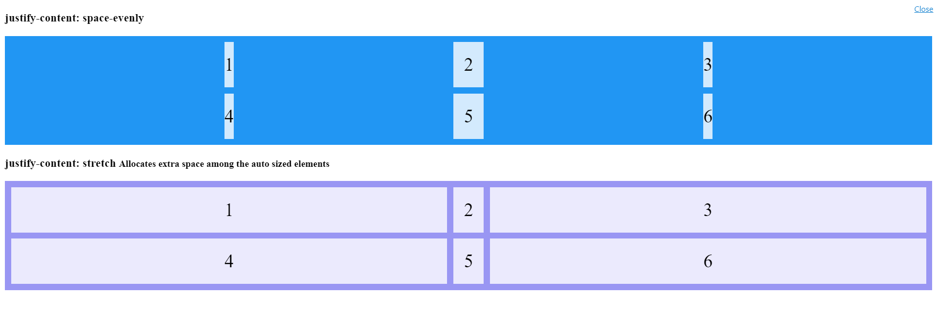
Is justify-content: stretch not supported for css grid in the latest browsers?
As I understand it, stretch will alter the width of any auto sized element, but not ones of fixed size. And the alteration will be such that each of these resized elements gets an equal amount of space.
Here's what MDN says:
If the combined size of the items along the main axis is less than the size of the alignment container, any auto-sized items have their size increased equally (not proportionally), while still respecting the constraints imposed by max-height/max-width (or equivalent functionality), so that the combined size exactly fills the alignment container along the main axis.
So in this snippet the 50px is changed to auto in the grid layout for two of them we get two of them stretched in the second container:
.grid-container {
  display: grid;
  justify-content: space-evenly;
  grid-template-columns: auto 50px auto; /*Changed from 50px for all*/
  grid-gap: 10px;
  background-color: #2196F3;
  padding: 10px;
}

.grid-container > div {
  background-color: rgba(255, 255, 255, 0.8);
  text-align: center;
  padding: 20px 0;
  font-size: 30px;
}

.grid-container.stretch {
  background-color: #9996f3;
  justify-content: stretch; /*no effect!!!*/
}
<h3>justify-content: space-evenly </h3>
<div class="grid-container">
<div>1</div>
<div>2</div>
<div>3</div>
<div>4</div>
<div>5</div>
<div>6</div>
</div>
<h3>justify-content: stretch <small>Allocates extra space among the auto sized elements</small></h3>
<div class="grid-container stretch">
<div>1</div>
<div>2</div>
<div>3</div>
<div>4</div>
<div>5</div>
<div>6</div>
</div>How do you query a web browser for CSS Grid support?
In CSS you can use this:
@supports (display: grid) {
    /* css styles for css grid */
}
The @supports syntax works back to Chrome 28, Edge 20, Firefox 22, Opera 12, Safari 9 according to MDN Web Docs.
Internet Explorer is not listed to support the @supports syntax.
Show alert if style is not supported, without HTML
You're making this too complicated /p>
if (document.documentElement.style.grid === undefined) {
    alert("Please use a different browser.");
}
In modern browsers, grid is a property of the style of every element. If it's undefined, then the browser doesn't support it.
Related Topics
Is Float For Layout Bad? What Should Be Used in Its Place
Show Child Div Within Hidden Parent Div
Border Gradient With Border Radius
Stretch and Scale a CSS Image in the Background - With CSS Only
How to Force a Div Block to Extend to the Bottom of a Page Even If It Has No Content
Is There a CSS Parent Selector
How to Combine :Nth-Child() or :Nth-Of-Type() With an Arbitrary Selector
How to Force Webkit to Redraw/Repaint to Propagate Style Changes
Select Every Nth Element in Css
How to Make Bootstrap Columns All the Same Height
Bootstrap Center Vertical and Horizontal Alignment
Vertical Align Center in Bootstrap 4
How to Remove Focus Border (Outline) Around Text/Input Boxes - Chrome
Reset/Remove CSS Styles For Element Only
How to Hide Collapsible Bootstrap Navbar on Click
See :Hover State in Chrome Developer Tools