Bootstrap Center Vertical and Horizontal Alignment
Bootstrap 5 (Updated 2021)
Bootstrap 5 is still flexbox based so vertical centering works the same way as it did in Bootstrap 4. For example, align-items-center (flex-direction: row) and justify-content-center (flex-direction: column) can used on the flexbox parent (row or d-flex).
Centering examples in Bootstrap 5
Vertical center (don't forget the parent must have a defined height!):
my-autofor centering inside flex (.d-flex) elementsmy-autocan be used to center columns (.col-) insiderowalign-items-centerto center columns (col-*) insiderow
Horizontal center:
text-centerto centerdisplay:inlineelements & column contentmx-autofor centering inside flex elementsmx-autocan be used to center columns (.col-) insiderowjustify-content-centerto center columns (col-*) insiderow
Bootstrap 4.3+ (Update 2019)
There's no need for extra CSS. What's already included in Bootstrap will work. Make sure the container(s) of the form are full height. Bootstrap 4 now has a h-100 class for 100% height...
Vertical center:
<div class="container h-100">
  <div class="row h-100 justify-content-center align-items-center">
    <form class="col-12">
      <div class="form-group">
        <label for="formGroupExampleInput">Example label</label>
        <input type="text" class="form-control" id="formGroupExampleInput" placeholder="Example input">
      </div>
      <div class="form-group">
        <label for="formGroupExampleInput2">Another label</label>
        <input type="text" class="form-control" id="formGroupExampleInput2" placeholder="Another input">
      </div>
    </form>
  </div>
</div>
https://codeply.com/go/raCutAGHre
the height of the container with the item(s) to center should be 100%
(or whatever the desired height is relative to the centered item)
Note: When using height:100% (percentage height) on any element, the element takes in the height of it's container. In modern browsers vh units height:100vh; can be used instead of % to get the desired height.
Therefore, you can set html, body {height: 100%}, or use the new min-vh-100 class on container instead of h-100.
Horizontal center:
text-centerto centerdisplay:inlineelements & column contentmx-autofor centering inside flex elementsoffset-*ormx-autocan be used to center columns (.col-)justify-content-centerto center columns (col-*) insiderow
Vertical Align Center in Bootstrap
Bootstrap 4 full-screen centered form
Bootstrap 4 center input group
Bootstrap 4 horizontal + vertical center full screen
Vertical Align Center in Bootstrap 4
Important! Vertical center is relative to the height of the parent
If the parent of the element you're trying to center has no defined
height, none of the vertical centering solutions will work!
Now, onto vertical centering...
Bootstrap 5 (Updated 2021)
Bootstrap 5 is still flexbox based so vertical centering works the same way as Bootstrap 4. For example, align-items-center, justify-content-center or auto margins can used on the flexbox parent (row or d-flex).
- use
align-items-centeron a flexbox row parent (roword-flex) - use
justify-content-centeron a flexbox column parent (d-flex flex-column) - use
my-autoon a flexbox parent
Vertical Center in Bootstrap 5
Bootstrap 4
You can use the new flexbox & size utilities to make the container full-height and display: flex. These options don't require extra CSS (except that the height of the container (ie:html,body) must be 100%).
Option 1 align-self-center on flexbox child
<div class="container d-flex h-100">
    <div class="row justify-content-center align-self-center">
     I'm vertically centered
    </div>
</div>
https://codeply.com/go/fFqaDe5Oey
Option 2 align-items-center on flexbox parent (.row is display:flex; flex-direction:row)
<div class="container h-100">
<div class="row align-items-center h-100">
<div class="col-6 mx-auto">
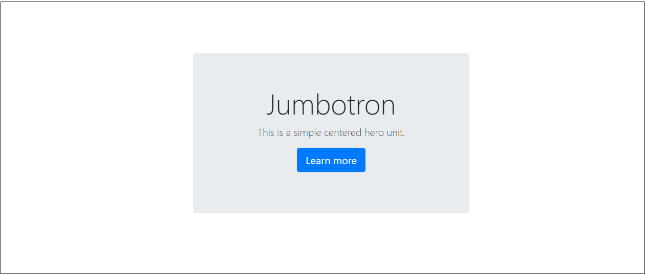
<div class="jumbotron">
I'm vertically centered
</div>
</div>
</div>
</div>
https://codeply.com/go/BumdFnmLuk
Option 3 justify-content-center on flexbox parent (.card is display:flex;flex-direction:column)
<div class="container h-100">
    <div class="row align-items-center h-100">
        <div class="col-6 mx-auto">
            <div class="card h-100 border-primary justify-content-center">
                <div>
                    ...card content...
                </div>
            </div>
        </div>
    </div>
</div>
https://codeply.com/go/3gySSEe7nd
More on Bootstrap 4 Vertical Centering
Now that Bootstrap 4 offers flexbox and other utilities, there are many approaches to vertical
alignment. http://www.codeply.com/go/WG15ZWC4lf
1 - Vertical Center Using Auto Margins:
Another way to vertically center is to use my-auto. This will center the element within it's container. For example, h-100 makes the row full height, and my-auto will vertically center the col-sm-12 column.
<div class="row h-100">
    <div class="col-sm-12 my-auto">
        <div class="card card-block w-25">Card</div>
    </div>
</div>
Vertical Center Using Auto Margins Demo
my-auto represents margins on the vertical y-axis and is equivalent to:
margin-top: auto;
margin-bottom: auto;
2 - Vertical Center with Flexbox:

Since Bootstrap 4 .row is now display:flex you can simply use align-self-center on any column to vertically center it...
       <div class="row">
           <div class="col-6 align-self-center">
                <div class="card card-block">
                 Center
                </div>
           </div>
           <div class="col-6">
                <div class="card card-inverse card-danger">
                    Taller
                </div>
          </div>
    </div>
or, use align-items-center on the entire .row to vertically center align all col-* in the row...
       <div class="row align-items-center">
           <div class="col-6">
                <div class="card card-block">
                 Center
                </div>
           </div>
           <div class="col-6">
                <div class="card card-inverse card-danger">
                    Taller
                </div>
          </div>
    </div>
Vertical Center Different Height Columns Demo
See this Q/A to center, but maintain equal height
3 - Vertical Center Using Display Utils:
Bootstrap 4 has display utils that can be used for display:table, display:table-cell, display:inline, etc.. These can be used with the vertical alignment utils to align inline, inline-block or table cell elements.
<div class="row h-50">
    <div class="col-sm-12 h-100 d-table">
        <div class="card card-block d-table-cell align-middle">
            I am centered vertically
        </div>
    </div>
</div>
Vertical Center Using Display Utils Demo
More examples
Vertical center image in <div>
Vertical center .row in .container
Vertical center and bottom in <div>
Vertical center child inside parent
Vertical center full screen jumbotron
Important! Did I mention height?
Remember vertical centering is relative to the height of the parent element. If you want to center on the entire page, in most cases, this should be your CSS...
body,html {
  height: 100%;
}
Or use min-height: 100vh (min-vh-100 in Bootstrap 4.1+) on the parent/container. If you want to center a child element inside the parent. The parent must have a defined height.
Also see:
Vertical alignment in bootstrap 4
Bootstrap Center Vertical and Horizontal Alignment
Horizontally and vertically center bootstrap 4 columns in consecutive rows
Here's a good way to do this using Bootstrap's build in flexboxes.
<div class="container d-flex h-100 flex-column">
    <div class="flex-grow-1"></div>
    <div class="row justify-content-center">
        <div class="col-3">
            <div class="card">ITEM A</div>
        </div>
    </div>
    <div class="row justify-content-center">
        <div class="col-3">
            <div class="card">ITEM B</div>
        </div>
    </div>
    <div class="row justify-content-center">
        <div class="col-3">
            <div class="card">ITEM C</div>
        </div>
    </div>
    <div class="flex-grow-1"></div>
</div>
We have two buffer flex rows, with flex-grow-1. Each of these rows will expand (with the same weight) to fill the top and bottom portions equally. Each of the content rows in the middle will have the height of their content.
The end result is the ITEM cards centered both vertically and horizontally on the screen. Because they are within individual rows, you can adjust margins/padding as necessary (by default they cards end up next to each other vertically.
Example screenshot of the above code in bootstrap
You could potentially do this one with one row + column and an internal flexbox, but that gives you less control over how the individual cards appear in relation to each other.
EDIT: d-flex makes the container a flex container around it's child rows, and flex-column makes the children render and stretch vertically rather than horizontally.
How do I vertically and horizontally center text in a container in bootstrap 4?
It is very easy makes the parent div as display: flex and make the child element margin: auto;
Check the demo below.
#outer {  width: 100%;  height: 100vh;  display: flex;}
#inner {  margin: auto;}
<div id="outer" class="container"> <div id="inner"> <h1>Heading</h1> <p>Some content</p> </div></div>How to center an h1 vertically and horizontally using bootstrap
Rather than using multiple bootstrap classes, you can use flex properties on the .greeting-container. You just have to add flex properties to justify and align the content in center.
.backIMg .greeting-container { height: 100vh; display: flex; justify-content: center; align-items: center;}<div class="backIMg"> <div class="greeting-container"> <h1>Welcome</h1> </div></div>Vertically and horizontally center a div within a flex-fill using bootstrap 4
Basically this has already been asked before.
To align the content of main, also make it a d-flex container and then use align-items-center.
<wrapper class="d-flex flex-column min-vh-100">
    <nav>
        nav
    </nav>
    <main class="flex-fill d-flex align-items-center">
        <div class="container-fluid text-center"> THIS IS THE DIV IM ATTEMPTING TO CENTER </div>
    </main>
    <footer>
        footer
    </footer>
</wrapper>
https://codeply.com/p/bxCBF84ozL
Note: The default direction of d-flex is flex-direction:row, therefore align-items:center will vertical align. To vertical center in flex-direction:column you would instead use justify-content:center
How can I center text and images vertically across columns with Bootstrap 5?
You want align-items-center on the row, which affects the flexbox cross-axis for its child elements. I suggest getting to know flexbox better via the Bootstrap flex docs and the CSS Tricks guide.
.name,
.intro {
  color: rgba(12, 11, 11, 0.6);
}

.name {
  font-size: 40px;
  font-weight: 700;
  font-family: 'DM Sans';
}

.intro {
  width: 525px;
  height: 107px;
  font-family: 'Ek Mukta';
  font-size: 25px;
  line-height: 40px;
}

#icon {
  margin: 10px;
  display: inline-block;
  width: 300px;
  height: 420px;
}
<link rel="stylesheet" href="https://cdn.jsdelivr.net/npm/bootstrap@5.1.3/dist/css/bootstrap.min.css" integrity="sha384-1BmE4kWBq78iYhFldvKuhfTAU6auU8tT94WrHftjDbrCEXSU1oBoqyl2QvZ6jIW3" crossorigin="anonymous">
<div class="container">
<div class="row align-items-center">
<div class="col-md-6">
<h3>Hi, I'm Ashley 👋</h3>
<p class="intro">Lorem ipsum dolor sit, amet consectetur adipisicing elit. Rem a, debitis, totam aa dddddd ddddd ddd Bootstrap Center Vertical and Horizontal Alignmenta. </p>
<br>
<a href="projects.html"><button id="checkout-projects">Check out my projects!</button></a>
</div>
<div class="col-md-6">
<img id="icon" src="https://via.placeholder.com/420x300" class="img-fluid">
</div>
</div>
</div>Related Topics
Single Huge .Css File Vs. Multiple Smaller Specific .Css Files
Using Percentage Values With Background-Position on a Linear-Gradient
Stretch and Scale a CSS Image in the Background - With CSS Only
Css - Why Doesn't Percentage Height Work
Why Does the Order of Media Queries Matter in Css
Difference Between Style = "Position:Absolute" and Style = "Position:Relative"
Css Opacity Only to Background Color, Not the Text on It
Justify the Last Line of a Div
How Would You Make Two <Div>S Overlap
How to Make Ng-Select Remove-And-Read-Only
How to Get the Footer to Stay At the Bottom of a Web Page
Font Awesome Not Working, Icons Showing as Squares
I Do Not Want to Inherit the Child Opacity from the Parent in Css
How to Select a Range of Elements in Repeated Pattern