Blurring an image via CSS?
You can use CSS3 filters. They are relatively easy to implement, though are only supported on webkit at the minute. Samsung Galaxy 2's browser should support though, as I think that's a webkit browser?
How to Blur part of an image in a box css
You may need backdrop-filter
The backdrop-filter CSS property lets you apply graphical effects such as blurring or color shifting to the area behind an element. Because it applies to everything behind the element, to see the effect you must make the element or its background at least partially transparent.
backdrop-filter: blur(20px);
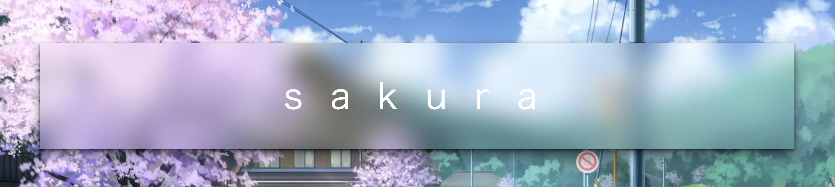
An amazing online demo: https://codepen.io/alphardex/pen/pooQMVp
body {
  display: flex;
  justify-content: center;
  align-items: center;
  height: 100vh;
  /* background: URL(); */
  background-size: cover;
  background-position: center;
}

.bgimage {
  display: flex;
  justify-content: center;
  align-items: center;
  width: 72vw;
  height: 36vh;
  /* box-shadow: ; */
  backdrop-filter: blur(20px);
  transition: 0.5s ease;

  &:hover {
    /* box-shadow: ; */
  }

  .title {
    padding-left: 0.375em;
    font-size: 3.6em;
    font-family: Lato, sans-serif;
    font-weight: 200;
    letter-spacing: 0.75em;
    color: white;

    @media (max-width: 640px) {
      font-size: 2em;
    }
  }
}
Blur part of an image with CSS
I have set the overflow property of the outer div to hidden and the margin-right of the inner one to -1 and it worked like a charm.
#image {
    ...
    overflow: hidden;
}

#image .blur {
    ...
    margin-right: -1px;
}
Here is the working example in JSFiddle.
#image {

    width: 940px;

    height: 360px;

    overflow: hidden;

    background-image: url('https://upload.wikimedia.org/wikipedia/commons/thumb/e/e3/Nuvola_wikipedia_icon.png/240px-Nuvola_wikipedia_icon.png');

}

#image .blur {

    background-image: url('https://upload.wikimedia.org/wikipedia/commons/thumb/e/e3/Nuvola_wikipedia_icon.png/240px-Nuvola_wikipedia_icon.png');

    background-position: center right;

    -webkit-filter: blur(3px);

    -moz-filter: blur(3px);

    -o-filter: blur(3px);

    -ms-filter: blur(3px);

    filter: blur(3px);

    filter: blur(3px);

    float: right;

    height: 100%;

    width: 360px;

    margin-right: -1px;

}
<div id="image">
<div class="blur"></div>
</div>CSS – Blurring image with un-blurred text
It sounds like the text is a child of the element that you are blurring. You can't do that. You need to do something like this:
<div class="container">
    <div class="blurredPhoto"></div>
    <div class="text">Your Text</div>
</div>

.container {
    width: 200px;
    height: 200px;
    position: relative;
}

.blurredPhoto {
    position: absolute;
    width: 200px;
    height: 200px;
}

.text {
    position: absolute;
    width: 200px;
    height: 200px;
}
Then apply your blurring logic only to the .blurredPhoto object.
When hover over img, all other images blur using CSS :not(:hover)
This trick works when you have a wrap element.
In this way you give the effect of all photos in the wrap except the one on which it is :hover
CSS Short version:
#wrap img {
    -webkit-transition: 400ms ease 100ms;
    -moz-transition: 400ms ease 100ms;
    transition: 400ms ease 100ms;
}

#wrap:hover img:not(:hover) {
    filter: blur(3px);
}
<div id='wrap'>
<img src="https://encrypted-tbn0.gstatic.com/images?q=tbn%3AANd9GcRK7bvAryKdY7JSlepTHatE1A4nAVU5lJXkdw&usqp=CAU"
width="100px">
<img src="https://encrypted-tbn0.gstatic.com/images?q=tbn%3AANd9GcRK7bvAryKdY7JSlepTHatE1A4nAVU5lJXkdw&usqp=CAU"
width="100px">
<img src="https://encrypted-tbn0.gstatic.com/images?q=tbn%3AANd9GcRK7bvAryKdY7JSlepTHatE1A4nAVU5lJXkdw&usqp=CAU"
width="100px">
</div>To blur an element with no background image by css
What you are looking for is backdrop-filter
body {

  background-image: url(https://i.picsum.photos/id/174/800/800.jpg);

  background-attachment: fixed;

  background-size: cover;

  height: 100vh;

  margin:0;

  position: relative;

}

.parent-div {

  position: relative;

  height:50vh;

  backdrop-filter: blur(10px);

  -webkit-backdrop-filter: blur(10px);

}
<div class=" parent-div">
<div class=" child-div">
<h4 class=" text-light">Hello world!!</h4>
</div>
</div>
<div class=" parent-div">
<div class=" child-div">
<h4 class=" text-light">Hello world!!</h4>
</div>
</div>How can I blur an image using css but keep the border straight?
Try something like this:
HTML:
<div id="container">
<img id="image" src="http://upload.wikimedia.org/wikipedia/commons/thumb/1/1e/Benz-velo.jpg/220px-Benz-velo.jpg">
</div>
CSS:
#image{
   filter: blur(5px);
   -webkit-filter: blur(5px);
   -moz-filter: blur(5px);
   -o-filter: blur(5px);
   -ms-filter: blur(5px);

   margin:-1px;
   padding:1px;
}

#container{
   width:222px;
   height:179px;
   overflow:hidden;
}
The margin on the image seems to be required for some reason (at least in Chrome).
Also on jsfiddle: http://jsfiddle.net/jdwire/HUaBV/1/.
Blur a part of the background image css
Alternatively, you can achieve the same effect with javascript - CSS is better -
as shown in this JSFiddle
var blurredDiv = document.createElement('div');

blurredDiv.className = 'blurry';

document.body.appendChild(blurredDiv);
body {
margin:0;
padding:0;
background-image:url('//cdn01.wallconvert.com/_media/wallpapers_2880x1800/1/4/silver-bmw-i8-39331.jpg');
background-size:cover;
}
.blurry {
width:calc(100% + 6px);
height:73px;
position:fixed;
top:-3px;
left:-3px;
background-image:url('//cdn01.wallconvert.com/_media/wallpapers_2880x1800/1/4/silver-bmw-i8-39331.jpg');
background-size:cover;
background-position:0 3px;
-webkit-filter: blur(3px);
filter: blur(3px);
}Blur the edges of an image or background image with CSS
If what you're looking for is simply to blur the image edges you can simply use the box-shadow with an inset.
Working example:
http://jsfiddle.net/d9Q5H/1/
HTML:
<div class="image-blurred-edge"></div>
CSS
.image-blurred-edge {
    background-image: url('http://lorempixel.com/200/200/city/9');
    width: 200px;
    height: 200px;
    /* you need to match the shadow color to your background or image border for the desired effect*/
    box-shadow: 0 0 8px 8px white inset;
}
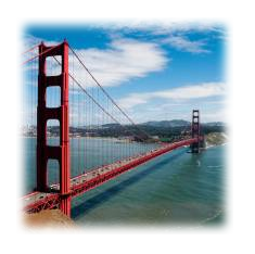
how to blur the background image only in css
If you are applying blur to <html> then it will blur your webpage.
Instead of adding background to <html> You need to create another <div> with in <body> with size to that of webpage and add blur to it.
Example
body {

  font-family: "Arial";

  color: #fff;

}

.page-bg {

  background: url('http://www.planwallpaper.com/static/images/general-night-golden-gate-bridge-hd-wallpapers-golden-gate-bridge-wallpaper.jpg');

  -webkit-filter: blur(5px);

  -moz-filter: blur(5px);

  -o-filter: blur(5px);

  -ms-filter: blur(5px);

  filter: blur(5px);

  position: fixed;

  width: 100%;

  height: 100%;

  top: 0;

  left: 0;

  z-index: -1;

}
<h1>
This is a title
</h1>
<div class="page-bg">
</div>Related Topics
Html/CSS Popup Div on Text Click
Adjacent Divs with Angled Borders
Css:After Encoding Characters in Content
CSS How to Print a Table with Background Color (Without Print Settings Changes)
Use a Space or Greater Than Sign > in CSS Selector
Switching to Em-Based Media Queries
Responsive Iframe (Google Maps) and Weird Resizing
Bootstrap.Css: .Container:Before Display Table
Inject CSS with Chrome Developer Tool
How to Expand a Child Div to 100% Screen Width If the Container Div Is Smaller
How to Hide Anchor Text Without Hiding the Anchor
How to Create Zebra Stripes on HTML Table Without Using JavaScript and Even/Odd Classes Generation
Text Blurry After 3D Transform
Centering a Button Vertically in Table Cell, Using Twitter Bootstrap
Overflow Scroll CSS Is Not Working in the Div
Jekyll Site Works Locally But Not on Github Pages
How to Style an Anchor Tag to Look Like a Button with the Same Height as the Button