Adding border to CSS triangle
One way to do it is the create an inner triangle which is smaller.
.triangle-left {

    width: 0;

    height: 0;

    border-top: 23px solid transparent;

    border-bottom: 23px solid transparent;

    border-right: 23px solid red;

}

.inner-triangle {

    position: relative;

    top: -20px;

    left: 2px;

    width: 0;

    height: 0;

    border-top: 20px solid transparent;

    border-bottom: 20px solid transparent;

    border-right: 20px solid blue;

}
<div class="triangle-left">
<div class="inner-triangle"></div>
</div>Adding borders to triangle built as borders
You can add the triangle borders with another pseudo element.
.dropdown-content:before,
.dropdown-content:after {
  position: absolute;
  left: 70%;
  width: 0;
  height: 0;
  content: '';
  border-left: 20px solid transparent;
  border-right: 20px solid transparent;
  border-bottom-width: 20px;
  border-bottom-style: solid;
}
.dropdown-content:before {
  top: -21px; /* extra -1 pixel offset at the top */
  border-bottom-color: red;
}
.dropdown-content:after {
  top: -20px;
  border-bottom-color: yellow;
}
.dropdown {

  position: relative;

  vertical-align: middle;

  display: inline-block;

}

.dropdown-content {

  position: absolute;

  min-width: 160px;

  background-color: yellow;

  padding: 12px 16px;

  margin-top: 20px;

  z-index: 1;

  border-color: red;

  border-width: thin;

  border-style: solid;

}

.dropdown-content a {

  display: block;

}

.dropdown-content:before,

.dropdown-content:after {

  position: absolute;

  left: 70%;

  width: 0;

  height: 0;

  content: '';

  border-left: 20px solid transparent;

  border-right: 20px solid transparent;

  border-bottom-width: 20px;

  border-bottom-style: solid;

}

.dropdown-content:before {

  top: -21px; /* extra -1 pixel offset at the top */

  border-bottom-color: red;

}

.dropdown-content:after {

  top: -20px;

  border-bottom-color: yellow;

}
<div class='dropdown'>
<div class="dropdown-content">
<a href="#">Link 1</a>
<a href="#">Link 2</a>
<a href="#">Link 3</a>
</div>
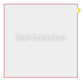
</div>Adding a border to div with top triangle
Actually the "triangle part" is a border itself, that's why you can't apply a CSS border to it, However there's a workaround.
use the :before pseudo-element to create another triangle bigger than the first and apply your border color to it.
.info-panel {

  display: block;

  position: relative;

  background: #FFFFFF;

  padding: 15px;

  border: 1px solid #DDDDDD;

  margin-top: 20px;

}

.info-panel:before, .info-panel:after {

  content: '';

  display: block;

  position: absolute;

  bottom: 100%;

  width: 0;

  height: 0;

}

.info-panel:before {

  left: 19px;

  border: 11px solid transparent;

  border-bottom-color: #ddd;

}

.info-panel:after {

  left: 20px;

  border: 10px solid transparent;

  border-bottom-color: #fff;

}
<div class="info-panel">
Testing
</div>CSS triangle custom border color
You actually have to fake it with two triangles....
.container {
    margin: 15px 30px;
    width: 200px;
    background: #fff;
    border: 1px solid #a00;
    position: relative;
    min-height: 200px;
    padding: 20px;
    text-align: center;
    color: #fff;
    font: bold 1.5em/180px Helvetica, sans-serif;
    text-shadow: 0 0 1px #000;
}

.container:after,
.container:before {
    content: '';
    display: block;
    position: absolute;
    left: 100%;
    width: 0;
    height: 0;
    border-style: solid;
}

.container:after {
    top: 10px;
    border-color: transparent transparent transparent #fdd;
    border-width: 10px;
}

.container:before {
    top: 9px;
    border-color: transparent transparent transparent #a00;
    border-width: 11px;
}
Updated Fiddle here
How to put a border on a triangle shape using css?
jsBin demo
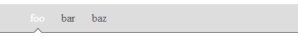
ul{
  list-style:none;
  background:#ddd;
  border-bottom: 1px solid #555;
}
ul li{
  display:inline-block;
}
ul li a{
  color:#555;
  display:inline-block;
  padding:10px;
  text-decoration:none;
  position:relative;
}
a.selected{
  color:#fff;
}
a.selected:after{                    /* Our arrow */
  position:absolute;
  -webkit-transform: rotate(45deg);
          transform: rotate(45deg);
  content:" ";
  width:8px;
  height:8px;
  border: 0 solid #555;
  border-width: 1px 0  0 1px;
  background:#fff;
  /* Now let's auto-center our arrow inside the pos. relative A parent */
  left:0;
  right:0;
  bottom:-5px;
  margin:0 auto;
}
Using :after on your a element, just set two borders and the same background color (in order to cover the bottom border of the ul), than rotate your little square by 45° and you're done.
Add a border to a triangle using pure CSS
The only way you could do something like this is to create another arrow just like it and put it behind the first to fake the border like this:
.arrow-tip {

    width: 0;

    height: 0;

    border-left: 15px solid transparent;

    border-right: 15px solid transparent;

    border-bottom: 15px solid #222;

    position: relative;

}

.arrow-tip:after {

    content: "";

    display: block;

    width: 0;

    height: 0;

    position: absolute;

    bottom: -16px;

    left: -17px;

    z-index: -1;

    border-left: 17px solid transparent;

    border-right: 17px solid transparent;

    border-bottom: 17px solid red;

}
<div class="arrow-tip"></div>Triangle with CSS with border
Someone already posted a pretty good answer to this question: https://stackoverflow.com/a/18607208/1320911
http://jsfiddle.net/wmDNr/3/
 .triangle {
     position: relative;
     width: 20px;
     margin-top: 100px;
 }
 .triangle>div {
     width: 20px;
     height: 2px;
     background: red;
     margin-top: 100px;
 }

 .triangle>div:before {
     content: " ";
     display: block;
     width: 20px;
     height: 2px;
     background: red;
     -webkit-transform: rotate(56deg);
     -moz-transform: rotate(56deg);
     -ms-transform: rotate(56deg);
     transform: rotate(56deg);
     position: absolute;
     top: -8px;
     right: -5px;
 }
 .triangle>div:after {
     content: " ";
     display: block;
     width: 20px;
     height: 2px;
     background: red;
     -webkit-transform: rotate(-56deg);
     -moz-transform: rotate(-56deg);
     -ms-transform: rotate(-56deg);
     transform: rotate(-56deg);
     position: absolute;
     top: -8px;
     left: -5px;
 }
Add border over triangle element
Try to add an ::after with more border-width and different position bottom and right, its work very well. Don't forget to change border-color to black and low down the z-index by -1.
Example:
.myDiv {

  width: 300px;

  padding: 15px;

  text-align: right;

  background-color: lightblue;

  position: relative;

  border: 1px solid black;

}

.myDiv::before {

  content: "";

  position: absolute;

  bottom: -20px;

  right: 20px;

  border-right: 20px solid lightblue;

  border-bottom: 20px solid transparent;

}

.myDiv::after {

  z-index:-1;

  content: "";

  position: absolute;

  width: 0;

  height: 0;

  bottom: -22px;

  right: 19px;

  border-right: 21px solid black;

  border-bottom: 21px solid transparent;

}
<div class="myDiv">Lorem ipsum dolor sit amet, consectetur adipiscing elit, sed do eiusmod tempor incididunt ut labore et dolore magna aliqua. Ut enim ad minim veniam, quis nostrud exercitation ullamco</div>Add border to 2 sides of CSS triangle?
100% pure CSS, no... but add an extra div in there and:
HTML
<div class="arrow-right">
  <div></div>
</div>
CSS
.arrow-right {
    width: 0;
    height: 0;
    border-top: 60px solid transparent;
    border-bottom: 60px solid transparent;
    border-left: 60px solid black;
}
.arrow-right > div {
    width: 0;
    position: relative;
    left: -60px;
    top: -59px;
    border-top: 59px solid transparent;
    border-bottom: 59px solid transparent;
    border-left: 59px solid green;
}
http://jsfiddle.net/qJJxm/
(replace every instance of 59 with a smaller number to make a wider border - all four should always be the same number)
Related Topics
Multiple !Important Class Declarations and Precedence
Vertical Scrollbar Leads to Horizontal Scrollbar
How to Alias Class Name in CSS or SASS
Prevent Child Div from Overflowing Parent Div
Table Cell Loses Border When CSS Gradient Filter Is Applied in IE8
Bootstrap 4 Flex Grid System Only
Chrome's Hidden CSS Scroll-Snap Threshold and How to Change It
How to Use Google Web Fonts in an HTML Email
Why Are My Descenders Being Cut Off When Using CSS @Font-Face
Why Are Inline-Block Elements Not Displayed Correctly in Internet Explorer 8
How to Filter and Show Only Applied CSS in Chrome Developer Tools (Like Firebug in Firefox)
How to Hide Default Choose File Button
CSS Link Element Jumps on Hover
Scale HTML Table Before Printing Using CSS
Calculating Viewport Height on Chrome Android with CSS
Is It Bad Practice to Use Negative Margins or Padding in CSS